Designed by: PepsiCo Design & Innovation
Country: United States

MR BLACK

1

MR BLACK

Designed by MR BLACK | Country: Australia

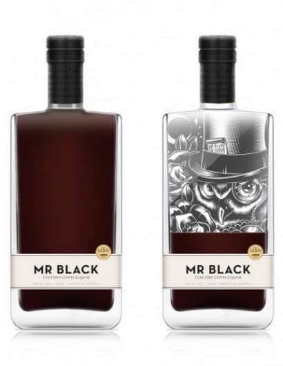
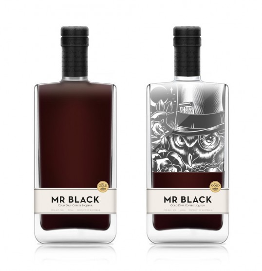
“We know MR BLACK isn’t for everyone, it’s not some cloying sickly sweet kiddie drink. It’s a rich, cold drip coffee liqueur for those who appreciate good coffee so our packing needed to speak to that. At MR BLACK we’re lovers of creative culture, so we knew we had to get a local artist in to help complete the product. At the same time, we didn’t want it to be an overpowering element of the design or to draw attention from the liquid inside.

Sydney artist Dale Bigeni created an original artwork for the bottle that is screen printed on the back face, revealing only as the liquid is drunk. This allows us to have quite a bold and minimal design on shelf, but has some interest and playfulness once taken home. At the end of the day, we just wanted MR BLACK to look as good as it tastes.”

1

Get the latest packaging design inspiration in your inbox:

Popular designs

Far Out Bar

Description: Far Out Bar is a cutting-edge packaging design project created for High Life Farms’ macrodose THC chocolate bars. This project involved

The Bra Guru

Most women are wearing the wrong size bra and that is a fact. The Bra Guru® is the first and only professional

The Port Vodka Lemon Water

Overview: In response to my client’s vision for a Cape Cod themed beverage brand, I embarked on the journey to create The Port

Designed by: PepsiCo Design & Innovation
Country: United States

MR BLACK

1
lovely-package-mr-black-coffee

MR BLACK

Designed by MR BLACK | Country: Australia

“We know MR BLACK isn’t for everyone, it’s not some cloying sickly sweet kiddie drink. It’s a rich, cold drip coffee liqueur for those who appreciate good coffee so our packing needed to speak to that. At MR BLACK we’re lovers of creative culture, so we knew we had to get a local artist in to help complete the product. At the same time, we didn’t want it to be an overpowering element of the design or to draw attention from the liquid inside.

Sydney artist Dale Bigeni created an original artwork for the bottle that is screen printed on the back face, revealing only as the liquid is drunk. This allows us to have quite a bold and minimal design on shelf, but has some interest and playfulness once taken home. At the end of the day, we just wanted MR BLACK to look as good as it tastes.”

1
Previous slide
Next slide

Explore more great package design

Get the latest on packaging design in your inbox: