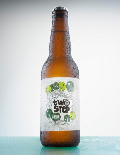
Designed by Freeform Advertising + Design | Country: Australia | Illustration: Rudi de Wet
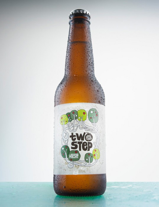
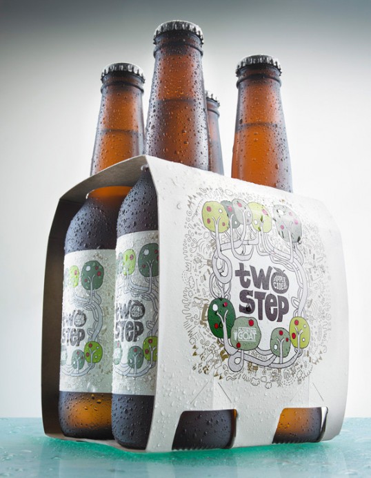
“We needed to create packaging that allowed Mountain Goat to stand out as the quality contender, whilst avoiding the conventions of many other labels (colour choices, obvious apple imagery etc).
Yet it still needed to be clear it was a cider. For this, we imagined the kind of orchard a brand like Mountain Goat might source its apples from.
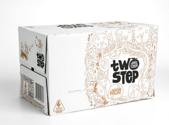
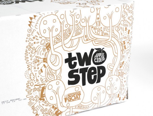
We then entered relevant terms into Google image search, and created a visual mashup of the more random results. These became the inhabitants of the orchard, such as the two-stepping goats, car castle, sneaky ninja and drum tractor.
The final product was this quirky, illustrated label which gave us a unique visual language for all packaging and communications.”

