Designed by: PepsiCo Design & Innovation
Country: United States

Victoria’s Kitchen

1

Victoria's Kitchen

Designed by QNY Creative | Country: United States

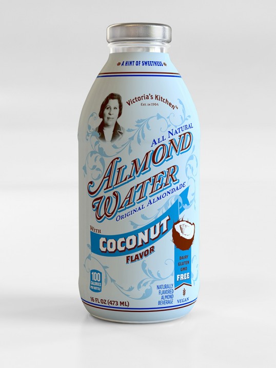
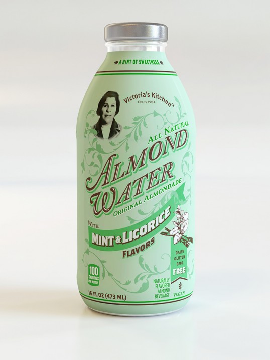
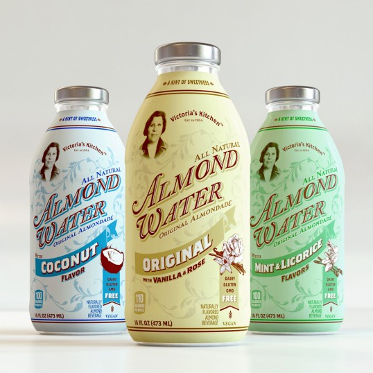
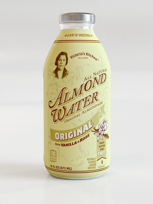
“Victoria’s Kitchen is a young californian start up, first launched their Almond Water in 2012. Inspired by a traditional and artisanal recipe from grandmother’s kitchen, Almond Water is the perfect combination of delicate yet tasty flavors. Infused with natural extracts, flavors and a hint of sweetness, Almond Water is a refreshing alternative to lemonade or iced tea.”

Victoria's Kitchen

Victoria's Kitchen

Victoria's Kitchen

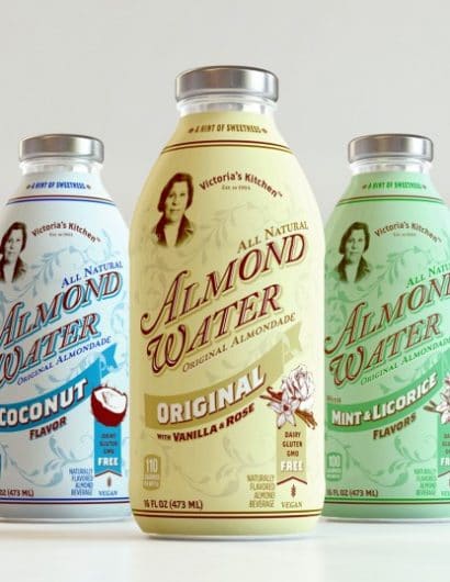
“We brought grandmother’s concept up-to-date by balancing the nostalgia of vintage produce labels with the shelf impact needed for modern packaging communication.

Pairing a lovely antique font and illustrations with a fresh background color, we gave Almond Water a vintage but modern identity. All of these elements work together, distinguishing Almond Water as a sophisticated, refreshing beverage offering.”

1

Get the latest packaging design inspiration in your inbox:

Popular designs

Far Out Bar

Description: Far Out Bar is a cutting-edge packaging design project created for High Life Farms’ macrodose THC chocolate bars. This project involved

The Port Vodka Lemon Water

Overview: In response to my client’s vision for a Cape Cod themed beverage brand, I embarked on the journey to create The Port

Designed by: PepsiCo Design & Innovation
Country: United States

Victoria’s Kitchen

1
lovely-package-victorias-kitchen-1

Victoria's Kitchen

Designed by QNY Creative | Country: United States

“Victoria’s Kitchen is a young californian start up, first launched their Almond Water in 2012. Inspired by a traditional and artisanal recipe from grandmother’s kitchen, Almond Water is the perfect combination of delicate yet tasty flavors. Infused with natural extracts, flavors and a hint of sweetness, Almond Water is a refreshing alternative to lemonade or iced tea.”

Victoria's Kitchen

Victoria's Kitchen

Victoria's Kitchen

“We brought grandmother’s concept up-to-date by balancing the nostalgia of vintage produce labels with the shelf impact needed for modern packaging communication.

Pairing a lovely antique font and illustrations with a fresh background color, we gave Almond Water a vintage but modern identity. All of these elements work together, distinguishing Almond Water as a sophisticated, refreshing beverage offering.”
1
Previous slide
Next slide

Explore more great package design

Get the latest on packaging design in your inbox: