Designed by: PepsiCo Design & Innovation
Country: United States

Henninger

Henninger

Designed by mousegraphics | Country: Greece

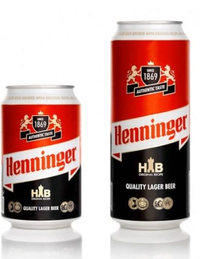
“The briefing (In brief):  We need to redesign our brand in order to reach a wider contemporary audience.

The target consumer: Various ages, mostly young and middle age consumers of both sexes, especially men.

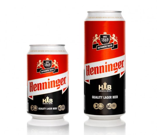
The design: A case of redesigning visual identity, this was a challenge that we approached by analyzing carefully all the elements of the existing logo and its context. We decided to keep and rearrange them in a meaningful way: the emblem (a coat of arms with 2 lions) was separated from the brand name, the overall design became more clear and linear, a frame based message was introduced. This evolved like a scrabble game with visual elements in the place of letters.”

Henninger

Get the latest packaging design inspiration in your inbox:

Popular designs

Burma Love Rebrand

Love at First BiteAs an extension of the Burma Superstar restaurant in San Francisco, Burma Love Foods gives diners an opportunity to

The Bra Guru

Most women are wearing the wrong size bra and that is a fact. The Bra Guru® is the first and only professional

Over the wave

This Kombucha originates in Lombok, Indonesia, where its paradise beaches attract hundreds of surfers eager to ride the waves. When you surf,

Pure Persian Honey

When we look closely at honey packaging, they are almost all in the usual format, and the ultimate in creativity is that

Designed by: PepsiCo Design & Innovation
Country: United States

Henninger

lovely-package-henninger-1

Henninger

Designed by mousegraphics | Country: Greece

“The briefing (In brief):  We need to redesign our brand in order to reach a wider contemporary audience.

The target consumer: Various ages, mostly young and middle age consumers of both sexes, especially men.

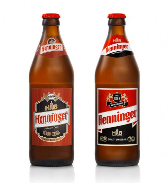
The design: A case of redesigning visual identity, this was a challenge that we approached by analyzing carefully all the elements of the existing logo and its context. We decided to keep and rearrange them in a meaningful way: the emblem (a coat of arms with 2 lions) was separated from the brand name, the overall design became more clear and linear, a frame based message was introduced. This evolved like a scrabble game with visual elements in the place of letters.”
Henninger

Previous slide
Next slide

Explore more great package design

Get the latest on packaging design in your inbox: