Designed by: PepsiCo Design & Innovation
Country: United States

NibMor

NibMor

Designed by Pearlfisher | Country: United States

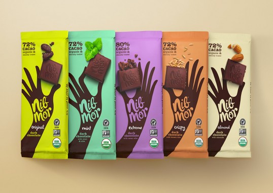
“Pearlfisher New York has created the new brand strategy, tone of voice, brand identity, and packaging for organic chocolate brand, NibMor.

A premium snack brand that does things differently, NibMor was founded by two nutritionists with a love for dark chocolate, eager to share the health benefits of chocolate as part of an active lifestyle. The challenge for NibMor was how to create a cohesive brand message that was enticing to consumers, expressing their healthy point of difference in a desirable way on the crowded confectionary shelf.”

NibMor

NibMor

NibMor

NibMor

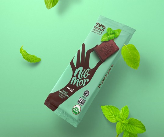
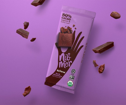
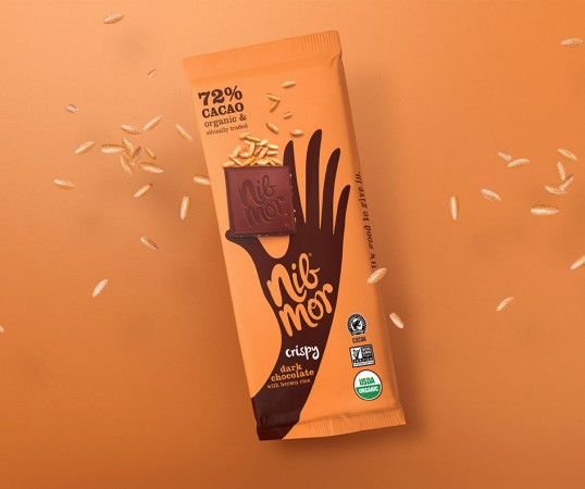
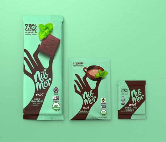
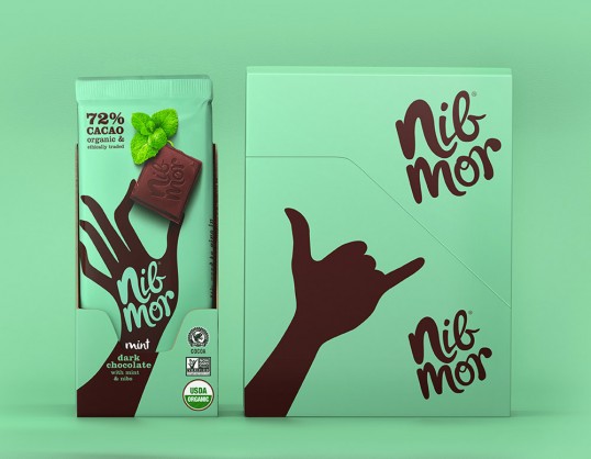
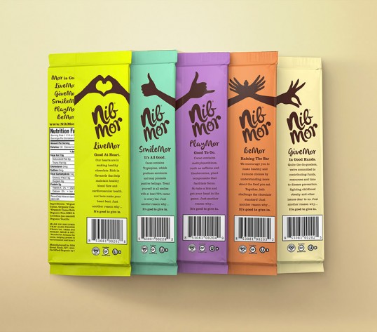
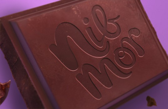
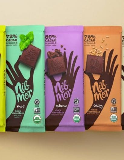
“Pearlfisher’s redesign and repositioning for NibMor unifies the health benefits of dark chocolate with the personality behind the brand in a dynamic way, creating a whole new visual and verbal language for chocolate. A fluid word mark takes their existing identity from earnest to energetic and reflects the personal touch that NibMor impart into each bar of their chocolate. As portion control is particularly important to NibMor’s food philosophy, Pearlfisher has used a hand as a primary design element that playfully cues the correct portion size for each product in the range. On the back of pack these hands evolve to evoke the personality and vibrancy behind the brand. The result is a new design that is modern, expressive and breaks the traditional category codes of chocolate to be both accessible and indulgent. Lastly, a new and vibrant color palette helps NibMor differentiate itself from competitor confectionary brands.”

NibMor

NibMor

“Tess Wicksteed, Executive Vice President at Pearlfisher New York comments, “We see Nibmor as the future of chocolate: chocolate with substance; fulfilling on many levels – social, personal and environmental. The project was about defining a clear brand idea and then bringing it to life both visually and verbally.”

Hamish Campbell, Creative Director at Pearlfisher New York comments, “Our new design for NibMor does away with the idea of guilty pleasure, making NibMor chocolate an everyday indulgence that you can feel good about. We can’t wait to see this brand start to change the market for the better.”

NibMor

NibMor

Get the latest packaging design inspiration in your inbox:

Popular designs

Far Out Bar

Description: Far Out Bar is a cutting-edge packaging design project created for High Life Farms’ macrodose THC chocolate bars. This project involved

Over the wave

This Kombucha originates in Lombok, Indonesia, where its paradise beaches attract hundreds of surfers eager to ride the waves. When you surf,

The Bra Guru

Most women are wearing the wrong size bra and that is a fact. The Bra Guru® is the first and only professional

Designed by: PepsiCo Design & Innovation
Country: United States

NibMor

lovely-package-nib-mor-1

NibMor

Designed by Pearlfisher | Country: United States

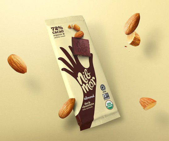
“Pearlfisher New York has created the new brand strategy, tone of voice, brand identity, and packaging for organic chocolate brand, NibMor.

A premium snack brand that does things differently, NibMor was founded by two nutritionists with a love for dark chocolate, eager to share the health benefits of chocolate as part of an active lifestyle. The challenge for NibMor was how to create a cohesive brand message that was enticing to consumers, expressing their healthy point of difference in a desirable way on the crowded confectionary shelf.”

NibMor

NibMor

NibMor

NibMor

“Pearlfisher’s redesign and repositioning for NibMor unifies the health benefits of dark chocolate with the personality behind the brand in a dynamic way, creating a whole new visual and verbal language for chocolate. A fluid word mark takes their existing identity from earnest to energetic and reflects the personal touch that NibMor impart into each bar of their chocolate. As portion control is particularly important to NibMor’s food philosophy, Pearlfisher has used a hand as a primary design element that playfully cues the correct portion size for each product in the range. On the back of pack these hands evolve to evoke the personality and vibrancy behind the brand. The result is a new design that is modern, expressive and breaks the traditional category codes of chocolate to be both accessible and indulgent. Lastly, a new and vibrant color palette helps NibMor differentiate itself from competitor confectionary brands.”

NibMor

NibMor

“Tess Wicksteed, Executive Vice President at Pearlfisher New York comments, “We see Nibmor as the future of chocolate: chocolate with substance; fulfilling on many levels – social, personal and environmental. The project was about defining a clear brand idea and then bringing it to life both visually and verbally.”

Hamish Campbell, Creative Director at Pearlfisher New York comments, “Our new design for NibMor does away with the idea of guilty pleasure, making NibMor chocolate an everyday indulgence that you can feel good about. We can’t wait to see this brand start to change the market for the better.”
NibMor

NibMor

Previous slide
Next slide

Explore more great package design

Get the latest on packaging design in your inbox: