Designed by: PepsiCo Design & Innovation
Country: United States

TCHO

tcho11

Designed by Edenspikermann | Country: Germany | Buy it

We updated this post with beautiful new photos, and because it’s such amazing work, felt that it should be brought back up to the front. Read up on Designer Susanna Dulkinys rationale for the design after the jump.
tcho21

tcho31

tcho41

tcho5

tcho6

tcho7

tcho8

tcho9

“The Aztecs prized the cacao bean so highly that it was their form of currency. The Aztec empire used cacao beans as trade for cloth, and in the Yucatan the beans were still used in place of coins as late as the 1840’s.

Cacao has an equally valuable place in modern society. And chocolate, while ancient, is also a modern food.

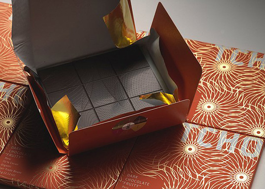
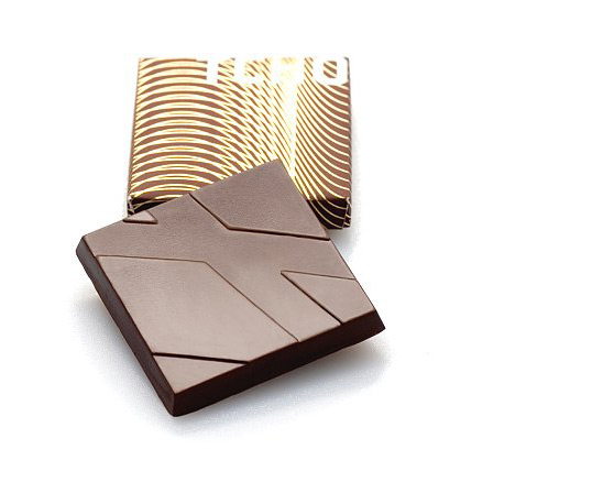
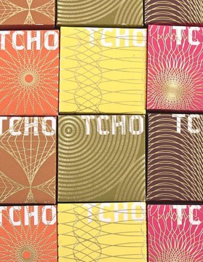
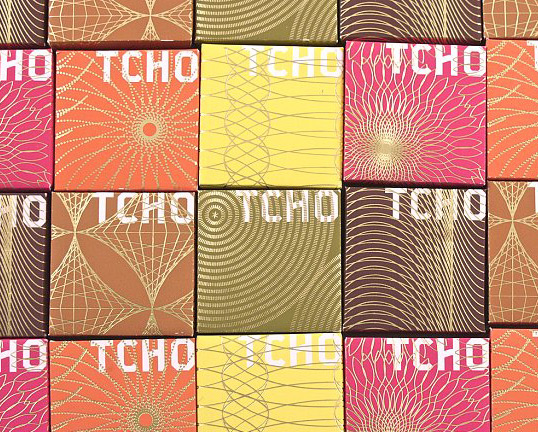
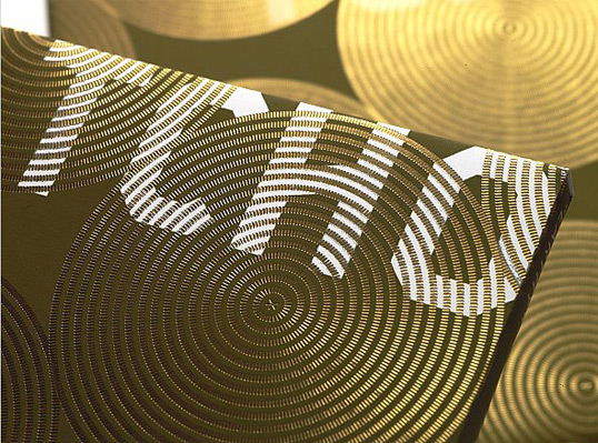
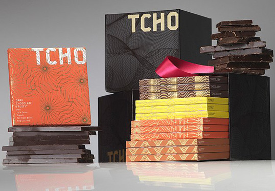
A TCHO Chocolate bar, with its algorithmic guilloche patterns, looks like a modern form of currency. “Modern” was always part of the brand brief — no faux traditionalism, but resolutely forward-looking for a new generation of chocolate enthusiasts.

So the TCHO brand language is deeper. Color, pattern, shape, the TCHO Flavor Wheel, and typography all serve to distinguish the TCHO visual brand.

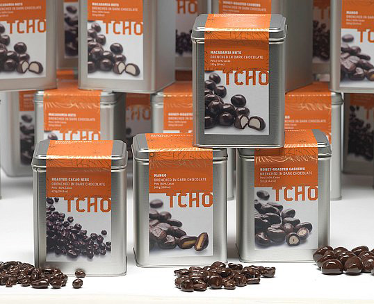
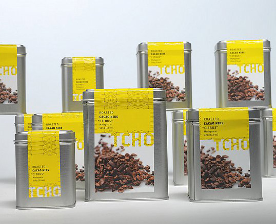
The colors on TCHO’s bars and products are drawn from the TCHO Flavor Wheel and represent the company’s unique flavor-driven philosophy, based on focusing on the inherent flavors present in cacao: chocolatey, earthy, nutty, floral, fruity, and citrus. These are flavors you can taste even if you aren’t a chocolate expert. TCHO is obsessed with making chocolates which are the purest expression of those flavors.

The six Flavor Wheel colors, plus six engraved repetitive patterns, are the visual expressions of TCHO’s flavor-driven focus.

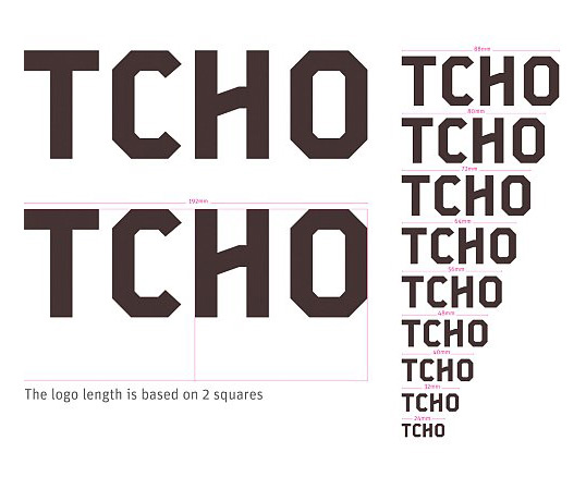
Other visual brand determinants include the square, specifically the measure of TCHO’s smallest bar. This square is the basis of measure for the grid underlying all packaging, literature, and communications.

The Logotype is derived from an iconic letterform from the industrial sector but with modified cross-strokes and corners to simulate what could be a chunky chocolate letter.

The typographic palette is clean and relatively light — reversing out of pure color to whites. This sets the logotype clearly apart creating clarity and contrast between brand and information.

The layout system is proportional and multiples of squares, defining column measures and image scale.

The rest is great chocolate.”

tcho4

TCHO explains the reasoning behind their beta packages.

“We love our Beta packages. Lots of you do too. From the outset, however, Beta was never intended to be TCHO’s final packaging.

The reasons are twofold: one is practical, the other esthetic.

When one of our chocolates graduates from Beta, it means we’ve integrated your feedback, finished our tweaking, and believe it’s ready for general release — which means much bigger batches. The more chocolate we produce, the more we need to package efficiently, and the handmade way we package the Beta products simply doesn’t scale.

Here’s why: You might have guessed that the Beta packages are as simple as they look — industrial brown kraft paper, sealed with our chocolate inside. What you might not know is that up to now, loyal interns and employees have been manually breaking bars, then hand-stuffing and hand-sealing each package of TCHO chocolate you’ve ordered, seen, and eaten.

With increased production, we would need squads of workers to do this amount of packaging, a blatant waste of human talent. The SIG packaging machines we purchased are capable of handling up to 200 bars a minute — we’d need about a hundred workers to do the same job.

The other reason our Beta chocolates graduate to new packaging is that one of TCHO’s guiding heuristics is to provide experience that delights — and we think our new packaging does exactly that. Chocolate may have ancient roots, but it is also a thoroughly modern food. Which is why we eschew faux traditionalism and embrace Susanna’s future-forward design.

Our Beta packaging was delightfully surprising in its straightforward simplicity. Our new packaging delights in a completely different way — it is bright, colorful, tactile, sophisticated.

But if you still love our Beta packaging, don’t despair. It is not going away. We will continue to wrap it around all our many future generations of Beta products.”

Get the latest packaging design inspiration in your inbox:

Popular designs

Far Out Bar

Description: Far Out Bar is a cutting-edge packaging design project created for High Life Farms’ macrodose THC chocolate bars. This project involved

Burma Love Rebrand

Love at First BiteAs an extension of the Burma Superstar restaurant in San Francisco, Burma Love Foods gives diners an opportunity to

Over the wave

This Kombucha originates in Lombok, Indonesia, where its paradise beaches attract hundreds of surfers eager to ride the waves. When you surf,

Designed by: PepsiCo Design & Innovation
Country: United States

TCHO

tcho11

tcho11

Designed by Edenspikermann | Country: Germany | Buy it

We updated this post with beautiful new photos, and because it’s such amazing work, felt that it should be brought back up to the front. Read up on Designer Susanna Dulkinys rationale for the design after the jump.
tcho21

tcho31

tcho41

tcho5

tcho6

tcho7

tcho8

tcho9

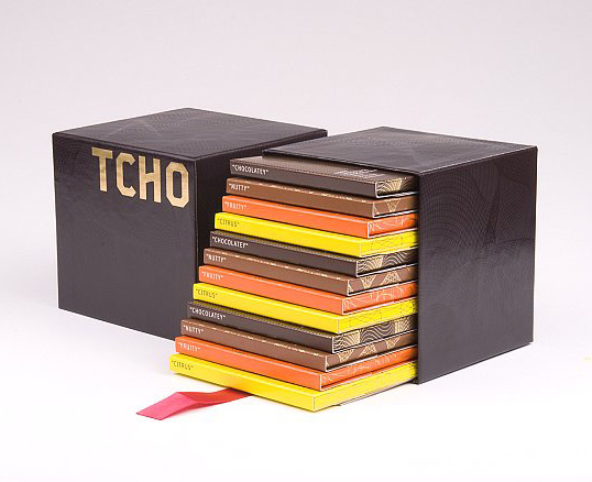
“The Aztecs prized the cacao bean so highly that it was their form of currency. The Aztec empire used cacao beans as trade for cloth, and in the Yucatan the beans were still used in place of coins as late as the 1840’s.

Cacao has an equally valuable place in modern society. And chocolate, while ancient, is also a modern food.

A TCHO Chocolate bar, with its algorithmic guilloche patterns, looks like a modern form of currency. “Modern” was always part of the brand brief — no faux traditionalism, but resolutely forward-looking for a new generation of chocolate enthusiasts.

So the TCHO brand language is deeper. Color, pattern, shape, the TCHO Flavor Wheel, and typography all serve to distinguish the TCHO visual brand.

The colors on TCHO’s bars and products are drawn from the TCHO Flavor Wheel and represent the company’s unique flavor-driven philosophy, based on focusing on the inherent flavors present in cacao: chocolatey, earthy, nutty, floral, fruity, and citrus. These are flavors you can taste even if you aren’t a chocolate expert. TCHO is obsessed with making chocolates which are the purest expression of those flavors.

The six Flavor Wheel colors, plus six engraved repetitive patterns, are the visual expressions of TCHO’s flavor-driven focus.

Other visual brand determinants include the square, specifically the measure of TCHO’s smallest bar. This square is the basis of measure for the grid underlying all packaging, literature, and communications.

The Logotype is derived from an iconic letterform from the industrial sector but with modified cross-strokes and corners to simulate what could be a chunky chocolate letter.

The typographic palette is clean and relatively light — reversing out of pure color to whites. This sets the logotype clearly apart creating clarity and contrast between brand and information.

The layout system is proportional and multiples of squares, defining column measures and image scale.

The rest is great chocolate.”
tcho4

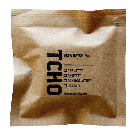
TCHO explains the reasoning behind their beta packages.

“We love our Beta packages. Lots of you do too. From the outset, however, Beta was never intended to be TCHO’s final packaging.

The reasons are twofold: one is practical, the other esthetic.

When one of our chocolates graduates from Beta, it means we’ve integrated your feedback, finished our tweaking, and believe it’s ready for general release — which means much bigger batches. The more chocolate we produce, the more we need to package efficiently, and the handmade way we package the Beta products simply doesn’t scale.

Here’s why: You might have guessed that the Beta packages are as simple as they look — industrial brown kraft paper, sealed with our chocolate inside. What you might not know is that up to now, loyal interns and employees have been manually breaking bars, then hand-stuffing and hand-sealing each package of TCHO chocolate you’ve ordered, seen, and eaten.

With increased production, we would need squads of workers to do this amount of packaging, a blatant waste of human talent. The SIG packaging machines we purchased are capable of handling up to 200 bars a minute — we’d need about a hundred workers to do the same job.

The other reason our Beta chocolates graduate to new packaging is that one of TCHO’s guiding heuristics is to provide experience that delights — and we think our new packaging does exactly that. Chocolate may have ancient roots, but it is also a thoroughly modern food. Which is why we eschew faux traditionalism and embrace Susanna’s future-forward design.

Our Beta packaging was delightfully surprising in its straightforward simplicity. Our new packaging delights in a completely different way — it is bright, colorful, tactile, sophisticated.

But if you still love our Beta packaging, don’t despair. It is not going away. We will continue to wrap it around all our many future generations of Beta products.”

Previous slide
Next slide

Explore more great package design

Get the latest on packaging design in your inbox: