Designed by: PepsiCo Design & Innovation
Country: United States

Moolanda

Moolanda

Designed by Cornershop | Country: Australia

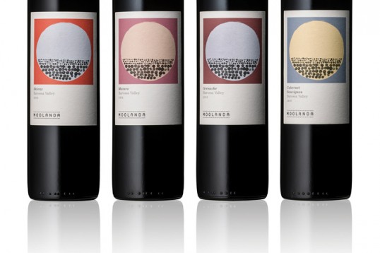
“Moolanda is an Aboriginal word meaning “on the far side.” The Moolanda vineyards are located on the far side of Barossa Valley. Aboriginal tribes roamed the valley for thousands of years and understood its unique qualities. Several rock art sites found in the region contain ancient drawings created using red, yellow and white ochre; rocks which can be found on Moolanda vineyards this very day. The way the soil interacts with these rocks affects how the vines grow. They are an invaluable part of the grape growing process for Moolanda.”

Moolanda

Moolanda

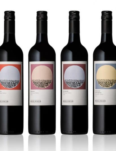
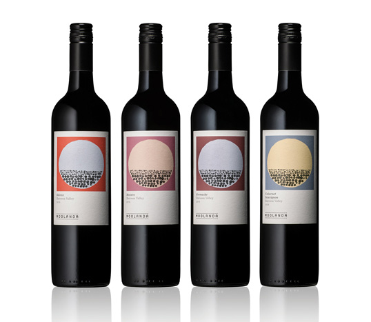
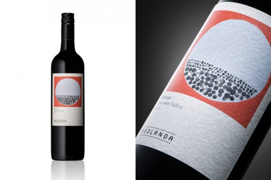
“The Moolanda branding and packaging is inspired by the terroir (land) and the vineyards Aboriginal connection. The illustration or graphic features dots that represent shallow layers of soil over layers of rocks; unique attributes of the Moolanda vineyards. The label is printed on uncoated paper in earthy tones with details finished in a high build gloss varnish to add value. Each product in the range sells for approximately A$30 rrp.”

 

Get the latest packaging design inspiration in your inbox:

Popular designs

Pure Persian Honey

When we look closely at honey packaging, they are almost all in the usual format, and the ultimate in creativity is that

The Port Vodka Lemon Water

Overview: In response to my client’s vision for a Cape Cod themed beverage brand, I embarked on the journey to create The Port

Burma Love Rebrand

Love at First BiteAs an extension of the Burma Superstar restaurant in San Francisco, Burma Love Foods gives diners an opportunity to

Designed by: PepsiCo Design & Innovation
Country: United States

Moolanda

lovely-package-moolanda-1

Moolanda

Designed by Cornershop | Country: Australia

“Moolanda is an Aboriginal word meaning “on the far side.” The Moolanda vineyards are located on the far side of Barossa Valley. Aboriginal tribes roamed the valley for thousands of years and understood its unique qualities. Several rock art sites found in the region contain ancient drawings created using red, yellow and white ochre; rocks which can be found on Moolanda vineyards this very day. The way the soil interacts with these rocks affects how the vines grow. They are an invaluable part of the grape growing process for Moolanda.”

Moolanda

Moolanda

“The Moolanda branding and packaging is inspired by the terroir (land) and the vineyards Aboriginal connection. The illustration or graphic features dots that represent shallow layers of soil over layers of rocks; unique attributes of the Moolanda vineyards. The label is printed on uncoated paper in earthy tones with details finished in a high build gloss varnish to add value. Each product in the range sells for approximately A$30 rrp.”
 

Previous slide
Next slide

Explore more great package design

Get the latest on packaging design in your inbox: