Designed by: PepsiCo Design & Innovation
Country: United States

Foods Cross

lovely-package-foods-cross-1

Designed by mousegraphics | Country: Greece

“The briefing (in brief): “We would like to enter the market with our top quality product. We need brand identity design and packaging applications.” 

The target consumer: Greek and foreign markets. Sophisticated consumers who look for quality products. 

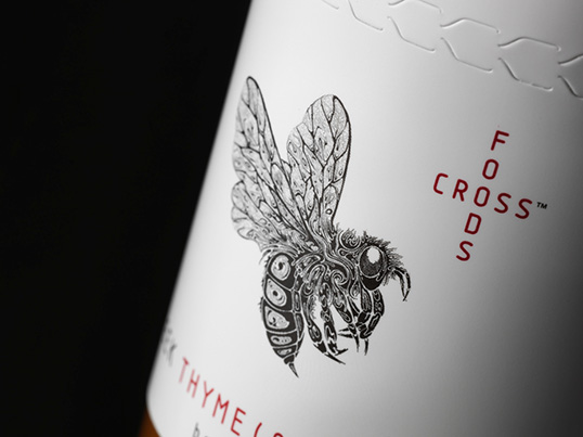
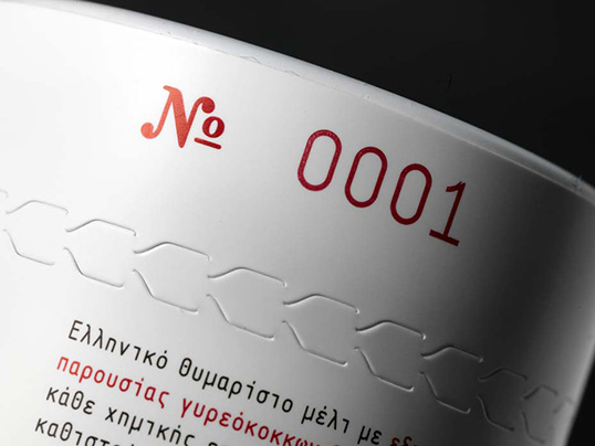
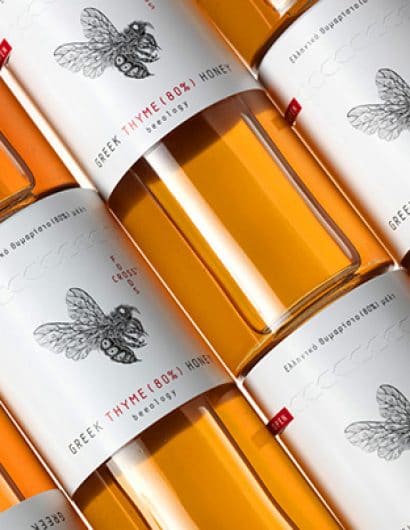
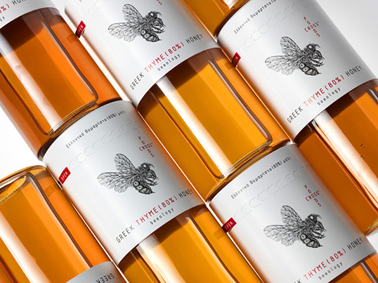
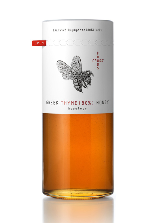
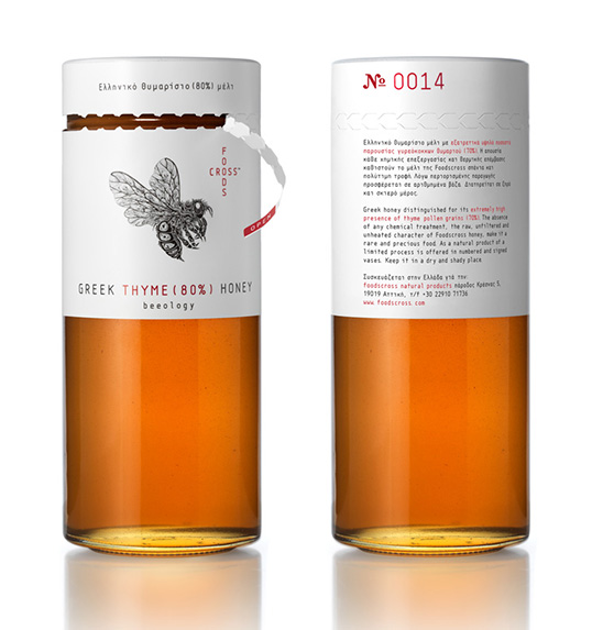
The design: The market for honey is a rising one and as such already filled with a variety of packaging designs. We needed to realize a brand identity able to convey this product’s specific advantage: it’s pure synthesis. This is Greek honey distinguished for its extremely high concentration of thyme pollen grains (80%). A rare, natural product of an eco-conscious process, meant to be offered in numbered and signed vases. We developed the logo design as a careful pairing of cross-shaped lettering (brand name) and the image of a bee, designed for us by the internationally known illustrator Si Scott. The elongated glass vessel we chose is covered on its upper part and toped by the brand identity elements and relevant information, in a way that allows the synthesis specifics and the collector’s data (number) to be clearly visible even when the top is removed. Black, white and red dominate the packaging design in an alternative reference to a pharmaceutical/cosmetics language.”
lovely-package-foods-cross-2 lovely-package-foods-cross-3 lovely-package-foods-cross-4 lovely-package-foods-cross-5 lovely-package-foods-cross-6

Get the latest packaging design inspiration in your inbox:

Popular designs

Over the wave

This Kombucha originates in Lombok, Indonesia, where its paradise beaches attract hundreds of surfers eager to ride the waves. When you surf,

Far Out Bar

Description: Far Out Bar is a cutting-edge packaging design project created for High Life Farms’ macrodose THC chocolate bars. This project involved

Designed by: PepsiCo Design & Innovation
Country: United States

Foods Cross

lovely-package-foods-cross-1

lovely-package-foods-cross-1

Designed by mousegraphics | Country: Greece

“The briefing (in brief): “We would like to enter the market with our top quality product. We need brand identity design and packaging applications.” 

The target consumer: Greek and foreign markets. Sophisticated consumers who look for quality products. 

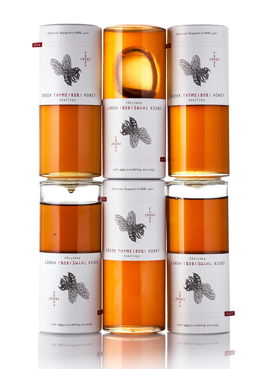
The design: The market for honey is a rising one and as such already filled with a variety of packaging designs. We needed to realize a brand identity able to convey this product’s specific advantage: it’s pure synthesis. This is Greek honey distinguished for its extremely high concentration of thyme pollen grains (80%). A rare, natural product of an eco-conscious process, meant to be offered in numbered and signed vases. We developed the logo design as a careful pairing of cross-shaped lettering (brand name) and the image of a bee, designed for us by the internationally known illustrator Si Scott. The elongated glass vessel we chose is covered on its upper part and toped by the brand identity elements and relevant information, in a way that allows the synthesis specifics and the collector’s data (number) to be clearly visible even when the top is removed. Black, white and red dominate the packaging design in an alternative reference to a pharmaceutical/cosmetics language.”
lovely-package-foods-cross-2 lovely-package-foods-cross-3 lovely-package-foods-cross-4 lovely-package-foods-cross-5 lovely-package-foods-cross-6

Previous slide
Next slide

Explore more great package design

Get the latest on packaging design in your inbox: