Designed by: PepsiCo Design & Innovation
Country: United States

Pablo & Rusty’s

lovely-package-pablo-and-rustys-1

Designed by Manual | Country: United States

“Pablo & Rusty’s is an award-winning small-batch coffee roaster based in Sydney, Australia. They strive to find amazing coffee; determine the best way to roast it; take it to one of their four stores and deliver an exceptional experience to their customers. Pablo & Rusty’s have a strong company culture, are passionate about sustainability, and are in constant pursuit of perfection.

Pablo & Rusty’s approached Manual to rebrand the company and better reflect the values they’d developed over the past decade. An immersion into the brand began with a brief research trip to Sydney to learn more about local coffee culture and experience Pablo & Rusty’s retail locations.”
lovely-package-pablo-and-rustys-2 lovely-package-pablo-and-rustys-3 lovely-package-pablo-and-rustys-6 lovely-package-pablo-and-rustys-5

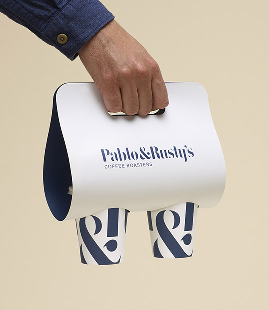
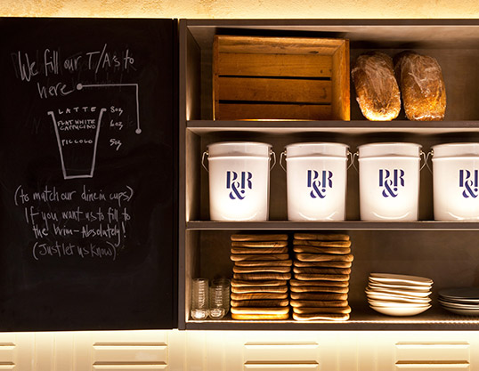
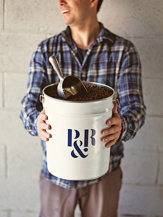
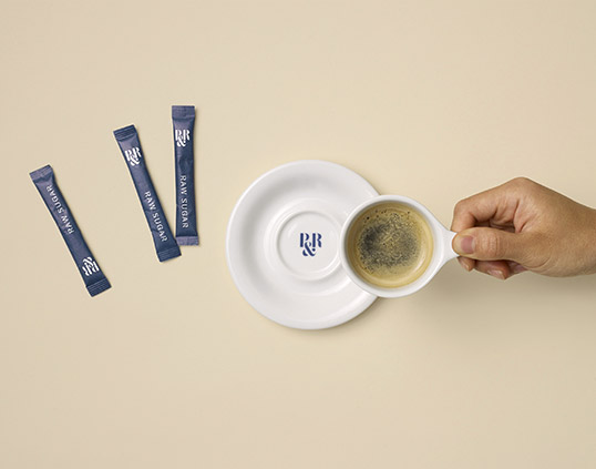
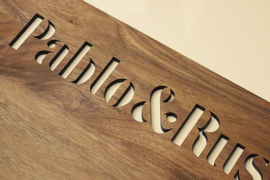
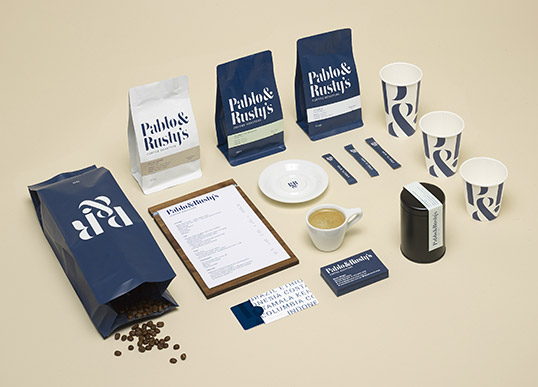
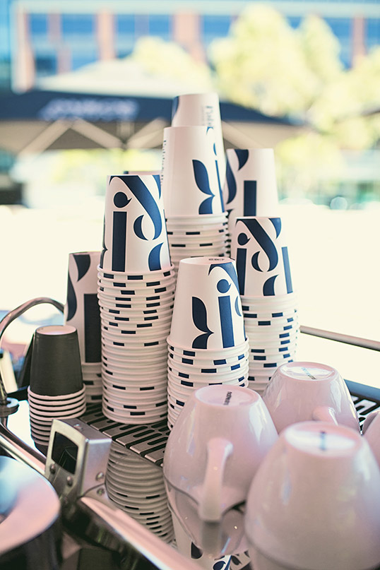
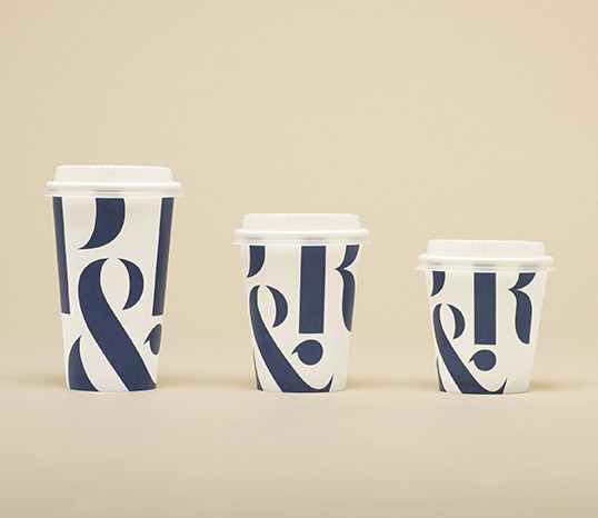
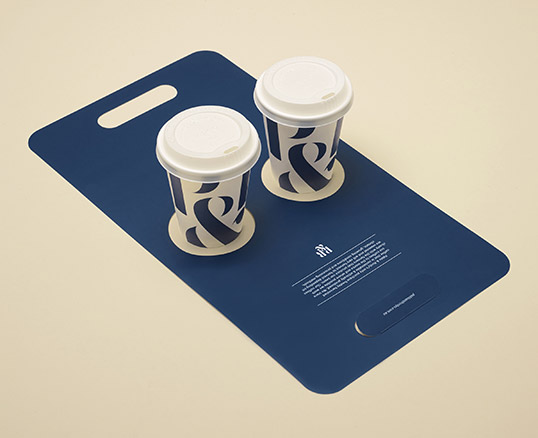
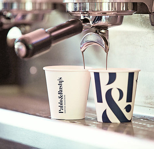
“Manual then created a complete brand identity, and applied it to key retail and packaging elements. We began by taking inspiration from the core of their business—the humble coffee sacks and stencil typography often found printed on them—and reinterpreted this as modern, sophisticated custom-drawn logotype. In our research we discovered that many of their customers and staff referred to them as ‘P&R’ for short, so we recommended building on that brand recognition and created a monogram that would work at small sizes. This duality in naming and branding provided the backbone for all print, packaging, and retail design elements.

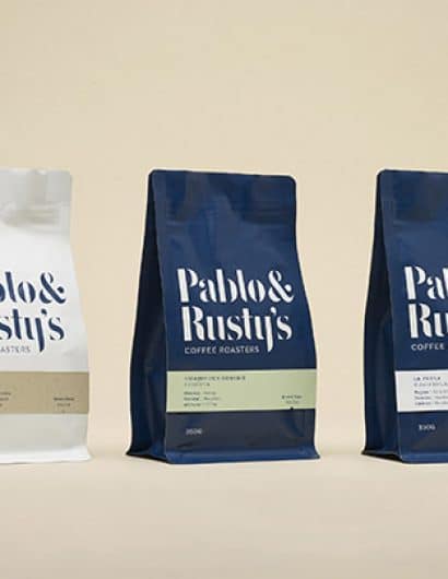
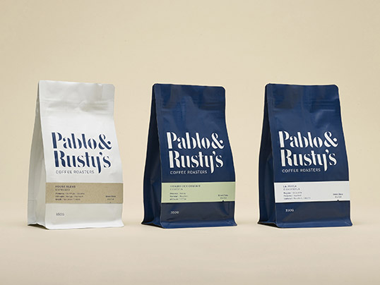
The simple use of typography and restrained color palette provided the appropriate level of design sophistication, and allowed the cafe experience–and coffee–to remain the focus.”

lovely-package-pablo-and-rustys-4 lovely-package-pablo-and-rustys-7 lovely-package-pablo-and-rustys-8 lovely-package-pablo-and-rustys-9 lovely-package-pablo-and-rustys-10 lovely-package-pablo-and-rustys-11

Get the latest packaging design inspiration in your inbox:

Popular designs

Luxurious Packaging Design for Saudi Chocolatier Fahda by TOLD

Discover how TOLD transformed the packaging of Saudi chocolate brand Fahda, creating an opulent unboxing experience with liquid gold lettering, cheetah iconography, and intricately embossed jungle landscapes. A luxury experience even before tasting the chocolate.

Laphroaig’s Wellington Boot-Inspired Gift Packaging Design

Laphroaig leverages story-telling to engage new drinkers, transforming the iconic green wellies into a giftable, reusable packaging for their single malt whisky. The wellie-inspired design disrupts traditional Scotch packaging, adding a playful touch to the brand’s history.

Designed by: PepsiCo Design & Innovation
Country: United States

Pablo & Rusty’s

lovely-package-pablo-and-rustys-1

lovely-package-pablo-and-rustys-1

Designed by Manual | Country: United States

“Pablo & Rusty’s is an award-winning small-batch coffee roaster based in Sydney, Australia. They strive to find amazing coffee; determine the best way to roast it; take it to one of their four stores and deliver an exceptional experience to their customers. Pablo & Rusty’s have a strong company culture, are passionate about sustainability, and are in constant pursuit of perfection.

Pablo & Rusty’s approached Manual to rebrand the company and better reflect the values they’d developed over the past decade. An immersion into the brand began with a brief research trip to Sydney to learn more about local coffee culture and experience Pablo & Rusty’s retail locations.”
lovely-package-pablo-and-rustys-2 lovely-package-pablo-and-rustys-3 lovely-package-pablo-and-rustys-6 lovely-package-pablo-and-rustys-5

“Manual then created a complete brand identity, and applied it to key retail and packaging elements. We began by taking inspiration from the core of their business—the humble coffee sacks and stencil typography often found printed on them—and reinterpreted this as modern, sophisticated custom-drawn logotype. In our research we discovered that many of their customers and staff referred to them as ‘P&R’ for short, so we recommended building on that brand recognition and created a monogram that would work at small sizes. This duality in naming and branding provided the backbone for all print, packaging, and retail design elements.

The simple use of typography and restrained color palette provided the appropriate level of design sophistication, and allowed the cafe experience–and coffee–to remain the focus.”
lovely-package-pablo-and-rustys-4 lovely-package-pablo-and-rustys-7 lovely-package-pablo-and-rustys-8 lovely-package-pablo-and-rustys-9 lovely-package-pablo-and-rustys-10 lovely-package-pablo-and-rustys-11

Previous slide
Next slide
Get the latest on packaging design in your inbox: