Designed by: PepsiCo Design & Innovation
Country: United States

Lighthouse Brewing Co.

lovely-package-lighthouse-brewing-co-1

Designed by Saint Bernadine Mission Communications Inc. | Country: Canada

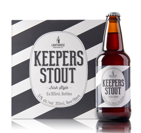
“As part of an entire portfolio rebrand, St. Bernadine was asked to help create a new look for Lighthouse Brewing Co.’s “House Series” family of craft beers.

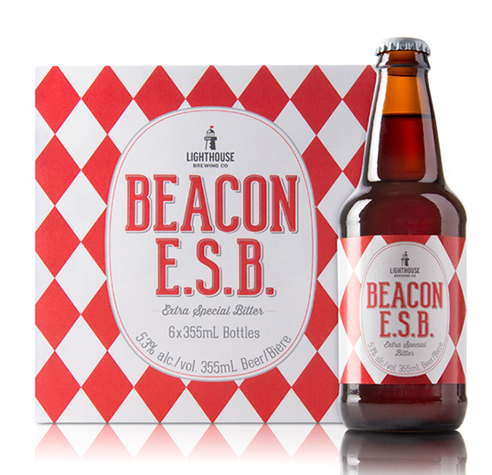
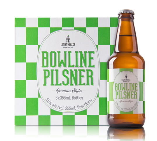
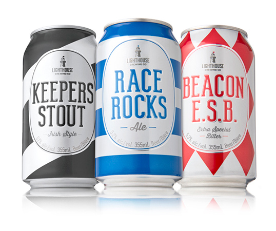
Aligned with the brand’s nautical positioning, and inspired by bold, colourful patterns found on lighthouses around the world, the team at St. Bernadine created striking patterns for the family (Race Rocks Amber Ale: horizontal stripes, Keepers Stout: diagonal bars, Beacon ESB: diamonds, and Bowline Pilsner: checked squares).

The flat white base colour brings family unity to the series as well as echoing the lighthouse namesake, while the colourful patterns allow each flavour to be easily distinguished within the series and contribute to findability and presence in a visually cluttered craft category.”
lovely-package-lighthouse-brewing-co-2 lovely-package-lighthouse-brewing-co-3 lovely-package-lighthouse-brewing-co-4 lovely-package-lighthouse-brewing-co-5

Get the latest packaging design inspiration in your inbox:

Popular designs

The Port Vodka Lemon Water

Overview: In response to my client’s vision for a Cape Cod themed beverage brand, I embarked on the journey to create The Port

Pure Persian Honey

When we look closely at honey packaging, they are almost all in the usual format, and the ultimate in creativity is that

Far Out Bar

Description: Far Out Bar is a cutting-edge packaging design project created for High Life Farms’ macrodose THC chocolate bars. This project involved

Designed by: PepsiCo Design & Innovation
Country: United States

Lighthouse Brewing Co.

lovely-package-lighthouse-brewing-co-1

lovely-package-lighthouse-brewing-co-1

Designed by Saint Bernadine Mission Communications Inc. | Country: Canada

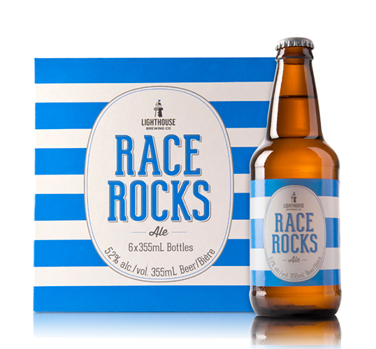
“As part of an entire portfolio rebrand, St. Bernadine was asked to help create a new look for Lighthouse Brewing Co.’s “House Series” family of craft beers.

Aligned with the brand’s nautical positioning, and inspired by bold, colourful patterns found on lighthouses around the world, the team at St. Bernadine created striking patterns for the family (Race Rocks Amber Ale: horizontal stripes, Keepers Stout: diagonal bars, Beacon ESB: diamonds, and Bowline Pilsner: checked squares).

The flat white base colour brings family unity to the series as well as echoing the lighthouse namesake, while the colourful patterns allow each flavour to be easily distinguished within the series and contribute to findability and presence in a visually cluttered craft category.”
lovely-package-lighthouse-brewing-co-2 lovely-package-lighthouse-brewing-co-3 lovely-package-lighthouse-brewing-co-4 lovely-package-lighthouse-brewing-co-5

Previous slide
Next slide

Explore more great package design

Get the latest on packaging design in your inbox: