Designed by: PepsiCo Design & Innovation
Country: United States

Gulp

lovely-package-gulp-1

Designed by Wieden + Kennedy London | Country: United Kingdom

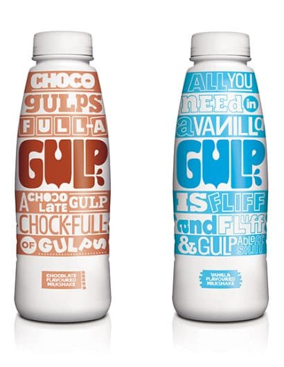
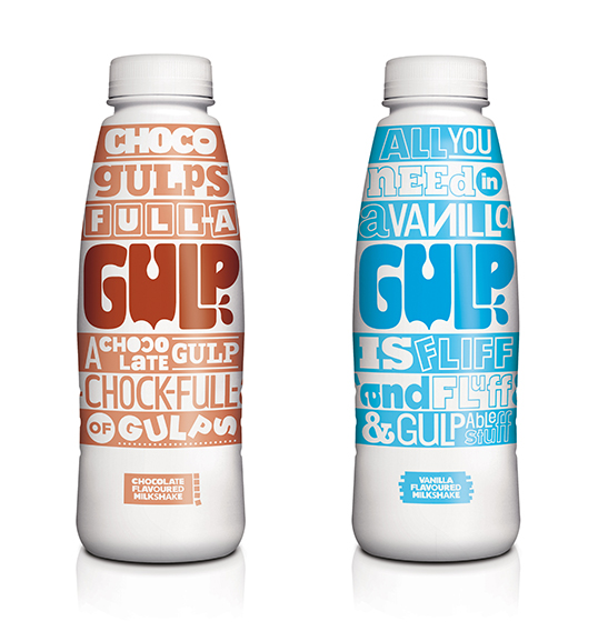
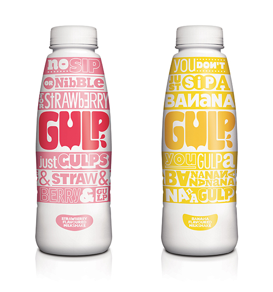
“Our role was to create the brand tone of voice and from that devise the package design for a new-to-market ready-to-drink milkshake, Gulp. We’ve made a bespoke wrapping for each of the vanilla, chocolate, strawberry and banana flavours.

Gulp isn’t just a name; it’s an attitude. It’s a way of behaving. The design is born from the fact that milkshakes need be to shaken to be enjoyed to the max. The typography literally shakes things up expressing Gulp’s cheery personality. The stripes running through the design bring to life the stages at which you should enjoy the drink to full effect – in big, bold gulps.”
lovely-package-gulp-2

Get the latest packaging design inspiration in your inbox:

Popular designs

Burma Love Rebrand

Love at First BiteAs an extension of the Burma Superstar restaurant in San Francisco, Burma Love Foods gives diners an opportunity to

The Port Vodka Lemon Water

Overview: In response to my client’s vision for a Cape Cod themed beverage brand, I embarked on the journey to create The Port

Over the wave

This Kombucha originates in Lombok, Indonesia, where its paradise beaches attract hundreds of surfers eager to ride the waves. When you surf,

Pure Persian Honey

When we look closely at honey packaging, they are almost all in the usual format, and the ultimate in creativity is that

Designed by: PepsiCo Design & Innovation
Country: United States

Gulp

lovely-package-gulp-1

lovely-package-gulp-1

Designed by Wieden + Kennedy London | Country: United Kingdom

“Our role was to create the brand tone of voice and from that devise the package design for a new-to-market ready-to-drink milkshake, Gulp. We’ve made a bespoke wrapping for each of the vanilla, chocolate, strawberry and banana flavours.

Gulp isn’t just a name; it’s an attitude. It’s a way of behaving. The design is born from the fact that milkshakes need be to shaken to be enjoyed to the max. The typography literally shakes things up expressing Gulp’s cheery personality. The stripes running through the design bring to life the stages at which you should enjoy the drink to full effect – in big, bold gulps.”

lovely-package-gulp-2

Previous slide
Next slide

Explore more great package design

Get the latest on packaging design in your inbox: