Designed by Milford | Country: The Netherlands
“Etos is the Netherlands’ best-known drugstore. It comes with a very wide range and lots of store brands. This is how Etos provides a perfect alternative to primary brands, always on the lookout for categories that will take the entire product range to the next level.
The team’s attention was drawn to the category tea that perfectly blends in with today’s consumers: a high-quality product that matches a natural, healthy lifestyle and which has every right to be among the store’s wellness products.”
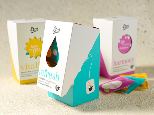
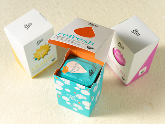
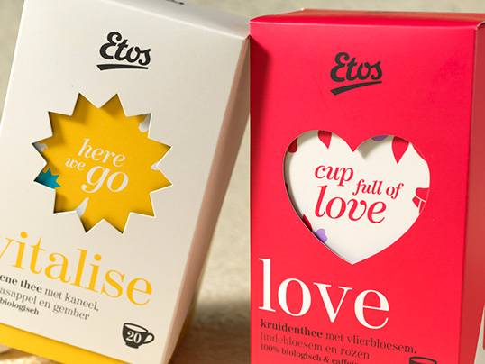
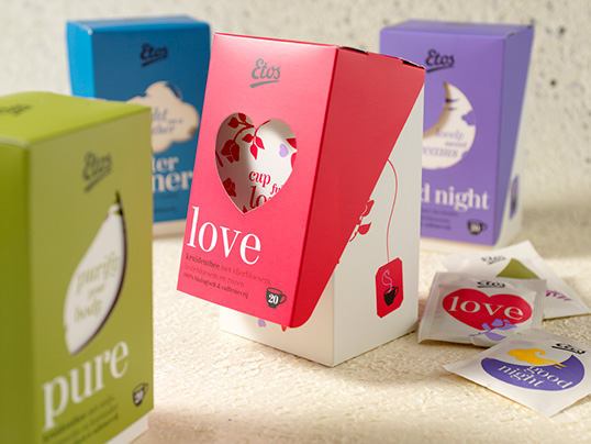
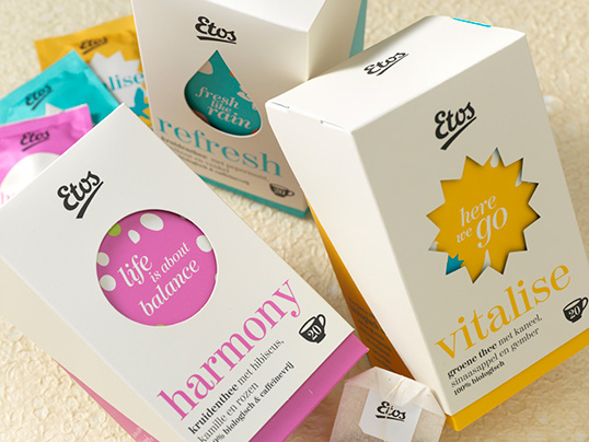
“Millford has been invited to provide the design, keeping these details in mind. Each variant needed to clearly communicate its function, favour or mood. The entire range needed to be one family and the packaging had to be attractive to such an extent it would in fact make a nice gift.
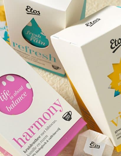
We came up with a characteristic physical packaging that is beyond any straightforward tea box. Also, we created our own design language exclusively for Etos tea. Each variant has its own icon in the shape of a window on the front of the packaging. The name in this window and the shape of the icon add to the story that goes with the tea variant in question. On all sides of the packaging, even on the inside, consumers are taken by surprise because of the design and colourfulness. There can be no doubt that careful attention has been paid to every single detail, which is a great source of inspiration to pamper yourself with a delicious cup of Etos tea.”
