Designed by: PepsiCo Design & Innovation
Country: United States

Grill Iron

lovely-package-grill-iron-1

Designed by End of Work | Country: Australia

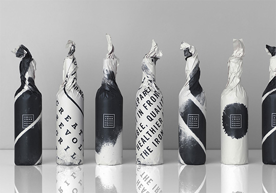
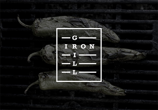
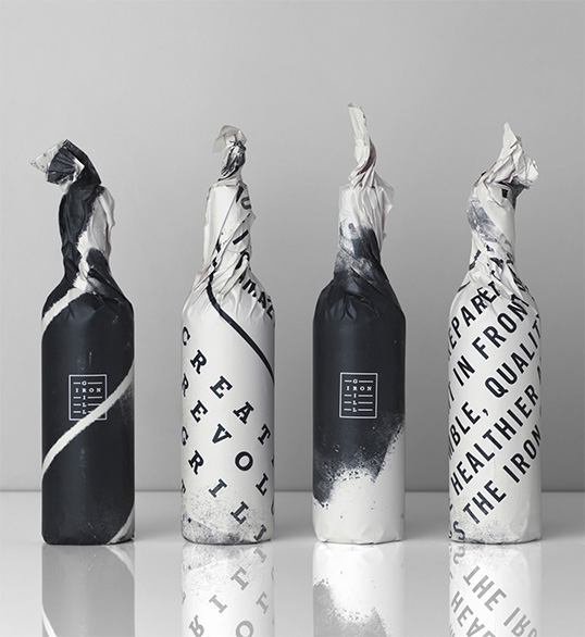
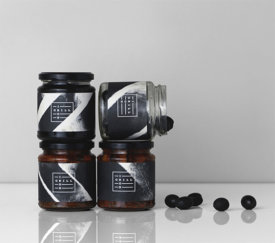
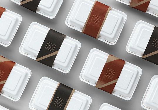
“A spirited new brand identity with a healthy attitude and an appetite for opinion. The grill is king. The logo is quite literally type on a grill and by using a graphic inspired by the grill, the visual identity has an impactful, almost militant quality with thick black scorch marks burned into key pieces. The packaging was designed to be as visible as possible on the super-lean budget. The interiors, signage, uniforms, point of sale and packaging all reflect this natural, clean ethos, using raw materials and earthy finishes, we paid homage to the handmade and bespoke offer that is the Iron Grill way. This idea drove the identity, which in turn drove the direction of the interior, the textures, the materials, the uniforms. All these elements build a engaging and memorable experience.”
lovely-package-grill-iron-3 lovely-package-grill-iron-4 lovely-package-grill-iron-5 lovely-package-grill-iron-2 lovely-package-grill-iron-6

Get the latest packaging design inspiration in your inbox:

Popular designs

Burma Love Rebrand

Love at First BiteAs an extension of the Burma Superstar restaurant in San Francisco, Burma Love Foods gives diners an opportunity to

Pure Persian Honey

When we look closely at honey packaging, they are almost all in the usual format, and the ultimate in creativity is that

The Bra Guru

Most women are wearing the wrong size bra and that is a fact. The Bra Guru® is the first and only professional

Designed by: PepsiCo Design & Innovation
Country: United States

Grill Iron

lovely-package-grill-iron-1

lovely-package-grill-iron-1

Designed by End of Work | Country: Australia

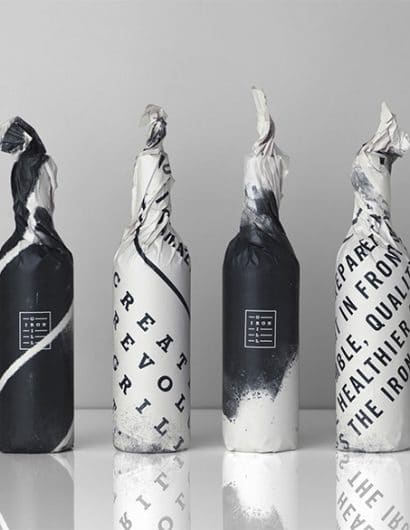
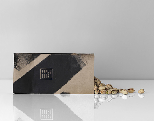
“A spirited new brand identity with a healthy attitude and an appetite for opinion. The grill is king. The logo is quite literally type on a grill and by using a graphic inspired by the grill, the visual identity has an impactful, almost militant quality with thick black scorch marks burned into key pieces. The packaging was designed to be as visible as possible on the super-lean budget. The interiors, signage, uniforms, point of sale and packaging all reflect this natural, clean ethos, using raw materials and earthy finishes, we paid homage to the handmade and bespoke offer that is the Iron Grill way. This idea drove the identity, which in turn drove the direction of the interior, the textures, the materials, the uniforms. All these elements build a engaging and memorable experience.”
lovely-package-grill-iron-3 lovely-package-grill-iron-4 lovely-package-grill-iron-5 lovely-package-grill-iron-2 lovely-package-grill-iron-6

Previous slide
Next slide

Explore more great package design

Get the latest on packaging design in your inbox: