Designed by: PepsiCo Design & Innovation
Country: United States

Mr. Black

1

lovely-package-mr-black-1

Designed by United Creatives | Country: United Kingdom

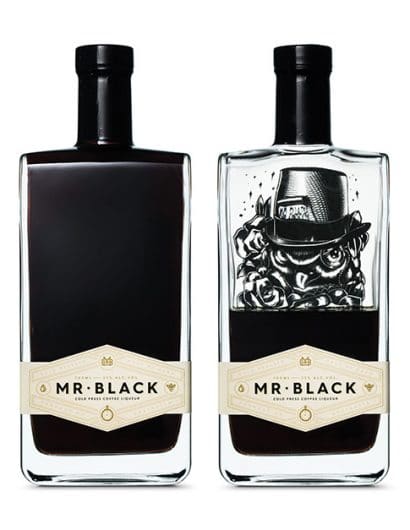
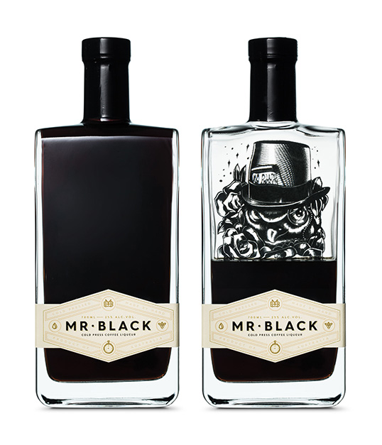
“After two years of rapid growth, The Mr Black Spirits Company has refreshed the packaging and name of their award winning cold press coffee liqueur.

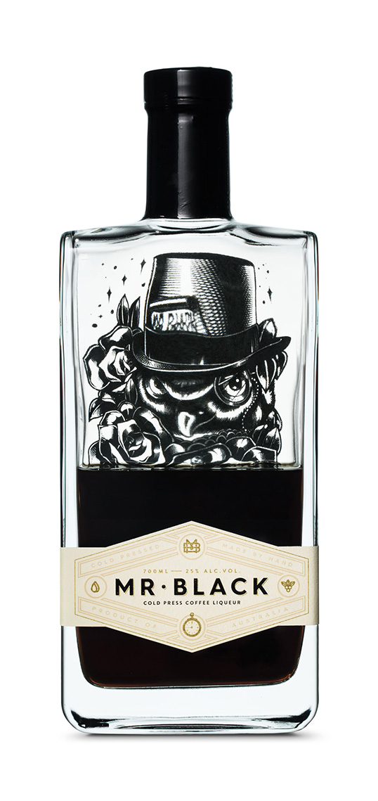
Collaborating with Manchester based graphic design company United Creatives, the team saw the opportunity to use the pack to tell more of the story about the production of Mr Black and the coffee craft that goes on inside the bottle.

“The first pack was just a placeholder – we whipped it up quite quickly – but then we won a few awards for it so it hung around a little longer than it should. Working with Chris and his team has been amazing. They really put the same craft into the outside of the bottle as what goes onto the juice inside. Chris has done some amazing work for clients like Brewdog, Fords Gin and Compass Box, so we knew he was the right man for us” says Tom Baker, director of Mr Black.”
lovely-package-mr-black-2

lovely-package-mr-black-3

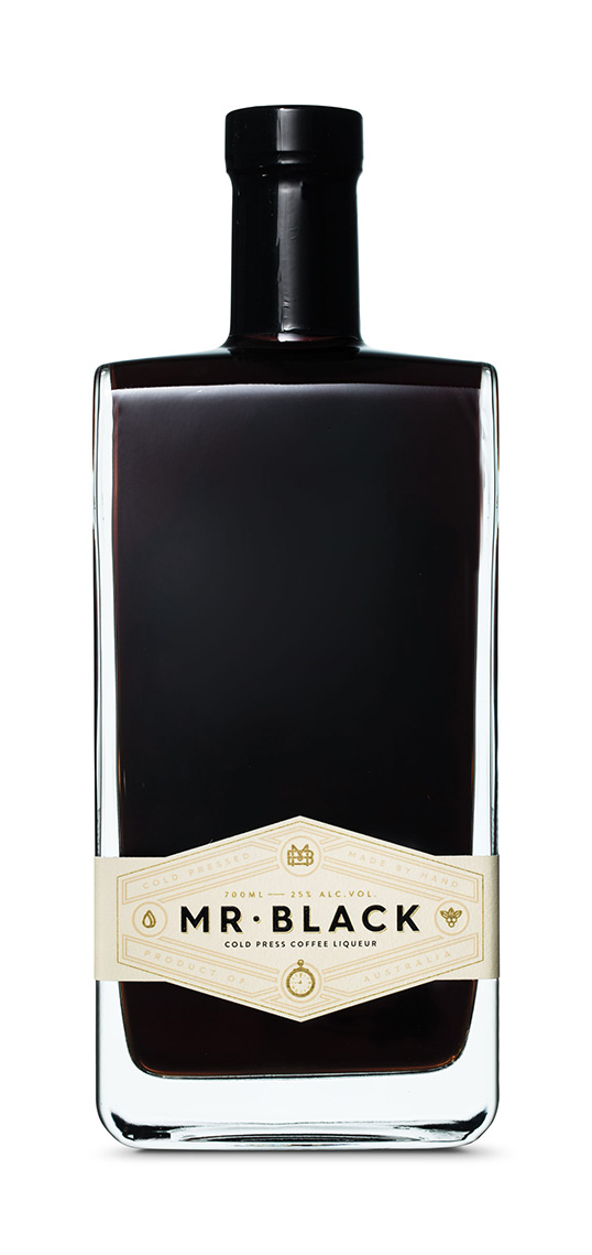
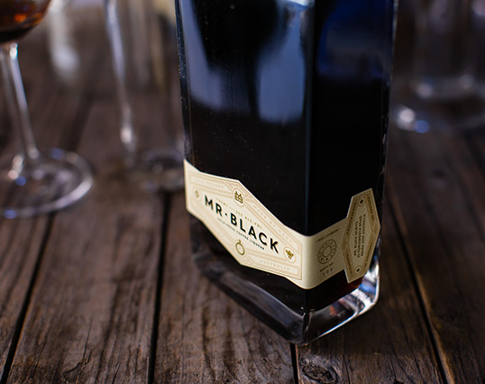
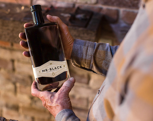
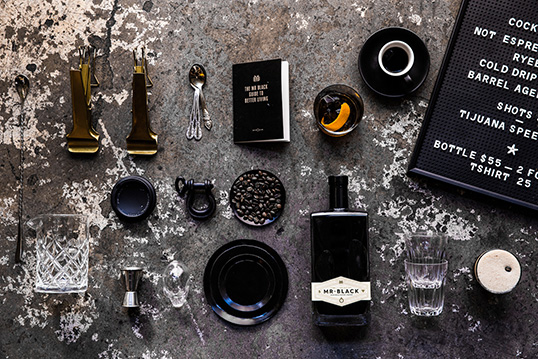
“Creating the new Mr Black was certainly a challenge. We introduced a new label shape derived from a sartorial sash – the sort of thing you wear with a tux. Then we built the world of Mr Black from the inside out: some masculine typography and lots of elements and infographics, included a bespoke monogram. The new pack is still unmistakably Mr Black, yet more considered and striking on-shelf” says Chris Edmunds of United Creatives.

With a new pack came a tweaked name. Replacing cold drip with cold press might seem minor, but it was exceptionally important to the team and something they laboured over for nearly a year.”
lovely-package-mr-black-4

lovely-package-mr-black-5

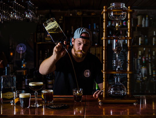
“Cold dripping is not how you reliably make realistic quantities of unoxidised coffee and there’s enough BS on the front of packs in this game. We just wanted to be real about how we make our product. The words cold press come from the 65kg basket press – stolen from a winery – that we use to assist in the extraction of our specialty coffees,” says Baker.

The new pack couldn’t come at a better time: Mr Black has just signed a distribution deal with UK premium drinks agency Lovedrinks (Goslings, Haymans, El Dorado).”
lovely-package-mr-black-7

lovely-package-mr-black-6

1

Get the latest packaging design inspiration in your inbox:

Popular designs

Pure Persian Honey

When we look closely at honey packaging, they are almost all in the usual format, and the ultimate in creativity is that

The Port Vodka Lemon Water

Overview: In response to my client’s vision for a Cape Cod themed beverage brand, I embarked on the journey to create The Port

Burma Love Rebrand

Love at First BiteAs an extension of the Burma Superstar restaurant in San Francisco, Burma Love Foods gives diners an opportunity to

The Bra Guru

Most women are wearing the wrong size bra and that is a fact. The Bra Guru® is the first and only professional

Far Out Bar

Description: Far Out Bar is a cutting-edge packaging design project created for High Life Farms’ macrodose THC chocolate bars. This project involved

Designed by: PepsiCo Design & Innovation
Country: United States

Mr. Black

1
lovely-package-mr-black-1

lovely-package-mr-black-1

Designed by United Creatives | Country: United Kingdom

“After two years of rapid growth, The Mr Black Spirits Company has refreshed the packaging and name of their award winning cold press coffee liqueur.

Collaborating with Manchester based graphic design company United Creatives, the team saw the opportunity to use the pack to tell more of the story about the production of Mr Black and the coffee craft that goes on inside the bottle.

“The first pack was just a placeholder – we whipped it up quite quickly – but then we won a few awards for it so it hung around a little longer than it should. Working with Chris and his team has been amazing. They really put the same craft into the outside of the bottle as what goes onto the juice inside. Chris has done some amazing work for clients like Brewdog, Fords Gin and Compass Box, so we knew he was the right man for us” says Tom Baker, director of Mr Black.”

lovely-package-mr-black-2

lovely-package-mr-black-3

“Creating the new Mr Black was certainly a challenge. We introduced a new label shape derived from a sartorial sash – the sort of thing you wear with a tux. Then we built the world of Mr Black from the inside out: some masculine typography and lots of elements and infographics, included a bespoke monogram. The new pack is still unmistakably Mr Black, yet more considered and striking on-shelf” says Chris Edmunds of United Creatives.

With a new pack came a tweaked name. Replacing cold drip with cold press might seem minor, but it was exceptionally important to the team and something they laboured over for nearly a year.”

lovely-package-mr-black-4

lovely-package-mr-black-5

“Cold dripping is not how you reliably make realistic quantities of unoxidised coffee and there’s enough BS on the front of packs in this game. We just wanted to be real about how we make our product. The words cold press come from the 65kg basket press – stolen from a winery – that we use to assist in the extraction of our specialty coffees,” says Baker.

The new pack couldn’t come at a better time: Mr Black has just signed a distribution deal with UK premium drinks agency Lovedrinks (Goslings, Haymans, El Dorado).”

lovely-package-mr-black-7

lovely-package-mr-black-6

1
Previous slide
Next slide

Explore more great package design

Get the latest on packaging design in your inbox: