Designed by: PepsiCo Design & Innovation
Country: United States

Moreish

lovely-package-moreish-7

Designed by Milk | Country: New Zealand

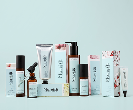
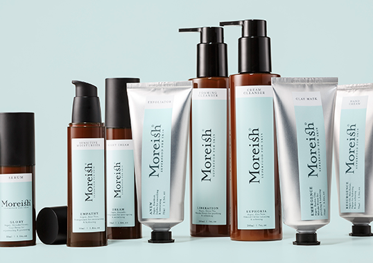
“The luxury segment is experiencing the strongest growth in skincare. Moreish was an existing, but underperforming range in pharmacy. The existing brand was centred purely around argan oil and its Moroccan provenance, but the visual architecture was very pharmaceutical in aesthetic and not embraced by consumers. While the already effective formulas have only been slightly altered, the brand positioning, language and design were completely up for grabs.

The new differentiated Moreish proposition is now more relevant to our target audience, we brought this new positioning alive through a more sophisticated pack language. The new positioning needed to work harder than focusing solely on a key ingredient, as these are subject to fads and potentially negative media. The skin is the body’s largest organ, and whatever goes on the skin is ‘consumed’ by the body, so therefore anything applied to the skin should truly nourish like nutrient-rich food does. Leveraging this simple insight, we repositioned the brand as ‘Superfood for Skin’.”
lovely-package-moreish-5 lovely-package-moreish-4 lovely-package-moreish-1

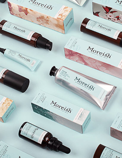
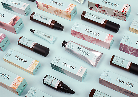
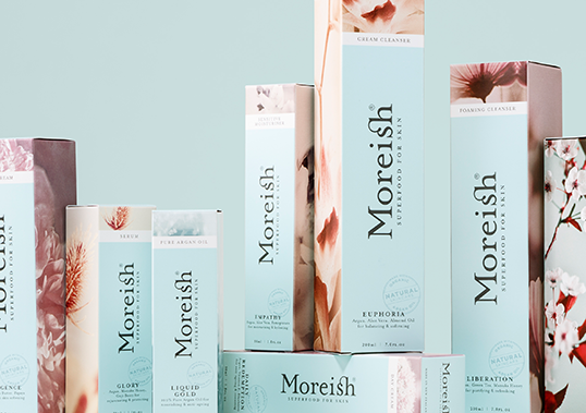
“Our key design directive was to create a high-end, feminine ‘department store’ brand that also has credibility as a truly ‘natural’ product. We proposed a stronger brand with luxury colour cues on the pack face, supported by more feminine and evocative imagery on the sides. We worked closely with the client to select suitable packaging forms and materials that leverage traditional cosmetic packaging cues but are designed to protect the natural products and are easy to use. A new tone of voice was developed, including new emotive variant naming and copy writing that communicates clearly with a touch of wit.”

lovely-package-moreish-3 lovely-package-moreish-2 lovely-package-moreish-6

Get the latest packaging design inspiration in your inbox:

Popular designs

Burma Love Rebrand

Love at First BiteAs an extension of the Burma Superstar restaurant in San Francisco, Burma Love Foods gives diners an opportunity to

The Bra Guru

Most women are wearing the wrong size bra and that is a fact. The Bra Guru® is the first and only professional

Far Out Bar

Description: Far Out Bar is a cutting-edge packaging design project created for High Life Farms’ macrodose THC chocolate bars. This project involved

Designed by: PepsiCo Design & Innovation
Country: United States

Moreish

lovely-package-moreish-7

lovely-package-moreish-7

Designed by Milk | Country: New Zealand

“The luxury segment is experiencing the strongest growth in skincare. Moreish was an existing, but underperforming range in pharmacy. The existing brand was centred purely around argan oil and its Moroccan provenance, but the visual architecture was very pharmaceutical in aesthetic and not embraced by consumers. While the already effective formulas have only been slightly altered, the brand positioning, language and design were completely up for grabs.

The new differentiated Moreish proposition is now more relevant to our target audience, we brought this new positioning alive through a more sophisticated pack language. The new positioning needed to work harder than focusing solely on a key ingredient, as these are subject to fads and potentially negative media. The skin is the body’s largest organ, and whatever goes on the skin is ‘consumed’ by the body, so therefore anything applied to the skin should truly nourish like nutrient-rich food does. Leveraging this simple insight, we repositioned the brand as ‘Superfood for Skin’.”
lovely-package-moreish-5 lovely-package-moreish-4 lovely-package-moreish-1

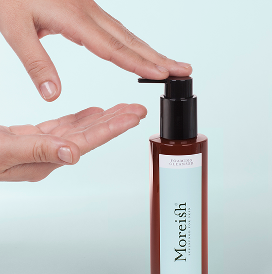
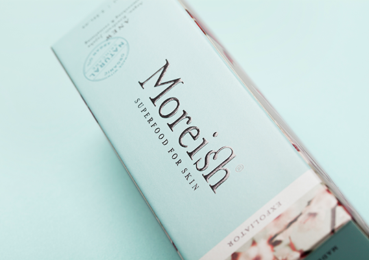
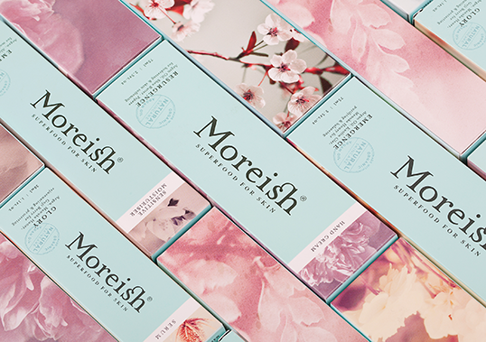
“Our key design directive was to create a high-end, feminine ‘department store’ brand that also has credibility as a truly ‘natural’ product. We proposed a stronger brand with luxury colour cues on the pack face, supported by more feminine and evocative imagery on the sides. We worked closely with the client to select suitable packaging forms and materials that leverage traditional cosmetic packaging cues but are designed to protect the natural products and are easy to use. A new tone of voice was developed, including new emotive variant naming and copy writing that communicates clearly with a touch of wit.”
lovely-package-moreish-3 lovely-package-moreish-2 lovely-package-moreish-6

Previous slide
Next slide

Explore more great package design

Get the latest on packaging design in your inbox: