Designed by: PepsiCo Design & Innovation
Country: United States

Sourcy

lovely-package-sourcy-1

Designed by VBAT | Country: Netherlands

“Brief: due to its strong position in the restaurant segment, Sourcy is one of the most well known mineral water brands in the Netherlands. In recent years the brand’s packaging strategy has been to develop separate bottle designs for high quality and mainstream restaurants. Aside from high production and logistical costs, this has not helped maintain a clear brand image for Sourcy. As such the design agency was briefed to develop a new iconic glass bottle – a clear reflection of the brand’s core values befitting of every dinner occasion, whether a high quality restaurant or mainstream outlet.

Technical and market requirements:
– The bottle design must be suitable for carbonated mineral water and fitting within Sourcy’s current standard bottling lines.

– 0,75L  glass bottle
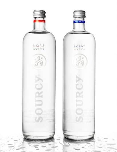
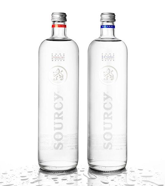
– Respect market colour codes – blue for non-carbonated and red for carbonated water.
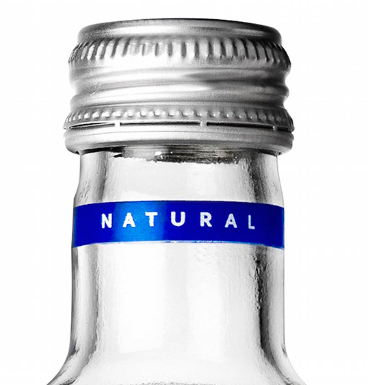
– Visible colour coding at the top of bottle to avoid restaurant personnel serving the wrong water.

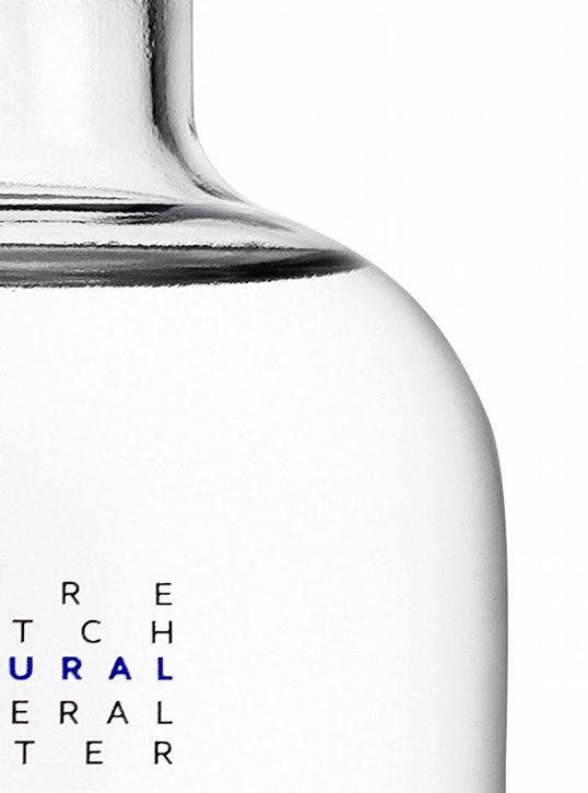
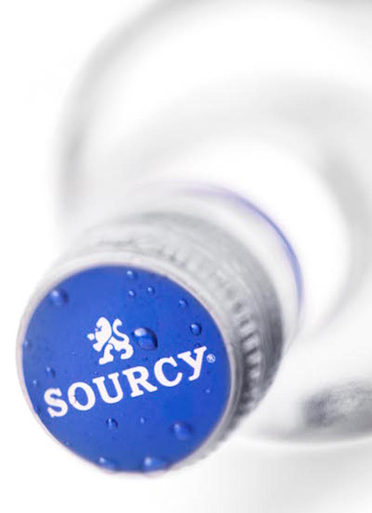
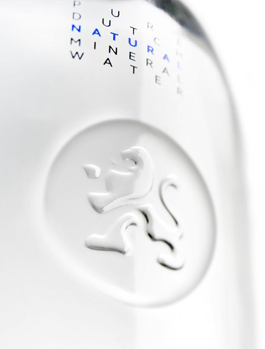
Creative solution: as a strong established brand coming from one source the creative solution was to develop one iconic bottle. A bottle that supports the quality of Sourcy mineral water and respects the quality of it’s customers. The new stylish outer shape is enriched with a deep embossed lens that serves as a podium for the brand’s lion emblem and symbolises the purity of the mineral water. The lion emblem, together with the higher shoulders of this new bottle, reflect the proud character of the brand. “Sourcy Pure Dutch” goes back to the essence, iconic without fuss, elegant yet understated.

Pure Dutch design.”
lovely-package-sourcy-2 lovely-package-sourcy-4 lovely-package-sourcy-3 lovely-package-sourcy-5

Get the latest packaging design inspiration in your inbox:

Popular designs

Far Out Bar

Description: Far Out Bar is a cutting-edge packaging design project created for High Life Farms’ macrodose THC chocolate bars. This project involved

Burma Love Rebrand

Love at First BiteAs an extension of the Burma Superstar restaurant in San Francisco, Burma Love Foods gives diners an opportunity to

Designed by: PepsiCo Design & Innovation
Country: United States

Sourcy

lovely-package-sourcy-1

lovely-package-sourcy-1

Designed by VBAT | Country: Netherlands

“Brief: due to its strong position in the restaurant segment, Sourcy is one of the most well known mineral water brands in the Netherlands. In recent years the brand’s packaging strategy has been to develop separate bottle designs for high quality and mainstream restaurants. Aside from high production and logistical costs, this has not helped maintain a clear brand image for Sourcy. As such the design agency was briefed to develop a new iconic glass bottle – a clear reflection of the brand’s core values befitting of every dinner occasion, whether a high quality restaurant or mainstream outlet.

Technical and market requirements:
– The bottle design must be suitable for carbonated mineral water and fitting within Sourcy’s current standard bottling lines.

– 0,75L  glass bottle
– Respect market colour codes – blue for non-carbonated and red for carbonated water.
– Visible colour coding at the top of bottle to avoid restaurant personnel serving the wrong water.

Creative solution: as a strong established brand coming from one source the creative solution was to develop one iconic bottle. A bottle that supports the quality of Sourcy mineral water and respects the quality of it’s customers. The new stylish outer shape is enriched with a deep embossed lens that serves as a podium for the brand’s lion emblem and symbolises the purity of the mineral water. The lion emblem, together with the higher shoulders of this new bottle, reflect the proud character of the brand. “Sourcy Pure Dutch” goes back to the essence, iconic without fuss, elegant yet understated.

Pure Dutch design.”
lovely-package-sourcy-2 lovely-package-sourcy-4 lovely-package-sourcy-3 lovely-package-sourcy-5

Previous slide
Next slide

Explore more great package design

Get the latest on packaging design in your inbox: