Designed by Scandinavian Design Group | Country: Sweden
“Challenge: since 2003 Blossa has launched an annual limited edition of glögg (mulled wine) with a new flavour and design. The launch is considered one of the prime happenings for Swedish glögg lovers. For many years, Blossa held an unthreatened position in new and innovative mulled wine flavours. Today, this is not the case. Competitors have started to catch up and launch their own versions of unexpected flavours as a means of competition. So what could we do to vitalize the brand further and manifest the position as a market leader?
Solution: when starting working with Blossa for the 2011 edition we created a design concept that could evolve and develop with each new annual release, moving the brand into a larger context beyond the packaging design and the perception of a traditional Christmas drink. The concept is based on new and interesting places where Blossa travels to find inspiration and exciting flavours. Coordinates on the bottle guide us to the exact destination that has inspired this year’s flavours.The taste of Blossa 11 is coffee, Arabica. A challenge every year is to find those right ingredients and flavours that goes perfectly with the traditional glögg spices. To find the ultimate coffee beans this year, Blossa went to El Salvador. The coordinates guide us to the plantation Finca las Delicias where the coffee is grown. The bottle is made in a brown matt, opaque finish with the year 11 distinctly printed and integrated in the coordinates.”
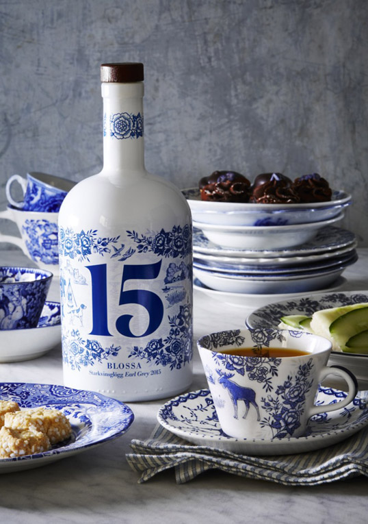
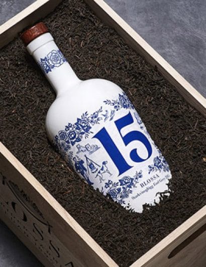
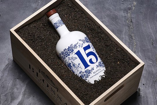
“In 2015, Blossa travels to the British Islands to find the taste of the classic Earl Grey tea. The coordinates take us to the heart of London and The London Tea Company, situated not far from Buckingham Palace. Inspired by the afternoon tea tradition, the design of Blossa 15 re-invents illustration techniques from traditional china. Illustration by Mikael Ericsson.”
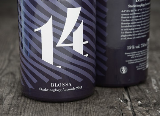
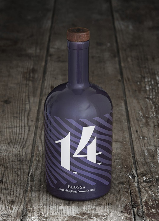
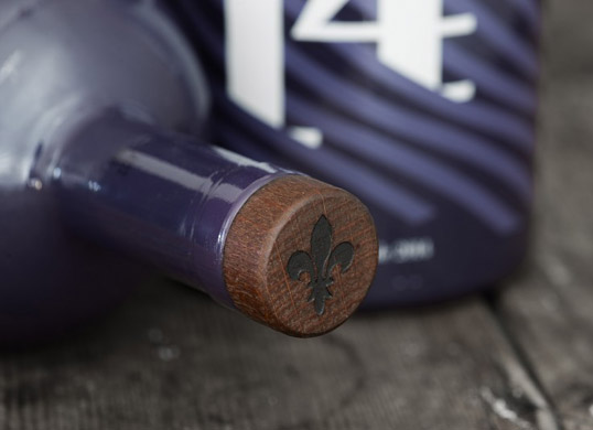
“In 2014, Blossa went to Provence in southern France to find inspiration among sun dried flowers and catch the taste of billowing lavender fields. The coordinates for this year’s bottle take us to the picturesque village of Digne les Bains – the capital of the lavender trade. The flowers and fields in this area inspired the stylized violet pattern on the bottle as well as the traditional, Provençal emblem on the cork.”
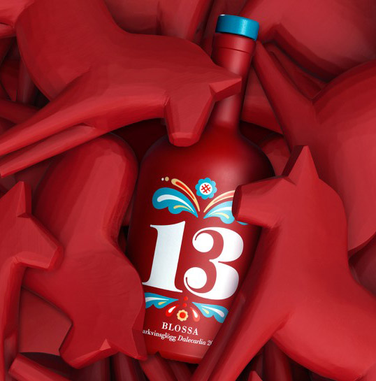
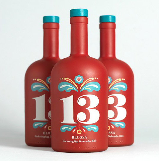
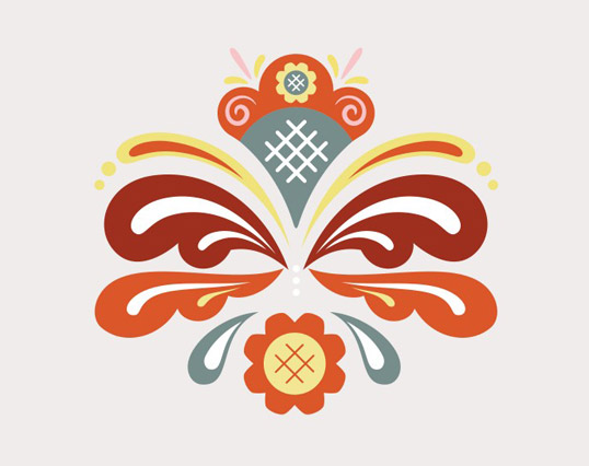
“In 2013 Blossa decided to travel not too far away, but to a place just as interesting and inspiring. Blossa went to Dalarna in Sweden, where the coordinates guide us to Mora. The design inspiration for the Dalecarlia (Dalarna in latin) glögg was found in the famous kurbits paintings. Both the red colour of the bottle and the blue colour of the cork are colours that origin from the area, the Faluröd (Falu-red) and the Dalablå (Dala-blue).”
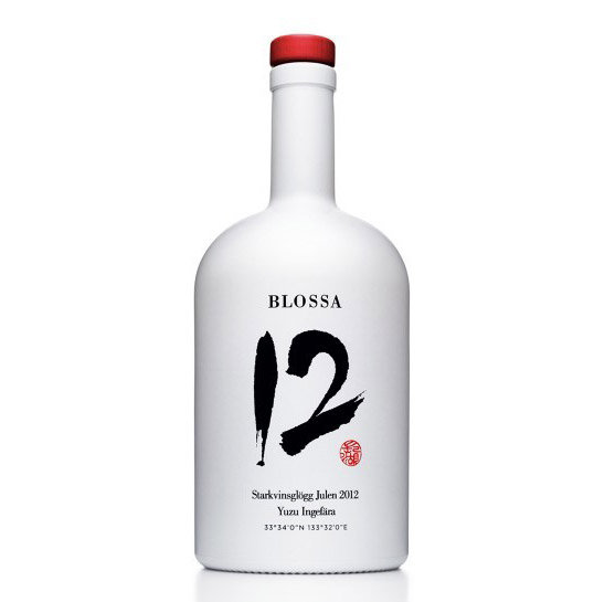
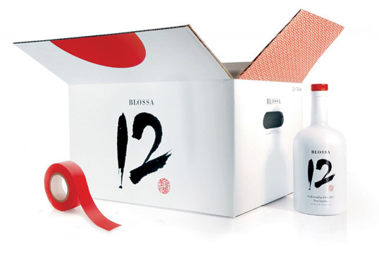
“In 2012 the Blossa tour went to Japan. The bottle is made in a white pearlescent finish, crowned with a red cap. A Japanese master of calligraphy was hired to illustrate the number 12 in a Japanese style. The coordinates of 2012 guide us to the city of Kochi on the island of Shikoku where the yuzu fruit grows (The Blossa 12 flavours are yuzu and ginger). In addition, the boxes illustrate, when closed, the Japanese flag.”
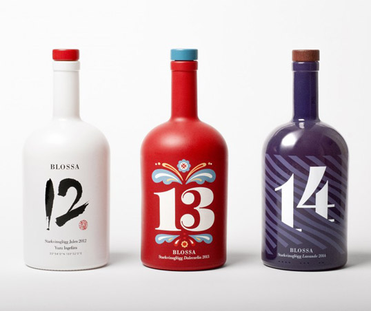
“Result: in September each year, when the annual edition is launched, the impact on social media is immense. The inspiring journeys, the unique designs and exciting flavours reach out to the design oriented food, beverage press and blogs in Sweden.”


