Designed by: PepsiCo Design & Innovation
Country: United States

Caralarga

lovely-package-caralarga-3

Designed by Sociedad Anónima | Country: Mexico

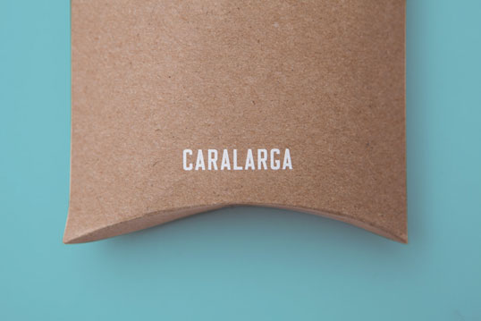
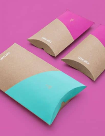
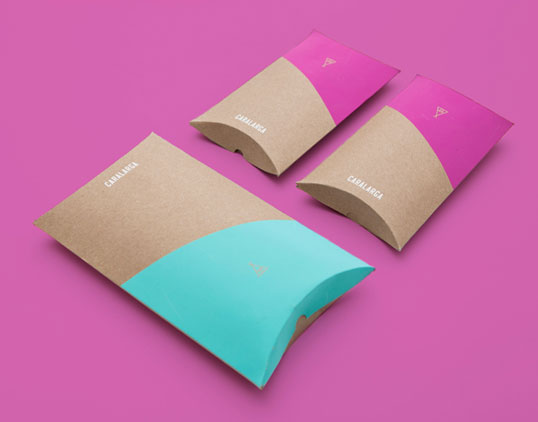
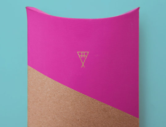
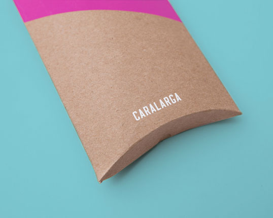
“Caralarga is a Mexican jewelry design firm. This project included the creation of visual identity and the design of the packaging. The brand concept was inspired and based by the work of Native Americans, trying to communicate this idea through the icon in the logo, which is a tepee that represents the two capital letters of the designer and founder of the brand: Ana Holschinder. We chose to work with a bright and vibrant color palette, combined with a modern sans serif font, which would reflect the energy of the brand. The result is a simple, yet unique, clean and bold packaging printed in full color and matte coated, using a geometric shape printed over half the surface of the box  to give a particular and friendly look.”
lovely-package-caralarga-4 lovely-package-caralarga-1 lovely-package-caralarga-2

Get the latest packaging design inspiration in your inbox:

Popular designs

Dama Blanca: Packaging Design for Salt of Cádiz

Discover the artisanal salt packaging design for Dama Blanca, a family project from Salinas of Cádiz. The design reflects the brand’s 3000-year history, authenticity and love for the sea, using natural materials and a sea-inspired palette.

Introducing Nasbah: Egyptian Product Packaging Design

Uncover how the Egyptian product “Nasbah” is taking a contemporary approach to package design, making a mark in the local market. Learn how the design strategy influences consumer perception and enhances product appeal.

Designed by: PepsiCo Design & Innovation
Country: United States

Caralarga

lovely-package-caralarga-3

lovely-package-caralarga-3

Designed by Sociedad Anónima | Country: Mexico

“Caralarga is a Mexican jewelry design firm. This project included the creation of visual identity and the design of the packaging. The brand concept was inspired and based by the work of Native Americans, trying to communicate this idea through the icon in the logo, which is a tepee that represents the two capital letters of the designer and founder of the brand: Ana Holschinder. We chose to work with a bright and vibrant color palette, combined with a modern sans serif font, which would reflect the energy of the brand. The result is a simple, yet unique, clean and bold packaging printed in full color and matte coated, using a geometric shape printed over half the surface of the box  to give a particular and friendly look.”
lovely-package-caralarga-4 lovely-package-caralarga-1 lovely-package-caralarga-2

Previous slide
Next slide
Get the latest on packaging design in your inbox: