Designed by: PepsiCo Design & Innovation
Country: United States

Bronuts

lovely-package-bronuts-1

Designed by One Plus One Design | Country: Canada

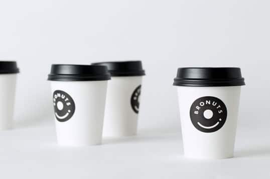
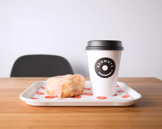
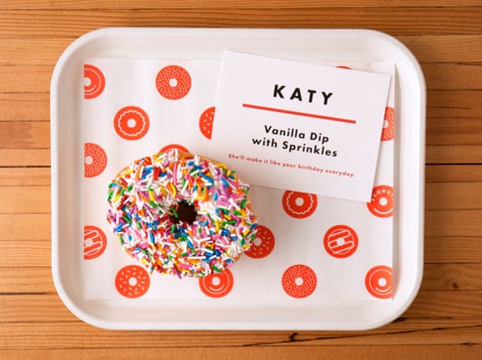
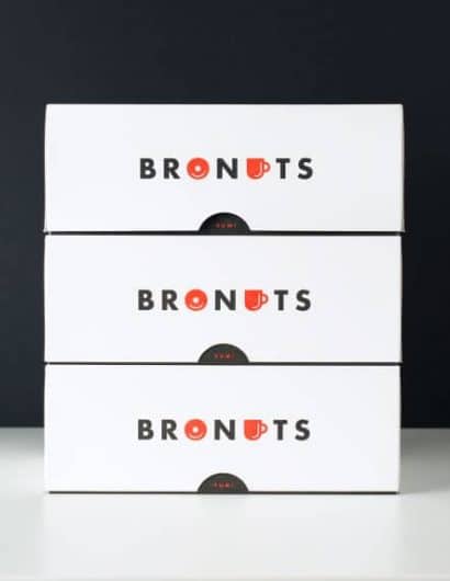
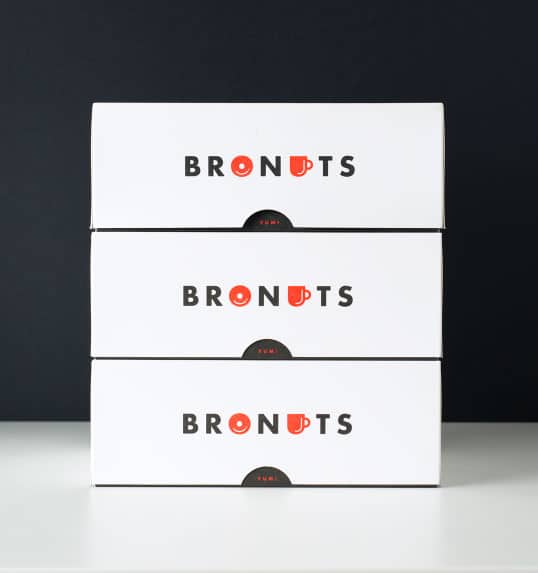
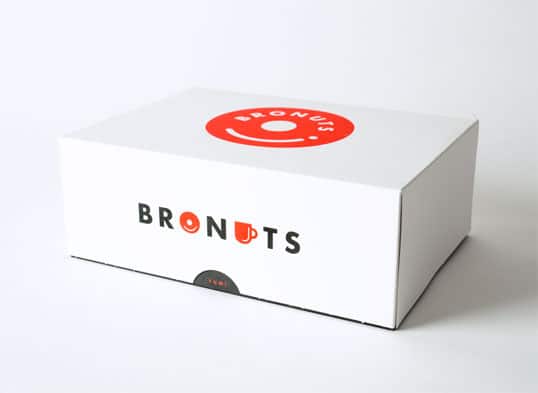
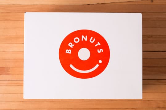
“Concept: a location in the Exchange District in Winnipeg, Canada, means a wide cross section of clientele. This includes young professionals, corporate offices, and college students, all from a multitude of different industries. With a bold name, the brand needed to give off a vibe landing in between hipness and approachability, attracting customers from all walks of life.

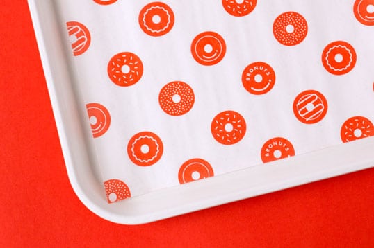
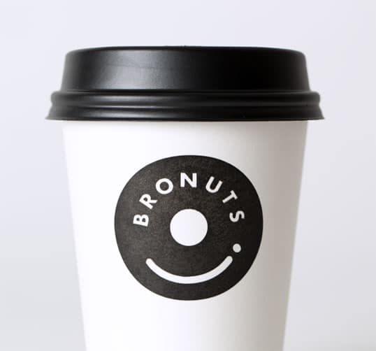
Solution: a simple product offering called for a simple solution. Better yet, a clever solution. Taking a step back from our initial concepts we quickly realized the opportunity the name held, which was not immediately obvious — coffee + donuts are located right in the middle of the company name. Running with this discovery, we engineered a crisp brand identity with a tongue in cheek personality, carefully considering each brand extension. Exterior and interior signage, menu design, individual and group donut packaging were all consistently designed for engaging customer experience.”
lovely-package-bronuts-6 lovely-package-bronuts-5 lovely-package-bronuts-2 lovely-package-bronuts-3 lovely-package-bronuts-8 lovely-package-bronuts-7 lovely-package-bronuts-9

Get the latest packaging design inspiration in your inbox:

Popular designs

The Port Vodka Lemon Water

Overview: In response to my client’s vision for a Cape Cod themed beverage brand, I embarked on the journey to create The Port

Designed by: PepsiCo Design & Innovation
Country: United States

Bronuts

lovely-package-bronuts-1

lovely-package-bronuts-1

Designed by One Plus One Design | Country: Canada

“Concept: a location in the Exchange District in Winnipeg, Canada, means a wide cross section of clientele. This includes young professionals, corporate offices, and college students, all from a multitude of different industries. With a bold name, the brand needed to give off a vibe landing in between hipness and approachability, attracting customers from all walks of life.

Solution: a simple product offering called for a simple solution. Better yet, a clever solution. Taking a step back from our initial concepts we quickly realized the opportunity the name held, which was not immediately obvious — coffee + donuts are located right in the middle of the company name. Running with this discovery, we engineered a crisp brand identity with a tongue in cheek personality, carefully considering each brand extension. Exterior and interior signage, menu design, individual and group donut packaging were all consistently designed for engaging customer experience.”
lovely-package-bronuts-6 lovely-package-bronuts-5 lovely-package-bronuts-2 lovely-package-bronuts-3 lovely-package-bronuts-8 lovely-package-bronuts-7 lovely-package-bronuts-9

Previous slide
Next slide

Explore more great package design

Get the latest on packaging design in your inbox: