Designed by: PepsiCo Design & Innovation
Country: United States

Aromatologic Spa Cosmetics

lovely-package-aromatologic-spa-cosmetics-1

Designed by mousegraphics | Country: Greece

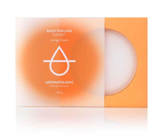
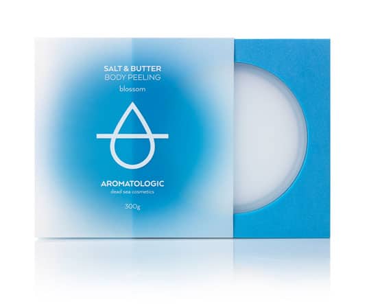
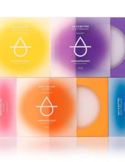
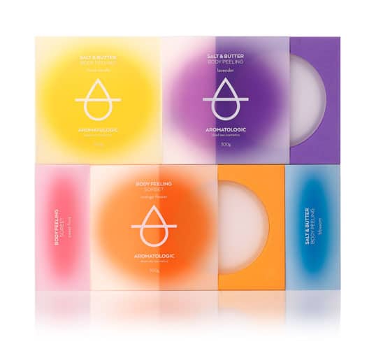
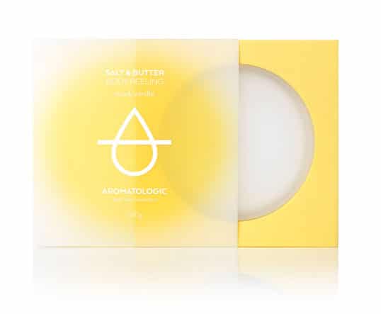
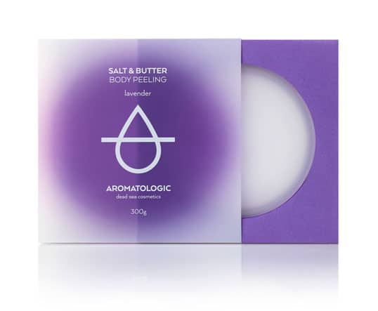
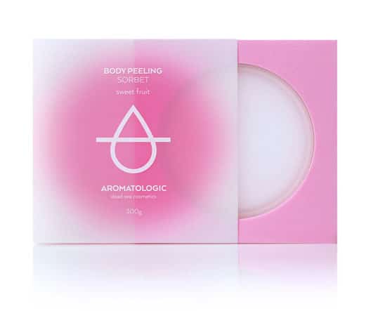
“We worked with our client to build the Aromatologic brand image and story and started packaging applications with the oil perfume series. In the spa line we worked further on the ‘logic’ component in the brand’s name. We designed the glass container, its padded case and plastic cover and devised their graphic design as a game of alternating materials and basic geometric shapes, volumes and colors. The brand logo, invented as the metamorphosis of an essence drop to letter A, is placed in the center of the packaging surface. Vibrant but hazy colors, corresponding to the hue and feel of the spa product in each case, radiate in soft, beneficial waves.”
lovely-package-aromatologic-spa-cosmetics-5 lovely-package-aromatologic-spa-cosmetics-3 lovely-package-aromatologic-spa-cosmetics-4 lovely-package-aromatologic-spa-cosmetics-6 lovely-package-aromatologic-spa-cosmetics-2

Get the latest packaging design inspiration in your inbox:

Popular designs

Over the wave

This Kombucha originates in Lombok, Indonesia, where its paradise beaches attract hundreds of surfers eager to ride the waves. When you surf,

Far Out Bar

Description: Far Out Bar is a cutting-edge packaging design project created for High Life Farms’ macrodose THC chocolate bars. This project involved

The Port Vodka Lemon Water

Overview: In response to my client’s vision for a Cape Cod themed beverage brand, I embarked on the journey to create The Port

The Bra Guru

Most women are wearing the wrong size bra and that is a fact. The Bra Guru® is the first and only professional

Designed by: PepsiCo Design & Innovation
Country: United States

Aromatologic Spa Cosmetics

lovely-package-aromatologic-spa-cosmetics-1

lovely-package-aromatologic-spa-cosmetics-1

Designed by mousegraphics | Country: Greece

“We worked with our client to build the Aromatologic brand image and story and started packaging applications with the oil perfume series. In the spa line we worked further on the ‘logic’ component in the brand’s name. We designed the glass container, its padded case and plastic cover and devised their graphic design as a game of alternating materials and basic geometric shapes, volumes and colors. The brand logo, invented as the metamorphosis of an essence drop to letter A, is placed in the center of the packaging surface. Vibrant but hazy colors, corresponding to the hue and feel of the spa product in each case, radiate in soft, beneficial waves.”
lovely-package-aromatologic-spa-cosmetics-5 lovely-package-aromatologic-spa-cosmetics-3 lovely-package-aromatologic-spa-cosmetics-4 lovely-package-aromatologic-spa-cosmetics-6 lovely-package-aromatologic-spa-cosmetics-2

Previous slide
Next slide

Explore more great package design

Get the latest on packaging design in your inbox: