Designed by: PepsiCo Design & Innovation
Country: United States

Budweiser

lovely-package-budweiser-3

Designed by jkr | Country: United States

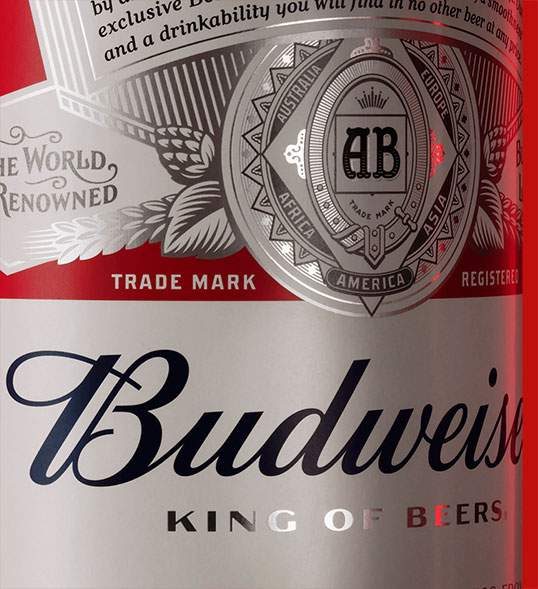
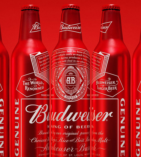
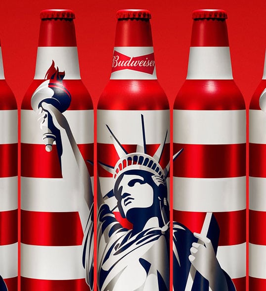
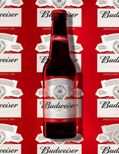
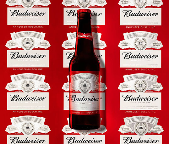
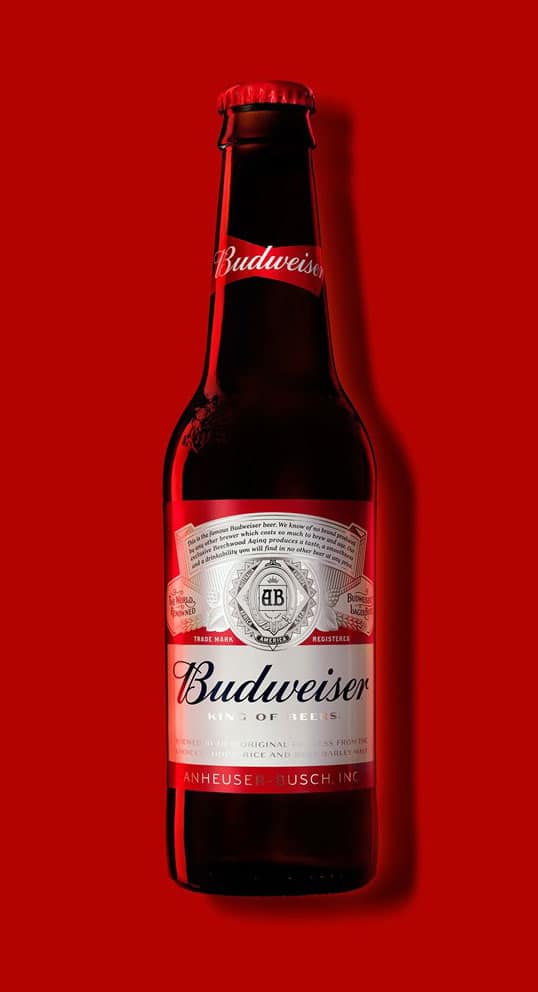
“People gravitate towards brands that have a unique story to tell, and few have as rich a history as Budweiser. Since 1876, the brand has represented uncompromising quality and relentless ambition, reflected through the craft and care that goes into brewing every beer. Our task was to capture this spirit through design.

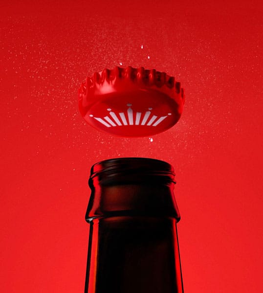
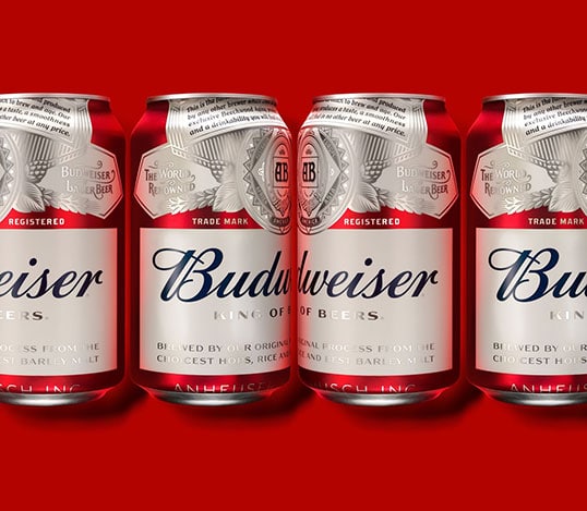
Recognising that it was time to align the brand identity with the beer itself, Budweiser partnered with our NYC team to refresh their packaging and visual identity. Starting with an exploration of the brand’s history, we uncovered the depth of Budweiser’s rich iconography. We then sweated the details, working alongside the world’s best to craft each element by hand.

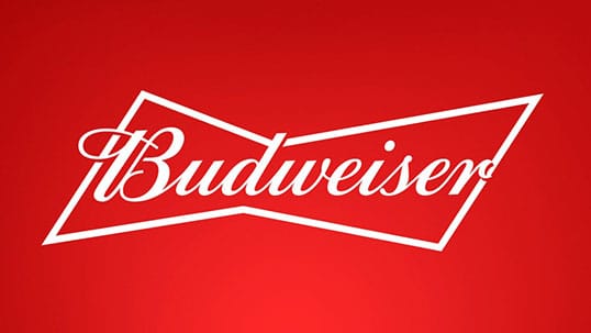
From there, we created two bespoke typefaces to communicate the brand’s principles and a simplified bow tie icon to deliver a more contemporary identity for today’s audience.”
lovely-package-budweiser-4 lovely-package-budweiser-1 lovely-package-budweiser-2 lovely-package-budweiser-5 lovely-package-budweiser-7 lovely-package-budweiser-6 lovely-package-budweiser-8

Get the latest packaging design inspiration in your inbox:

Popular designs

Burma Love Rebrand

Love at First BiteAs an extension of the Burma Superstar restaurant in San Francisco, Burma Love Foods gives diners an opportunity to

The Port Vodka Lemon Water

Overview: In response to my client’s vision for a Cape Cod themed beverage brand, I embarked on the journey to create The Port

Far Out Bar

Description: Far Out Bar is a cutting-edge packaging design project created for High Life Farms’ macrodose THC chocolate bars. This project involved

Pure Persian Honey

When we look closely at honey packaging, they are almost all in the usual format, and the ultimate in creativity is that

Designed by: PepsiCo Design & Innovation
Country: United States

Budweiser

lovely-package-budweiser-3

lovely-package-budweiser-3

Designed by jkr | Country: United States

“People gravitate towards brands that have a unique story to tell, and few have as rich a history as Budweiser. Since 1876, the brand has represented uncompromising quality and relentless ambition, reflected through the craft and care that goes into brewing every beer. Our task was to capture this spirit through design.

Recognising that it was time to align the brand identity with the beer itself, Budweiser partnered with our NYC team to refresh their packaging and visual identity. Starting with an exploration of the brand’s history, we uncovered the depth of Budweiser’s rich iconography. We then sweated the details, working alongside the world’s best to craft each element by hand.

From there, we created two bespoke typefaces to communicate the brand’s principles and a simplified bow tie icon to deliver a more contemporary identity for today’s audience.”
lovely-package-budweiser-4 lovely-package-budweiser-1 lovely-package-budweiser-2 lovely-package-budweiser-5 lovely-package-budweiser-7 lovely-package-budweiser-6 lovely-package-budweiser-8

Previous slide
Next slide

Explore more great package design

Get the latest on packaging design in your inbox: