Designed by: PepsiCo Design & Innovation
Country: United States

Seaworthy Vodka

lovely-package-seaworthy-7

Designed by Squad Ink | Country: Australia

“We constantly find ourselves dreaming up product ideas that bridge the gap between design and product development. Seaworthy Vodka is one of those ideas that we’re proud has made it off the pages in our scrapbook and into production!

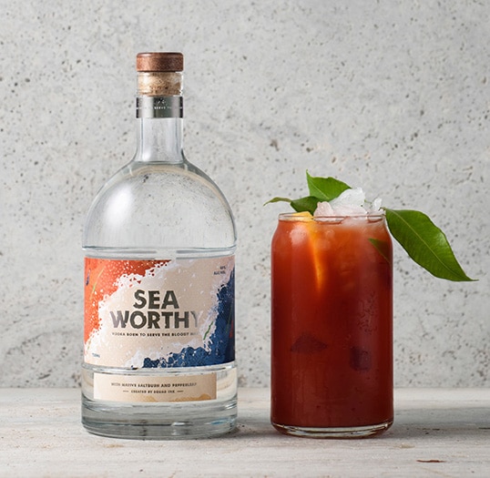
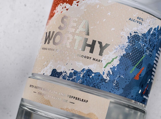
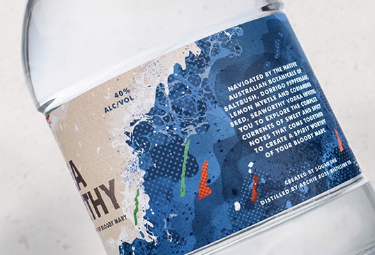
Inspired by the Australian seaside and the glorious Bloody Mary cocktail –Seaworthy’s unique taste profile is navigated by the native Australian botanicals of Saltbush (recalling sea-like flavours), Dorrigo Pepperleaf, Lemon Myrtle and Coriander seed.

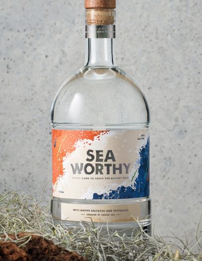
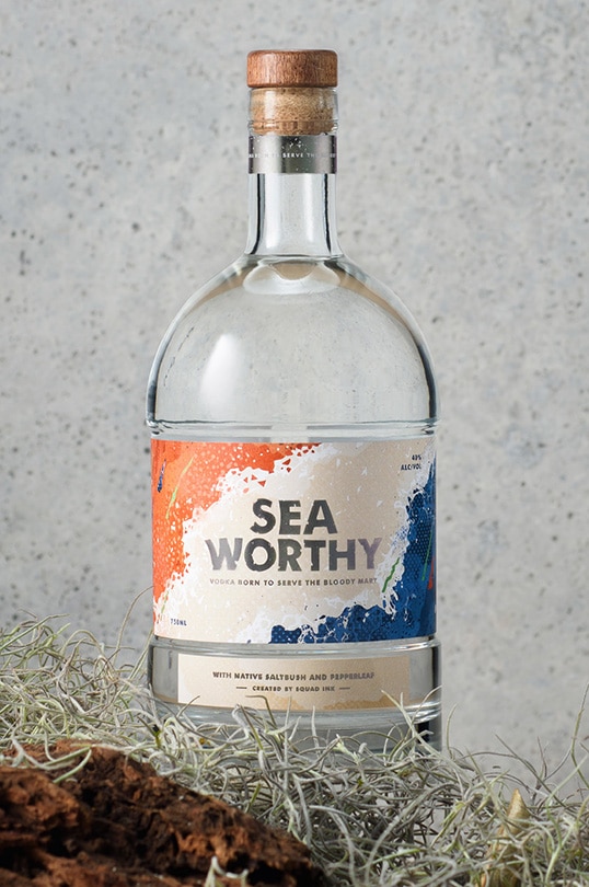
Seaworthy explores the relationship between land and sea: Two powerful forces coming together to represent the creation of something intriguing and exciting through the complex profile of earthy spice and salty, sweet sea flavour notes. We captured the energy and drama of land and sea colliding through a striking illustration applied to a full circumference bottle label that draws in consumers from all angles.”
lovely-package-seaworthy-6 lovely-package-seaworthy-1

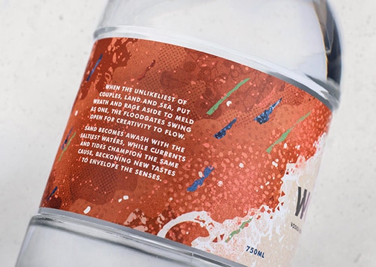
“To further develop the narrative, and for added drama, we crafted the below verses which feature on the label and the box;

When the unlikeliest of couples, land and sea,
put wrath and rage aside to meld as one,
the floodgates swing open for creativity to flow.
Sand becomes awash with the saltiest waters,
while currents and tides champion the same cause,
beckoning new tastes 
to envelope the senses.

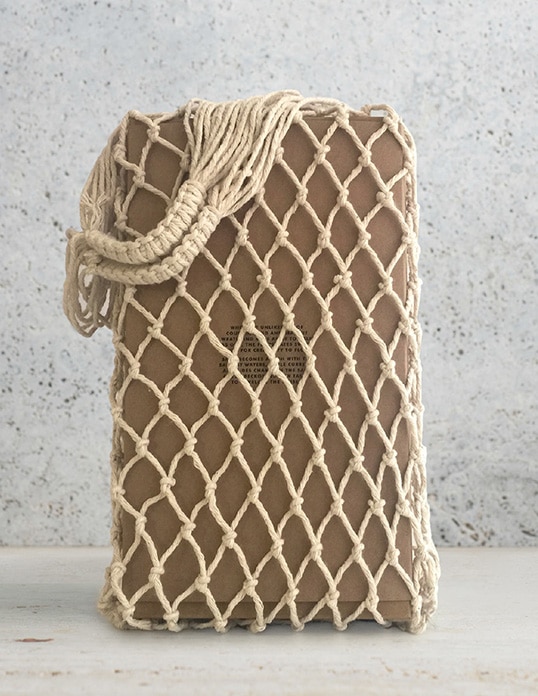
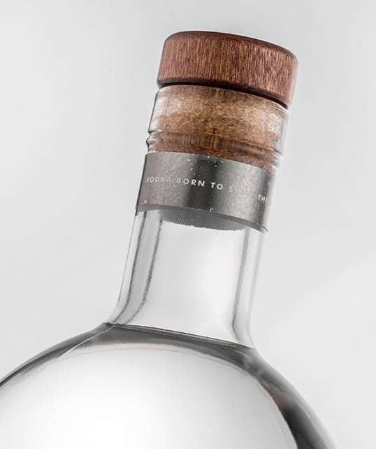
To mimic the scars of erosion from sea spray, we used a gunmetal silver foil throughout the labels, which we weathered and distressed. The bottle is housed in an understated craft box which sits inside a cotton net bag – channeling a sense of mystery akin to that of a long lost package that has been swept ashore.

A big thanks to Will Edwards and the team at Archie Rose Distilling Co. for turning our unorthodox idea for a spirit into an exceptional product that we’re very proud to put our name to.”
lovely-package-seaworthy-3 lovely-package-seaworthy-4 lovely-package-seaworthy-2 lovely-package-seaworthy-5

Get the latest packaging design inspiration in your inbox:

Popular designs

Pure Persian Honey

When we look closely at honey packaging, they are almost all in the usual format, and the ultimate in creativity is that

Over the wave

This Kombucha originates in Lombok, Indonesia, where its paradise beaches attract hundreds of surfers eager to ride the waves. When you surf,

Designed by: PepsiCo Design & Innovation
Country: United States

Seaworthy Vodka

lovely-package-seaworthy-7

lovely-package-seaworthy-7

Designed by Squad Ink | Country: Australia

“We constantly find ourselves dreaming up product ideas that bridge the gap between design and product development. Seaworthy Vodka is one of those ideas that we’re proud has made it off the pages in our scrapbook and into production!

Inspired by the Australian seaside and the glorious Bloody Mary cocktail –Seaworthy’s unique taste profile is navigated by the native Australian botanicals of Saltbush (recalling sea-like flavours), Dorrigo Pepperleaf, Lemon Myrtle and Coriander seed.

Seaworthy explores the relationship between land and sea: Two powerful forces coming together to represent the creation of something intriguing and exciting through the complex profile of earthy spice and salty, sweet sea flavour notes. We captured the energy and drama of land and sea colliding through a striking illustration applied to a full circumference bottle label that draws in consumers from all angles.”

lovely-package-seaworthy-6 lovely-package-seaworthy-1

“To further develop the narrative, and for added drama, we crafted the below verses which feature on the label and the box;

When the unlikeliest of couples, land and sea,
put wrath and rage aside to meld as one,
the floodgates swing open for creativity to flow.
Sand becomes awash with the saltiest waters,
while currents and tides champion the same cause,
beckoning new tastes 
to envelope the senses.

To mimic the scars of erosion from sea spray, we used a gunmetal silver foil throughout the labels, which we weathered and distressed. The bottle is housed in an understated craft box which sits inside a cotton net bag – channeling a sense of mystery akin to that of a long lost package that has been swept ashore.

A big thanks to Will Edwards and the team at Archie Rose Distilling Co. for turning our unorthodox idea for a spirit into an exceptional product that we’re very proud to put our name to.”
lovely-package-seaworthy-3 lovely-package-seaworthy-4 lovely-package-seaworthy-2 lovely-package-seaworthy-5

Previous slide
Next slide

Explore more great package design

Get the latest on packaging design in your inbox: