Designed by: PepsiCo Design & Innovation
Country: United States

Double Good Popcorn Goes Good On Packaging

Packaging designs play a crucial role in fostering brand awareness. Sometimes packaging can be the only factor for a customer to choose your brand over the others at a store. Double Good quickly realized this fact and went for a complete brand overhaul.

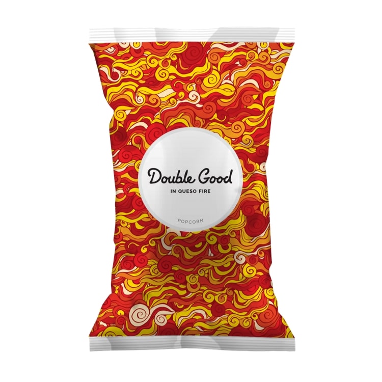
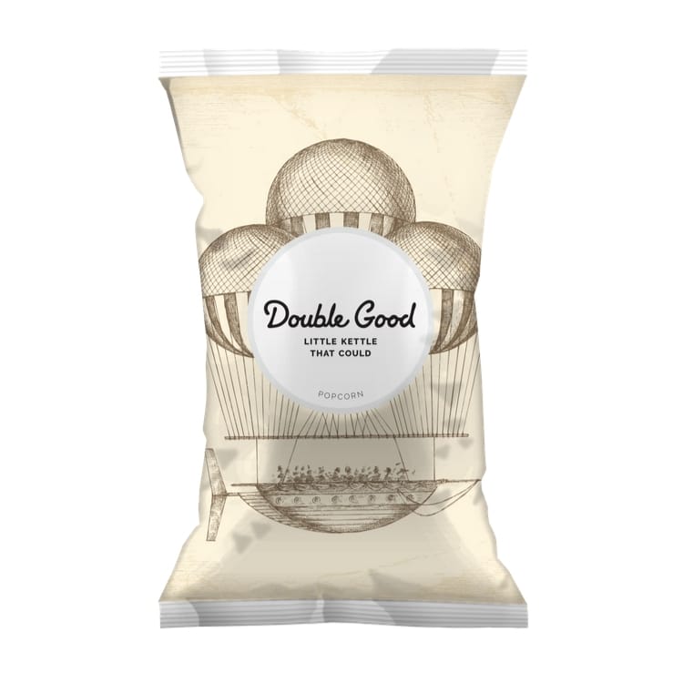
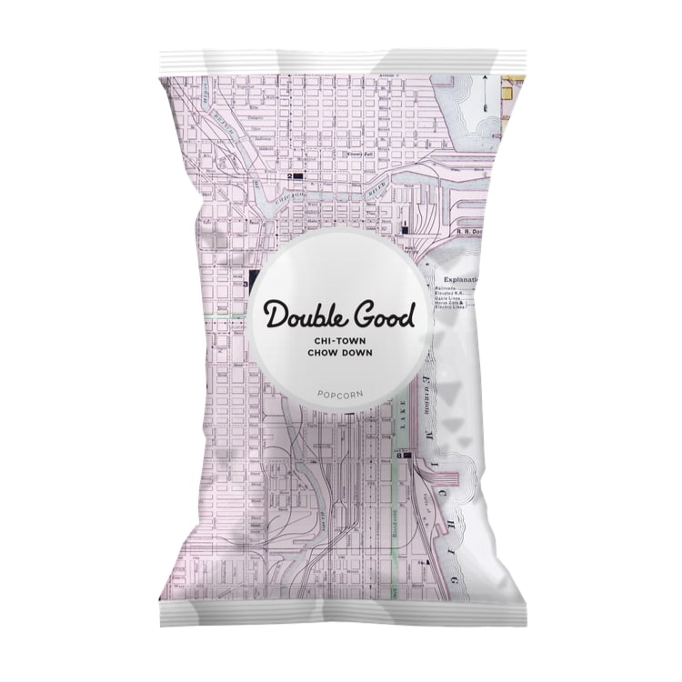
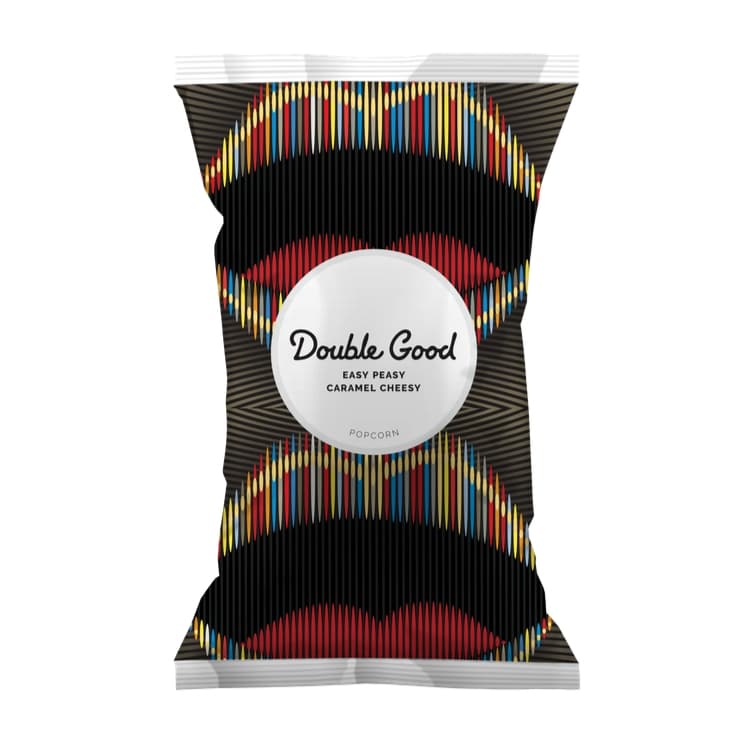
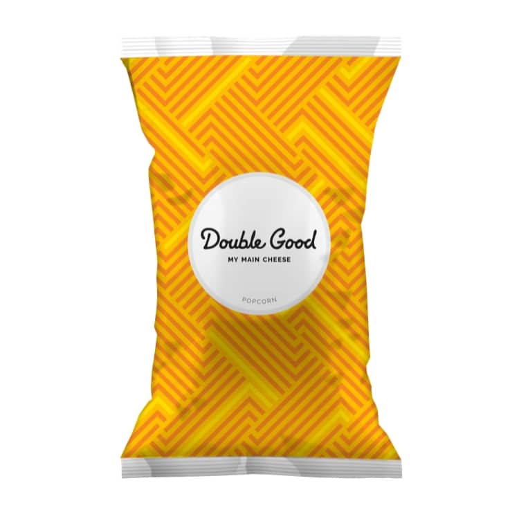
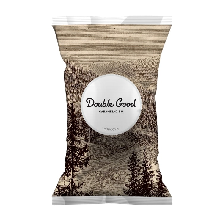
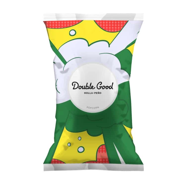
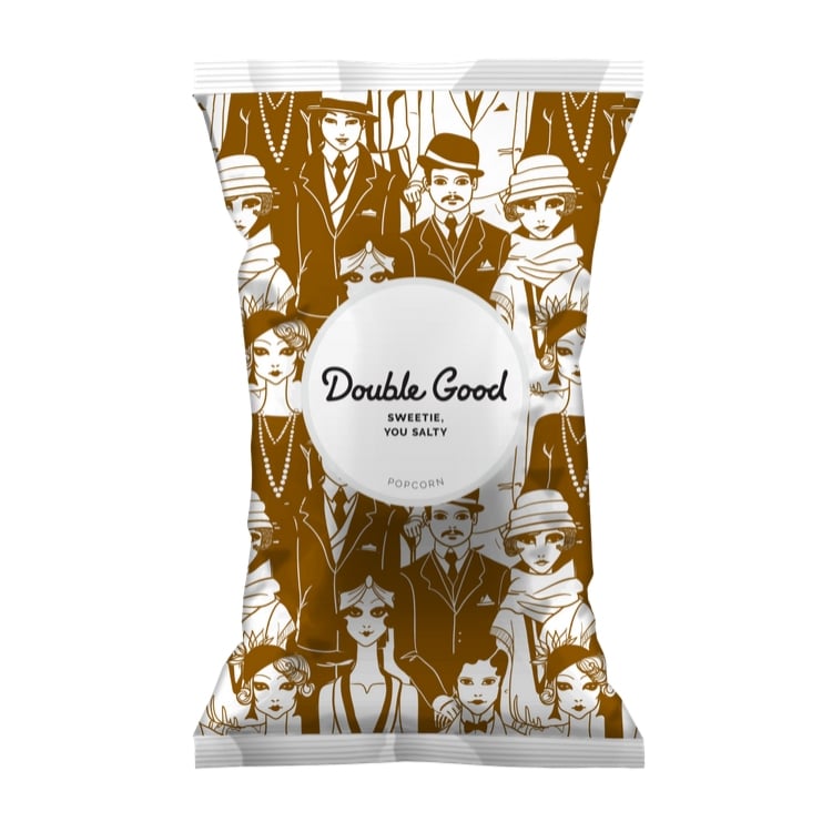
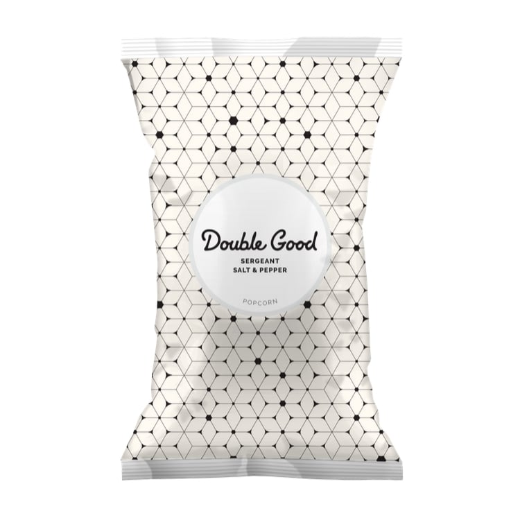
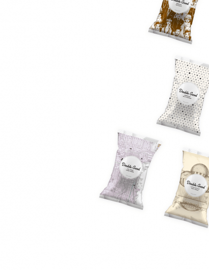
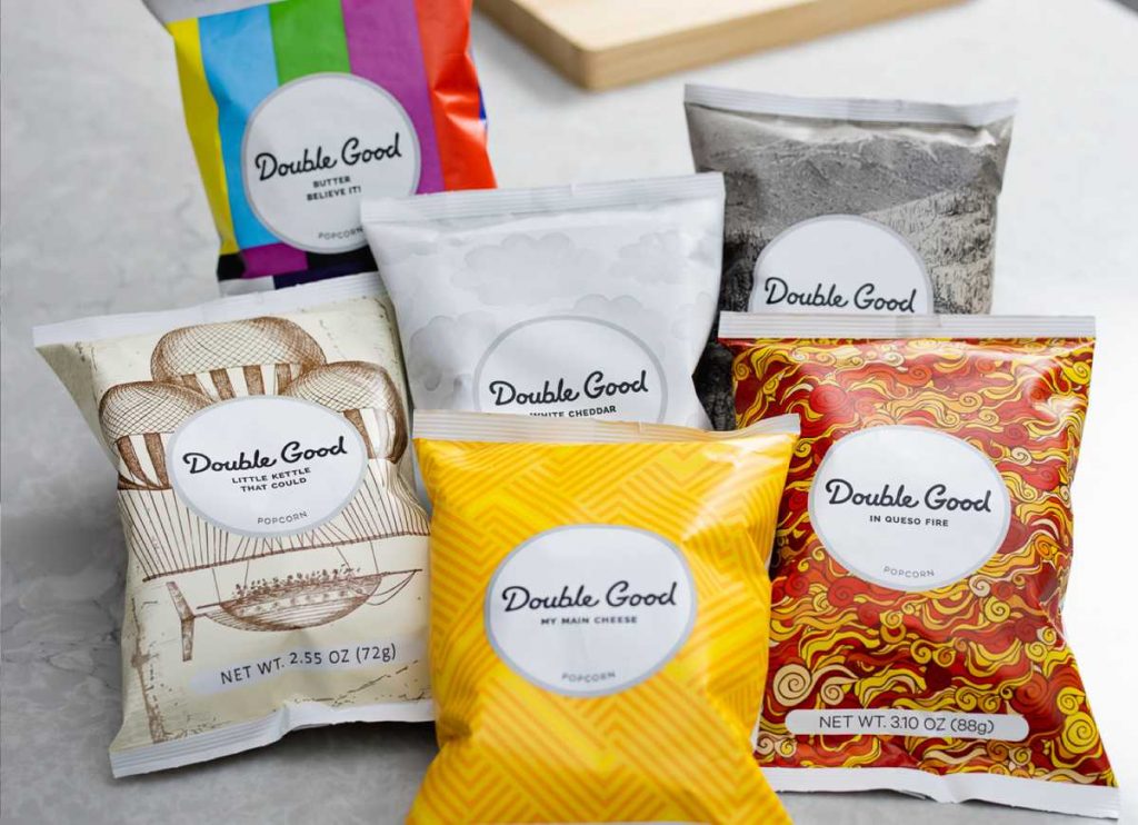
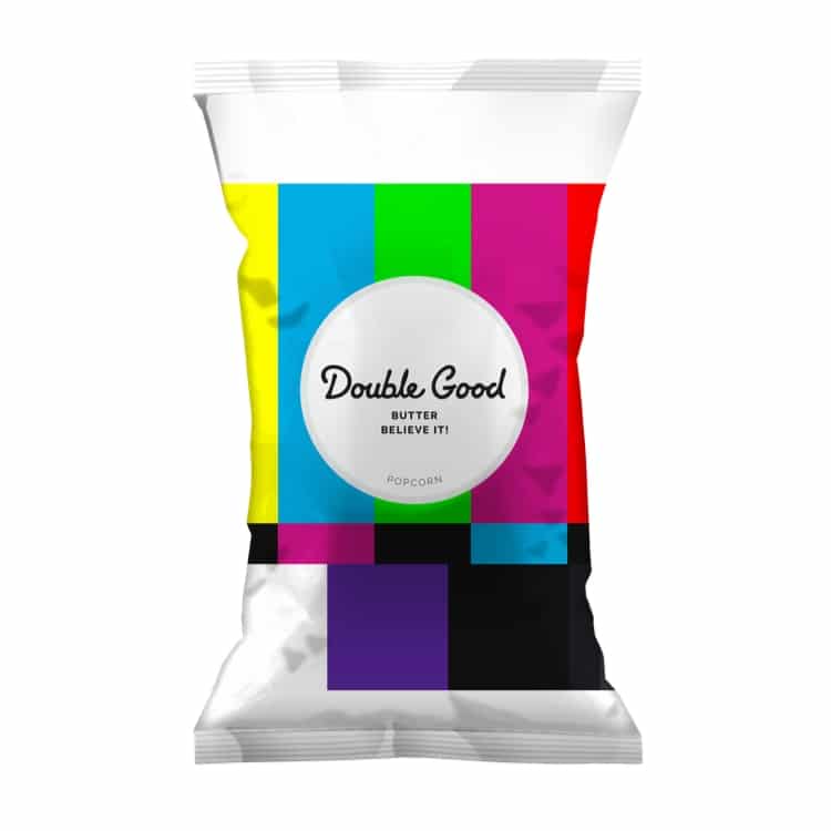
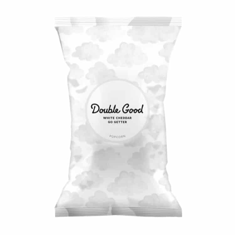
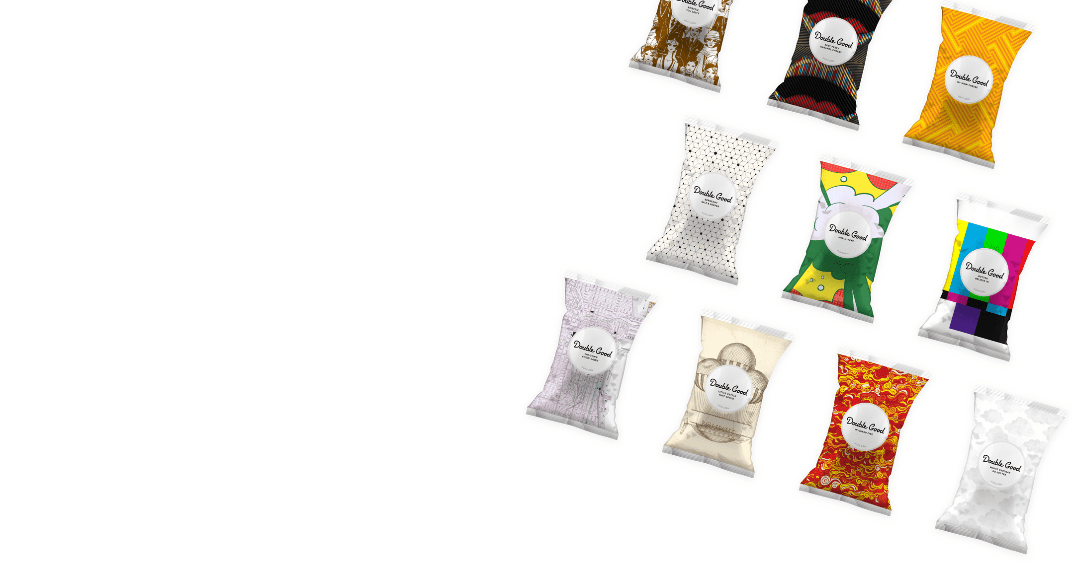
Previously known as Popcorn Palace, the snack makers adopted a new name and a variety of packaging designs. The popcorn packages mirror the various flavors the company creates. The stylized patterns lie at the center of the packaging designs. Every bag of Double Good tells a unique story to its customers.

Apart from the attractive packaging designs, the brand supports children with special needs. 50 percent of the profit goes to these children. The official website mentions the following:

“We started the Double Goods Kids Foundation to provide the equipment, education, and opportunity for kids with special needs to get all the benefits the sports and extracurricular activities provide. And that’s where you come in: 50 percent of every dollar you spend goes to help kids with special needs.”
Double Good Popcorn
Double Good Popcorn Goes Good On Packaging

What makes Double Good packaging different?

Good packaging is not only about great designs; it is also about establishing brand identity and brand awareness. Double Good popcorn packaging is relevant and memorable apart from being attractive.

Let us take a closer look.

Relevant

You may have the best packaging designs, but what good are they if they are not relevant? What do I mean by relevant? Like good logos, packaging designs must clearly communicate what the customers can expect from the brand. The packaging must also be an extension of the brand identity, i.e., it must communicate the brand values and missions.

Double Good is a fantastic example of relevant packaging. From Double Good My Main Cheese to Double Good in a Caramel Nutshell, the packaging designs communicate what the customers can expect from each bag. Plus, they highlight the key personalities of the brand.

Memorable

Another similarity all good packaging designs share is that they are memorable. When you see two similar products sitting on the shelf of a store from different brands, you are more likely to grab the one that attracts you: this is especially true when you are out to buy products from brands you have not previously purchased. Attractive packaging will remain in your memory long after you have consumed the product.

The Double Good range of popcorn comes in a variety of packaging, each linked to the flavors it contains. The attractive packaging, along with the outstanding flavors, makes the product unique and memorable.

Conclusion

Double Good has come a long way from Popcorn Palace. Not only does the packaging attract customers and potential buyers, but it also stands for a strong social cause.

Get the latest packaging design inspiration in your inbox:

Popular designs

Far Out Bar

Description: Far Out Bar is a cutting-edge packaging design project created for High Life Farms’ macrodose THC chocolate bars. This project involved

Burma Love Rebrand

Love at First BiteAs an extension of the Burma Superstar restaurant in San Francisco, Burma Love Foods gives diners an opportunity to

Designed by: PepsiCo Design & Innovation
Country: United States

Double Good Popcorn Goes Good On Packaging

header-image

Packaging designs play a crucial role in fostering brand awareness. Sometimes packaging can be the only factor for a customer to choose your brand over the others at a store. Double Good quickly realized this fact and went for a complete brand overhaul.

Previously known as Popcorn Palace, the snack makers adopted a new name and a variety of packaging designs. The popcorn packages mirror the various flavors the company creates. The stylized patterns lie at the center of the packaging designs. Every bag of Double Good tells a unique story to its customers.

Apart from the attractive packaging designs, the brand supports children with special needs. 50 percent of the profit goes to these children. The official website mentions the following:

“We started the Double Goods Kids Foundation to provide the equipment, education, and opportunity for kids with special needs to get all the benefits the sports and extracurricular activities provide. And that’s where you come in: 50 percent of every dollar you spend goes to help kids with special needs.”
Double Good Popcorn
Double Good Popcorn Goes Good On Packaging

What makes Double Good packaging different?

Good packaging is not only about great designs; it is also about establishing brand identity and brand awareness. Double Good popcorn packaging is relevant and memorable apart from being attractive.

Let us take a closer look.

Relevant

You may have the best packaging designs, but what good are they if they are not relevant? What do I mean by relevant? Like good logos, packaging designs must clearly communicate what the customers can expect from the brand. The packaging must also be an extension of the brand identity, i.e., it must communicate the brand values and missions.

Double Good is a fantastic example of relevant packaging. From Double Good My Main Cheese to Double Good in a Caramel Nutshell, the packaging designs communicate what the customers can expect from each bag. Plus, they highlight the key personalities of the brand.

Memorable

Another similarity all good packaging designs share is that they are memorable. When you see two similar products sitting on the shelf of a store from different brands, you are more likely to grab the one that attracts you: this is especially true when you are out to buy products from brands you have not previously purchased. Attractive packaging will remain in your memory long after you have consumed the product.

The Double Good range of popcorn comes in a variety of packaging, each linked to the flavors it contains. The attractive packaging, along with the outstanding flavors, makes the product unique and memorable.

Conclusion

Double Good has come a long way from Popcorn Palace. Not only does the packaging attract customers and potential buyers, but it also stands for a strong social cause.

Previous slide
Next slide

Explore more great package design

Get the latest on packaging design in your inbox: