


Designed By: Kseniia Ovchunnikova | Country: Russia
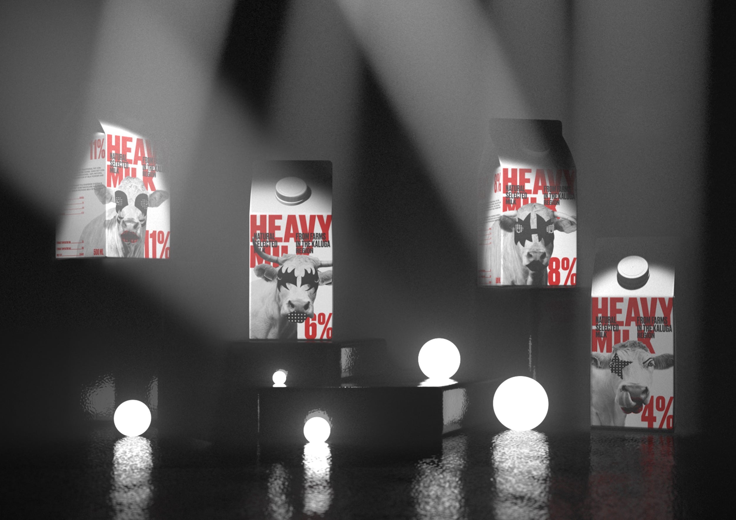
Have you ever been to a Kiss concert? You can set aside all the other rock bands in history on one side and Kiss on another. Well, I am not comparing Kiss and other bands based on their music, but on the theatrics. While other bands perform, Kiss gives you an experience. From pyrotechnics to the smoke to the climax, Kiss is all about extreme theatrics. The visual metaphor for the full-fat milk was found with the members of Kiss.
The milk brand includes four products, each corresponding to the members of the hard rock band. The makeup of the cow is heavy or light, depending on the fatness of the milk.
While the makeup has been reduced with simplified color combinations for the packaging, it still remains recognizable. Be it the Starchild or the Demon, the Space Ace or the Catman: the influence is clearly visible when you look at the cow on the packaging.


In addition to the monochromatic color palette, red has been used as an accent color to attract customers. Furthermore, the color also helps understand the fat content of the milk.
The typography is rigid, bold, and rough, symbolizing the heaviness of the rock band and the milk.
Kseniia Ovchunnikova, the designer, mentions the following:
“With a visual presentation, I wanted to ‘finish’ the metaphor of a rock band by placing a carton of milk on a stage with spotlights. It seems to me that this technique could be used in product advertising.”


