


Designed By: Biles Hendry | Country: UK
In a move to reimagine its brand identity, Burts Snacks approached the London-based branding and design agency, Biles Hendry. The award-winning British chip makers wanted their brand to have “more meaning, presence, and appeal.”
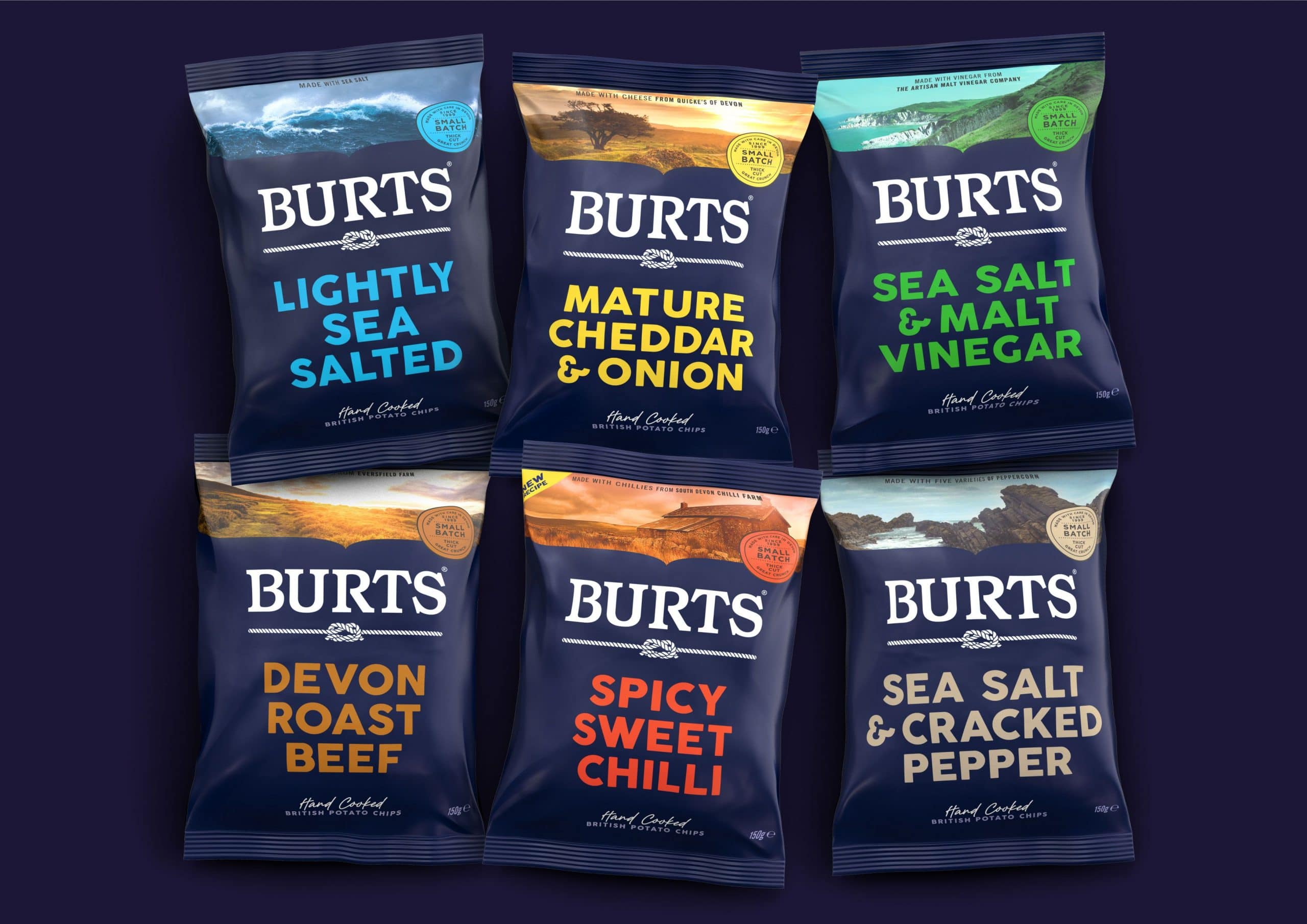
Biles Hendry has captured the very essence of the British brand through the redesign. The evolved branding highlights the company’s honest and straightforward personality. One of the main highlights of the packaging is the images of Devon’s farmland. The images of farmland and landscape on the packaging inform the customers that the products are made in Devon. Furthermore, it highlights the fact that the ingredients are locally sourced from “independent businesses like Spoilt Pig Farm, Quicke’s Cheese, and South Devon Chilli Farm.”


Dark blue has been used as the primary color, symbolizing honesty, seriousness, integrity, and power. The color palette, along with the typography, sets the design apart from Burts’ competitors. In addition to bringing brand cohesion, the evolved packaging design enhances the shelf presence.
“We are absolutely thrilled at Burts with the new packaging,” mentioned Dave McNulty, CEO at Burts.
The design looks truly amazing, and we have already received a universally positive reception so far. It’s recognizably Burts, but communicates so much more than the old design, ensuring that consumers get a sense of exactly who we are.”


