Designed by: PepsiCo Design & Innovation
Country: United States

Packaging Design Of Kraft Heinz New Vegan Mayo Range

Designed by: PB Creative | Country: US

Kraft Heinz recently teamed up PB Creative, a London-based design agency, to create a fresh and exciting look for its newly launched Vegan Mayo range.

According to several studies, the global food landscape is seeing an unprecedented change. The primary reason for such transformation is the consumers’ growing awareness of the impact of the various types of food on the environment. With sustainability and other health issues in mind, a considerable number of consumers are turning towards plant-based diets.

In the EU, 20 percent of the consumers have turned flexitarians, meaning they primarily consume a vegetarian diet with the occasional inclusion of meat or fish. However, 1 percent identify themselves as vegan completely.  

While the health benefits of plant-based food are well established, it is sometimes said to lack flavor and excitement. With that in mind, Kraft Heinz decided to create an exciting and flavor-filled line of eggless mayo packed with natural plant-based tang.
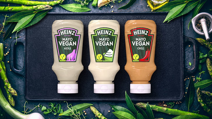
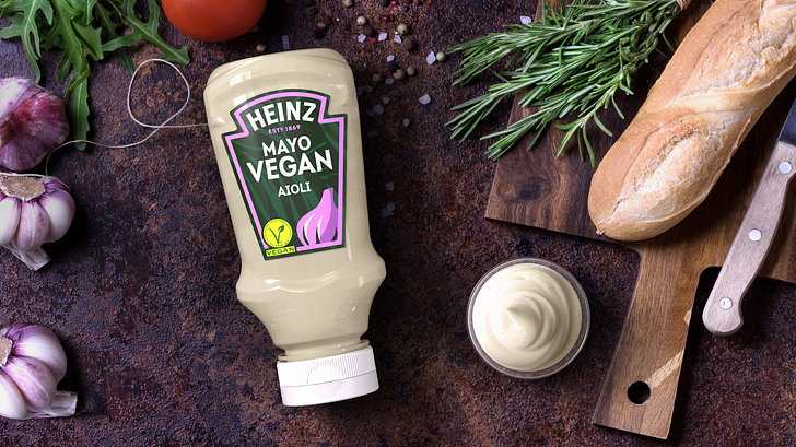
Packaging Design Of Kraft Heinz New Vegan Mayo Range

The packaging

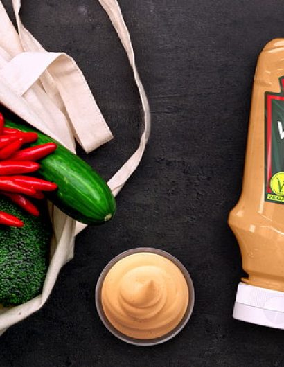
The packaging is in line with vegan category codes. The dark green background adds to the richness of the design, while the foreground colors are in sync with the flavors.

Lloyd Moffatt, Creative Director at PB Creative, explained:

“Our aim was to elevate and reinvigorate the vegan experience and remove the perceived blandness from the category. We wanted to create a confident and assertive range aesthetic that communicated flavor at the very heart of the proposition while still reassuring consumers on the vegan nature of the product.”


Get the latest packaging design inspiration in your inbox:

Popular designs

Over the wave

This Kombucha originates in Lombok, Indonesia, where its paradise beaches attract hundreds of surfers eager to ride the waves. When you surf,

Pure Persian Honey

When we look closely at honey packaging, they are almost all in the usual format, and the ultimate in creativity is that

Designed by: PepsiCo Design & Innovation
Country: United States

Packaging Design Of Kraft Heinz New Vegan Mayo Range

Heinz 2

Designed by: PB Creative | Country: US

Kraft Heinz recently teamed up PB Creative, a London-based design agency, to create a fresh and exciting look for its newly launched Vegan Mayo range.

According to several studies, the global food landscape is seeing an unprecedented change. The primary reason for such transformation is the consumers’ growing awareness of the impact of the various types of food on the environment. With sustainability and other health issues in mind, a considerable number of consumers are turning towards plant-based diets.

In the EU, 20 percent of the consumers have turned flexitarians, meaning they primarily consume a vegetarian diet with the occasional inclusion of meat or fish. However, 1 percent identify themselves as vegan completely.

While the health benefits of plant-based food are well established, it is sometimes said to lack flavor and excitement. With that in mind, Kraft Heinz decided to create an exciting and flavor-filled line of eggless mayo packed with natural plant-based tang.
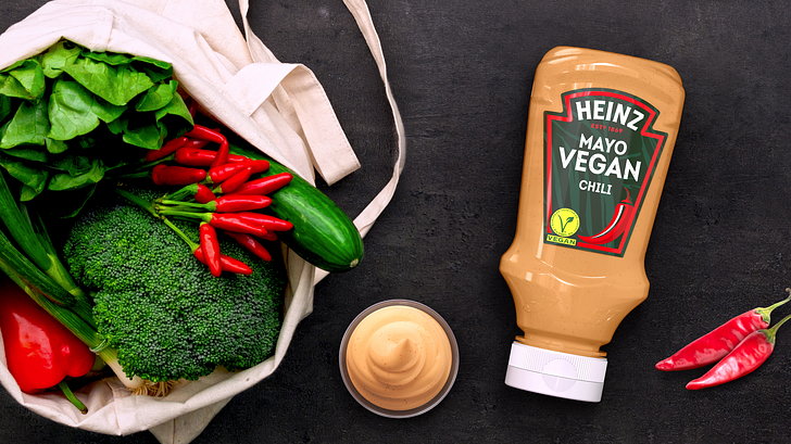
Packaging Design Of Kraft Heinz New Vegan Mayo Range

The packaging

The packaging is in line with vegan category codes. The dark green background adds to the richness of the design, while the foreground colors are in sync with the flavors.

Lloyd Moffatt, Creative Director at PB Creative, explained:

“Our aim was to elevate and reinvigorate the vegan experience and remove the perceived blandness from the category. We wanted to create a confident and assertive range aesthetic that communicated flavor at the very heart of the proposition while still reassuring consumers on the vegan nature of the product.”

Previous slide
Next slide

Explore more great package design

Get the latest on packaging design in your inbox: