Designed by: PepsiCo Design & Innovation
Country: United States

The New Kraft Mac & Cheese Box Will Make You Smile

Designed by: JKR Global | Country: US

“Say cheese everyone,” says the photographer before taking that memorable group photo. Well, with the new Kraft Mac & Cheese, you won’t have to force a smile on your face: one look at the packaging, and you are all set.

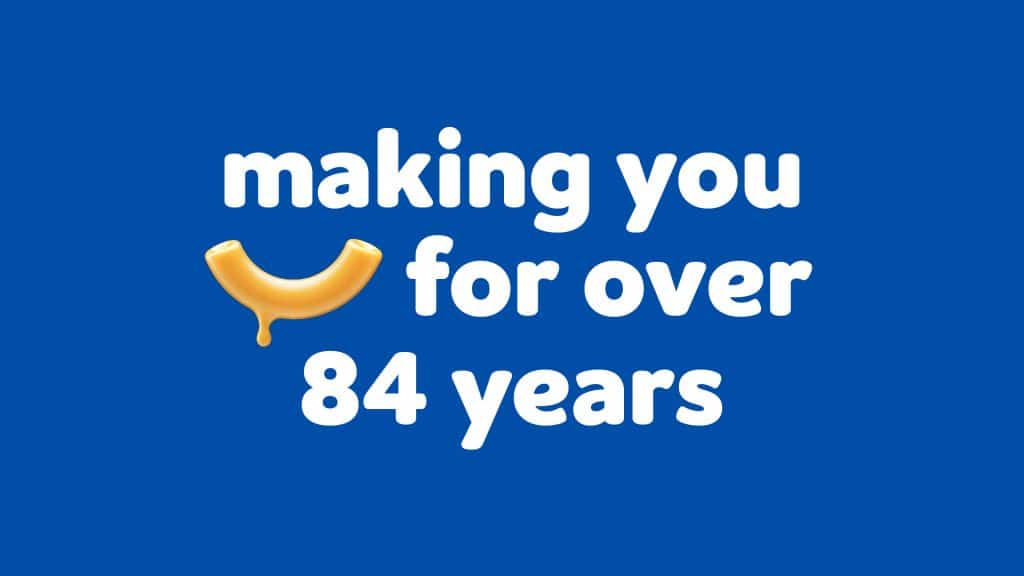
Kraft, for 84 years, has offered its delicious cheesy noodle, Macaroni & Cheese to families across the country. Not only Americans but Canadians, Australians, and the Brits have also loved the product. The brand that built a large fan following over the last eight decades; decided it was finally time for a brand refresh.

The New Kraft Mac & Cheese Box Will Make You Smile

The packaging

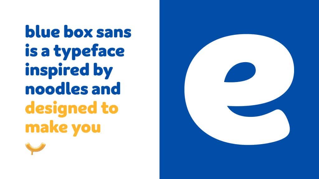
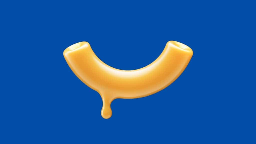
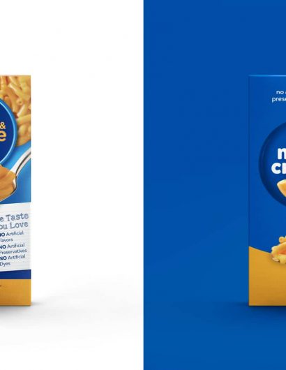
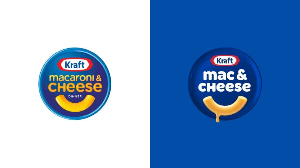
Kraft approached the global design and packaging experts JKR to refresh the packaging and the logo. The first noticeable change is the name. Moving from “Macaroni & Cheese,” your favorite pack of cheesy noodles is now called “Mac & Cheese.” The new box also features a new logo. The new noodle smile with a drop of cheese dripping from the corner is placed under the wordmark. The new packaging looks attractive and appealing.

Victoria Lee, Kraft Mac & Cheese brand manager, mentioned the following via press release:

“For packaging design, we wanted to communicate brand benefits in a fun way by maximizing the impact of color, photography and typography in a simple yet powerful design layout. By displaying the “Old Fashioned Brewing Method” product value, we want the packaging design to become a strong brand identity and have a competitive value in the market.”

Get the latest packaging design inspiration in your inbox:

Popular designs

Over the wave

This Kombucha originates in Lombok, Indonesia, where its paradise beaches attract hundreds of surfers eager to ride the waves. When you surf,

Pure Persian Honey

When we look closely at honey packaging, they are almost all in the usual format, and the ultimate in creativity is that

Far Out Bar

Description: Far Out Bar is a cutting-edge packaging design project created for High Life Farms’ macrodose THC chocolate bars. This project involved

Designed by: PepsiCo Design & Innovation
Country: United States

The New Kraft Mac & Cheese Box Will Make You Smile

KMC-PressAssets-11

Designed by: JKR Global | Country: US

“Say cheese everyone,” says the photographer before taking that memorable group photo. Well, with the new Kraft Mac & Cheese, you won’t have to force a smile on your face: one look at the packaging, and you are all set.

Kraft, for 84 years, has offered its delicious cheesy noodle, Macaroni & Cheese to families across the country. Not only Americans but Canadians, Australians, and the Brits have also loved the product. The brand that built a large fan following over the last eight decades; decided it was finally time for a brand refresh.
The New Kraft Mac & Cheese Box Will Make You Smile

The packaging

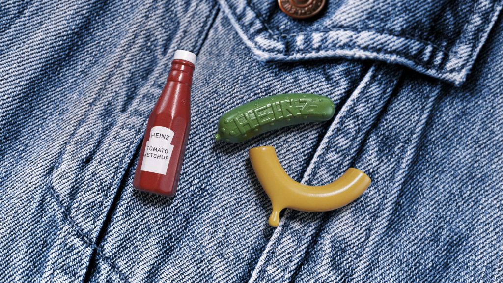
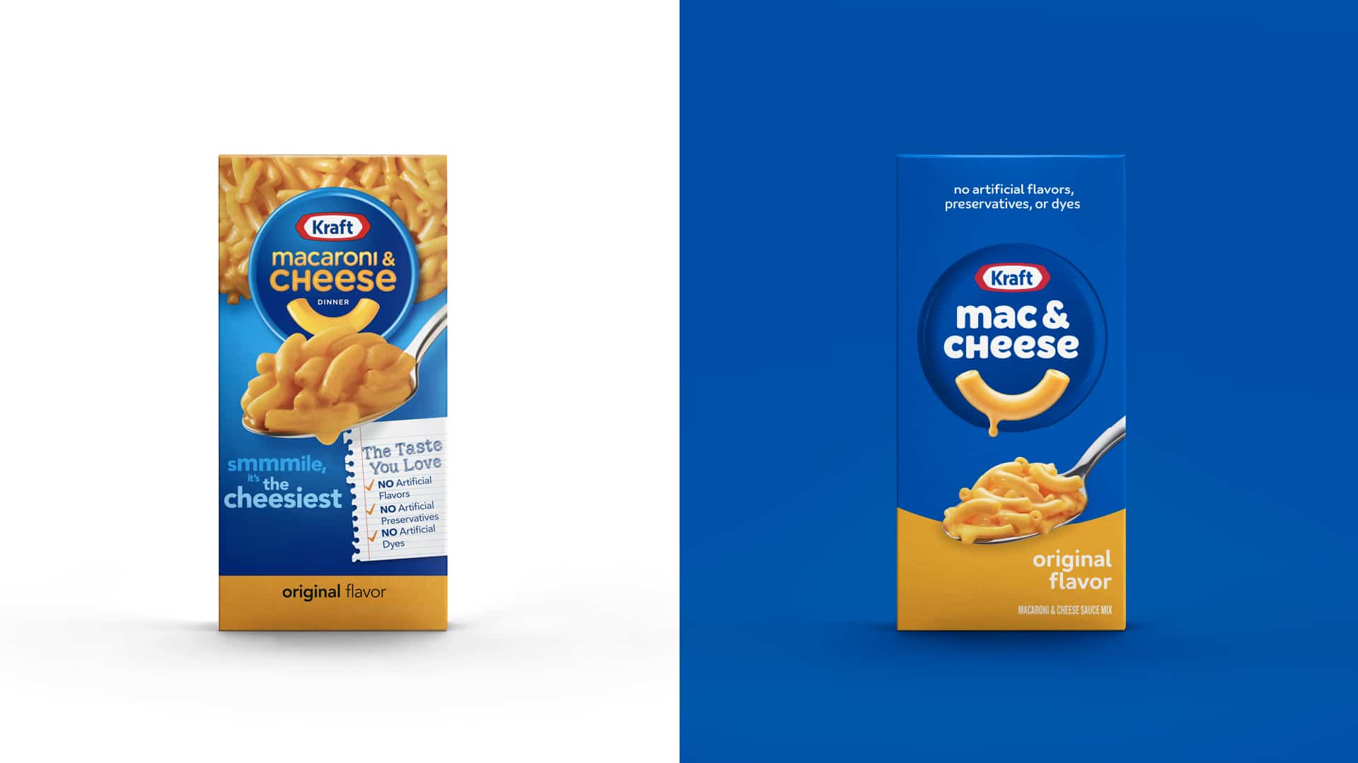
Kraft approached the global design and packaging experts JKR to refresh the packaging and the logo. The first noticeable change is the name. Moving from “Macaroni & Cheese,” your favorite pack of cheesy noodles is now called “Mac & Cheese.” The new box also features a new logo. The new noodle smile with a drop of cheese dripping from the corner is placed under the wordmark. The new packaging looks attractive and appealing.

Victoria Lee, Kraft Mac & Cheese brand manager, mentioned the following via press release:

“For packaging design, we wanted to communicate brand benefits in a fun way by maximizing the impact of color, photography and typography in a simple yet powerful design layout. By displaying the “Old Fashioned Brewing Method” product value, we want the packaging design to become a strong brand identity and have a competitive value in the market.”

Previous slide
Next slide

Explore more great package design

Get the latest on packaging design in your inbox: