Designed by: PepsiCo Design & Innovation
Country: United States

Rocks Squash Brand Refresh

Designed by: Family (and friends) | Country: UK


Built around the idea of ‘Refreshingly Liberating’ Drinks, the London-based creative agency has been creating a brand refresh for Rock Squash. Moving away from complex recipes, the brand prides itself in the simple combination of cane sugar, whole fruit, and Devonshire spring water.

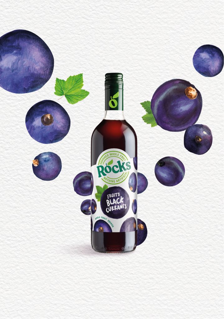
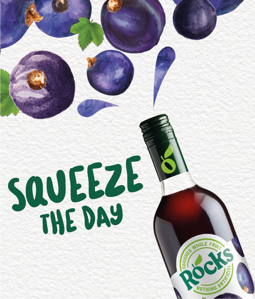
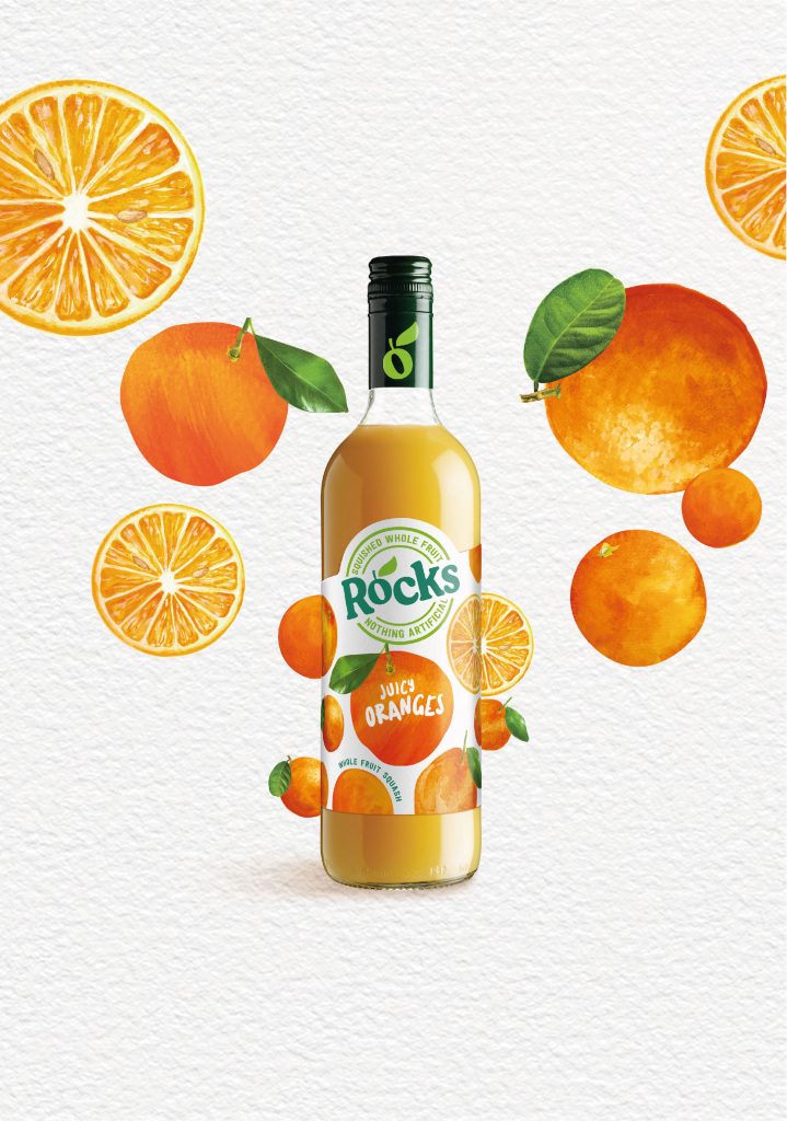
The brand refresh focuses on highlighting the simple ingredients and the mouthwatering flavors. The illustrations used on the packaging are natural and aligned with the brand personality. Family (and friends) completely avoided the use of Photoshop-style images, typically associated with soft drinks, to highlight the brand’s organic attributes.
Rocks Squash Brand Refresh

“An important part of the brand refresh meant looking and feeling like a premium, natural, wholesome family option, not positioned as a ‘kiddie’ squash brand” says Derek Johnston, head of strategy at Family and friends.

“This refresh comes at a good time – the cost-of-living crisis is leading less footfall in bars and cafes, so more people are seeking a posher, premium drinks experience at home and at summer BBQs etc.

The marketing team at Rocks said this of the project:

“Rocks is a special brand that stands very strongly for delicious taste from natural, whole fruits that are free from any artificial ingredients – and this is really important to our consumers, too. We wanted the packaging to reflect this and provide that strong, natural reassurance, so we’ve brought all the fruits front and centre of pack and cleaned up the design to make it look simple and delicious.”

Get the latest packaging design inspiration in your inbox:

Popular designs

The Bra Guru

Most women are wearing the wrong size bra and that is a fact. The Bra Guru® is the first and only professional

The Port Vodka Lemon Water

Overview: In response to my client’s vision for a Cape Cod themed beverage brand, I embarked on the journey to create The Port

Far Out Bar

Description: Far Out Bar is a cutting-edge packaging design project created for High Life Farms’ macrodose THC chocolate bars. This project involved

Burma Love Rebrand

Love at First BiteAs an extension of the Burma Superstar restaurant in San Francisco, Burma Love Foods gives diners an opportunity to

Designed by: PepsiCo Design & Innovation
Country: United States

Rocks Squash Brand Refresh

Rocks_PackShots_PR-05_05_22_FL-03

Designed by: Family (and friends) | Country: UK


Built around the idea of ‘Refreshingly Liberating’ Drinks, the London-based creative agency has been creating a brand refresh for Rock Squash. Moving away from complex recipes, the brand prides itself in the simple combination of cane sugar, whole fruit, and Devonshire spring water.

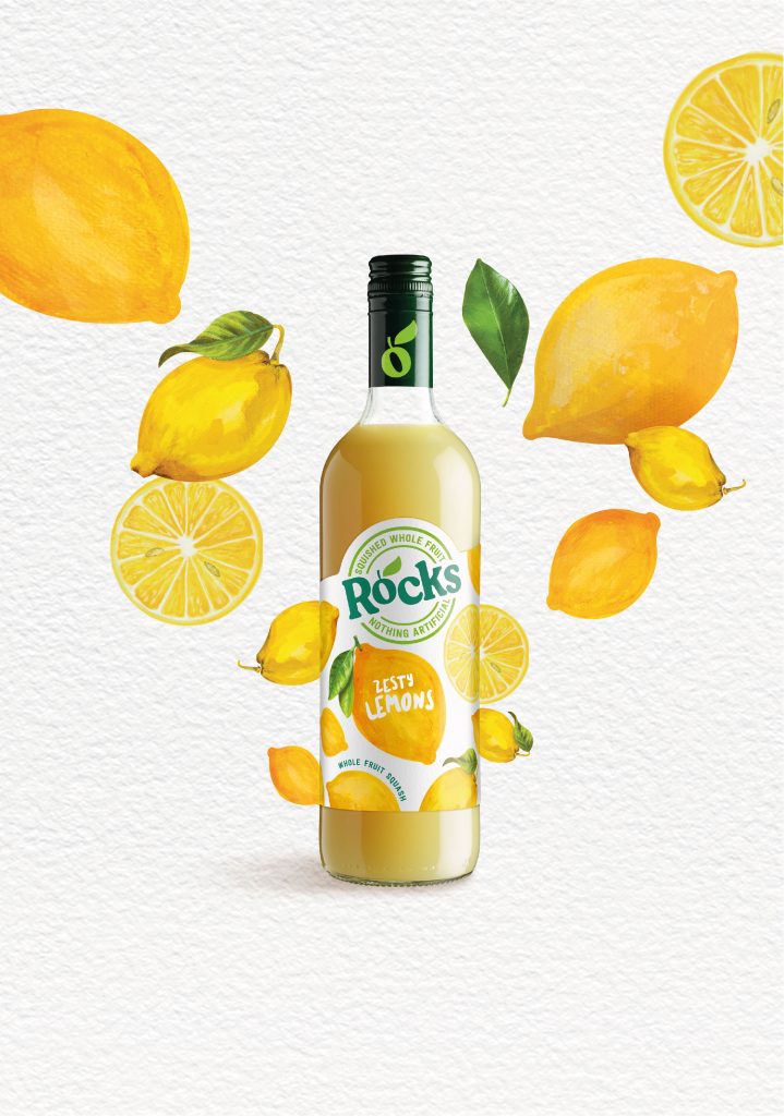
The brand refresh focuses on highlighting the simple ingredients and the mouthwatering flavors. The illustrations used on the packaging are natural and aligned with the brand personality. Family (and friends) completely avoided the use of Photoshop-style images, typically associated with soft drinks, to highlight the brand’s organic attributes.
Rocks Squash Brand Refresh

“An important part of the brand refresh meant looking and feeling like a premium, natural, wholesome family option, not positioned as a ‘kiddie’ squash brand” says Derek Johnston, head of strategy at Family and friends.

“This refresh comes at a good time – the cost-of-living crisis is leading less footfall in bars and cafes, so more people are seeking a posher, premium drinks experience at home and at summer BBQs etc.

The marketing team at Rocks said this of the project:

“Rocks is a special brand that stands very strongly for delicious taste from natural, whole fruits that are free from any artificial ingredients – and this is really important to our consumers, too. We wanted the packaging to reflect this and provide that strong, natural reassurance, so we’ve brought all the fruits front and centre of pack and cleaned up the design to make it look simple and delicious.”

Previous slide
Next slide

Explore more great package design

Get the latest on packaging design in your inbox: