Designed by: The Labelmaker | Country: Slovenia
Jordan Jelev, aka the Labelmaker, is a Varna-based award-winning wine label designer. The Labelmaker focuses only on creating packaging designs for wine, beer, and spirits. The creative artist’s latest work is for Erzetic Winery, a family-owned business that focuses on crafting quality wines.
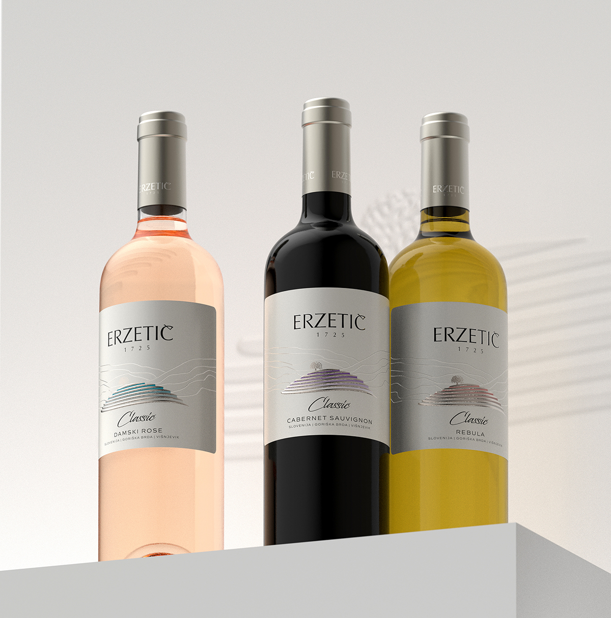
“For Erzetic winery, I tried to give my best to do a classic design yet trying to implement some modern approaches mostly in using special materials and print embellishments.
We picked a special paper with creamy mother of pearl finish that alters ink colors by adding some semi-metallic effect.”


The packaging design is simple yet oozes sophistication. The image of the tree atop a hill transports one close to the serenity of nature. The typeface, in addition to the monochromatic color palette, adds to the overall elegance of the packaging.
“The Erzetic logo is printed with raised varnish along with the lines around Veliki Vrh that were meant to somehow create a feeling for landscape, hills, nature, without stealing the whole attention.
Veliki Vrh, just like in Orbis wine label design, was stamped with special silver hot foil and then an embossing effect was added so that you could touch it and sense it with your fingertips.”