Designed by: PepsiCo Design & Innovation
Country: United States

Stormbrands Redesigns The Brand Identity Of Counted

Designed by: StormBrands | Country: UK

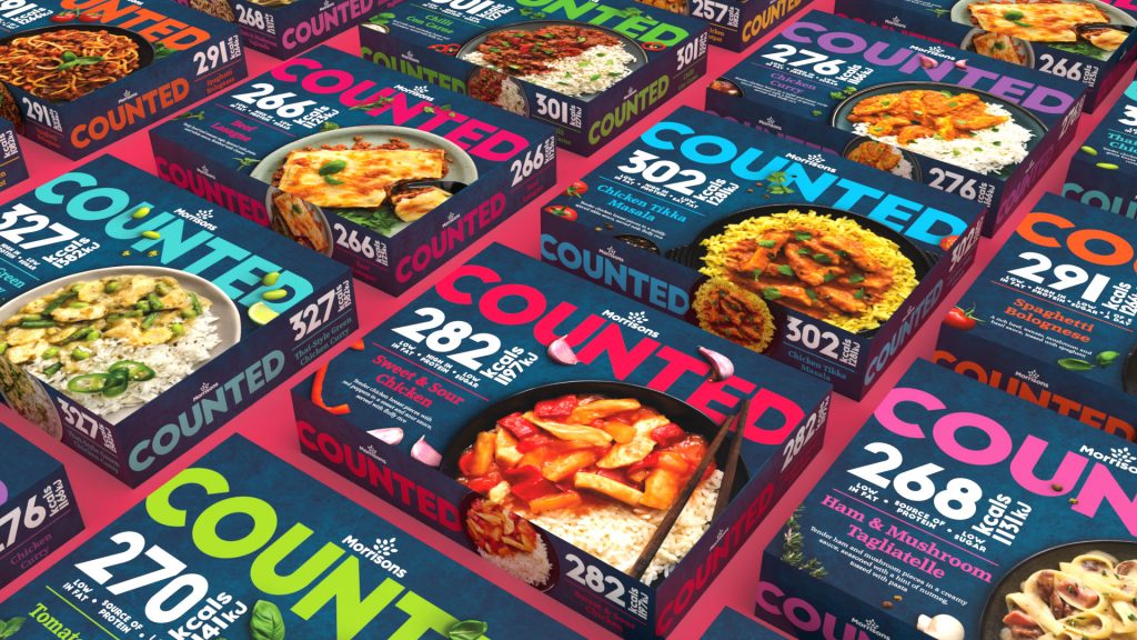
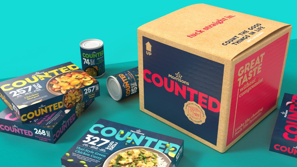
Branding and design agency StromBrands, has redesigned Morrisons’ ‘Counted’ range. The Counted food range is the supermarket’s homegrown calorie-controlled meal solution. The Counted range is a healthy alternative to customers’ favorite high-calorie meals.

The evolving customer behavior is something that brands have to keep in mind. Today, consumers are more aware of the food they eat. Gone are the days when the packaging could get away with a simple ingredients list and expiry date. Brands have to put more into the packaging to improve its shelf value.

Morrison’s brief to StormBrands was simple: position the brand around evolving customer trends. The challenge was to create a brand identity powerful enough to stand out from the crowd in the highly competitive and noisy market segment.
Stormbrands Redesigns The Brand Identity Of Counted

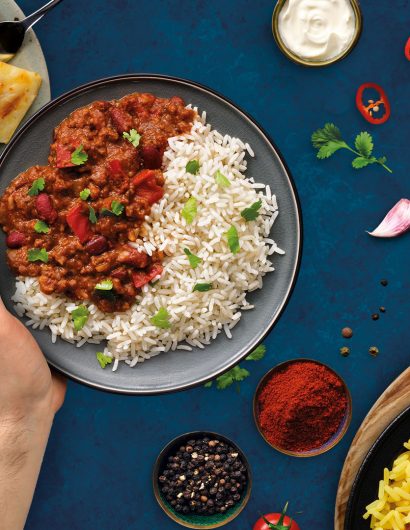
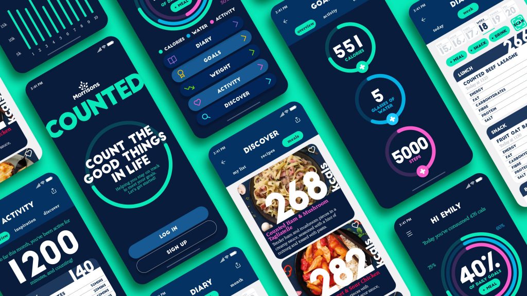
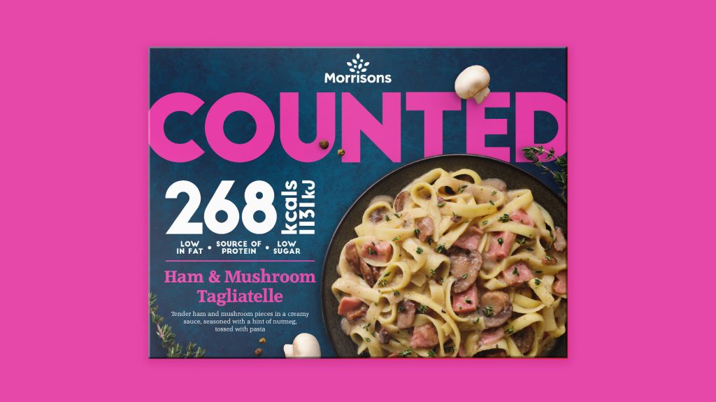
The final range design was unapologetic, bold, and clean. The designs focus on attracting customers by communicating the health benefits of the products.

Zoe Phillipson, StormBrands Creative Director, mentioned:

“We’ve flipped the diet world on its head using the category codes of ‘Counted’ but with the color palette ‘dialed up’ to the max. It’s now at its loudest and proudest with powerful range typography taking center stage. Clear calorie messaging is still at the heart of the proposition but it’s now celebratory rather than apologetic. We’ve effectively elevated the ‘Counted’ range to a world of flavor without compromise.”


Get the latest packaging design inspiration in your inbox:

Popular designs

The Port Vodka Lemon Water

Overview: In response to my client’s vision for a Cape Cod themed beverage brand, I embarked on the journey to create The Port

Far Out Bar

Description: Far Out Bar is a cutting-edge packaging design project created for High Life Farms’ macrodose THC chocolate bars. This project involved

Over the wave

This Kombucha originates in Lombok, Indonesia, where its paradise beaches attract hundreds of surfers eager to ride the waves. When you surf,

Designed by: PepsiCo Design & Innovation
Country: United States

Stormbrands Redesigns The Brand Identity Of Counted

Stormbrands_Counted_Image02a

Designed by: StormBrands | Country: UK

Branding and design agency StromBrands, has redesigned Morrisons’ ‘Counted’ range. The Counted food range is the supermarket’s homegrown calorie-controlled meal solution. The Counted range is a healthy alternative to customers’ favorite high-calorie meals.

The evolving customer behavior is something that brands have to keep in mind. Today, consumers are more aware of the food they eat. Gone are the days when the packaging could get away with a simple ingredients list and expiry date. Brands have to put more into the packaging to improve its shelf value.

Morrison’s brief to StormBrands was simple: position the brand around evolving customer trends. The challenge was to create a brand identity powerful enough to stand out from the crowd in the highly competitive and noisy market segment.
Stormbrands Redesigns The Brand Identity Of Counted

The final range design was unapologetic, bold, and clean. The designs focus on attracting customers by communicating the health benefits of the products.

Zoe Phillipson, StormBrands Creative Director, mentioned:

“We’ve flipped the diet world on its head using the category codes of ‘Counted’ but with the color palette ‘dialed up’ to the max. It’s now at its loudest and proudest with powerful range typography taking center stage. Clear calorie messaging is still at the heart of the proposition but it’s now celebratory rather than apologetic. We’ve effectively elevated the ‘Counted’ range to a world of flavor without compromise.”

Previous slide
Next slide

Explore more great package design

Get the latest on packaging design in your inbox: