


Designed by: ThinkBoldStudio | Country: Portuga
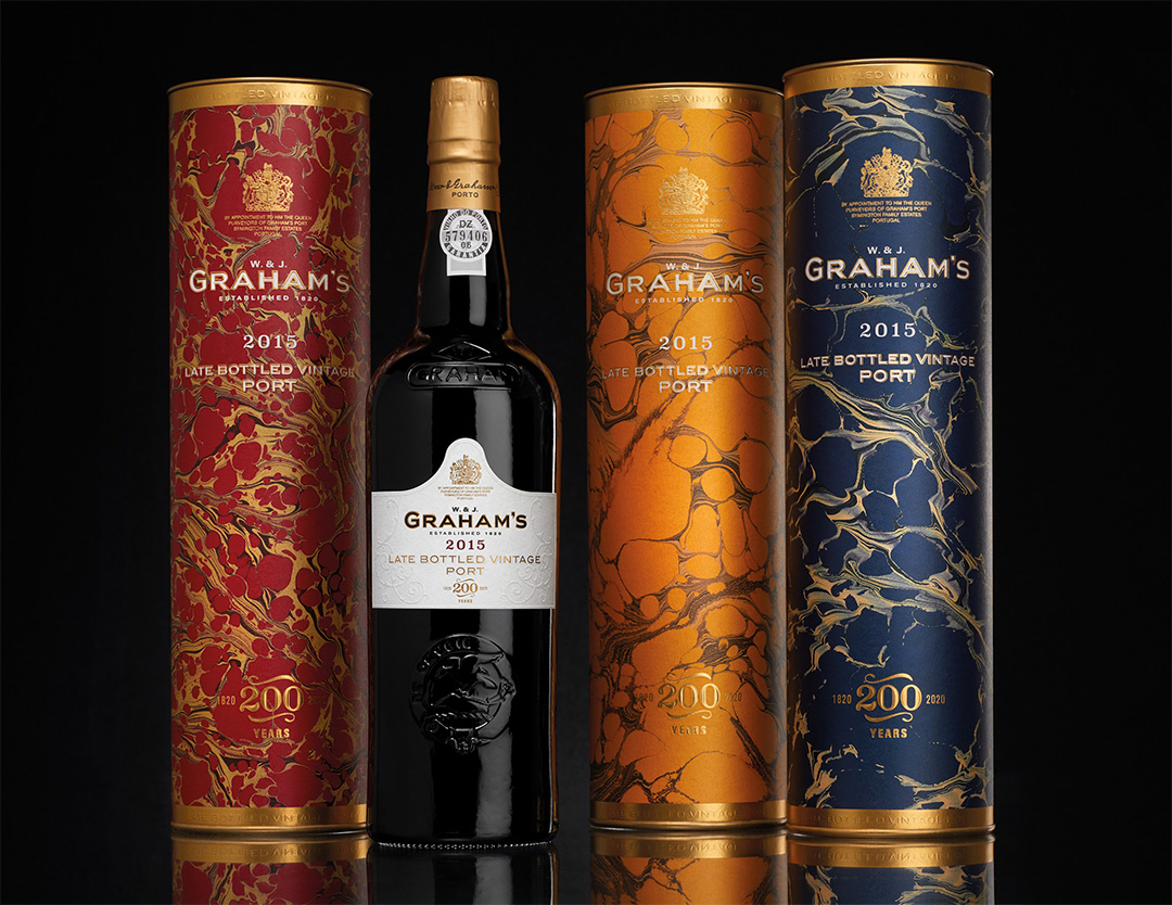
The Symington Family Estates owns several vineyards and various brands of Ports in Portugal. The 2015 special edition Late Bottled Vintage Port celebrates the exceptional landmark of Graham’s Bicentenary.
Graham’s mentions the following:
“The year was exceptionally dry and hot, and this led to a very early vintage with incredibly low yields. The low yields translated into intense and concentrated wines, rich and opulent — beautifully balanced by the freshness provided by excellent acidities — such as the quality that Graham’s declared a classic Vintage Port from 2017. Following on from the 2015 Bicentenary LBV edition the new colors of the tubes pay homage to 2017 as a year that was declared Vintage, these colors will carry on until the next LBV year coincides with a declared Vintage Year.”


The handcrafted tubes are designed to reflect the rich heritage of the brand. The attention to detail is stunning and reminds one of the rich handmade designs of the yesteryears.
“The tubes were designed using handcrafted marbled paper which reflects the craft and attention to detail of the brand and builds on our heritage in honoring the craftsmanship that goes into producing wines of such consistent quality. The front and back labels are adorned with beautifully embossed detail inspired by a combination of Porto’s wrought iron balconies and traditional Portuguese tiles (azulejos) to evoke memories of Porto’s charming streets.”


