Designed by: PepsiCo Design & Innovation
Country: United States

Branding And Packaging Of “Products Of The XXII Century”

Designed by: Ohmybrand  | Country: Russia


The company, “Products of the XXII Century,” contacted the Moscow-based branding and packaging company Ohmybrand to overhaul its current identity in order to cater to new customer segments beyond its current geographical boundaries.

The design house mentions the following:

“Previously, the company got most of its profit from the wholesale. Recently the company has decided to expand the geography of its presence and its implementation channels. The company has carried out extensive work. It has reformatted the assortment, leaving only the most useful and easy-to-use ingredients. It has also expanded the line of ready-made products with added functionality (for example, products with added fiber and vitamins).

Branding And Packaging Of “Products Of The XXII Century”

The packaging

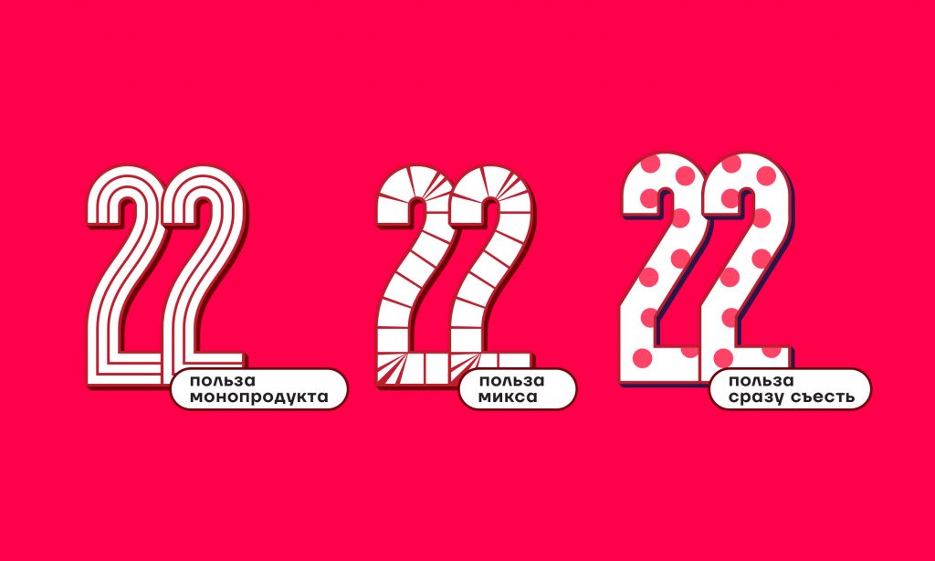
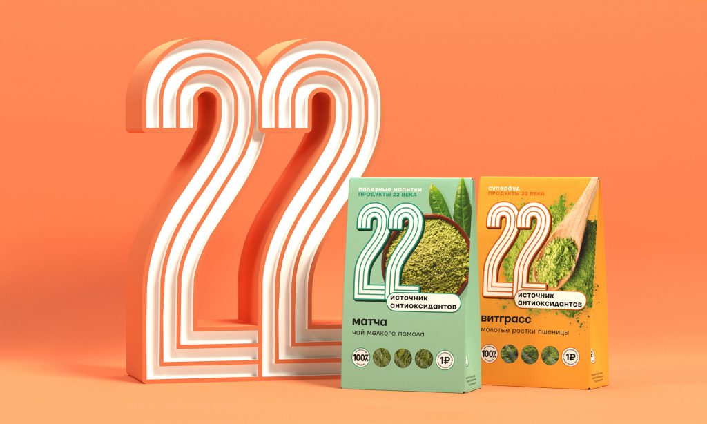
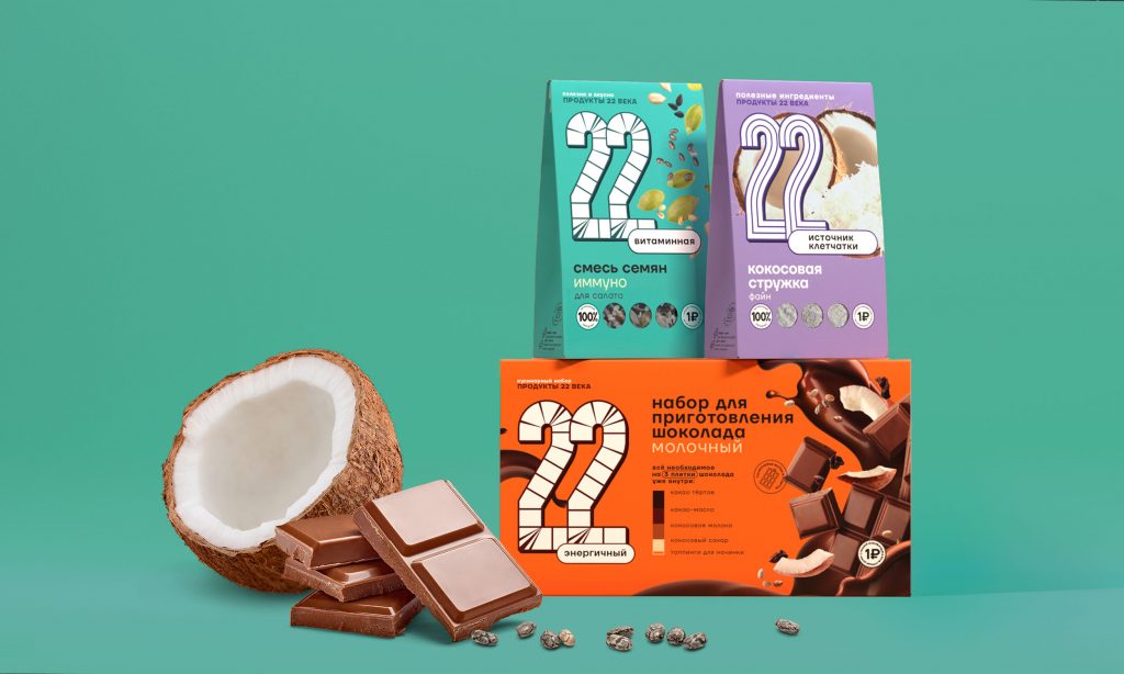
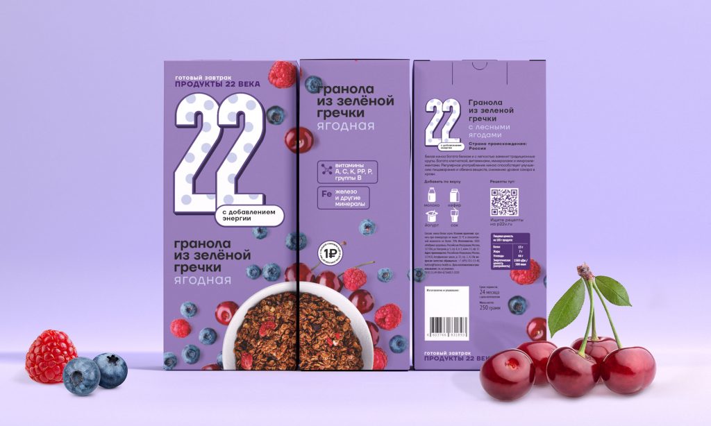
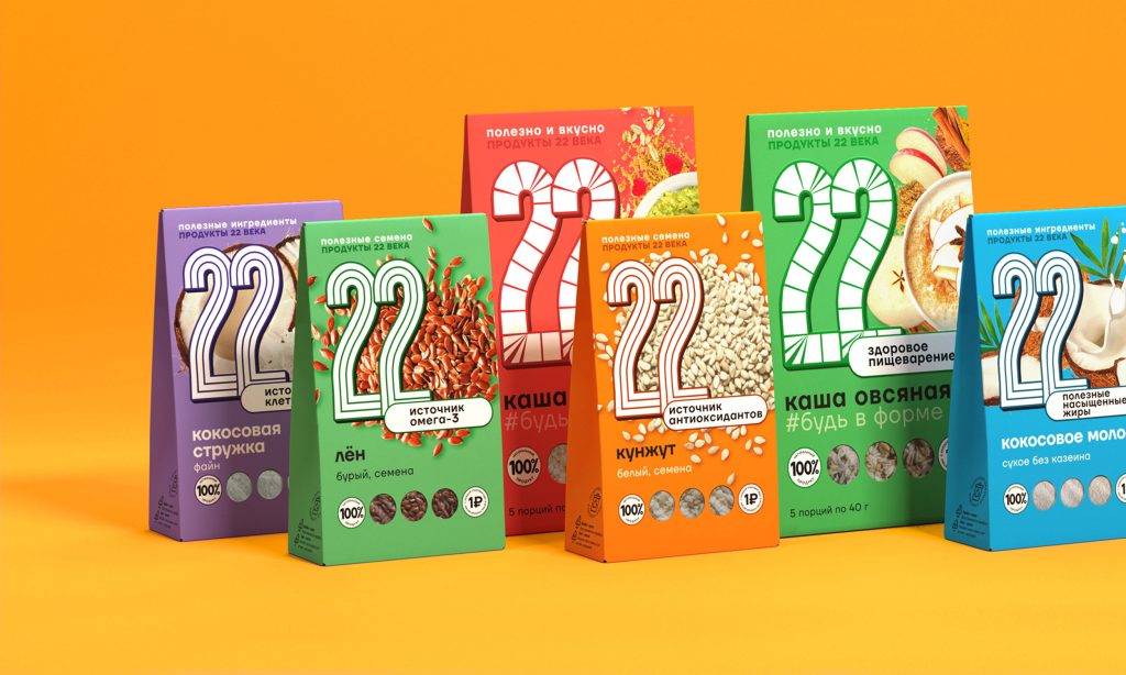
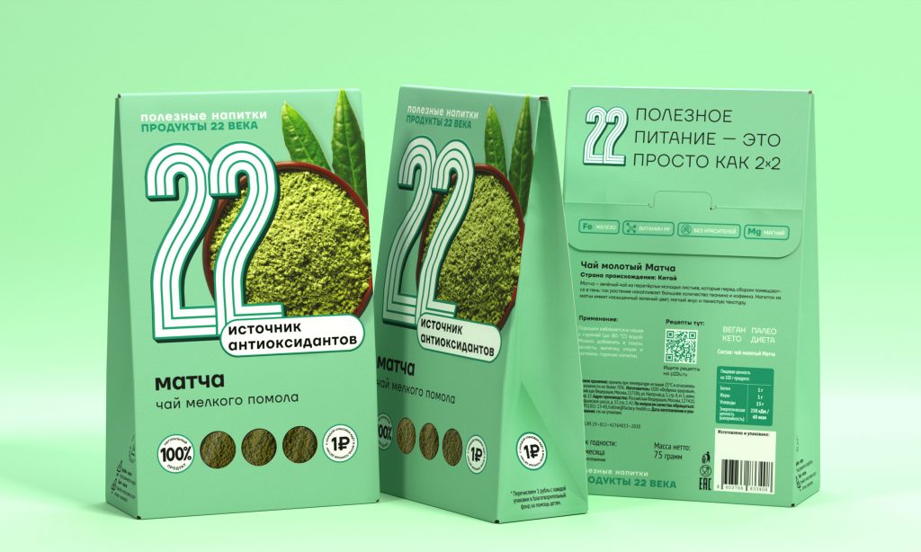
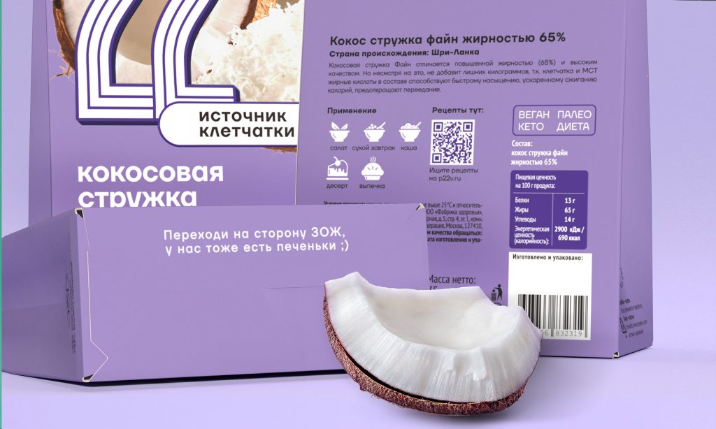
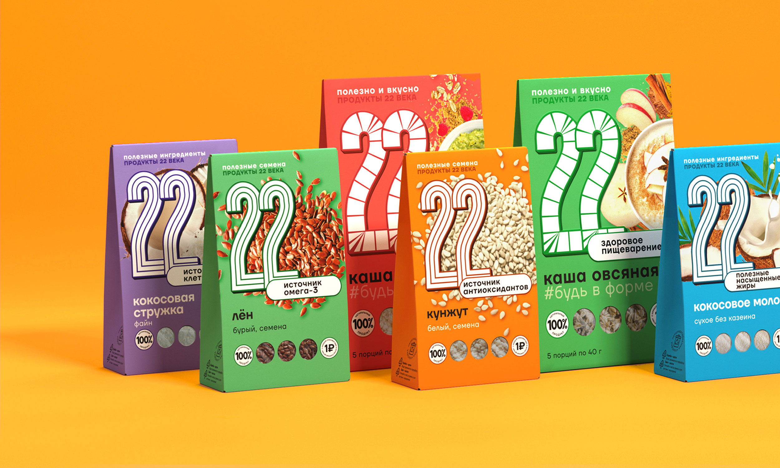
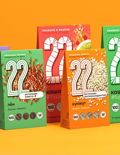
In addition to creating a new visual system, Ohmybrand shortened the brand name to “22” from “Products of the XXII Century.” Furthermore, the new bright color palette conveys a cheerful and positive brand personality. Proper disposal of the packaging and recycling instructions have also been provided to make life easier for the customers.

“We analyzed the audience and identified the main barriers of perception that can be influenced by correctly constructed branding: healthy food cannot be delicious, it is difficult to prepare and hard to understand, it does not work and, most likely, the words about its benefits are all lies and “marketing”.

Therefore, the new concept is based on the understanding of the problems of the entire segment:

  • the “entrance” into a healthy diet for non-specialists should become easier
  • consumers should understand at a glance what the benefits of a particular product are and how to use it
  • eating right is simple as pie”
Get the latest packaging design inspiration in your inbox:

Popular designs

Far Out Bar

Description: Far Out Bar is a cutting-edge packaging design project created for High Life Farms’ macrodose THC chocolate bars. This project involved

Over the wave

This Kombucha originates in Lombok, Indonesia, where its paradise beaches attract hundreds of surfers eager to ride the waves. When you surf,

Designed by: PepsiCo Design & Innovation
Country: United States

Branding And Packaging Of “Products Of The XXII Century”

s_5

Designed by: Ohmybrand  | Country: Russia


The company, “Products of the XXII Century,” contacted the Moscow-based branding and packaging company Ohmybrand to overhaul its current identity in order to cater to new customer segments beyond its current geographical boundaries.

The design house mentions the following:

“Previously, the company got most of its profit from the wholesale. Recently the company has decided to expand the geography of its presence and its implementation channels. The company has carried out extensive work. It has reformatted the assortment, leaving only the most useful and easy-to-use ingredients. It has also expanded the line of ready-made products with added functionality (for example, products with added fiber and vitamins).

Branding And Packaging Of “Products Of The XXII Century”

The packaging

In addition to creating a new visual system, Ohmybrand shortened the brand name to “22” from “Products of the XXII Century.” Furthermore, the new bright color palette conveys a cheerful and positive brand personality. Proper disposal of the packaging and recycling instructions have also been provided to make life easier for the customers.

“We analyzed the audience and identified the main barriers of perception that can be influenced by correctly constructed branding: healthy food cannot be delicious, it is difficult to prepare and hard to understand, it does not work and, most likely, the words about its benefits are all lies and “marketing”.

Therefore, the new concept is based on the understanding of the problems of the entire segment:

  • the “entrance” into a healthy diet for non-specialists should become easier
  • consumers should understand at a glance what the benefits of a particular product are and how to use it
  • eating right is simple as pie”
Previous slide
Next slide

Explore more great package design

Get the latest on packaging design in your inbox: