Designed by: PepsiCo Design & Innovation
Country: United States

Packaging Design Of Copain

Designed by: Neom | Country: Italy

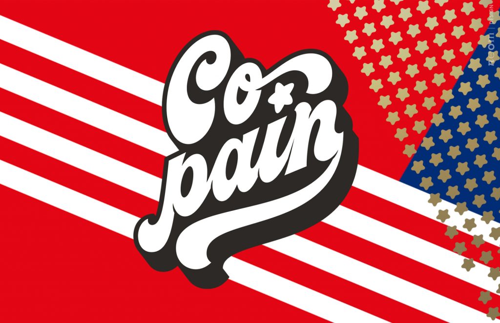
Copain is a French word meaning friends or me and my partner. The French word also has another meaning: the term is generally used to denote a bread company. The term has been adopted by Sarl Chez Perle de Sucre, an Algerian company within the industrial bakery sector.

With Copain, the Algerian company announces its entry into a border marketing sector. Sarl Chez Perle de Sucre approached the Padua-based design agency Neom to create the packaging design for the new brand. The design agency mentions:

“The indication received was very clear: follow the concept of the ‘American Look like’ or to propose an offer of products inspired by American food culture, therefore sandwiches, hot-dogs, etc.

Among the various conceptual areas proposed, the company found itself closer to the typical American pop style. A classic Evergreen capable of overcoming the barriers of time expertly updated thanks to the use of a photographic cut and a contemporary layout setting.”
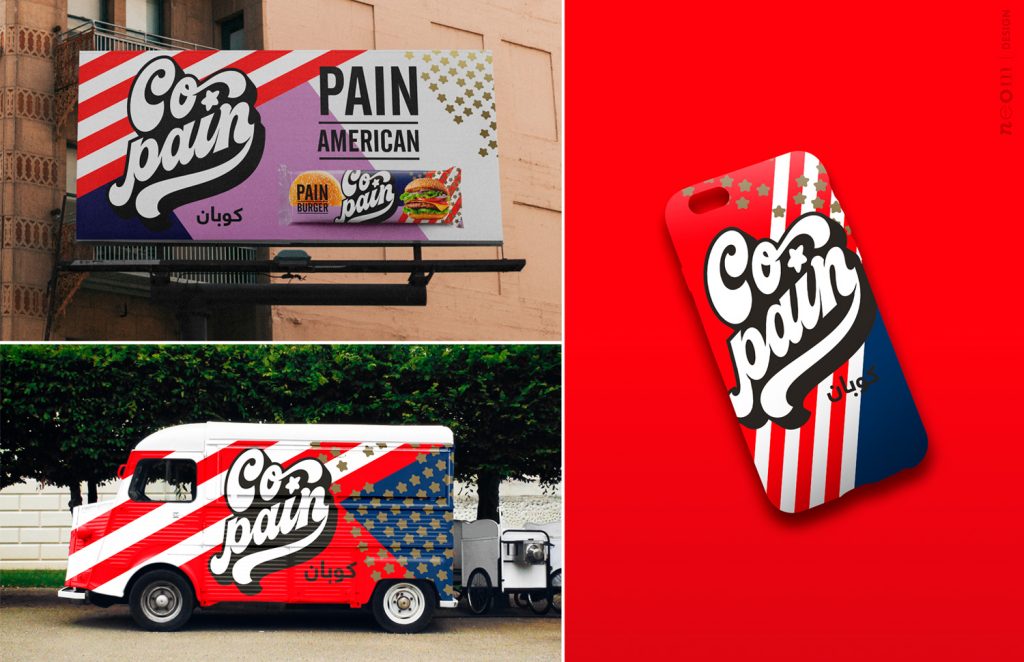
Packaging Design Of Copain

The packaging

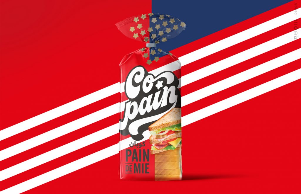
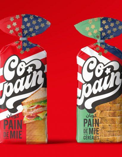
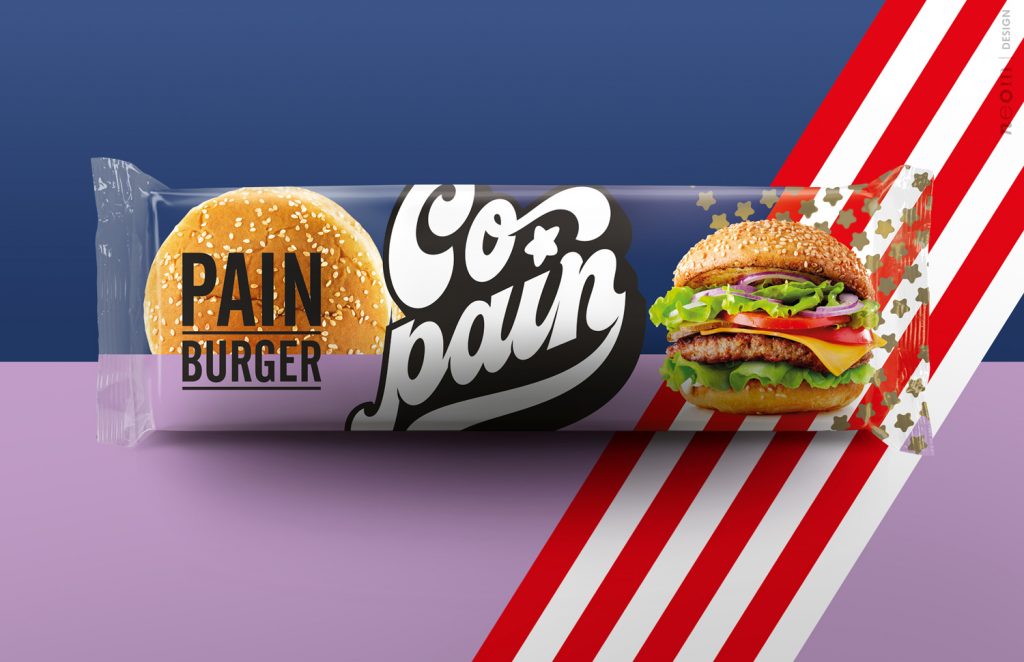
The packaging design reminds one of the American flags, increasing the shelf value of the product. In addition to the logo, the packaging contains the image of the product that raises the appetite appeal.

“The final result is a strong range of products with very high personality, recognition and shelf impact. A real product innovation but above all of style that could easily overcome the boundaries of the country where it was born.

Get the latest packaging design inspiration in your inbox:

Popular designs

The Port Vodka Lemon Water

Overview: In response to my client’s vision for a Cape Cod themed beverage brand, I embarked on the journey to create The Port

Designed by: PepsiCo Design & Innovation
Country: United States

Packaging Design Of Copain

Neom_Copain_02

Designed by: Neom | Country: Italy

Copain is a French word meaning friends or me and my partner. The French word also has another meaning: the term is generally used to denote a bread company. The term has been adopted by Sarl Chez Perle de Sucre, an Algerian company within the industrial bakery sector.

With Copain, the Algerian company announces its entry into a border marketing sector. Sarl Chez Perle de Sucre approached the Padua-based design agency Neom to create the packaging design for the new brand. The design agency mentions:

“The indication received was very clear: follow the concept of the ‘American Look like’ or to propose an offer of products inspired by American food culture, therefore sandwiches, hot-dogs, etc.

Among the various conceptual areas proposed, the company found itself closer to the typical American pop style. A classic Evergreen capable of overcoming the barriers of time expertly updated thanks to the use of a photographic cut and a contemporary layout setting.”
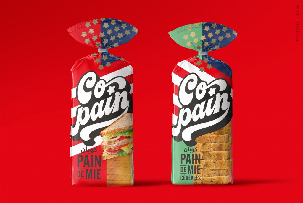
Packaging Design Of Copain

The packaging

The packaging design reminds one of the American flags, increasing the shelf value of the product. In addition to the logo, the packaging contains the image of the product that raises the appetite appeal.

“The final result is a strong range of products with very high personality, recognition and shelf impact. A real product innovation but above all of style that could easily overcome the boundaries of the country where it was born.

Previous slide
Next slide

Explore more great package design

Get the latest on packaging design in your inbox: