Designed by: Zuzanna Walas | Country: Poland
Rai, a dietary supplement brand, recently collaborated with the Poland-based design agency, Zuzanna Walas, to create its branding and packaging. Rai is a women’s well-being brand focused on creating products that are natural, vegan, and organic.
The products
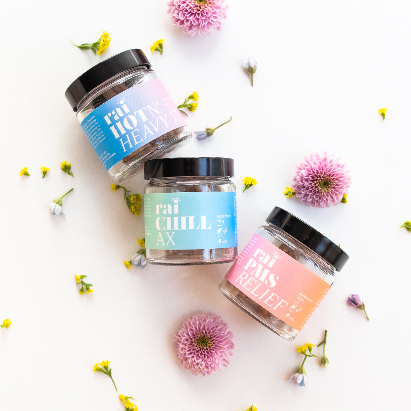
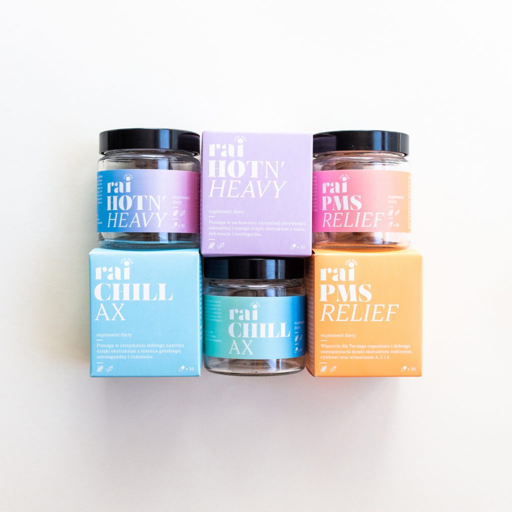
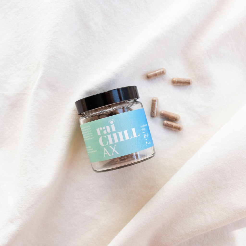
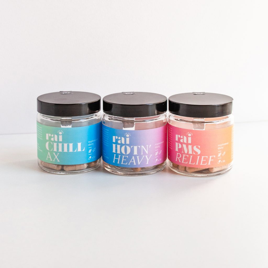
“Rai for her offers three products: CHILLAX for stress reduction, PMS RELIEF for reduction of tension and irritability during PMS and HOT N’ HEAVY to enhance libido. All products are 100% natural, vegan and gluten free.”

The packaging
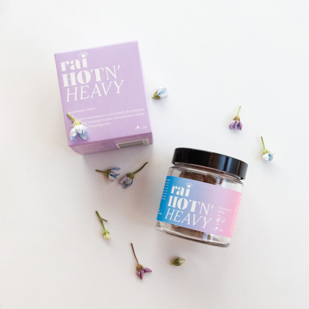
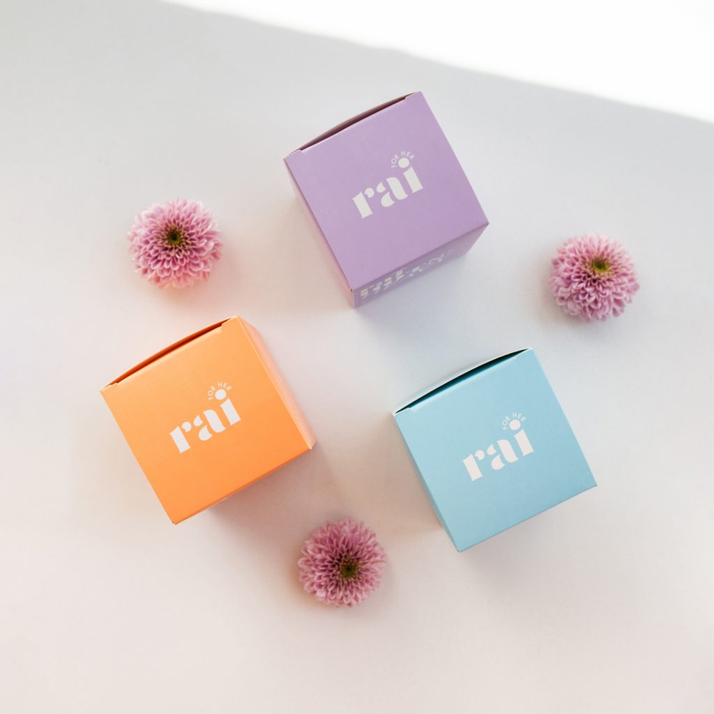
The idea behind the branding and packaging design is to communicate the “heavenly, light, and relaxed” feeling associated with the products.
According to the brand, the word “Rai” is associated with “Raj,” which in Polish translates to heaven. The packaging design of Rai is based on the meaning associated with the brand name.
“…The heaven metaphor was visually translated into colorful and soft gradients that can be read as a rainbow when placed next to each other, creating a whole spectrum of health help. Gradients also reflect the idea of change: the product helps you transition from one state to another. The chosen colors reflect these transformations…”

