Designed by: PepsiCo Design & Innovation
Country: United States

Packaging Design: East Point Coffee

Designed by: Brett Lair | Country: Canada

Whether you are a musician, a filmmaker, or a graphic designer, once you get a creative hunch, you become restless as long as you don’t see it materialize. The packaging design for the fictional East Point Coffee, created by the talented graphic artist Brett Lair, was born out of the desire to express his creative hunch on paper.

The creative artist mentions:

While I’ve never been to the East Coast of Canada (it’s on the bucket list!), I’ve had this idea floating around for a while now. I wanted to come up with an East Coast/lighthouse inspired identity and see how that could play out with various identity assets, branding and a lineup of products for packaging.

Packaging Design: East Point Coffee

The packaging

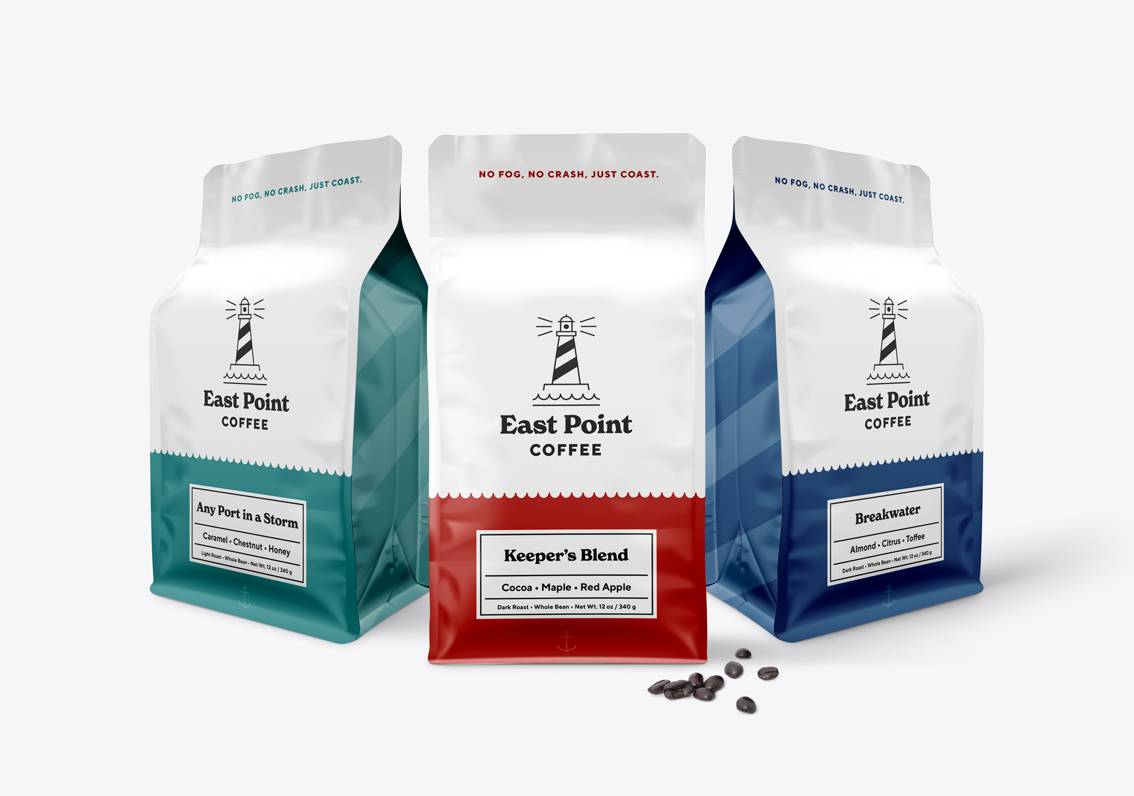
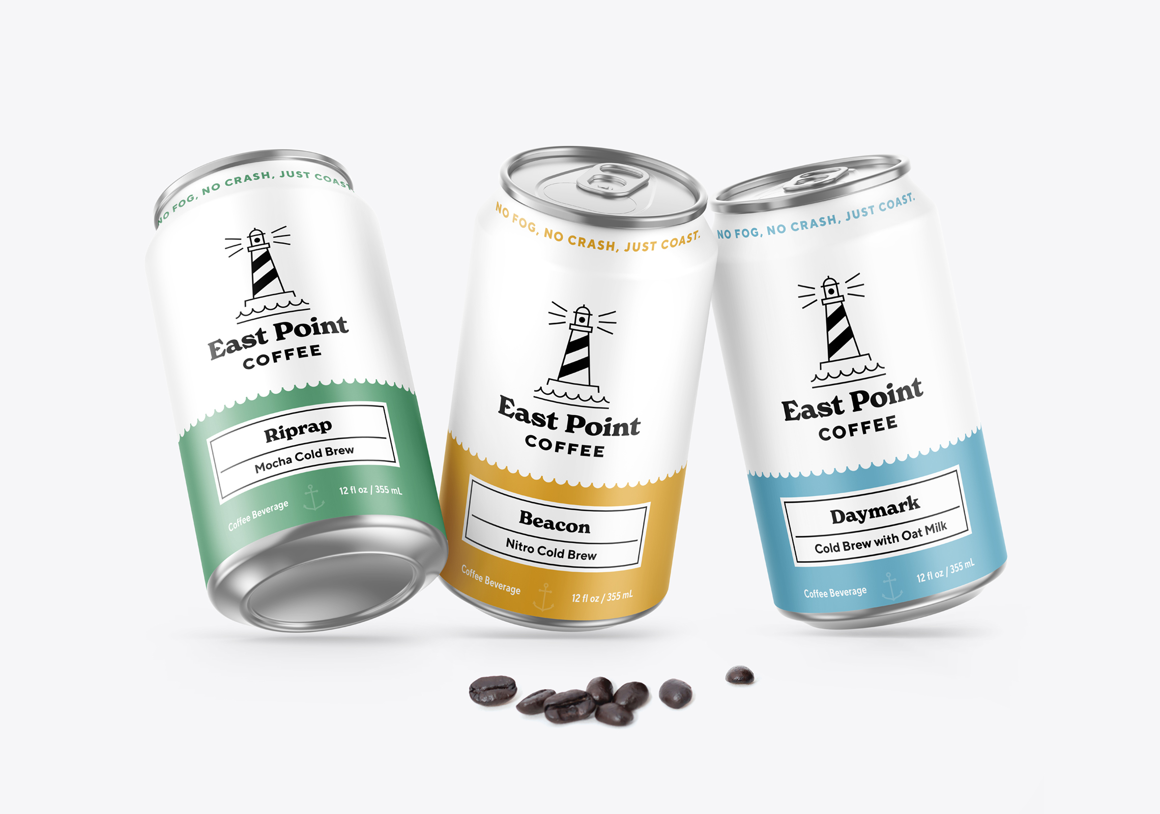
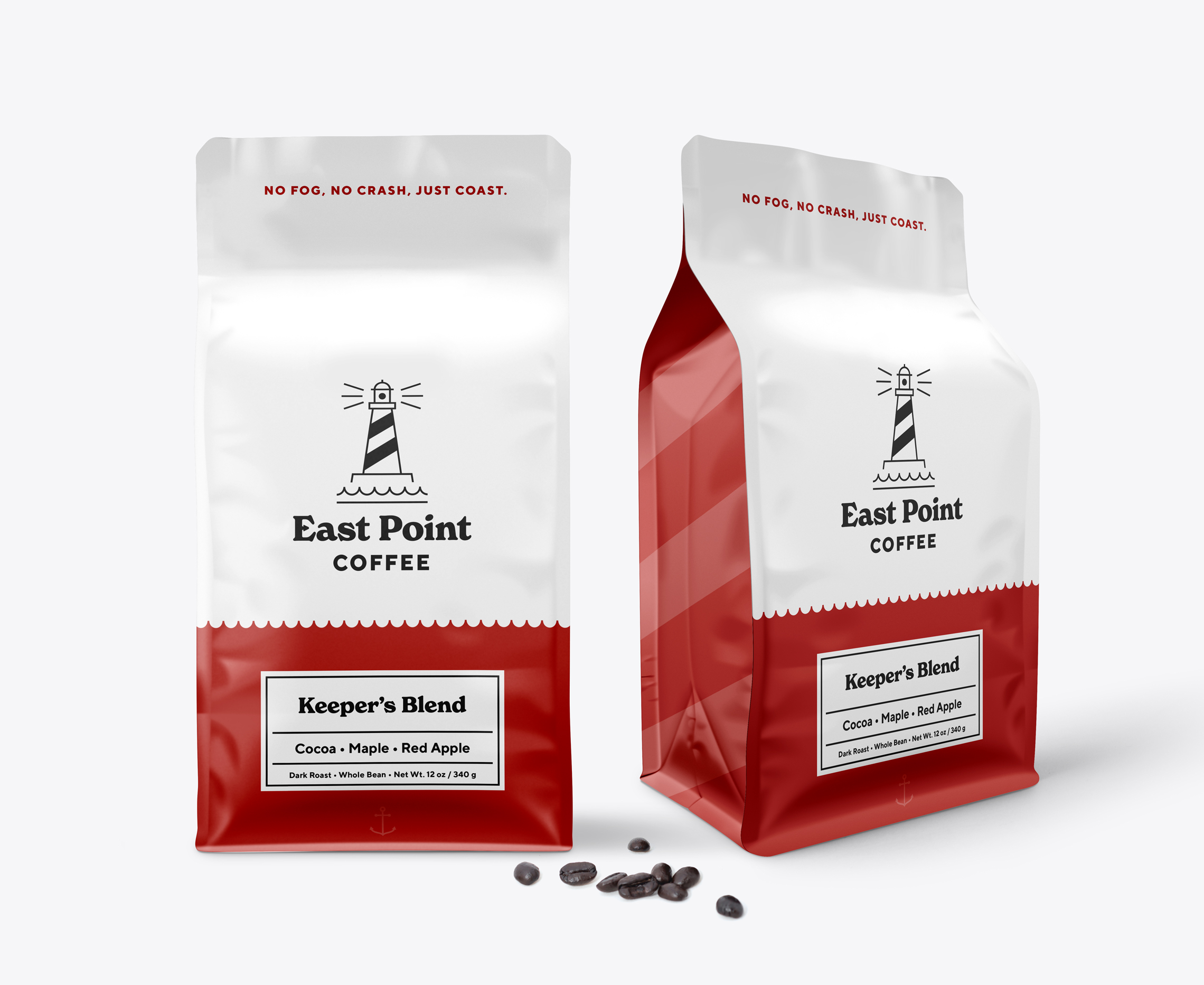
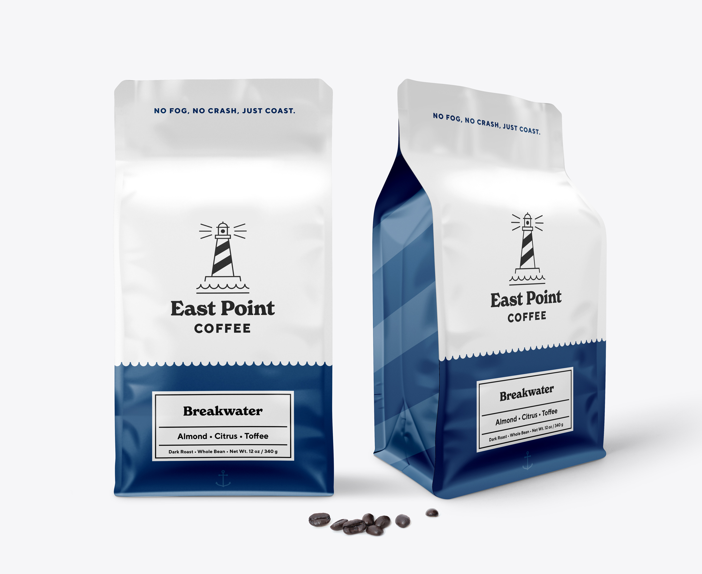
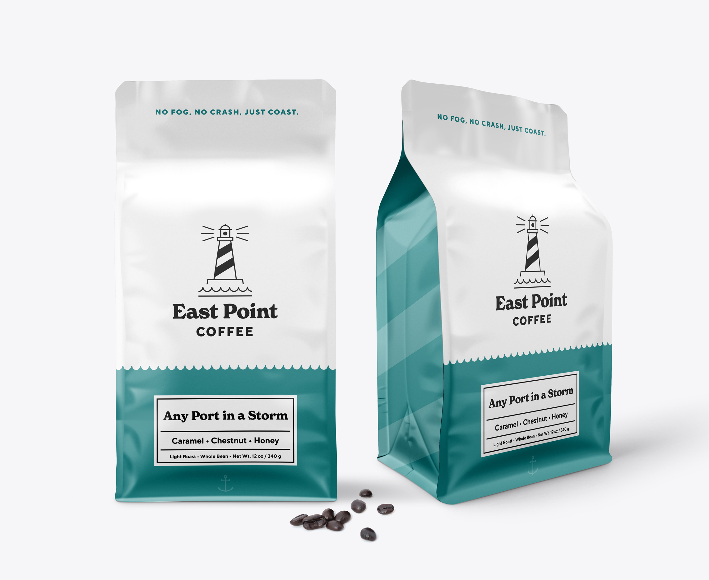
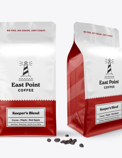
The centerpiece of the packaging design is the lighthouse. Just below the Lighthouse is the East Point Coffee wordmark. Each flavor has been assigned a color, making it easier for the customers to choose their favorite pack. For example, the mix of Cocoa, Maple, and Red Apple comes in a red pack, whereas the blend of Caramel, Chestnut, and Honey comes in a green package.

“Once I had the name, various identity lockups, and tagline sorted out and designed, I got into the design for the coffee pouch packaging. The waves from the identity were used to add color and separation to the bag where the name and flavor notes are displayed, while the angled stripes from the lighthouse create the pattern on the side.” 

Get the latest packaging design inspiration in your inbox:

Popular designs

Far Out Bar

Description: Far Out Bar is a cutting-edge packaging design project created for High Life Farms’ macrodose THC chocolate bars. This project involved

Over the wave

This Kombucha originates in Lombok, Indonesia, where its paradise beaches attract hundreds of surfers eager to ride the waves. When you surf,

Pure Persian Honey

When we look closely at honey packaging, they are almost all in the usual format, and the ultimate in creativity is that

Designed by: PepsiCo Design & Innovation
Country: United States

Packaging Design: East Point Coffee

3-eastpointcoffee-bag-keepers-world-brand-design

Designed by: Brett Lair | Country: Canada

Whether you are a musician, a filmmaker, or a graphic designer, once you get a creative hunch, you become restless as long as you don’t see it materialize. The packaging design for the fictional East Point Coffee, created by the talented graphic artist Brett Lair, was born out of the desire to express his creative hunch on paper.

The creative artist mentions:

While I’ve never been to the East Coast of Canada (it’s on the bucket list!), I’ve had this idea floating around for a while now. I wanted to come up with an East Coast/lighthouse inspired identity and see how that could play out with various identity assets, branding and a lineup of products for packaging.

Packaging Design: East Point Coffee

The packaging

The centerpiece of the packaging design is the lighthouse. Just below the Lighthouse is the East Point Coffee wordmark. Each flavor has been assigned a color, making it easier for the customers to choose their favorite pack. For example, the mix of Cocoa, Maple, and Red Apple comes in a red pack, whereas the blend of Caramel, Chestnut, and Honey comes in a green package.

“Once I had the name, various identity lockups, and tagline sorted out and designed, I got into the design for the coffee pouch packaging. The waves from the identity were used to add color and separation to the bag where the name and flavor notes are displayed, while the angled stripes from the lighthouse create the pattern on the side.” 

Previous slide
Next slide

Explore more great package design

Get the latest on packaging design in your inbox: