Designed by: PepsiCo Design & Innovation
Country: United States

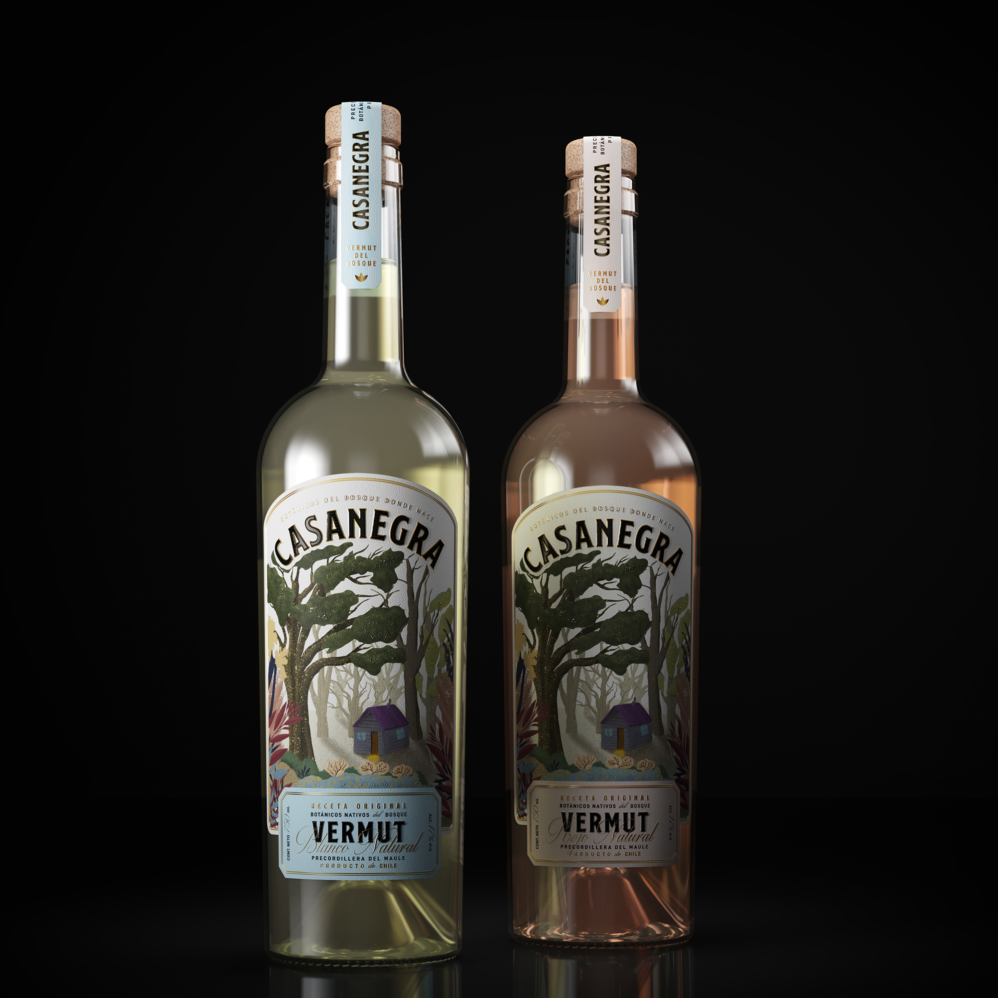
Packaging Design: Casanegra Vermut

Designed by: Zig Design Studio | Argentina

Created by Betina Uzcudun and Paulo Escobar in Maule Valley, Chile, Casanegra began its journey in 2011. Betina and Paulo walk the rugged yet beautiful terrain identifying different spices which would eventually find their way into the White and Rosso Vermut bottles.

This project started in 2011 as an experiment. These two nature guardians started mixing different spices to make a beverage that would represent the native forest flavors.

They tried many recipes until they found the best match for their Vermut. When they were comfortable with the result they started making some friends try it. The rest is history…”
Packaging Design: Casanegra Vermut

The packaging

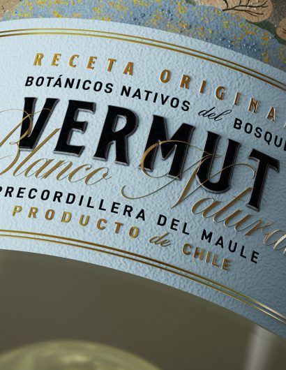
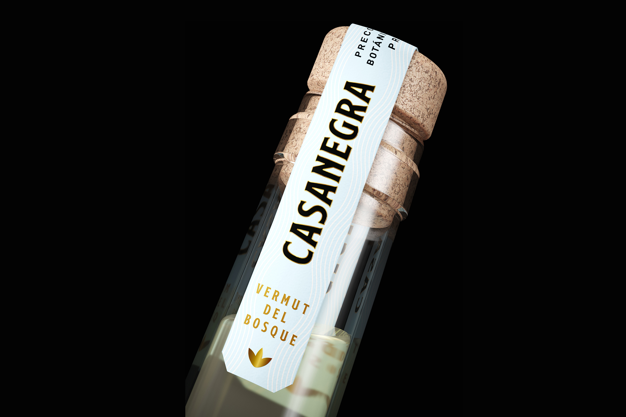
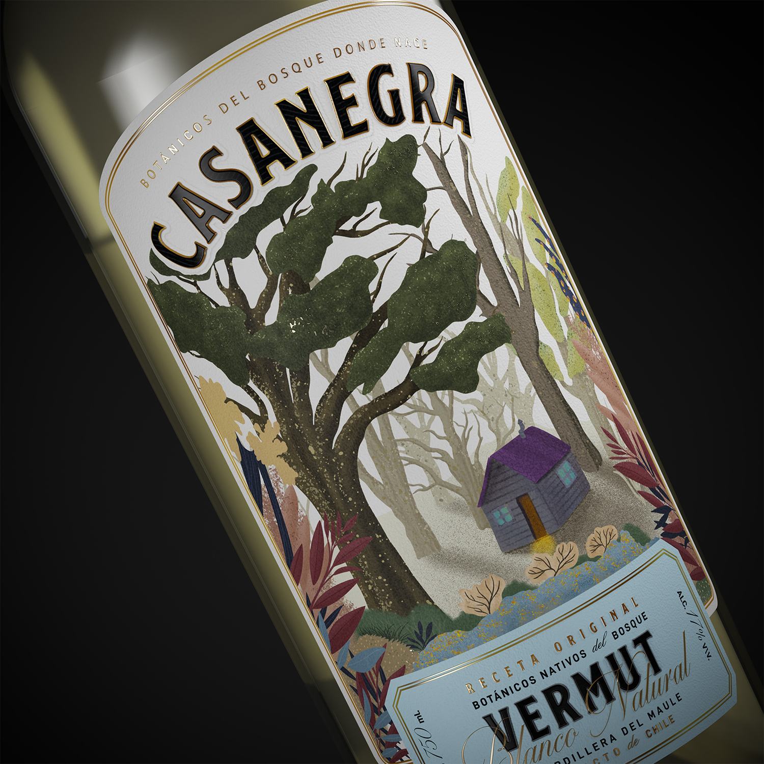
Betina and Paulo collaborated with the Mendoza-based creative agency, Zig Design Studio, to create compelling packaging designs for the brand. The illustration on the label depicts the beautiful surroundings of the distillery.

Since the elaboration is sustainable and respectful of the environment we wanted to give this label a soft and colorful look and feel where people can see between the leaves.

Something that we wanted to show in the illustration was the cozy way they are used to live up in the forest. The cabin is surrounded by many different trees and bushes. The smokey chimney on the rooftop and the different kinds of leaves that you can find over there give us that idea.

Get the latest packaging design inspiration in your inbox:

Popular designs

The Bra Guru

Most women are wearing the wrong size bra and that is a fact. The Bra Guru® is the first and only professional

Pure Persian Honey

When we look closely at honey packaging, they are almost all in the usual format, and the ultimate in creativity is that

Burma Love Rebrand

Love at First BiteAs an extension of the Burma Superstar restaurant in San Francisco, Burma Love Foods gives diners an opportunity to

Designed by: PepsiCo Design & Innovation
Country: United States

Packaging Design: Casanegra Vermut

2-casanegra

Designed by: Zig Design Studio | Argentina

Created by Betina Uzcudun and Paulo Escobar in Maule Valley, Chile, Casanegra began its journey in 2011. Betina and Paulo walk the rugged yet beautiful terrain identifying different spices which would eventually find their way into the White and Rosso Vermut bottles.

This project started in 2011 as an experiment. These two nature guardians started mixing different spices to make a beverage that would represent the native forest flavors.

They tried many recipes until they found the best match for their Vermut. When they were comfortable with the result they started making some friends try it. The rest is history…”
Packaging Design: Casanegra Vermut

The packaging

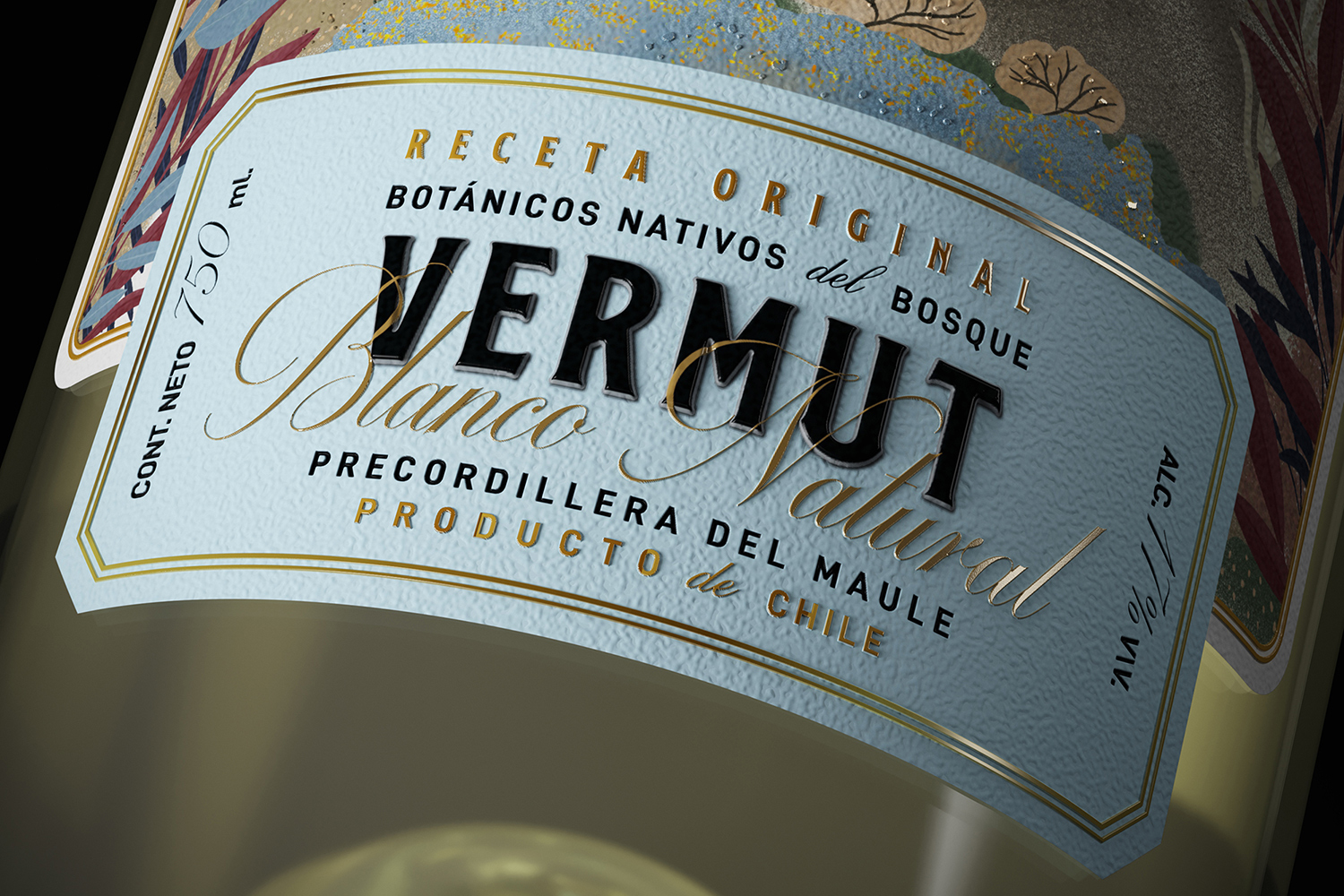
Betina and Paulo collaborated with the Mendoza-based creative agency, Zig Design Studio, to create compelling packaging designs for the brand. The illustration on the label depicts the beautiful surroundings of the distillery.

Since the elaboration is sustainable and respectful of the environment we wanted to give this label a soft and colorful look and feel where people can see between the leaves.

Something that we wanted to show in the illustration was the cozy way they are used to live up in the forest. The cabin is surrounded by many different trees and bushes. The smokey chimney on the rooftop and the different kinds of leaves that you can find over there give us that idea.

Previous slide
Next slide

Explore more great package design

Get the latest on packaging design in your inbox: