Designed by: PepsiCo Design & Innovation
Country: United States

Packaging Design: Mädchen Wein

Designed by:  Franziska Böttcher Studio | Country: Germany

Mädchen Wein teamed up with the Berlin-based design agency, Franziska Böttcher Studio, to create packaging designs that would highlight the power of conversation. The wine brand recognizes and celebrates beautiful conversations with our girlfriends.

A glass of wine can make a good talk become a great one. This wine is for all those great talks with our girl friends – the sad and the happy ones, the silly and the serious ones, the calm and the furious ones. For all the situations life throws at us: new and lost loves, good and bad work days, new adventures, old wounds and great celebrations. It’s not an „a girls make cute wine for girls“-wine. It’s a wine with character for real talks between real women. A true Mädchen Wein (girls wine).

Packaging Design: Mädchen Wein

The packaging

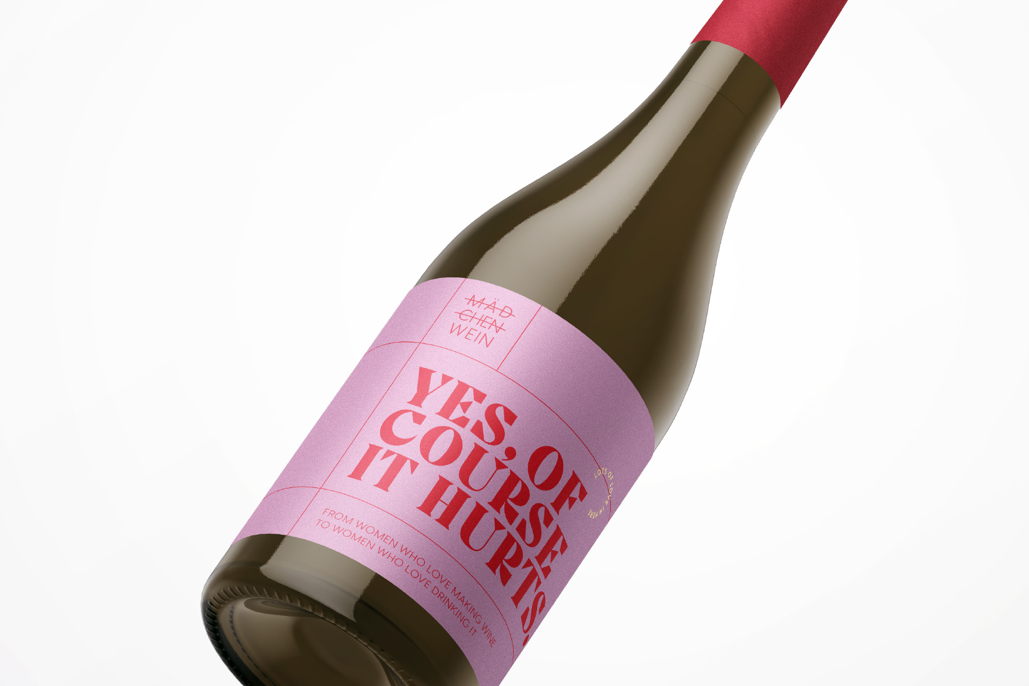
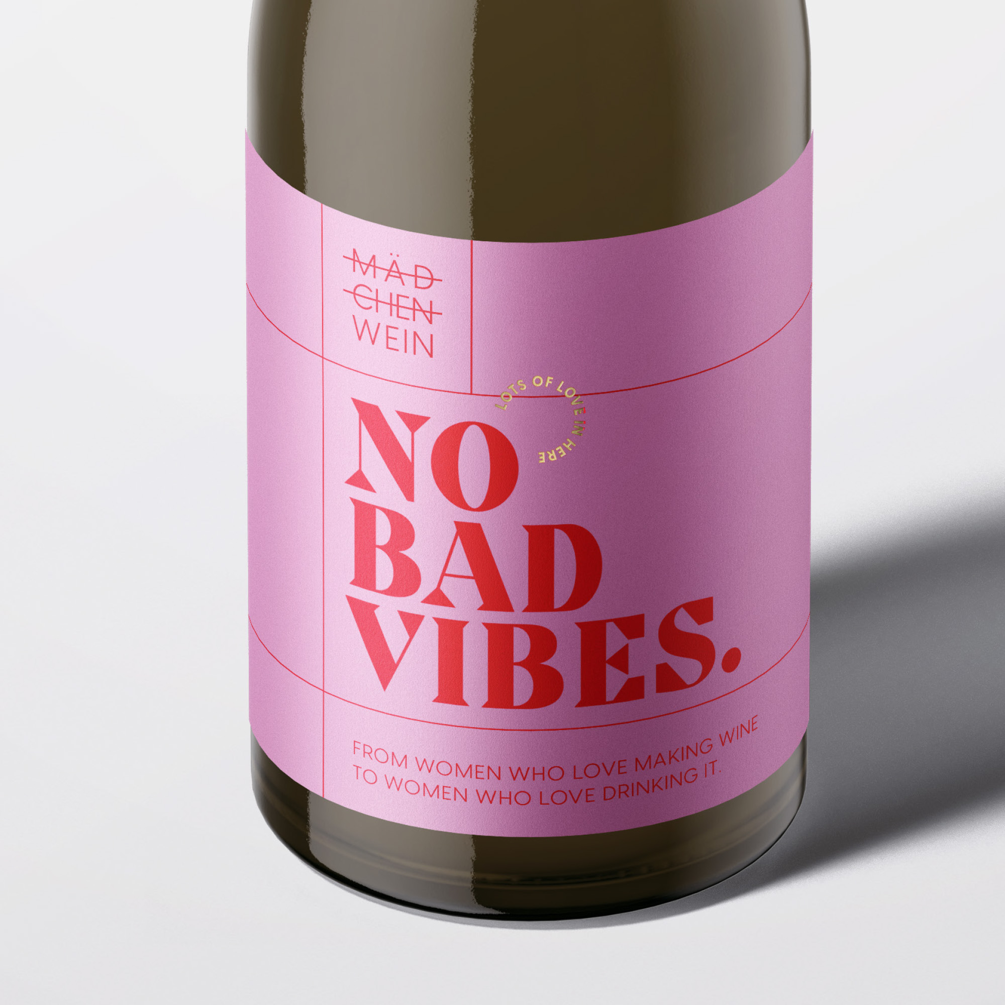
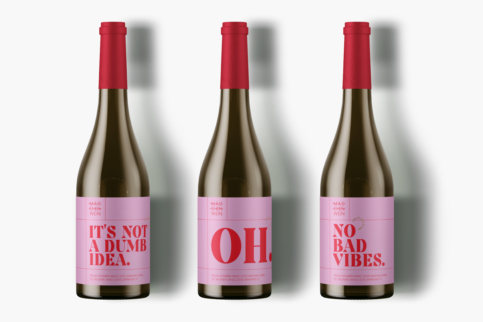
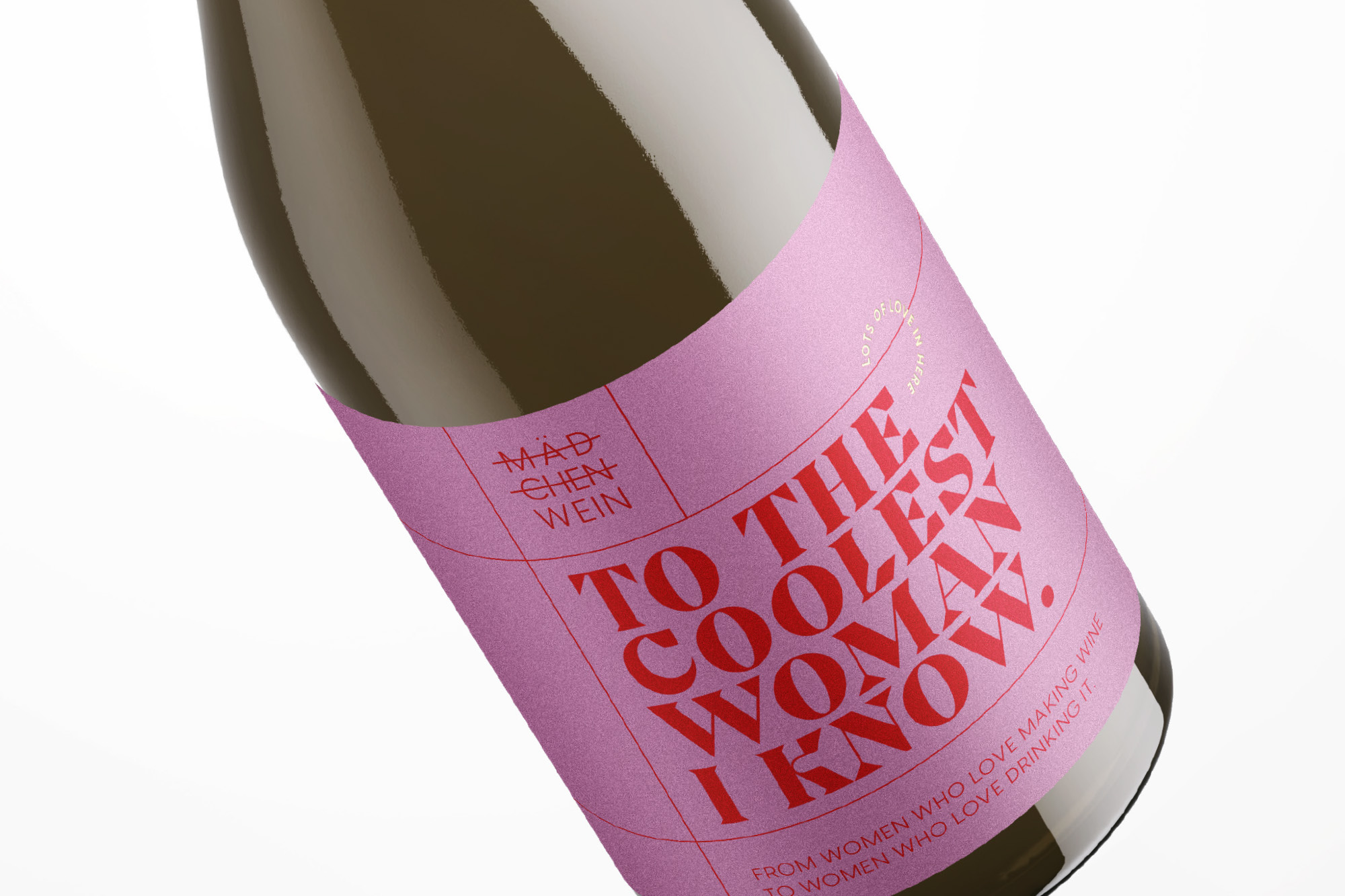
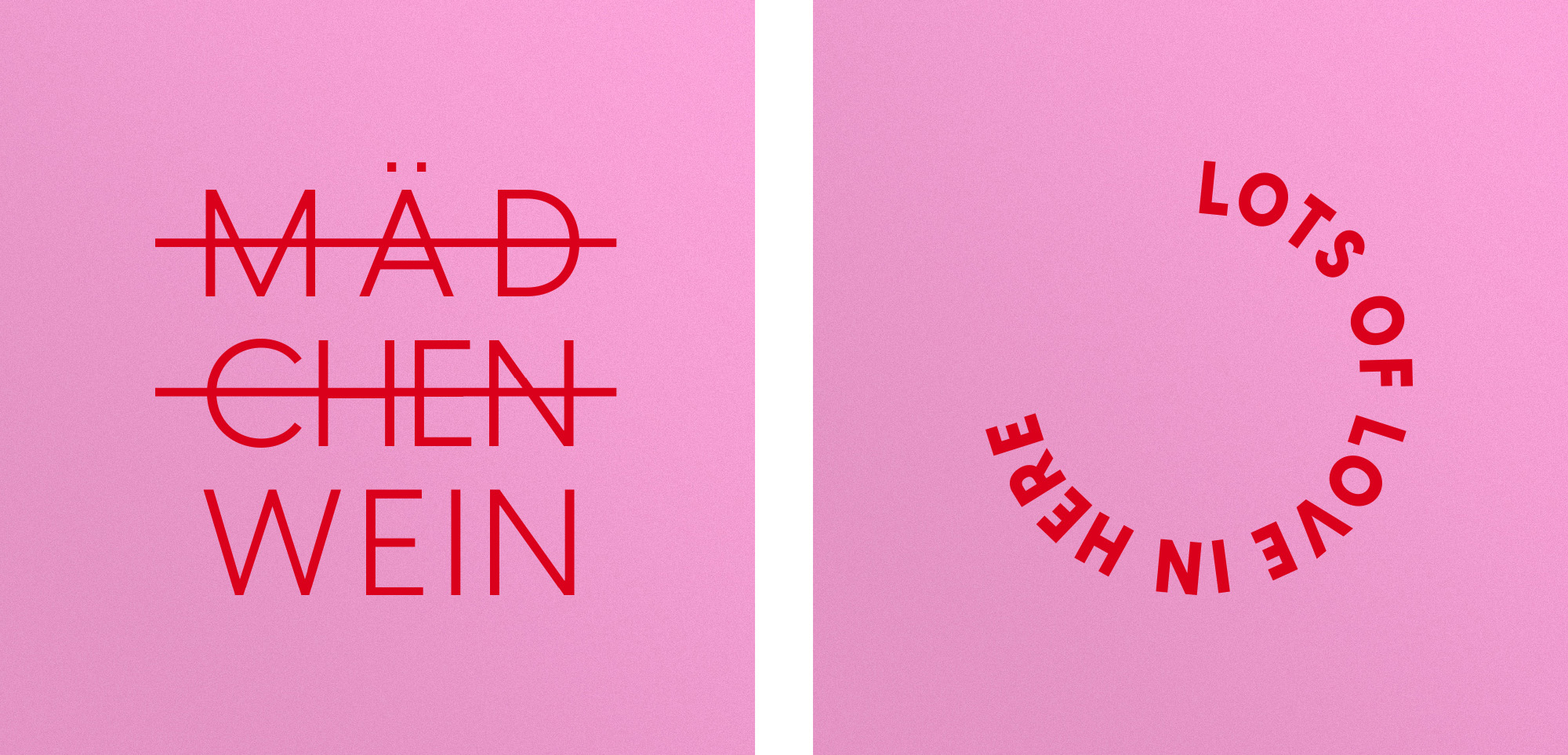
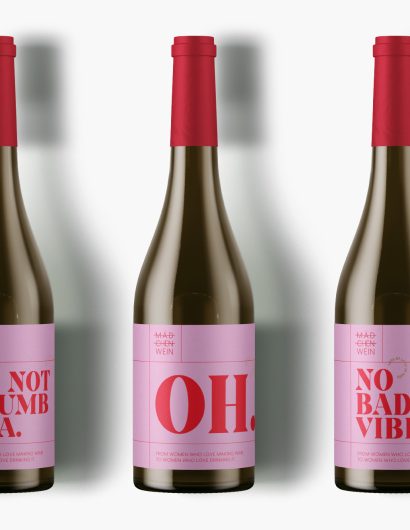
The design agency used a combination of red and pink, which gives the brand a contemporary touch. Furthermore, the grid of red lines makes the brand look more serious. The typography compliments and accentuates the look of the beer brand.

On the label pink and red are coming together in a vibrant, fun and very contemporary way. A grid of fine red lines adds structure to the design and gives it a more serious and grown up look. These elements are accompanied by bold yet elegant typography that is full of character and strength – embodying the strength of all the women coming together having these wines. A small and lovely detail is the golden seal that says „lots of love inside“ – referring to the craft and devotion of the winemakers as well as to the friendships the wines are lucky enough to witness.

Get the latest packaging design inspiration in your inbox:

Popular designs

Pure Persian Honey

When we look closely at honey packaging, they are almost all in the usual format, and the ultimate in creativity is that

Over the wave

This Kombucha originates in Lombok, Indonesia, where its paradise beaches attract hundreds of surfers eager to ride the waves. When you surf,

The Port Vodka Lemon Water

Overview: In response to my client’s vision for a Cape Cod themed beverage brand, I embarked on the journey to create The Port

The Bra Guru

Most women are wearing the wrong size bra and that is a fact. The Bra Guru® is the first and only professional

Designed by: PepsiCo Design & Innovation
Country: United States

Packaging Design: Mädchen Wein

FranziskaBoettcher_Maedchenwein_Packaging_3

Designed by:  Franziska Böttcher Studio | Country: Germany

Mädchen Wein teamed up with the Berlin-based design agency, Franziska Böttcher Studio, to create packaging designs that would highlight the power of conversation. The wine brand recognizes and celebrates beautiful conversations with our girlfriends.

A glass of wine can make a good talk become a great one. This wine is for all those great talks with our girl friends – the sad and the happy ones, the silly and the serious ones, the calm and the furious ones. For all the situations life throws at us: new and lost loves, good and bad work days, new adventures, old wounds and great celebrations. It’s not an „a girls make cute wine for girls“-wine. It’s a wine with character for real talks between real women. A true Mädchen Wein (girls wine).

Packaging Design: Mädchen Wein

The packaging

The design agency used a combination of red and pink, which gives the brand a contemporary touch. Furthermore, the grid of red lines makes the brand look more serious. The typography compliments and accentuates the look of the beer brand.

On the label pink and red are coming together in a vibrant, fun and very contemporary way. A grid of fine red lines adds structure to the design and gives it a more serious and grown up look. These elements are accompanied by bold yet elegant typography that is full of character and strength – embodying the strength of all the women coming together having these wines. A small and lovely detail is the golden seal that says „lots of love inside“ – referring to the craft and devotion of the winemakers as well as to the friendships the wines are lucky enough to witness.

Previous slide
Next slide

Explore more great package design

Get the latest on packaging design in your inbox: