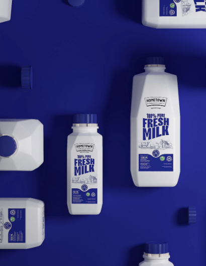
Designed by: Widarto Impact | Country: Indonesia
HowmeTown, a new Indonesian brand, is all set to capture the dairy market segment in the country. One of the unique selling propositions of the brand is its products. The brand only uses freshly procured dairy products from farms with a healthy level of pasteurization. While the company boasts of manufacturing high-quality products: it is facing major roadblocks in terms of visibility on the shelf.
“But over time, there are several obstacles faced by HomeTown, one of which is not easy by consumers to recognize HomeTown products on supermarket shelves. Of course this is a problem in itself considering the competition in the milk market in Indonesia is so tight.
Face to face with several global competitors and big local companies, of course HomeTown must change the face of its packaging to be relevant to the competition and the market.”
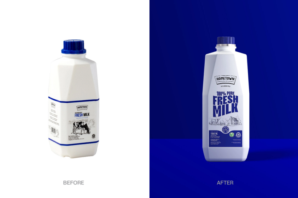
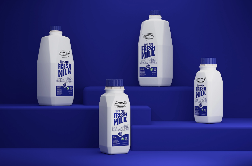
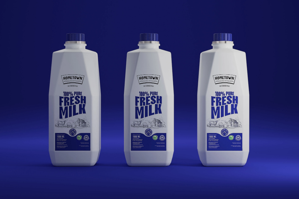
The packaging
HomeTown partnered with Widarto Impact, a Trenggalek-based creative studio, to create packaging designs that would enhance the shelf value of the products.
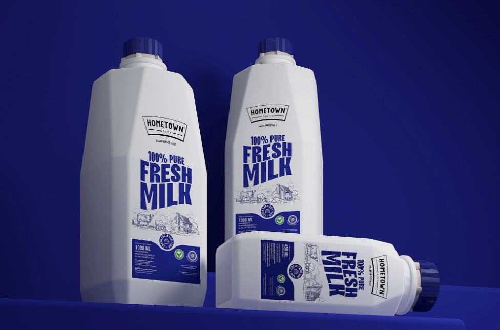
Eko Widarto, the creative director, wanted the packaging to scream the product’s USP while maintaining the brand’s core personality: “simple, clear, and fun.”
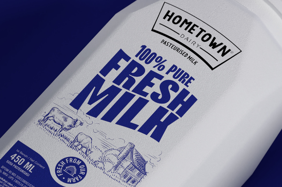
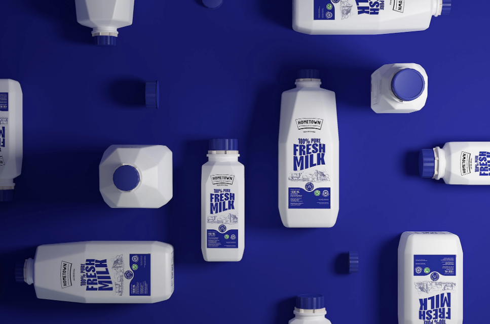
“We chose Pantone Blue 072C as the main color to replace the previous blue color which often inconsistent. This blue color is also one of the points recognized by customers.
We highlight the statement “100% Pure Fresh Milk” as a point of view of HomeTown’s new design label with a combination of cow farm illustrations.
Overall, the HomeTown label’s new design looks artisanal, youthful, and modern. This is to connect with HomeTown’s target market, namely young families, especially young mothers.”


