Designed by: PepsiCo Design & Innovation
Country: United States

Mimosa Yoghurts Packaging Design

Designed by: Volta Brand Shaping Studio | Country: Portugal

Mimosa has been a major player in the dairy sector for fifty years. While the dairy brand is known for its superior-quality products, “its packaging lacked differentiation and consistency.”

Mimosa decided it was time for rebranding with the idea of creating “proximity and trust” with the old customers while reaching out to new ones.

We started with a careful analysis of the strengths and weaknesses of the current packs: the strong colors, brand presence and clarity of the product were positive points, but the visual style, the yoghurt “splashes” and the typography used conveyed a low-cost image that Mimosa would have to move away from.

Mimosa Yoghurts Packaging Design

The packaging

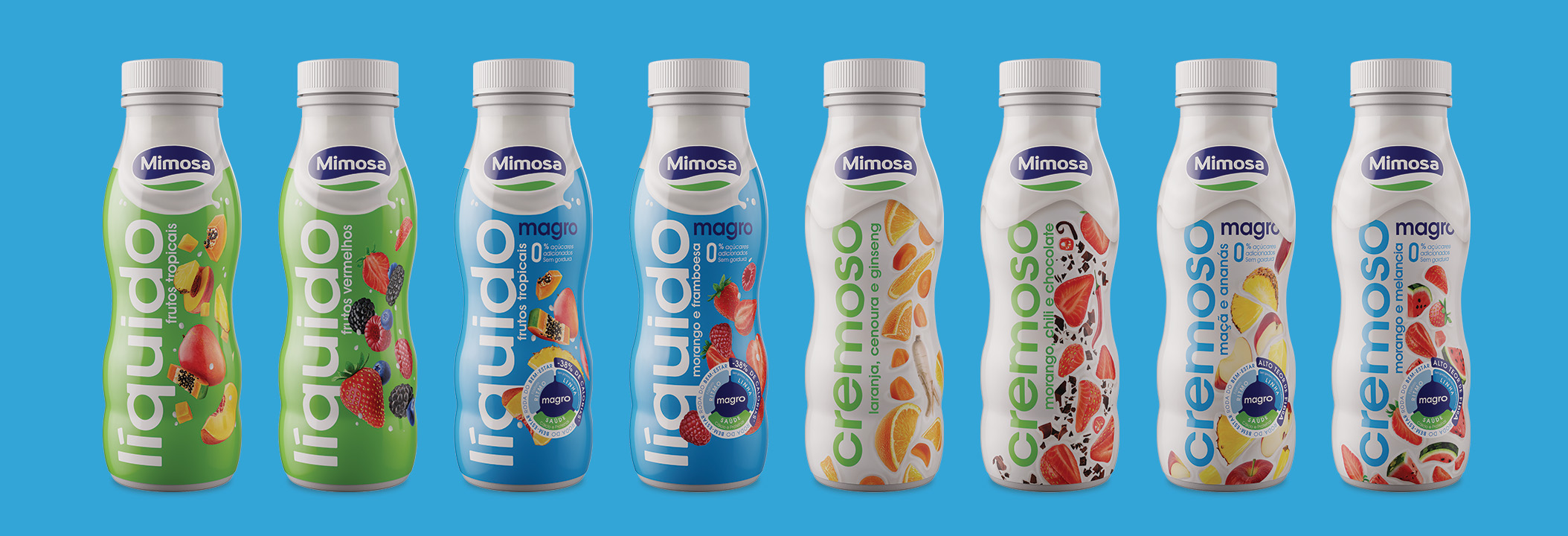
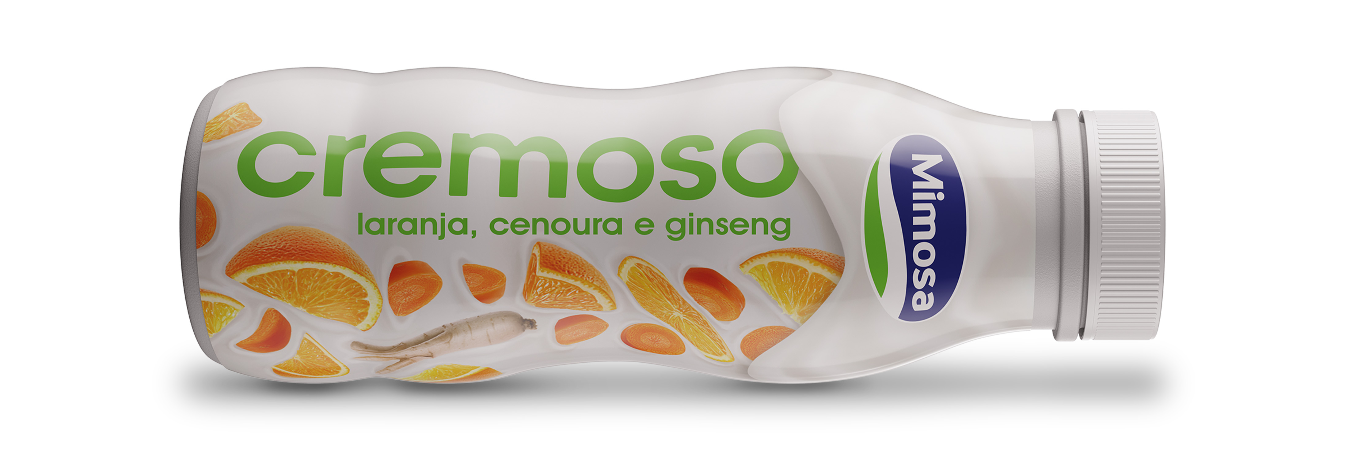
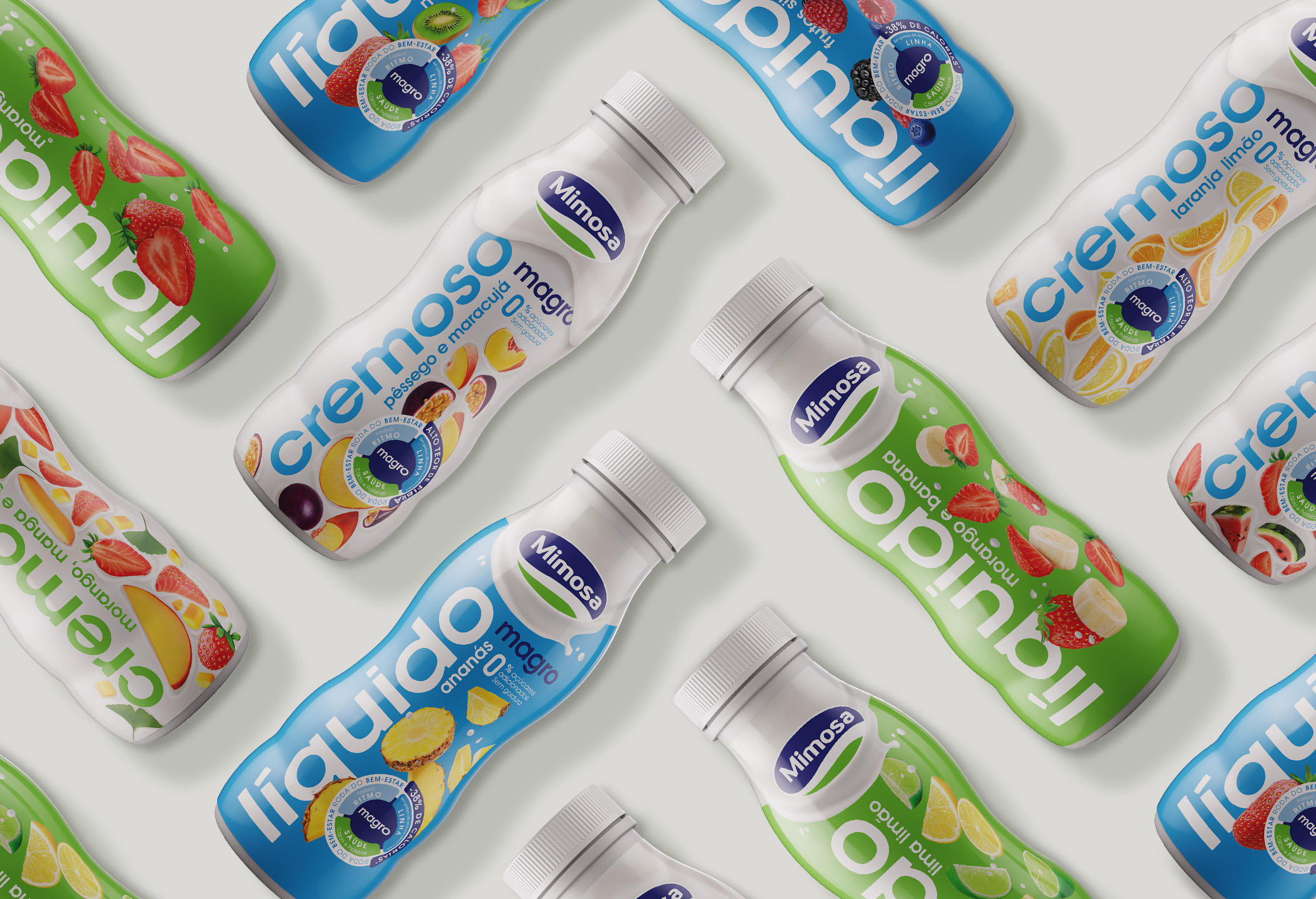
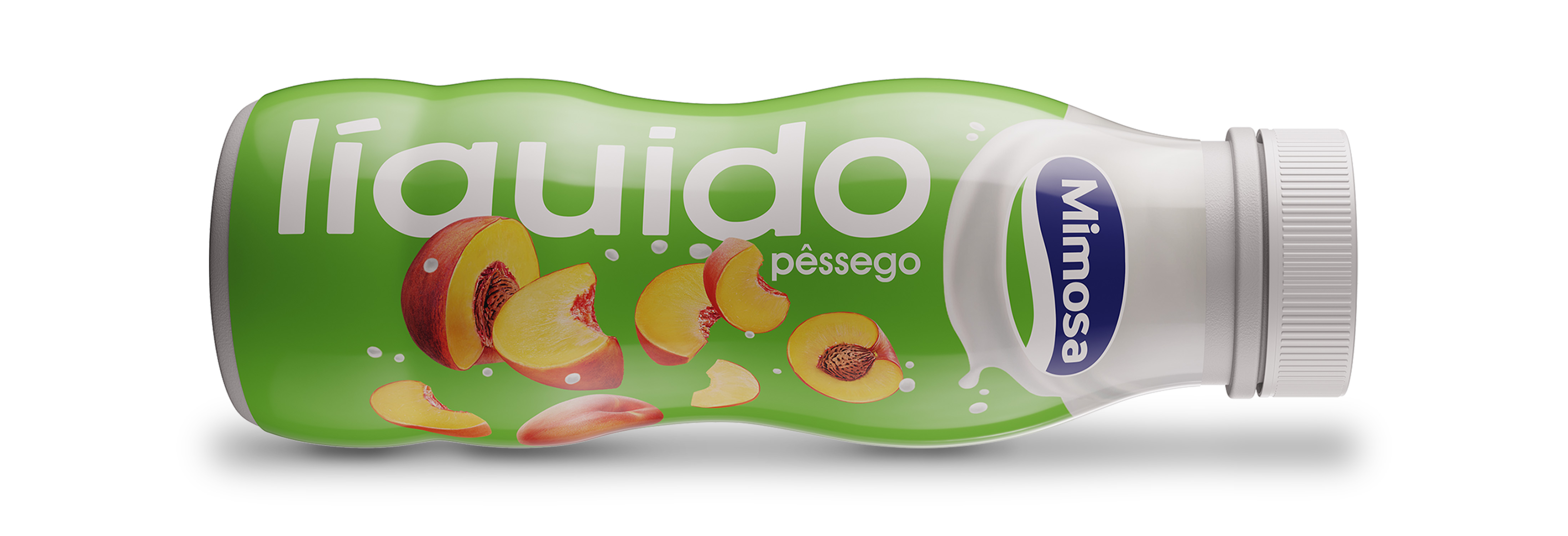
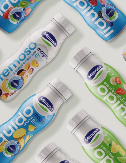
Mimosa teamed up with Volta Brand Shaping Studio, a Porto-based creative agency, to create packaging designs for its Liquidos and Cremoso Yoghurt brands. The design studio created new colors and added new illustrations on the packaging labels. While Liquidos can now be seen in stylish green and blue backgrounds, the primary color used on the packaging label of Cremoso is creamy white.

“With an approachable, modern and innovating image of great versatility and coherence, Mimosa yoghurts are now a true reflection of the brand’s values, that now claims its spot as the Portuguese families choice for quality, convenience, happiness, and above all, lots of flavor.

Get the latest packaging design inspiration in your inbox:

Popular designs

The Port Vodka Lemon Water

Overview: In response to my client’s vision for a Cape Cod themed beverage brand, I embarked on the journey to create The Port

Pure Persian Honey

When we look closely at honey packaging, they are almost all in the usual format, and the ultimate in creativity is that

Over the wave

This Kombucha originates in Lombok, Indonesia, where its paradise beaches attract hundreds of surfers eager to ride the waves. When you surf,

Designed by: PepsiCo Design & Innovation
Country: United States

Mimosa Yoghurts Packaging Design

Mimosa 4

Designed by: Volta Brand Shaping Studio | Country: Portugal

Mimosa has been a major player in the dairy sector for fifty years. While the dairy brand is known for its superior-quality products, “its packaging lacked differentiation and consistency.”

Mimosa decided it was time for rebranding with the idea of creating “proximity and trust” with the old customers while reaching out to new ones.

We started with a careful analysis of the strengths and weaknesses of the current packs: the strong colors, brand presence and clarity of the product were positive points, but the visual style, the yoghurt “splashes” and the typography used conveyed a low-cost image that Mimosa would have to move away from.

Mimosa Yoghurts Packaging Design

The packaging

Mimosa teamed up with Volta Brand Shaping Studio, a Porto-based creative agency, to create packaging designs for its Liquidos and Cremoso Yoghurt brands. The design studio created new colors and added new illustrations on the packaging labels. While Liquidos can now be seen in stylish green and blue backgrounds, the primary color used on the packaging label of Cremoso is creamy white.

“With an approachable, modern and innovating image of great versatility and coherence, Mimosa yoghurts are now a true reflection of the brand’s values, that now claims its spot as the Portuguese families choice for quality, convenience, happiness, and above all, lots of flavor.

Previous slide
Next slide

Explore more great package design

Get the latest on packaging design in your inbox: