Designed by: PepsiCo Design & Innovation
Country: United States

Asda Organic Packaging Design

1

Designed by: OurCreative | Country: UK

Keeping things natural and organic is the way to a sustainable future. With global temperatures reaching concerning levels, it only makes sense to limit our carbon emissions and adopt a lifestyle in sync with nature. Asda’s organic range of healthy food is a positive step towards keeping the planet healthy.

Organic was the buzzword of the early noughties, this original trend finds itself in a world where exciting, fresh developing food trends quickly emerge appealing to its audiences like a smack on the lips! But caring for the planet and making ethical choices is here to stay. Asda wanted to make organic choices accessible to all with clear communication of the benefits to a value seeking audience.

Asda Organic Packaging Design

The packaging

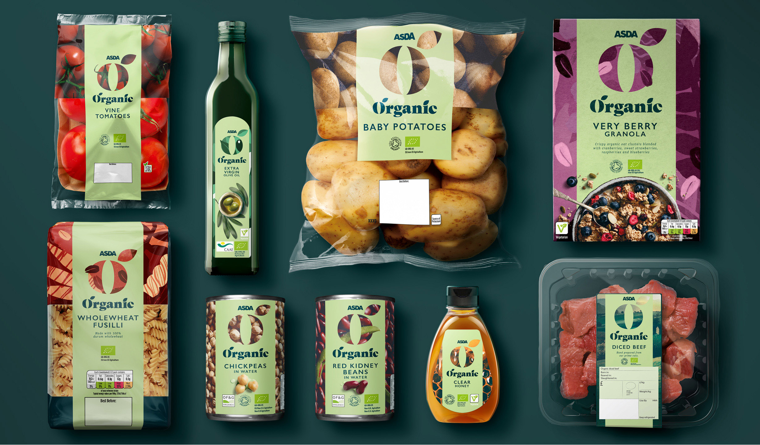
Asda teamed up with OurCreative, a Leeds-based branding agency, to create packaging designs focused on communicating the brand’s organic approach. The centerpiece of the packaging design is the letter “O” taken from the logo. The letter has been beautifully used to convey the organic nature of the produce.

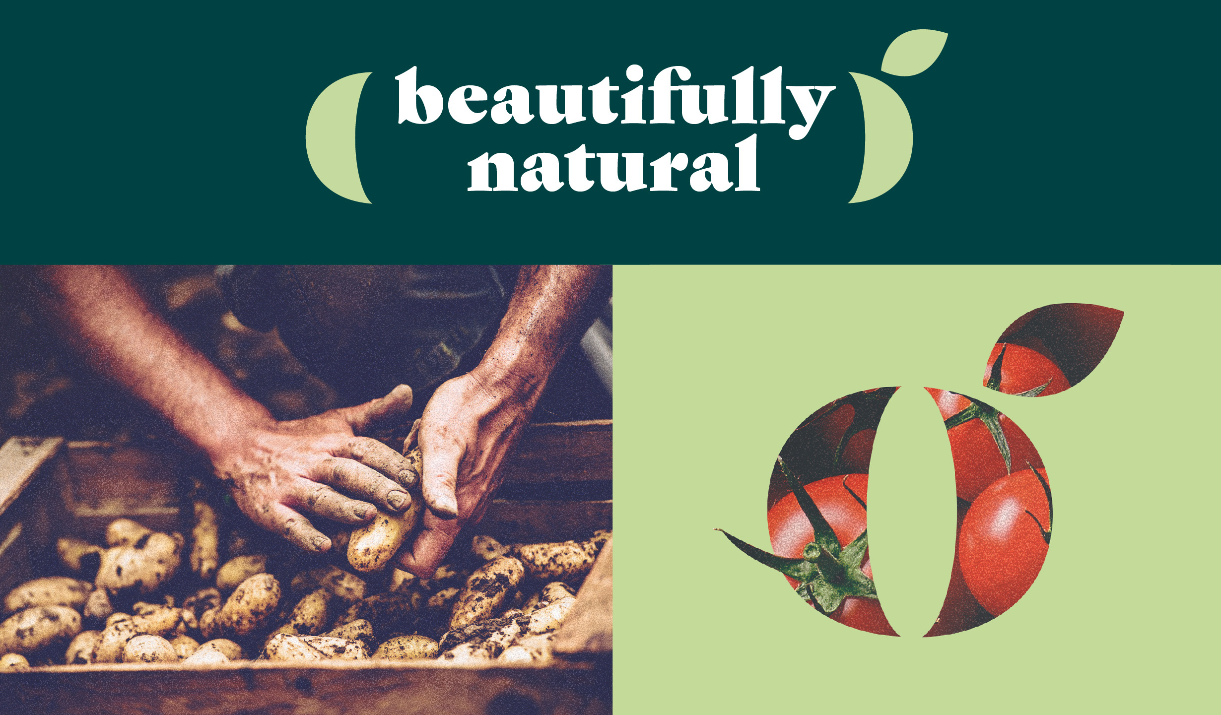
“Re-imagining this category as one, the O taken from the logo has been crafted into a viewfinder, celebrating the natural beauty of organic produce, providing reassurance that Asda’s products are expertly picked for their ethical sourcing, premium quality and exceptional taste.

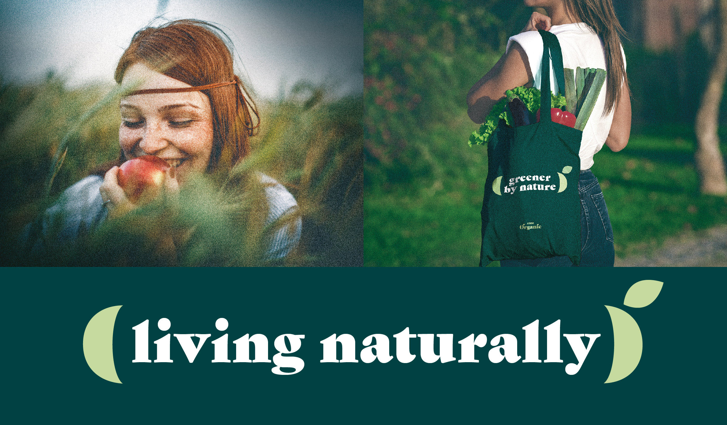
The natural “from the earth” photography has a raw, grainy, cinematic feel to accentuate the organic nature of the products.

The cohesive, distinct, and own-able brand identity appeals to ethical consumers who want to be good to their mind, body and planet. The sophisticated green panel is an identifiable beacon for organic in store, elevating the range from mid-tier.

1

Get the latest packaging design inspiration in your inbox:

Popular designs

Burma Love Rebrand

Love at First BiteAs an extension of the Burma Superstar restaurant in San Francisco, Burma Love Foods gives diners an opportunity to

Far Out Bar

Description: Far Out Bar is a cutting-edge packaging design project created for High Life Farms’ macrodose THC chocolate bars. This project involved

Pure Persian Honey

When we look closely at honey packaging, they are almost all in the usual format, and the ultimate in creativity is that

Designed by: PepsiCo Design & Innovation
Country: United States

Asda Organic Packaging Design

1
Organic 3

Designed by: OurCreative | Country: UK

Keeping things natural and organic is the way to a sustainable future. With global temperatures reaching concerning levels, it only makes sense to limit our carbon emissions and adopt a lifestyle in sync with nature. Asda’s organic range of healthy food is a positive step towards keeping the planet healthy.

Organic was the buzzword of the early noughties, this original trend finds itself in a world where exciting, fresh developing food trends quickly emerge appealing to its audiences like a smack on the lips! But caring for the planet and making ethical choices is here to stay. Asda wanted to make organic choices accessible to all with clear communication of the benefits to a value seeking audience.

Asda Organic Packaging Design

The packaging

Asda teamed up with OurCreative, a Leeds-based branding agency, to create packaging designs focused on communicating the brand’s organic approach. The centerpiece of the packaging design is the letter “O” taken from the logo. The letter has been beautifully used to convey the organic nature of the produce.

“Re-imagining this category as one, the O taken from the logo has been crafted into a viewfinder, celebrating the natural beauty of organic produce, providing reassurance that Asda’s products are expertly picked for their ethical sourcing, premium quality and exceptional taste.

The natural “from the earth” photography has a raw, grainy, cinematic feel to accentuate the organic nature of the products.

The cohesive, distinct, and own-able brand identity appeals to ethical consumers who want to be good to their mind, body and planet. The sophisticated green panel is an identifiable beacon for organic in store, elevating the range from mid-tier.

1
Previous slide
Next slide

Explore more great package design

Get the latest on packaging design in your inbox: