Designed by: PepsiCo Design & Innovation
Country: United States

Triveda Brand And Packaging Design

Designed by: Mid-Air Studio | Country: UK

Tenna Anette Schreiner, a pundit of “functional and integrative nutrition,” launched her brand of organic fermented cashews called Triveda. The cashew dips, according to the expert, “are made with intention, insight, and creativity.” Triveda products are beneficial for the body and mind because they contain adaptogenic ingredients.

Bursting with live, nutrient-dense and adaptogenic ingredients to support body, mind and gut. The range takes inspiration from the ancient teachings of Ayurveda and blends this with dynamic modern flavors.

Triveda Brand And Packaging Design

The packaging

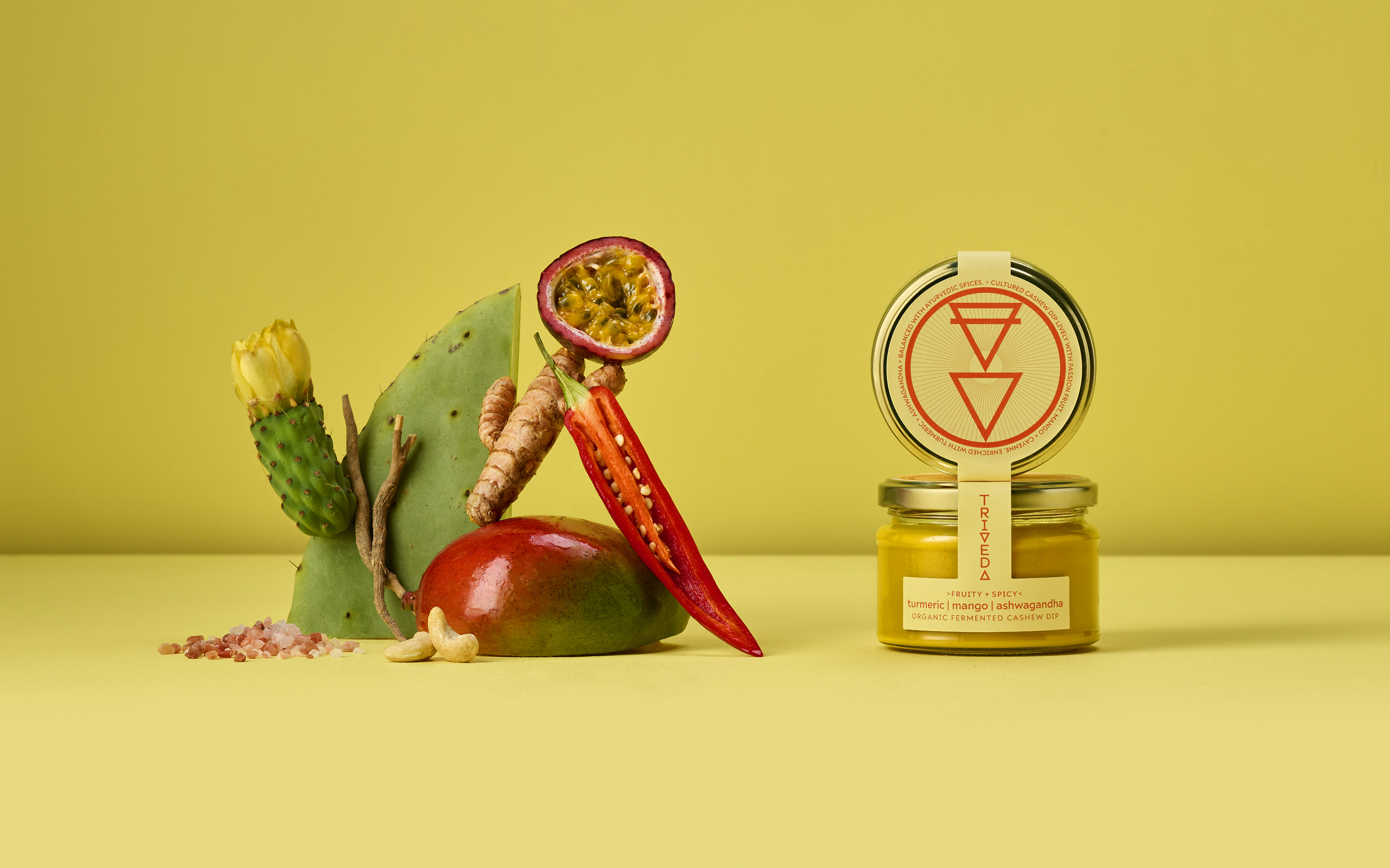
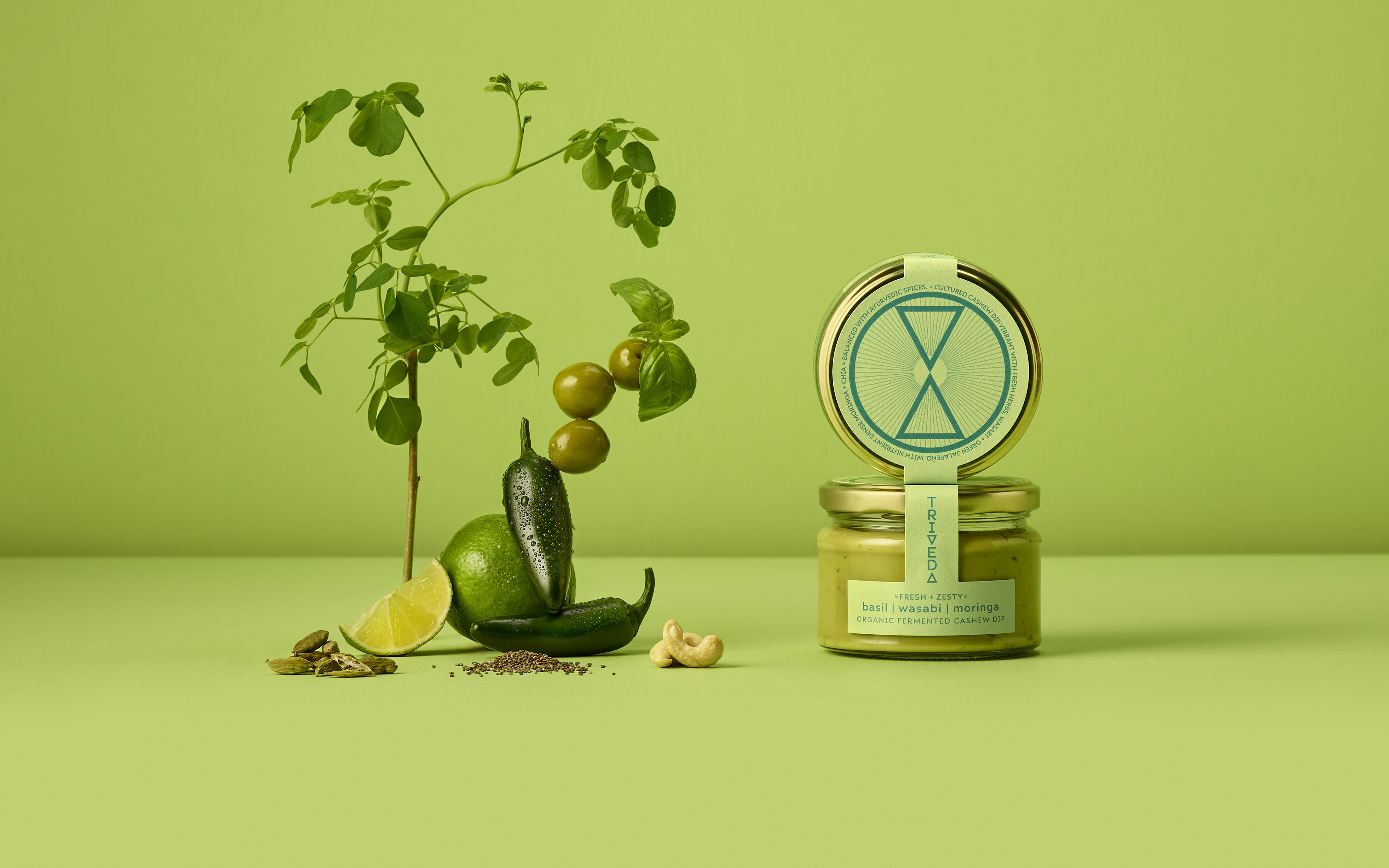
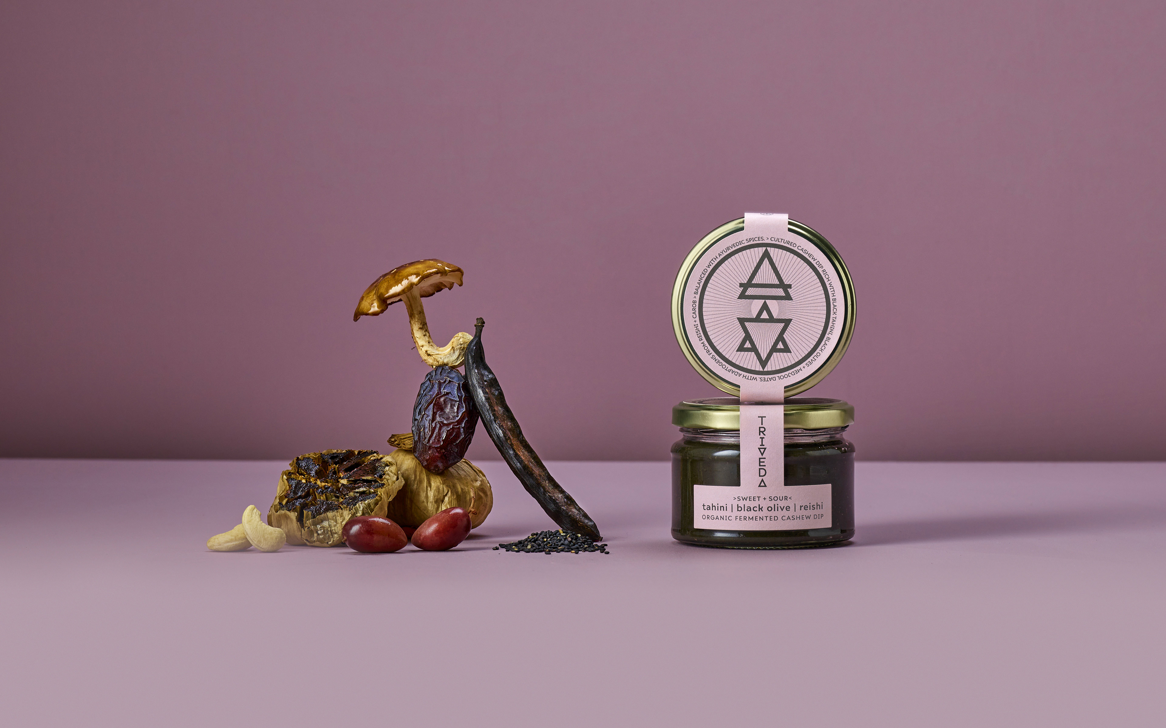
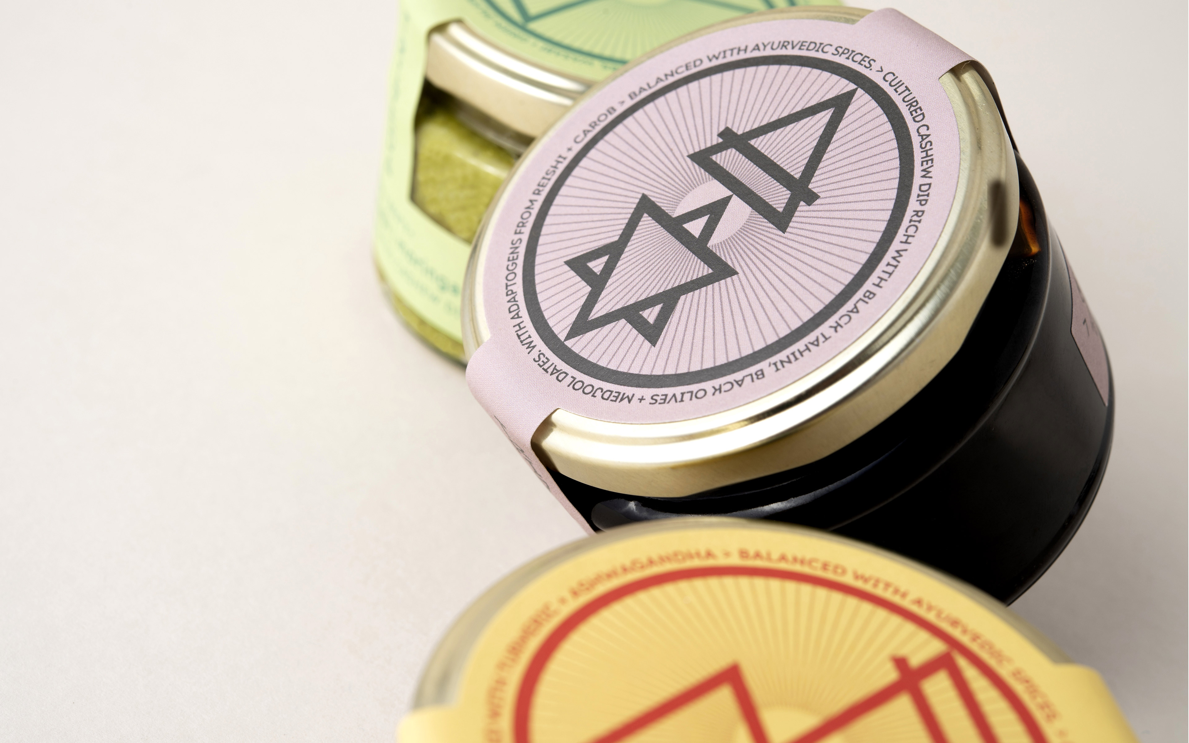
The packaging design for the brand was created by Mid-Air Studio, a London-based branding agency that focuses on creating authentic works of art. The inspiration behind the packaging was the three Doshas of Ayurveda. In addition to the triangle symbol representing the core principles of Indian Ayurveda Shastra, it is also the centerpiece of the packaging design.

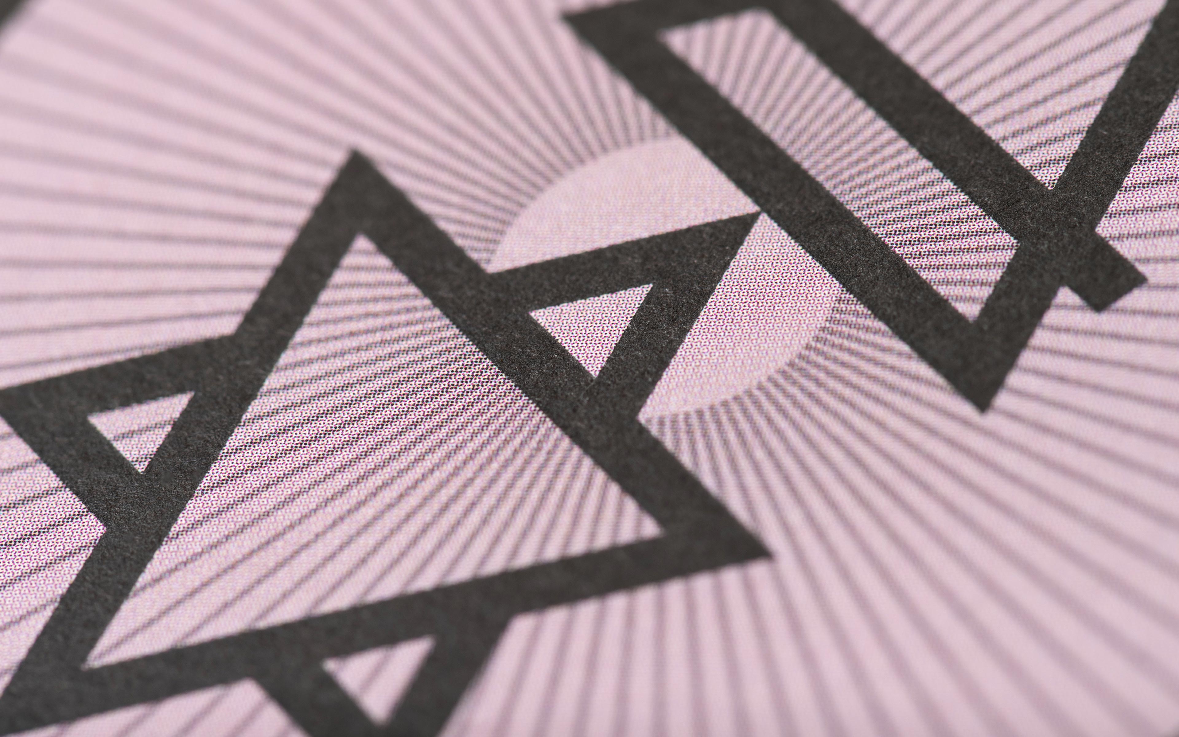
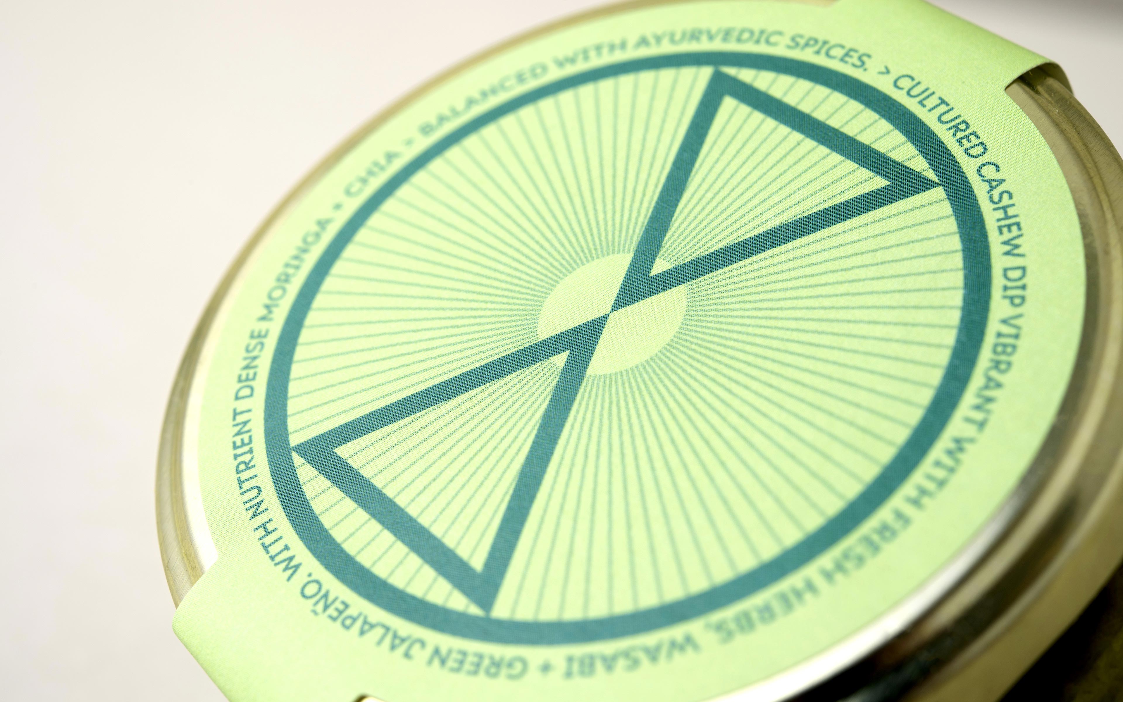
“Creative concept – the triangle as a core symbol of balance between of the three Doshas of Ayurveda. This became the foundations of a vertical logotype composed of 2 triangles that in turn form the basis of each dip’s main visual iconography. Each is composed of 2 balancing elemental symbols that reflect the three Doshas of Ayurveda – Kapha [earth + water], Vata [air + ether], and Pitta [fire + water] .

This theme together with the choice of ingredients informed the color palette for each flavor.

The triangular form continues to inform a wider set of icons to support functional and emotional messaging.”

Get the latest packaging design inspiration in your inbox:

Popular designs

Far Out Bar

Description: Far Out Bar is a cutting-edge packaging design project created for High Life Farms’ macrodose THC chocolate bars. This project involved

The Bra Guru

Most women are wearing the wrong size bra and that is a fact. The Bra Guru® is the first and only professional

The Port Vodka Lemon Water

Overview: In response to my client’s vision for a Cape Cod themed beverage brand, I embarked on the journey to create The Port

Pure Persian Honey

When we look closely at honey packaging, they are almost all in the usual format, and the ultimate in creativity is that

Designed by: PepsiCo Design & Innovation
Country: United States

Triveda Brand And Packaging Design

Triveda 1

Designed by: Mid-Air Studio | Country: UK

Tenna Anette Schreiner, a pundit of “functional and integrative nutrition,” launched her brand of organic fermented cashews called Triveda. The cashew dips, according to the expert, “are made with intention, insight, and creativity.” Triveda products are beneficial for the body and mind because they contain adaptogenic ingredients.

Bursting with live, nutrient-dense and adaptogenic ingredients to support body, mind and gut. The range takes inspiration from the ancient teachings of Ayurveda and blends this with dynamic modern flavors.

Triveda Brand And Packaging Design

The packaging

The packaging design for the brand was created by Mid-Air Studio, a London-based branding agency that focuses on creating authentic works of art. The inspiration behind the packaging was the three Doshas of Ayurveda. In addition to the triangle symbol representing the core principles of Indian Ayurveda Shastra, it is also the centerpiece of the packaging design.

“Creative concept – the triangle as a core symbol of balance between of the three Doshas of Ayurveda. This became the foundations of a vertical logotype composed of 2 triangles that in turn form the basis of each dip’s main visual iconography. Each is composed of 2 balancing elemental symbols that reflect the three Doshas of Ayurveda – Kapha [earth + water], Vata [air + ether], and Pitta [fire + water] .

This theme together with the choice of ingredients informed the color palette for each flavor.

The triangular form continues to inform a wider set of icons to support functional and emotional messaging.”

Previous slide
Next slide

Explore more great package design

Get the latest on packaging design in your inbox: