Designed by: PepsiCo Design & Innovation
Country: United States

Packaging Design: Beef & Steak

Designed by: Van Heertum Design VHD | Country: Netherlands

Beef & Steak makes ordering online easy. From South American beef to Wagyu, the online meat store has a range of mouthwatering and fresh meats. In addition to loose meat, Beef  & Steak boasts of creating several meat packages.

“They want people to be able to enjoy their high-quality products at home without having to go to the butcher. As experts in the field of meat, they know exactly where to get the best quality flank steaks, T-bone steak, lamb but also poultry for their customers.

Packaging Design: Beef & Steak

The packaging

Beef & Steak partnered with Van Heertum Design VHD, a Tilburg-based award-winning ad agency, to create the packaging designs for the different condiments of the brand. The agency used a combination of red, black, and white to create designs that would easily stand apart from the crowd while sitting on the shelf of a store.

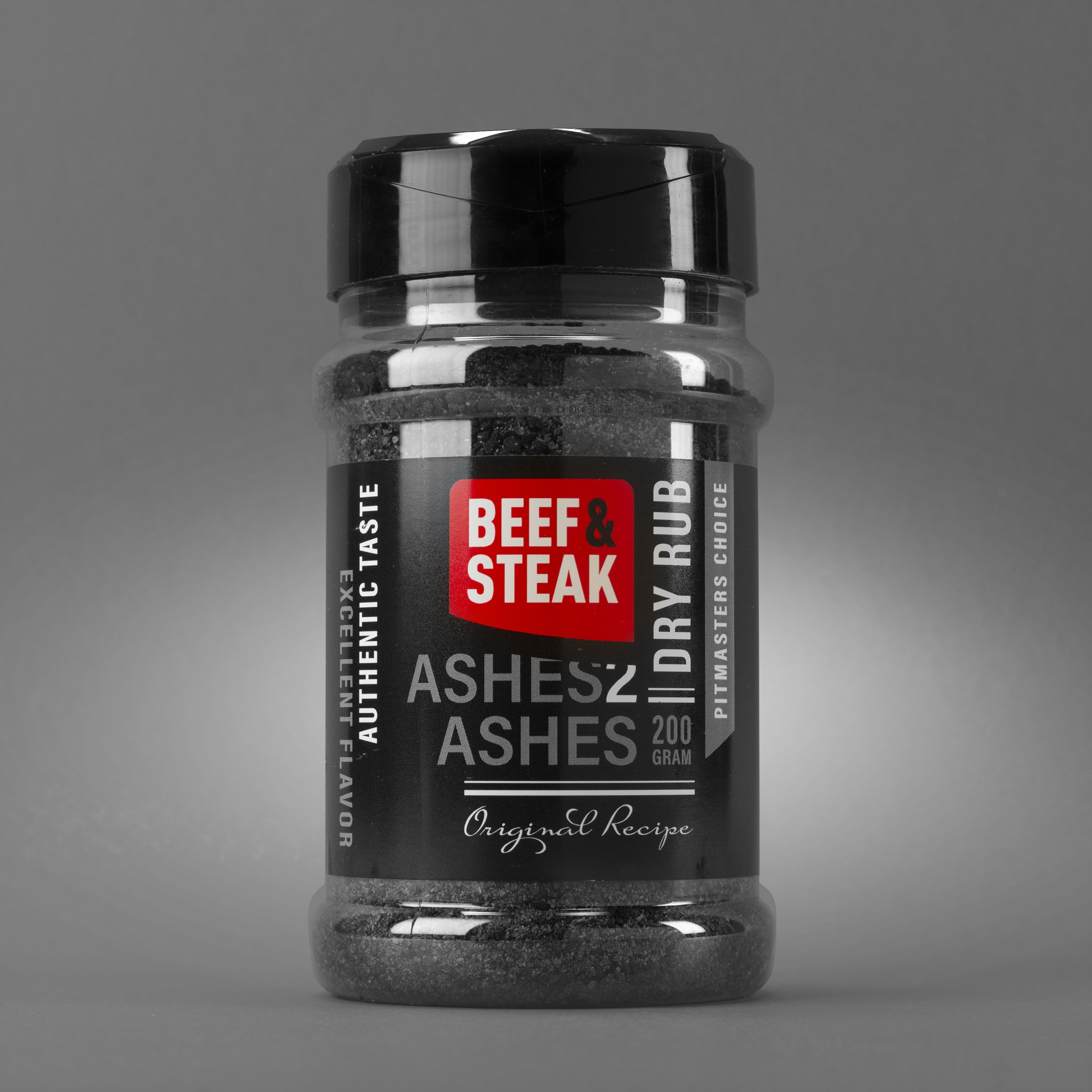
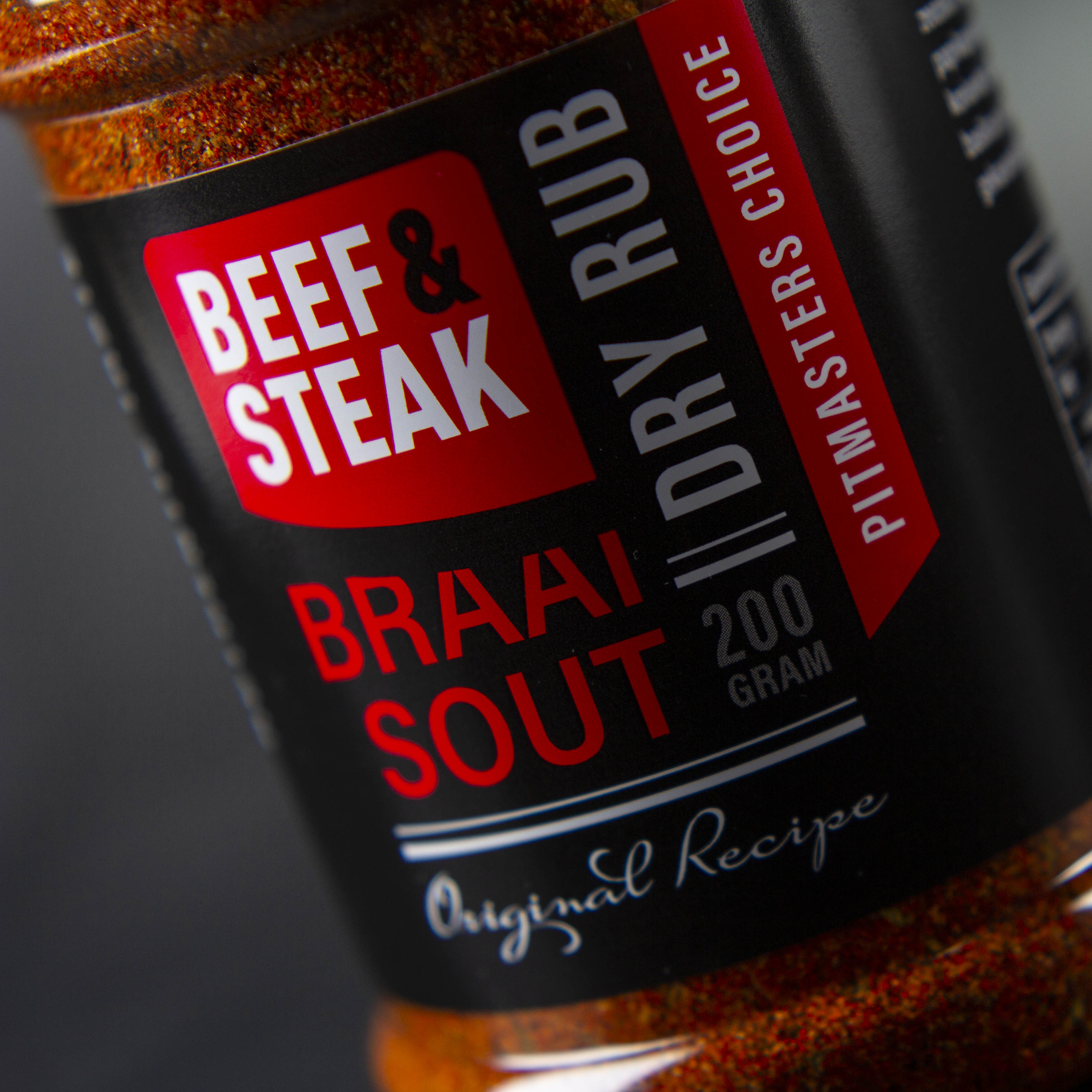
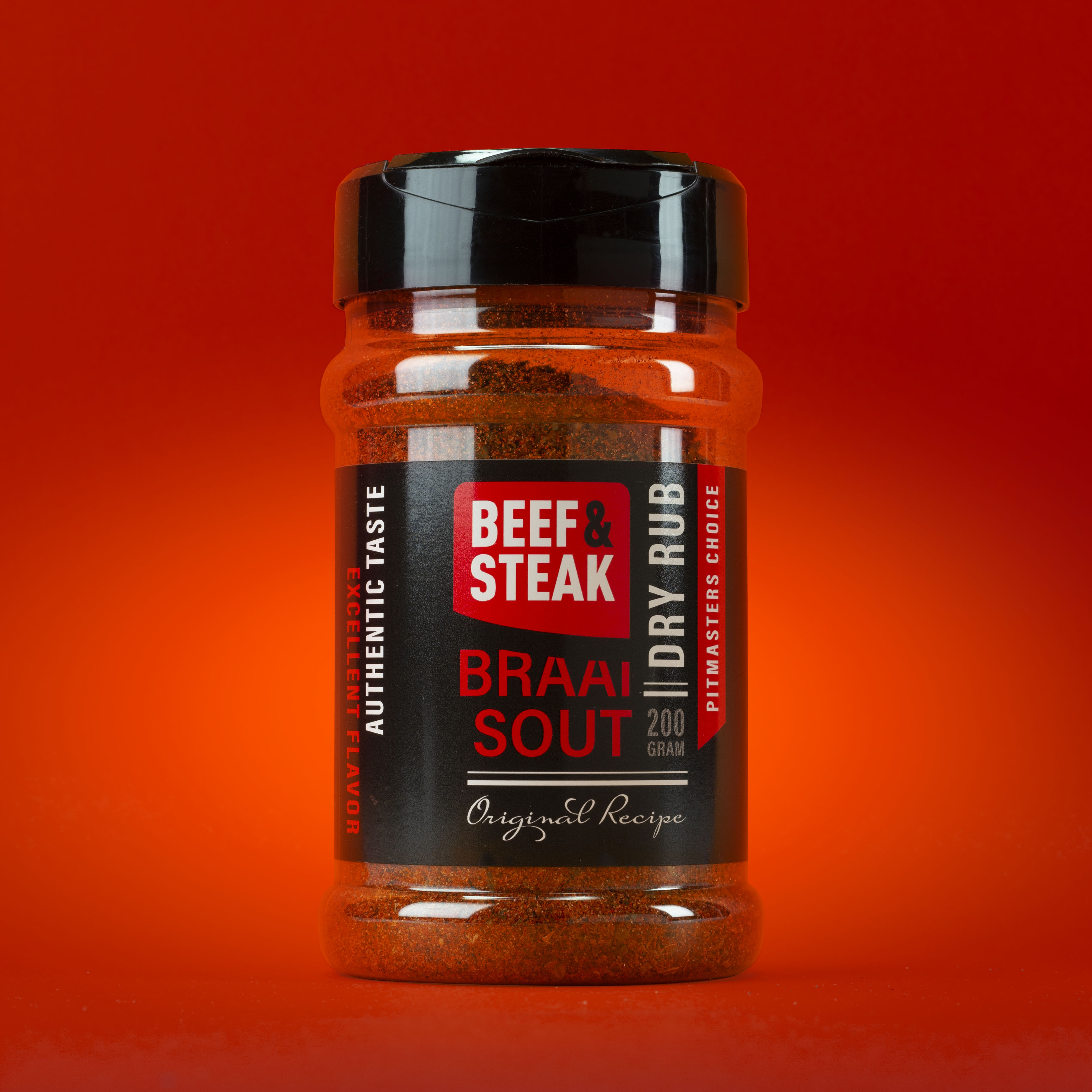
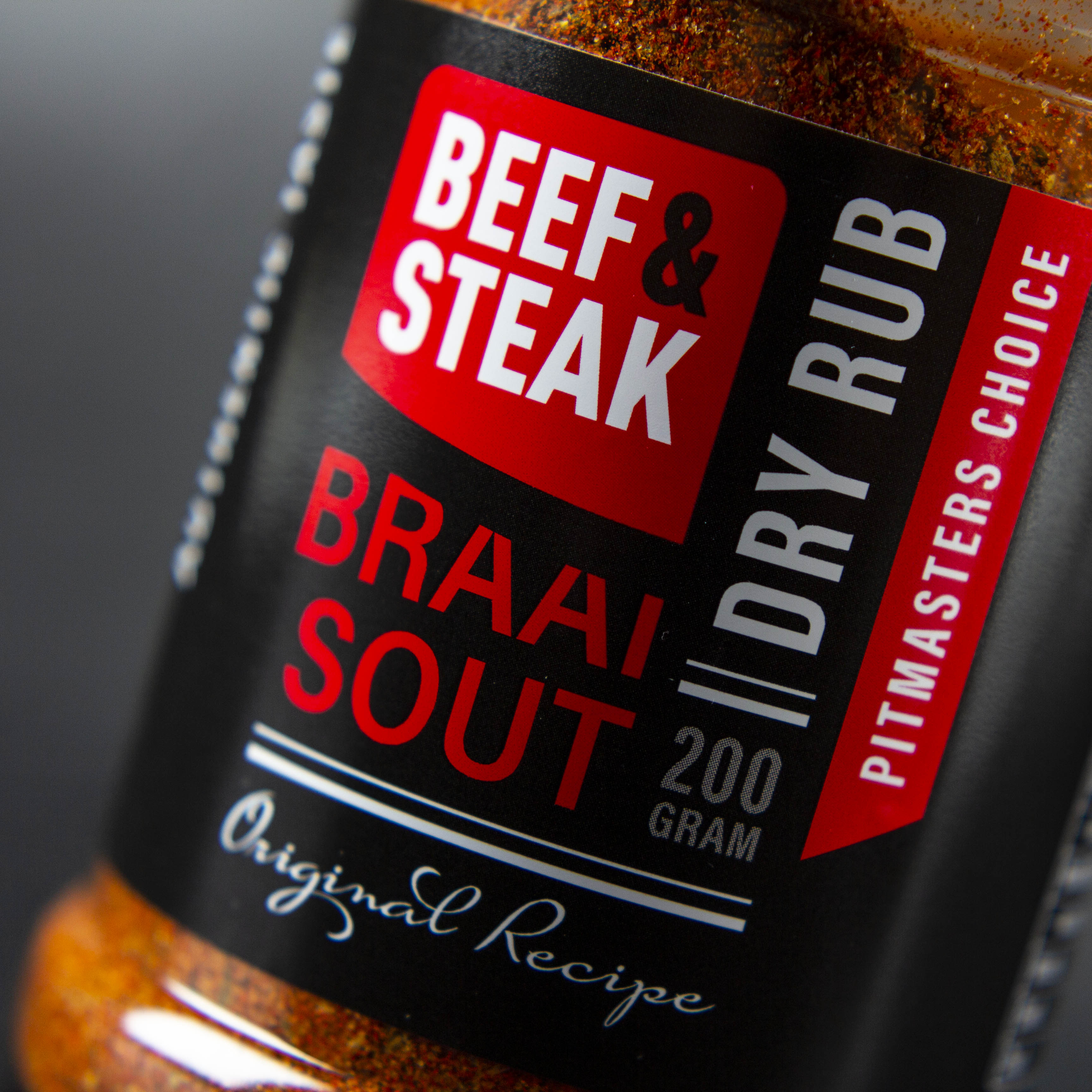
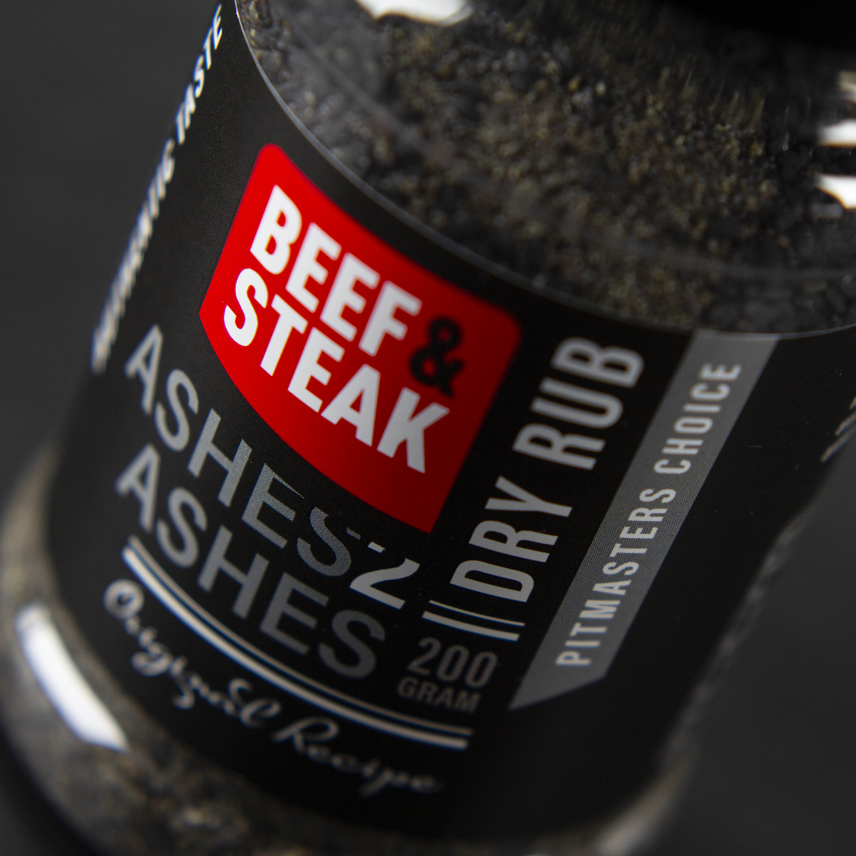
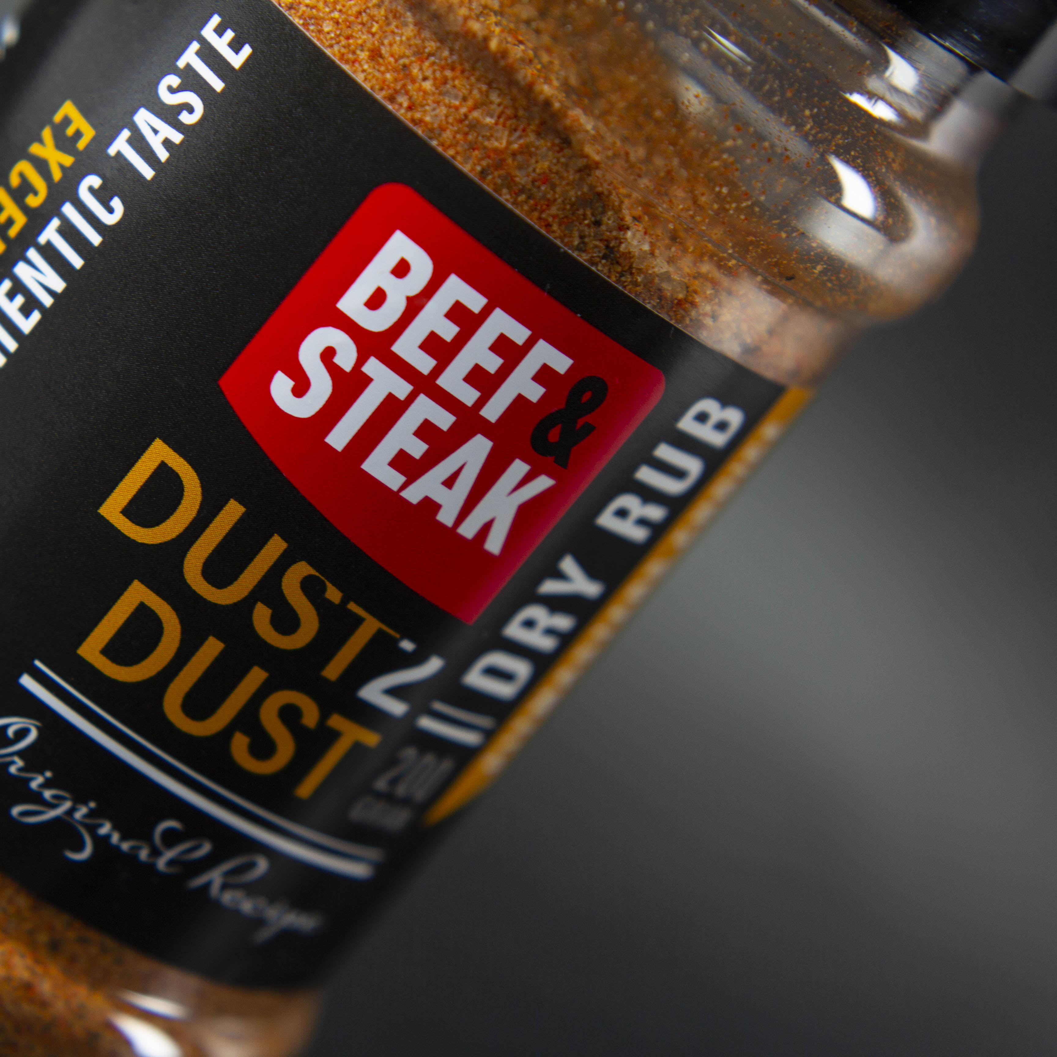
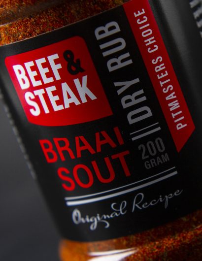
“This dry rub line consists of 3 different flavors: Ashes 2 Ashes, Braai Sout and Dust 2 Dust. In the packaging we chose to work with clear shakers and black lids and labels to create a big contrast with the product itself.

With a centralized logo we further are working with the product color in the labels where we only work with text and words to create a new eye-catching graphic design style. A completely new look and feel for the category.”

Get the latest packaging design inspiration in your inbox:

Popular designs

The Port Vodka Lemon Water

Overview: In response to my client’s vision for a Cape Cod themed beverage brand, I embarked on the journey to create The Port

Over the wave

This Kombucha originates in Lombok, Indonesia, where its paradise beaches attract hundreds of surfers eager to ride the waves. When you surf,

Far Out Bar

Description: Far Out Bar is a cutting-edge packaging design project created for High Life Farms’ macrodose THC chocolate bars. This project involved

Designed by: PepsiCo Design & Innovation
Country: United States

Packaging Design: Beef & Steak

Beef Steak 1

Designed by: Van Heertum Design VHD | Country: Netherlands

Beef & Steak makes ordering online easy. From South American beef to Wagyu, the online meat store has a range of mouthwatering and fresh meats. In addition to loose meat, Beef  & Steak boasts of creating several meat packages.

“They want people to be able to enjoy their high-quality products at home without having to go to the butcher. As experts in the field of meat, they know exactly where to get the best quality flank steaks, T-bone steak, lamb but also poultry for their customers.

Packaging Design: Beef & Steak

The packaging

Beef & Steak partnered with Van Heertum Design VHD, a Tilburg-based award-winning ad agency, to create the packaging designs for the different condiments of the brand. The agency used a combination of red, black, and white to create designs that would easily stand apart from the crowd while sitting on the shelf of a store.

“This dry rub line consists of 3 different flavors: Ashes 2 Ashes, Braai Sout and Dust 2 Dust. In the packaging we chose to work with clear shakers and black lids and labels to create a big contrast with the product itself.

With a centralized logo we further are working with the product color in the labels where we only work with text and words to create a new eye-catching graphic design style. A completely new look and feel for the category.”

Previous slide
Next slide

Explore more great package design

Get the latest on packaging design in your inbox: