Designed by: PepsiCo Design & Innovation
Country: United States

Stilly Vodka Packaging Design

Designed by: Appartement 103 | Country: France

Nick and Amanda Barthelemy, residents of Stillwater, Minnesota, launched a new category of an adult beverage called “Stilly.” The RTD (ready-to-drink) sector is booming in the US. While RTDs and Hard Seltzers often contain artificial flavors, Stilly is well on its way to establishing itself as a premium brand.

Stilly beverages are NOT seltzers, and they’re not your ordinary cocktails in a can; they’re an all-new category of unique adult beverages called a “stilly. It’s a light and refreshing cocktail made with premium vodka or other distilled spirits, fine bubbles, a squeeze of natural juices, and natural flavors. The exact ingredients and processes used to make a “stilly” are a closely guarded secret. However, a “vodka stilly” starts with Stilly vodka, developed to be of superior quality, exceptionally smooth, and distinctive to accentuate the fruit flavors present in the drink.

Stilly Vodka Packaging Design

The packaging

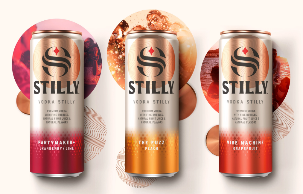
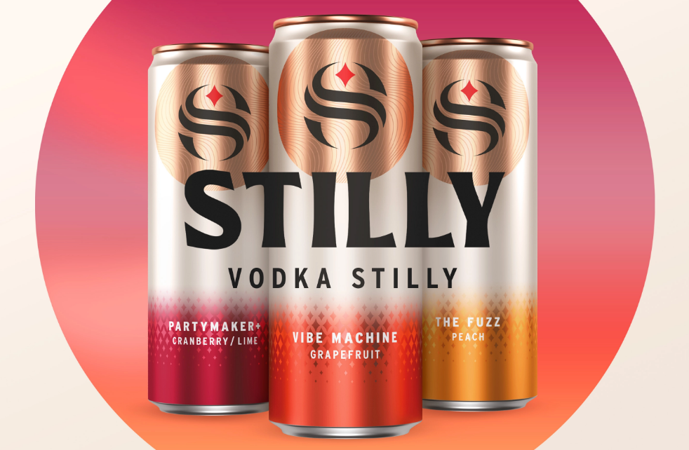
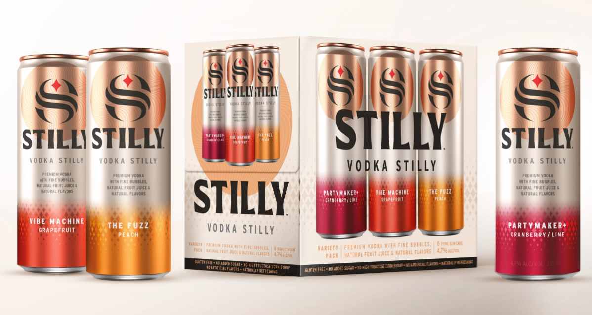
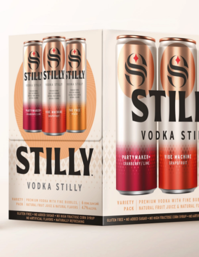
Stilly Vodka teamed up with Appartement 103, a Paris-based branding agency, to create packaging designs that would establish Stilly as a premium alternative in the RTD sector. The top portion of the packaging works as the brand badge with the company name and the logo, while the bottom half reveals the flavor specifications.

The  ‘iconic S’ acts as a powerful communication tool which can be used across many different touchpoints; it evokes the notion of fluidity and mixology with the curved lines. It also serves as a nod to St. Croix river that crosses Stillwater, where the brand comes from.

As an inspiring means to guide the way, the red star symbolizes Stillwater and Minnesota’s motto: «L’Etoile du Nord’.

Furthermore, the copper circle anchors the brand, enhancing visibility and contrast; also evoking the production process, which involves distillation in copper stills. It connects with the brand world, expressing a feeling of togetherness and memorable moments in a circle of friends.”     

Get the latest packaging design inspiration in your inbox:

Popular designs

The Bra Guru

Most women are wearing the wrong size bra and that is a fact. The Bra Guru® is the first and only professional

Far Out Bar

Description: Far Out Bar is a cutting-edge packaging design project created for High Life Farms’ macrodose THC chocolate bars. This project involved

Pure Persian Honey

When we look closely at honey packaging, they are almost all in the usual format, and the ultimate in creativity is that

Designed by: PepsiCo Design & Innovation
Country: United States

Stilly Vodka Packaging Design

Stilly Vodka 3

Designed by: Appartement 103 | Country: France

Nick and Amanda Barthelemy, residents of Stillwater, Minnesota, launched a new category of an adult beverage called “Stilly.” The RTD (ready-to-drink) sector is booming in the US. While RTDs and Hard Seltzers often contain artificial flavors, Stilly is well on its way to establishing itself as a premium brand.

Stilly beverages are NOT seltzers, and they’re not your ordinary cocktails in a can; they’re an all-new category of unique adult beverages called a “stilly. It’s a light and refreshing cocktail made with premium vodka or other distilled spirits, fine bubbles, a squeeze of natural juices, and natural flavors. The exact ingredients and processes used to make a “stilly” are a closely guarded secret. However, a “vodka stilly” starts with Stilly vodka, developed to be of superior quality, exceptionally smooth, and distinctive to accentuate the fruit flavors present in the drink.

Stilly Vodka Packaging Design

The packaging

Stilly Vodka teamed up with Appartement 103, a Paris-based branding agency, to create packaging designs that would establish Stilly as a premium alternative in the RTD sector. The top portion of the packaging works as the brand badge with the company name and the logo, while the bottom half reveals the flavor specifications.

The  ‘iconic S’ acts as a powerful communication tool which can be used across many different touchpoints; it evokes the notion of fluidity and mixology with the curved lines. It also serves as a nod to St. Croix river that crosses Stillwater, where the brand comes from.

As an inspiring means to guide the way, the red star symbolizes Stillwater and Minnesota’s motto: «L’Etoile du Nord’.

Furthermore, the copper circle anchors the brand, enhancing visibility and contrast; also evoking the production process, which involves distillation in copper stills. It connects with the brand world, expressing a feeling of togetherness and memorable moments in a circle of friends.”     

Previous slide
Next slide

Explore more great package design

Get the latest on packaging design in your inbox: