Designed by: PepsiCo Design & Innovation
Country: United States

Packaging Redesign: Yam Kombucha

1

Designed by: Ismo Design | Country: Brazil

The “Kundalini Shakti” is the divine serpentine energy that is present in all of us in a dormant form. When a person, through spiritual practices, raises this energy through seven chakras in the body, she receives all the spiritual information available in the universe. The seven chakras are the seven power centers within the body. Yam is the heart chakra and one of the three top energy centers. A practitioner begins to see lights of different colors when the serpentine energy reaches the heart chakra. 

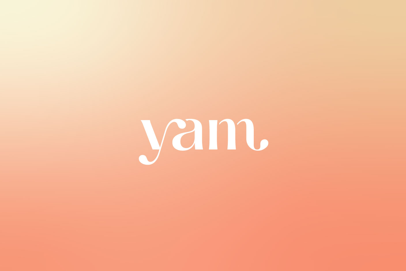
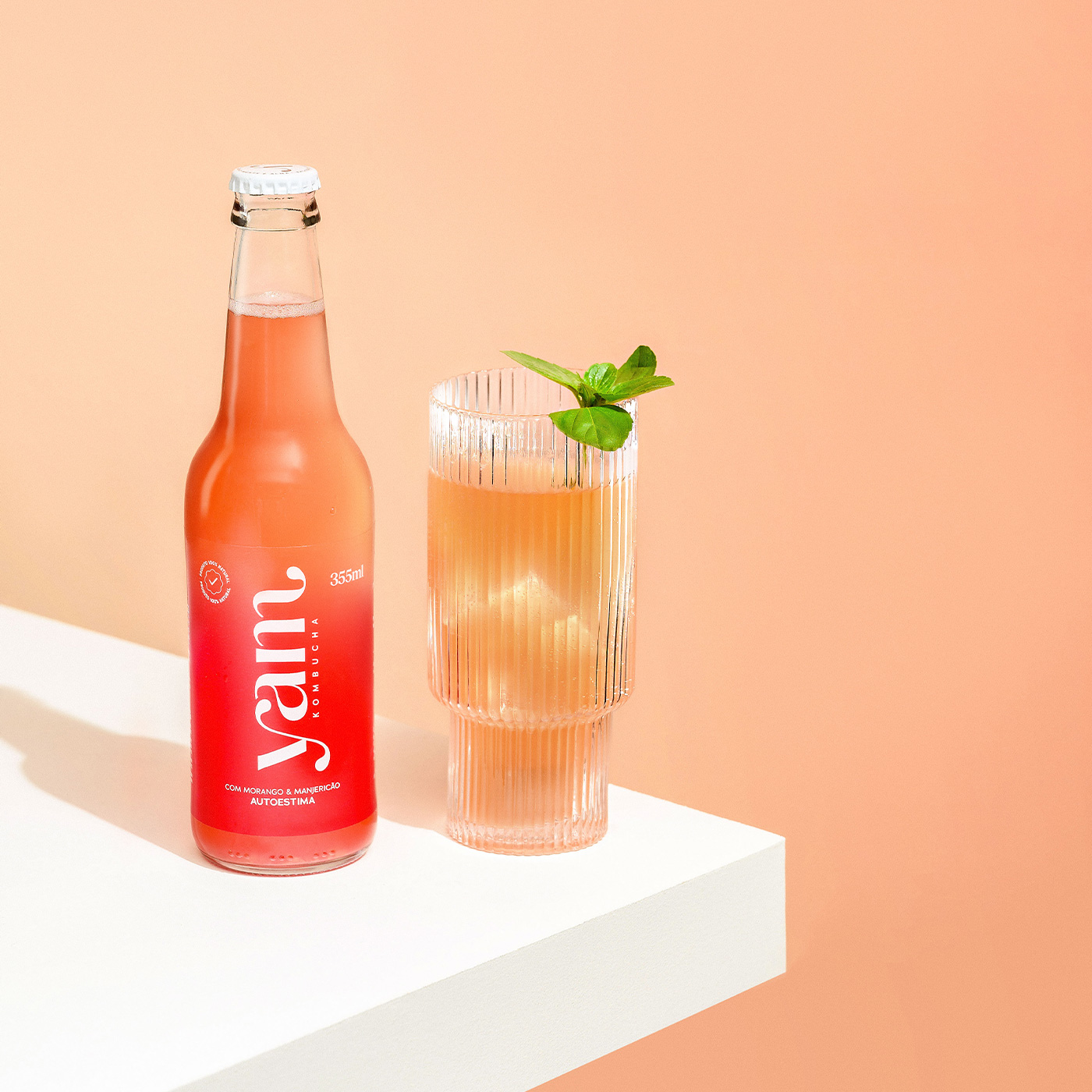
The packaging redesign of Yam focuses on highlighting the colors seen by a practitioner when the Kundalini Shakti reaches the heart chakra.

The name ‘Yam’ derives from the Hindu mantra related to the heart chakra. Although both the name of the brand and the culture of production and consumption of kombuchas have their origins in the East, the entire visual identity system of the brand, from the logo to the packaging, did not bring these references. Nor did they address the health and body benefits resulting from the consumption of kombuchas. In fact, the logo brought an incorrect visual connotation to the meaning of the name, resembling the onomatopoeia used to refer to something tasty: “yummi”. In addition, the packaging, from the color of the glass to the design of the label, looked more like a craft beer than a functional, non-alcoholic, refreshing, and healthy drink, such as a kombucha.

Packaging Redesign: Yam Kombucha

The packaging

Yam partnered with Ismo Design, a Porto Alegre-based creative studio, to produce packaging redesigns that would illustrate the true meaning of the brand. The creative studio focused on the meaning of the word to create eight designs. The illustrations on the label highlight the true essence of Yam, along with visually communicating the eight different flavors.

The redesign of Yam Kombucha’s packaging was designed so that the label color of each of its 8 flavors would blend differently with the unique coloring of each liquid. Thus, it was possible to achieve a visual effect that reverberates the characteristics of lightness and balance between body, mind and soul presented in the brand positioning. Under this color gradient, the logo and other information are printed in white silkscreen. On the packaging, the physical and emotional benefits of the ingredients of each flavor are described on the side. This way, the consumer can choose the ideal kombucha for each moment of the day, enjoying a healthy and refreshing drink, which still provides the positive sensations required by the most different routines.

1

Get the latest packaging design inspiration in your inbox:

Popular designs

Over the wave

This Kombucha originates in Lombok, Indonesia, where its paradise beaches attract hundreds of surfers eager to ride the waves. When you surf,

The Bra Guru

Most women are wearing the wrong size bra and that is a fact. The Bra Guru® is the first and only professional

Burma Love Rebrand

Love at First BiteAs an extension of the Burma Superstar restaurant in San Francisco, Burma Love Foods gives diners an opportunity to

Designed by: PepsiCo Design & Innovation
Country: United States

Packaging Redesign: Yam Kombucha

1
085

Designed by: Ismo Design | Country: Brazil

The “Kundalini Shakti” is the divine serpentine energy that is present in all of us in a dormant form. When a person, through spiritual practices, raises this energy through seven chakras in the body, she receives all the spiritual information available in the universe. The seven chakras are the seven power centers within the body. Yam is the heart chakra and one of the three top energy centers. A practitioner begins to see lights of different colors when the serpentine energy reaches the heart chakra. 

The packaging redesign of Yam focuses on highlighting the colors seen by a practitioner when the Kundalini Shakti reaches the heart chakra.

The name ‘Yam’ derives from the Hindu mantra related to the heart chakra. Although both the name of the brand and the culture of production and consumption of kombuchas have their origins in the East, the entire visual identity system of the brand, from the logo to the packaging, did not bring these references. Nor did they address the health and body benefits resulting from the consumption of kombuchas. In fact, the logo brought an incorrect visual connotation to the meaning of the name, resembling the onomatopoeia used to refer to something tasty: “yummi”. In addition, the packaging, from the color of the glass to the design of the label, looked more like a craft beer than a functional, non-alcoholic, refreshing, and healthy drink, such as a kombucha.

Packaging Redesign: Yam Kombucha

The packaging

Yam partnered with Ismo Design, a Porto Alegre-based creative studio, to produce packaging redesigns that would illustrate the true meaning of the brand. The creative studio focused on the meaning of the word to create eight designs. The illustrations on the label highlight the true essence of Yam, along with visually communicating the eight different flavors.

The redesign of Yam Kombucha’s packaging was designed so that the label color of each of its 8 flavors would blend differently with the unique coloring of each liquid. Thus, it was possible to achieve a visual effect that reverberates the characteristics of lightness and balance between body, mind and soul presented in the brand positioning. Under this color gradient, the logo and other information are printed in white silkscreen. On the packaging, the physical and emotional benefits of the ingredients of each flavor are described on the side. This way, the consumer can choose the ideal kombucha for each moment of the day, enjoying a healthy and refreshing drink, which still provides the positive sensations required by the most different routines.

1
Previous slide
Next slide

Explore more great package design

Get the latest on packaging design in your inbox: