Designed by: PepsiCo Design & Innovation
Country: United States

Changin’ Packaging Design

1

Designed by: Baries Design GMBH | Country: Germany

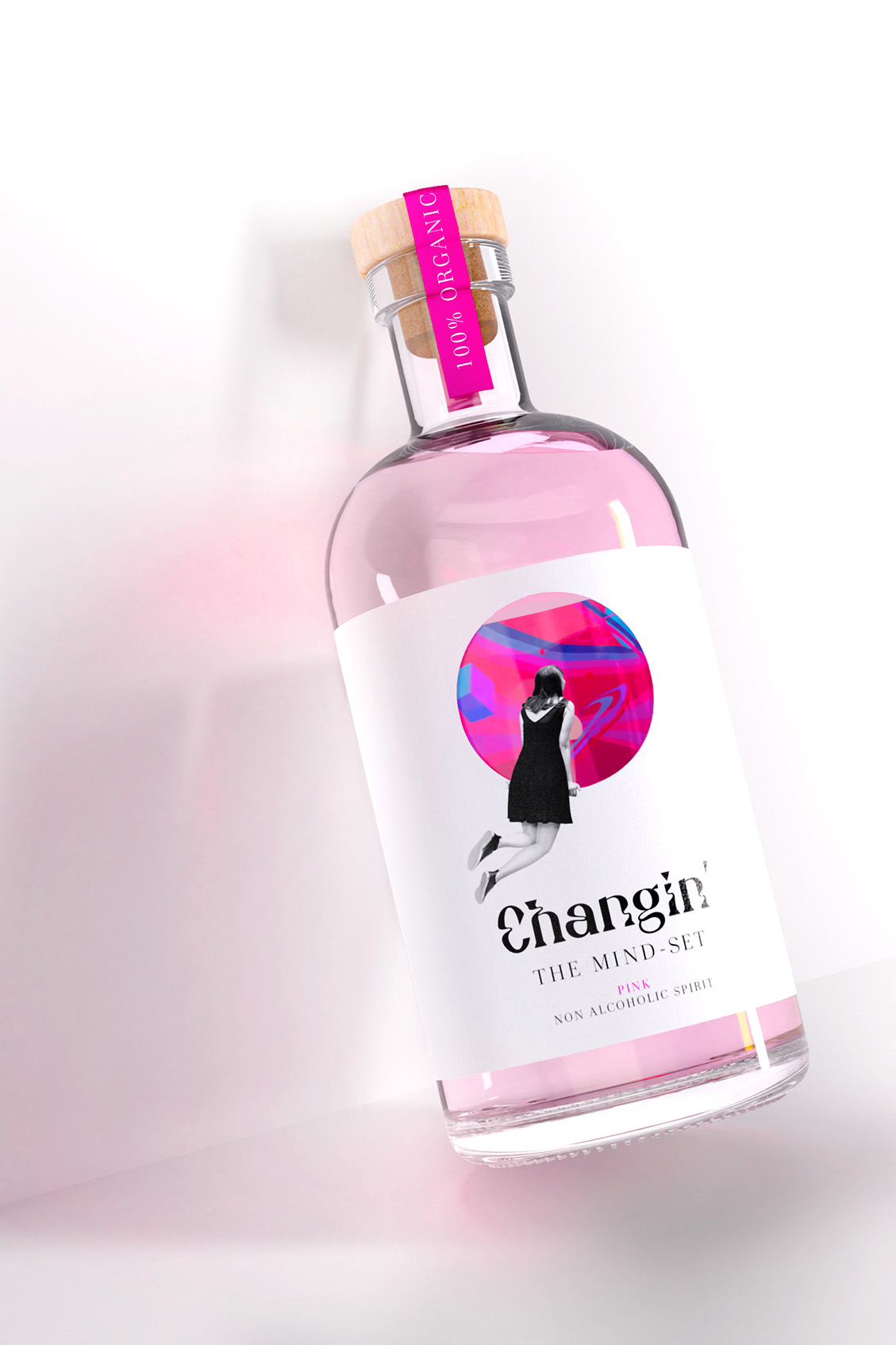
If you are under the impression that a non-alcoholic beverage cannot be as intoxicating as regular alcoholic spirits, think again! Inspired by the flavors of gin, Changin’, is a non-alcoholic brand that can change your perspective. Made using select herbs, this non-alcoholic spirit is a treat for your taste buds.

The packaging design reflects the change of perspective that one may experience while savoring the taste of Changin’.

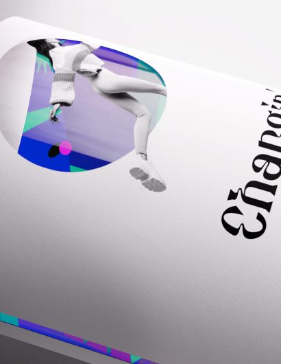
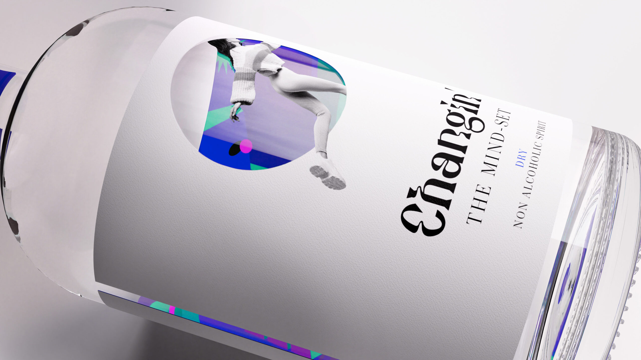
The label design very much represents that change. People are trapped in their own, monotonous world and can take a peek into a new, colorful and free world. It is inspiring to acquire a new outlook on things and to escape a stuck mind-set. The colors give you an idea of the positive experiences that await you, if you let it happen. The design of the bottle is split into two different image styles to emphasize the different mind-sets: a clean front label and colorful back label which is only visible from inside the bottle. It is designed like an entrance to another world which you can only access through Changin‘ – the non-alcoholic spirit. To guarantee a sustainable packaging, Changin’ was designed plastic-free (glass bottle, wood & cork lid, paper label) and its chosen ingredients are 100% organic.”
Changin’ Packaging Design

The packaging

Baries Design, a Düsseldorf-based packaging design agency, created label illustrations that highlight the positive experiences associated with the brand. The color palettes and typography evoke psychedelic images along with instantly attracting customers. Not only does the packaging reflect the change in perception, but it also arouses curiosity.

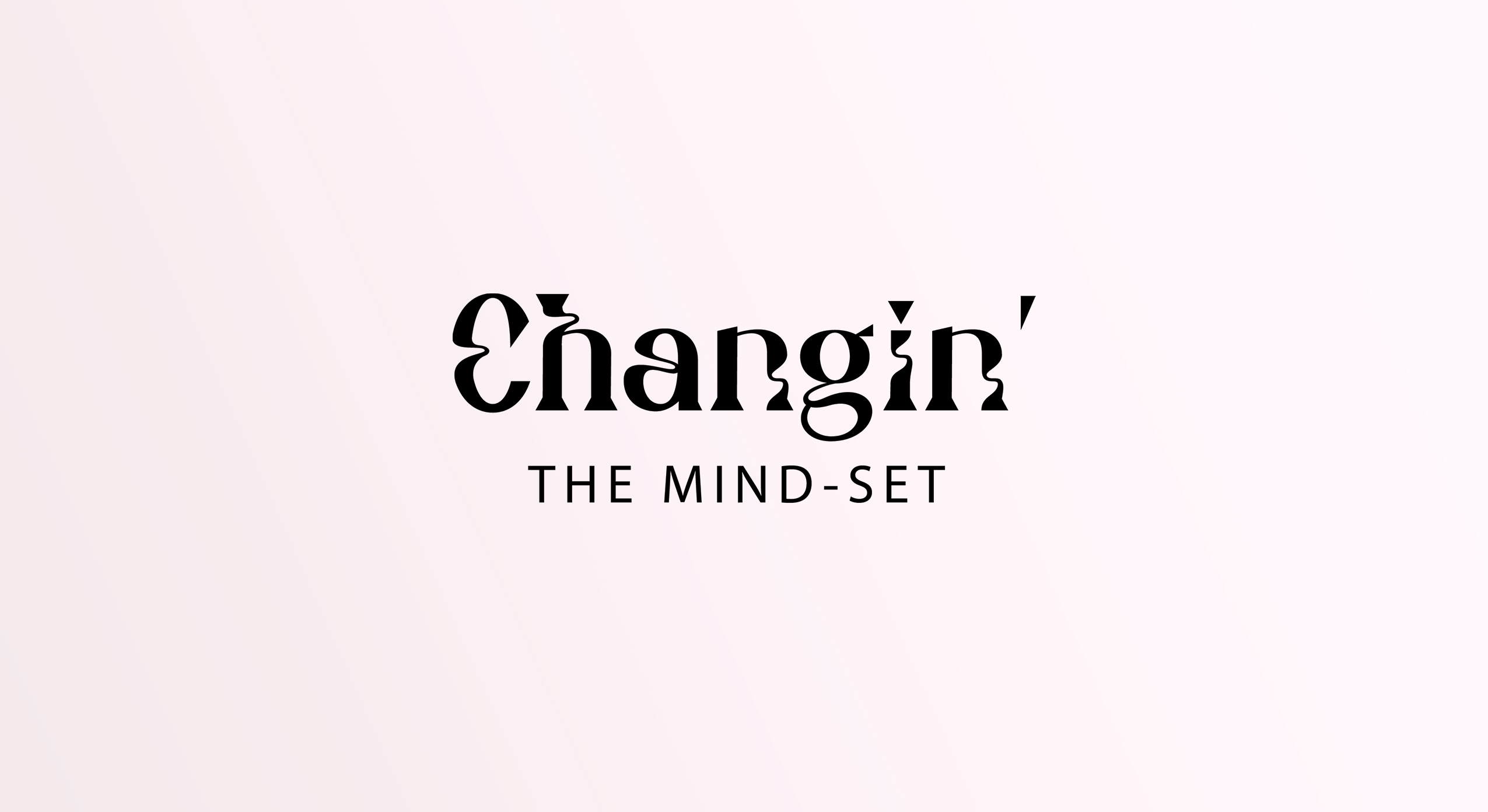
“The name Changin’ is a combination of the words “change” and “gin” as the taste of the drink is inspired by gin. The font of the logo and the colors on the back label represent the idea of psychedelic visualizations where all aspects of perception and mental associations can be altered – and that’s all about Changin’ the mind-set. The detailed design of the whole bottle forces you to take a close look and to engage with the design: pick up the bottle and look through it to see what’s going on inside. It arouses instant curiosity. In a world with limited attention spans, Changin’ encourages you to think and take a close look. It is a product of today’s zeitgeist and so much more than just a drink.

1

Get the latest packaging design inspiration in your inbox:

Popular designs

The Port Vodka Lemon Water

Overview: In response to my client’s vision for a Cape Cod themed beverage brand, I embarked on the journey to create The Port

Far Out Bar

Description: Far Out Bar is a cutting-edge packaging design project created for High Life Farms’ macrodose THC chocolate bars. This project involved

Over the wave

This Kombucha originates in Lombok, Indonesia, where its paradise beaches attract hundreds of surfers eager to ride the waves. When you surf,

Burma Love Rebrand

Love at First BiteAs an extension of the Burma Superstar restaurant in San Francisco, Burma Love Foods gives diners an opportunity to

Designed by: PepsiCo Design & Innovation
Country: United States

Changin’ Packaging Design

1
Changin_Non_Alcoholic_Spirit_Detail_Mood_00-scaled

Designed by: Baries Design GMBH | Country: Germany

If you are under the impression that a non-alcoholic beverage cannot be as intoxicating as regular alcoholic spirits, think again! Inspired by the flavors of gin, Changin’, is a non-alcoholic brand that can change your perspective. Made using select herbs, this non-alcoholic spirit is a treat for your taste buds.

The packaging design reflects the change of perspective that one may experience while savoring the taste of Changin’.

The label design very much represents that change. People are trapped in their own, monotonous world and can take a peek into a new, colorful and free world. It is inspiring to acquire a new outlook on things and to escape a stuck mind-set. The colors give you an idea of the positive experiences that await you, if you let it happen. The design of the bottle is split into two different image styles to emphasize the different mind-sets: a clean front label and colorful back label which is only visible from inside the bottle. It is designed like an entrance to another world which you can only access through Changin‘ – the non-alcoholic spirit. To guarantee a sustainable packaging, Changin’ was designed plastic-free (glass bottle, wood & cork lid, paper label) and its chosen ingredients are 100% organic.”
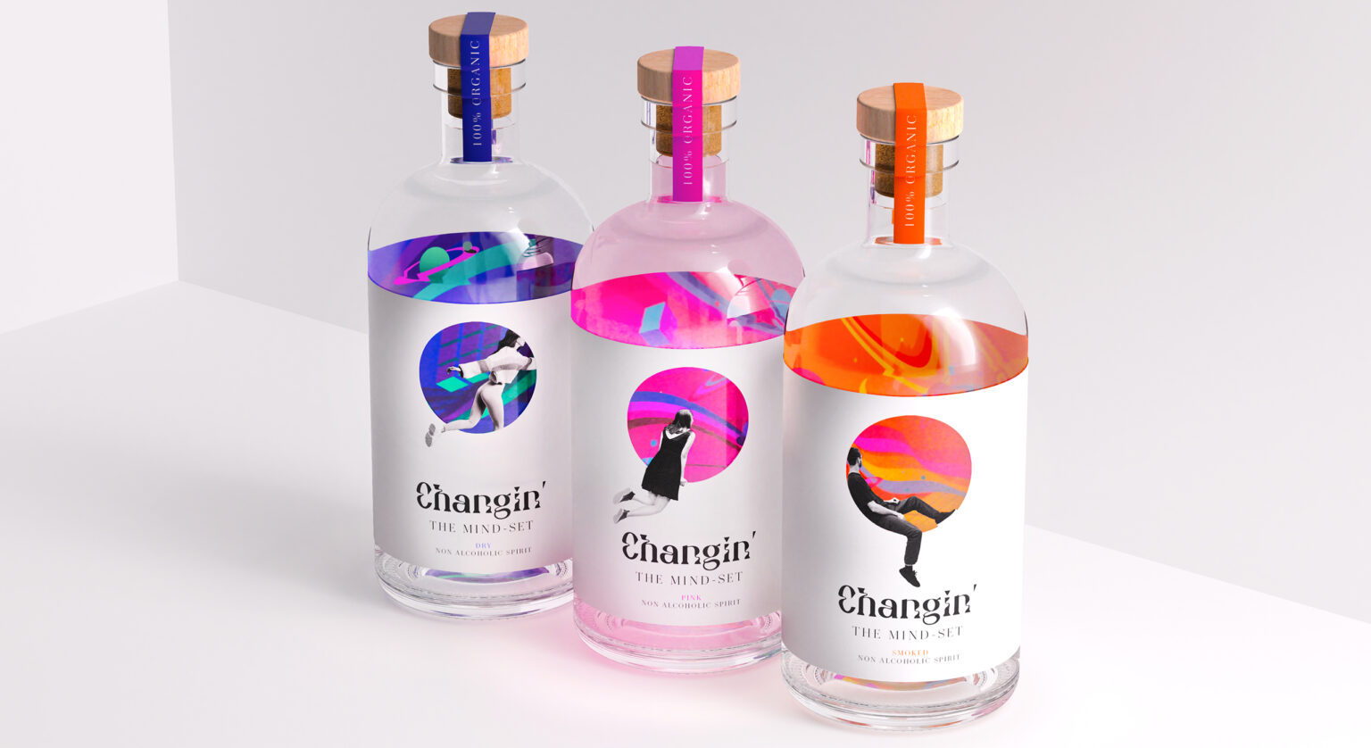
Changin’ Packaging Design

The packaging

Baries Design, a Düsseldorf-based packaging design agency, created label illustrations that highlight the positive experiences associated with the brand. The color palettes and typography evoke psychedelic images along with instantly attracting customers. Not only does the packaging reflect the change in perception, but it also arouses curiosity.

“The name Changin’ is a combination of the words “change” and “gin” as the taste of the drink is inspired by gin. The font of the logo and the colors on the back label represent the idea of psychedelic visualizations where all aspects of perception and mental associations can be altered – and that’s all about Changin’ the mind-set. The detailed design of the whole bottle forces you to take a close look and to engage with the design: pick up the bottle and look through it to see what’s going on inside. It arouses instant curiosity. In a world with limited attention spans, Changin’ encourages you to think and take a close look. It is a product of today’s zeitgeist and so much more than just a drink.

1
Previous slide
Next slide

Explore more great package design

Get the latest on packaging design in your inbox: