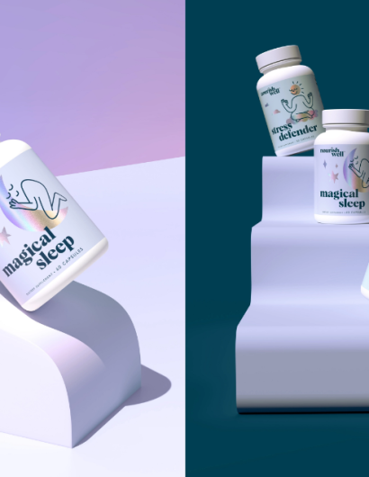
Designed by: Riser | Country: US
Nourish Well is a health and wellness brand founded by a registered hormone and gut holistic dietician. The wellness supplements made by the company are crafted using select ingredients beneficial for the body and mind.
While it is true that the wellness category is filled with brands that tempt customers with empty promises, Nourish Well has managed to set itself apart from the crowd by helping “people optimize their wellness.
“Anyone who has shopped for supplements knows it can be a category filled with confusion, skepticism, and empty promises. Nourish Well was created to change that. With a commitment to help people optimize their wellness, Nourish Well removes all doubt through high-quality, lab-tested products and a brand platform that encourages nourishing one’s body from the inside-out.”
The packaging
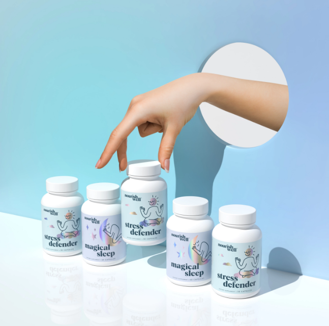
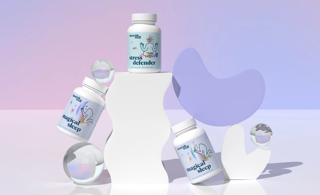
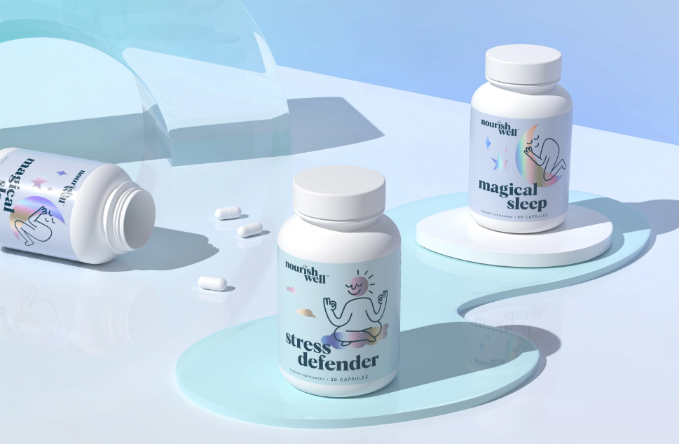
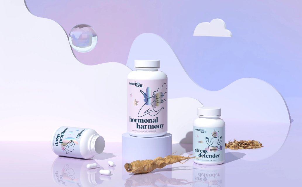
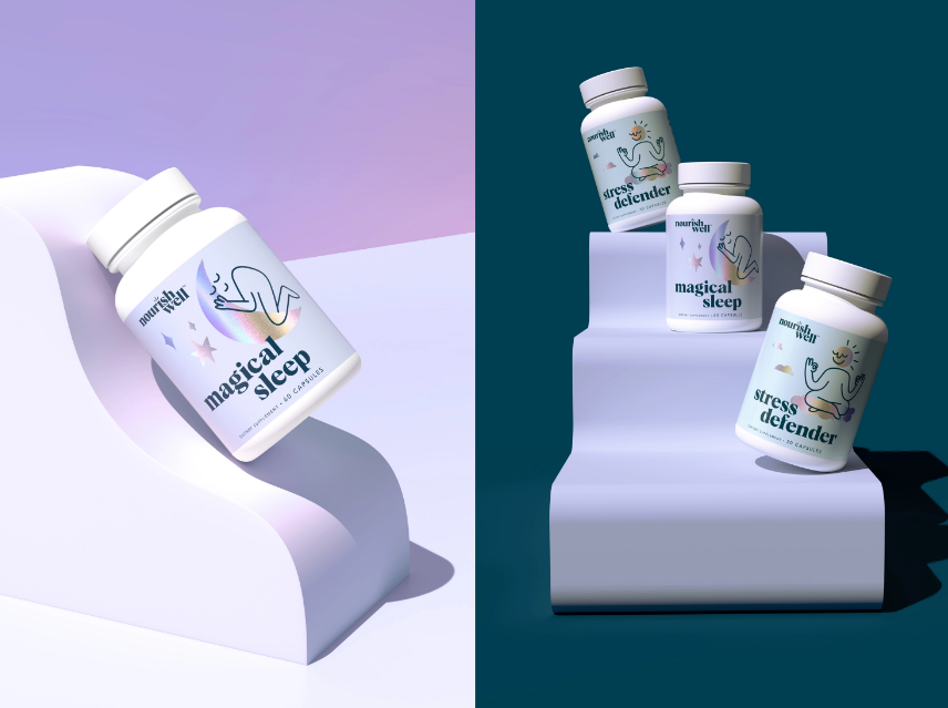
Nourish Well approached Riser, a San Francisco-based branding agency, hoping to create something different with the brand and the packaging designs. Inspired by the founder’s attractive personality, Riser created “a clean brand with attitude.” The packaging designs are uncomplicated and clearly illustrate the benefits of each product.
“Underwhelmed by the overall traditional and/or clinical aesthetic of competitive brands in the category, Nourish Well’s founder came to us with a request for something different. Inspired by her bright personality and wanting to both excite people to live more holistically and build credibility for Nourish Well, we created a clean brand with attitude. A holographic foil signals innovation, potency, and a departure from traditional “natural” supplements. An overlay of simple, yet quirky linework illustrates each product’s unique benefit and gives the brand a fun and friendly personality that feels lighthearted and welcoming. Subtle cool tones paired with an airy layout speak to purity and efficacy, without going so far as to feel clinical or cold.”


