Designed by: PepsiCo Design & Innovation
Country: United States

Kamea Wine Packaging Design

2

Designed by: The Labelmaker | Country: Bulgaria

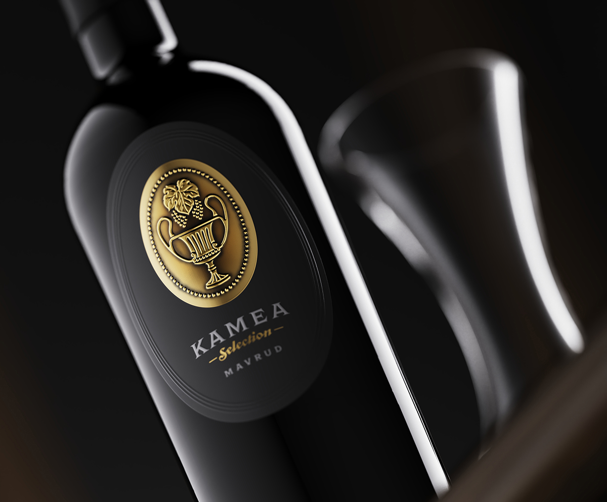
The Kamea Selection is a premium brand from Kamea Winery. The idea behind creating new illustrations was to upgrade the existing design and enhance the luxurious feel of the product.

“We did not want to change completely the existing wine label design. We were looking for an upgrade that preserves the main composition and character of the existing labels but at the same time one that would make them look more serious and luxurious.

This is how we came up with the idea to pay some extra attention to the materials that we used.”
Kamea Wine Packaging Design

The packaging

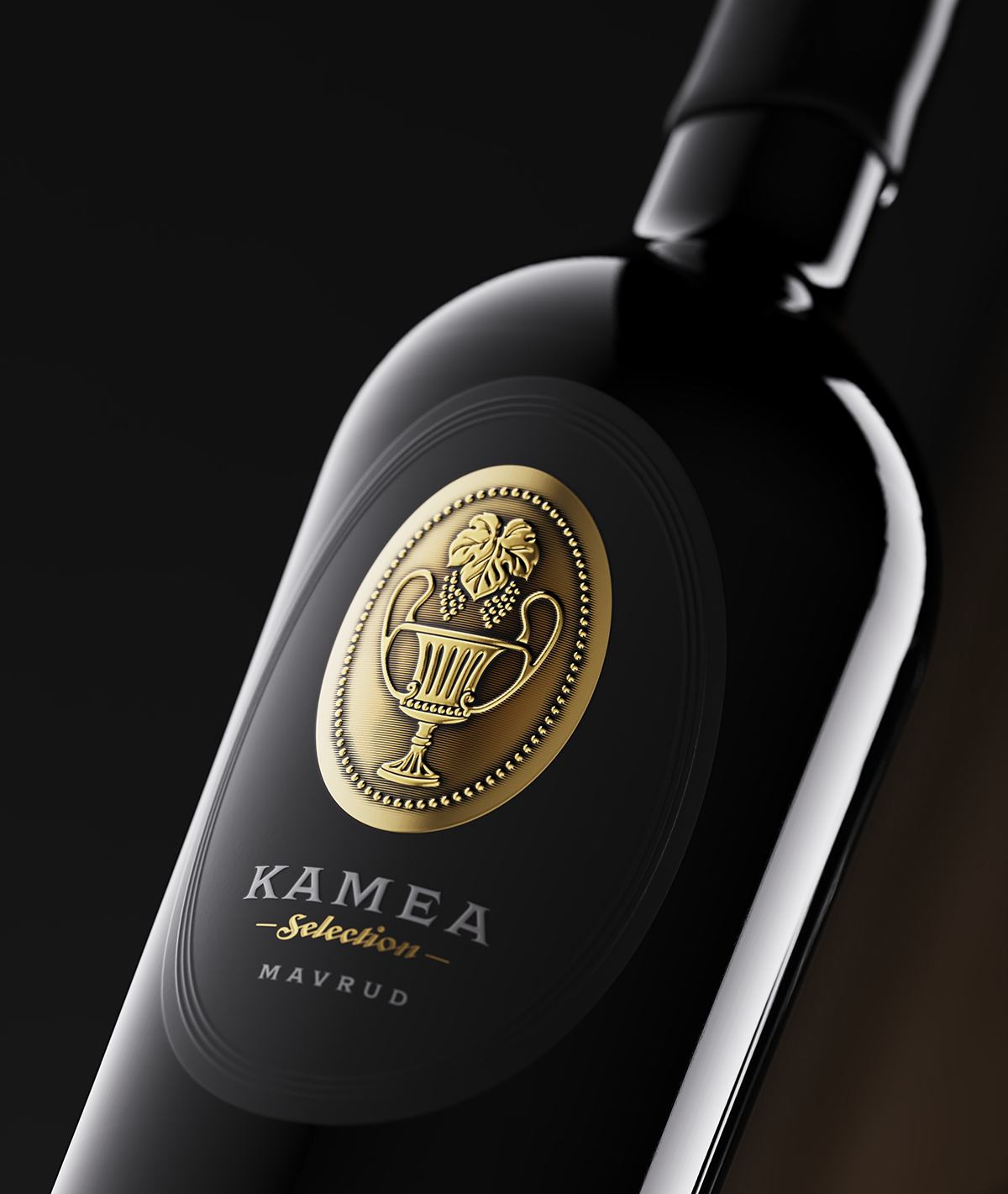
Kamea Winery partnered with The Labelmaker, a Sofia-based branding agency, to upgrade the existing packaging design. The new design created by the branding agency includes two layers of paper that enhance the look and feel of the product.

“The new design consists of two layers of paper assembled in one label which is new awesome feature delivered by my friends from Dagaprint. The background label is printed on black pulp soft touch paper while the front label is printed on thicker metal foil with very strong and visible sculpted embossing. I also added some hand-made shades around the embossed zones in order to make them pop out even more.”

2

Get the latest packaging design inspiration in your inbox:

Popular designs

Far Out Bar

Description: Far Out Bar is a cutting-edge packaging design project created for High Life Farms’ macrodose THC chocolate bars. This project involved

Burma Love Rebrand

Love at First BiteAs an extension of the Burma Superstar restaurant in San Francisco, Burma Love Foods gives diners an opportunity to

Designed by: PepsiCo Design & Innovation
Country: United States

Kamea Wine Packaging Design

2
@@@1_Ketri.1045

Designed by: The Labelmaker | Country: Bulgaria

The Kamea Selection is a premium brand from Kamea Winery. The idea behind creating new illustrations was to upgrade the existing design and enhance the luxurious feel of the product.

“We did not want to change completely the existing wine label design. We were looking for an upgrade that preserves the main composition and character of the existing labels but at the same time one that would make them look more serious and luxurious.

This is how we came up with the idea to pay some extra attention to the materials that we used.”
Kamea Wine Packaging Design

The packaging

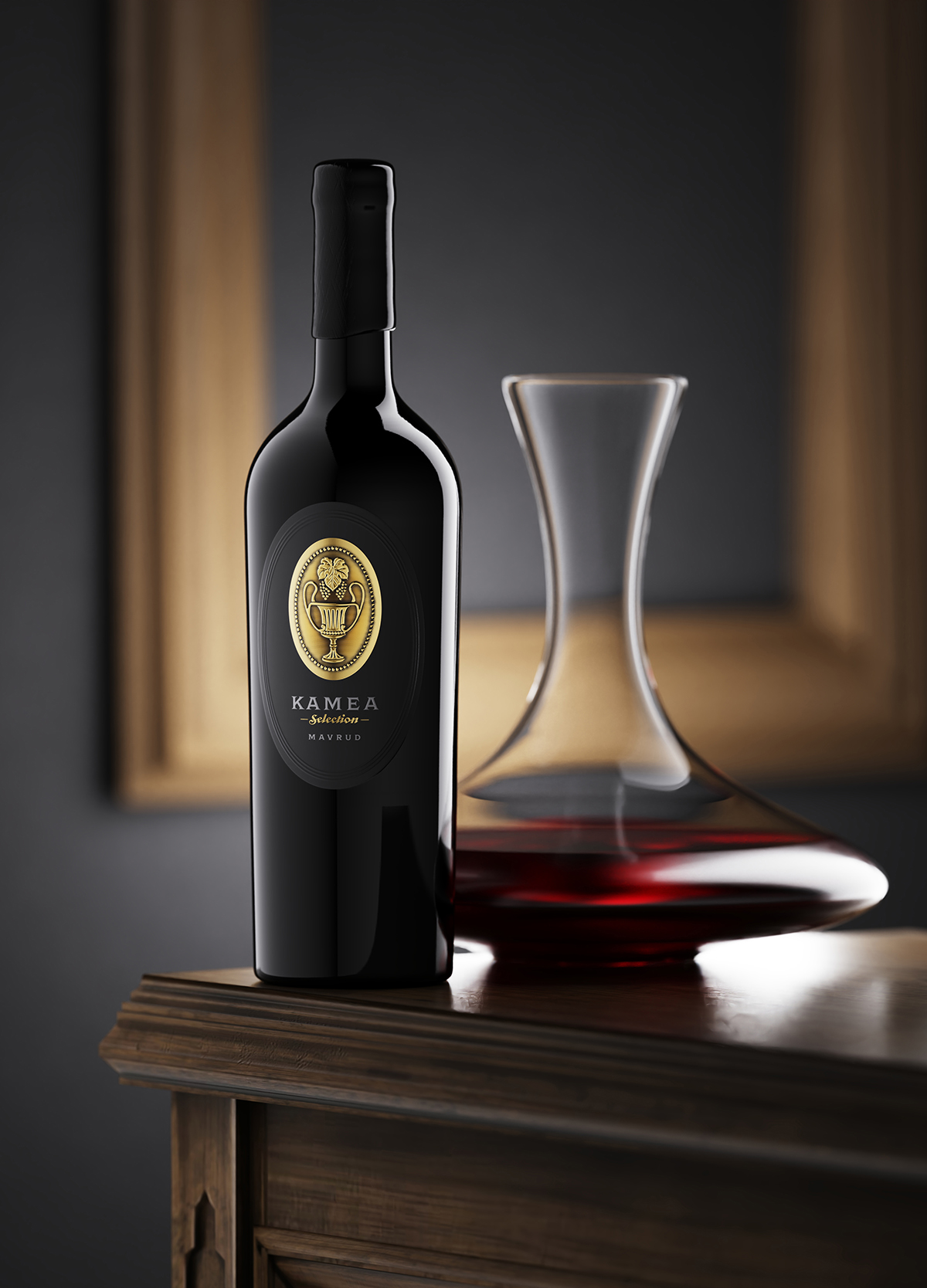
Kamea Winery partnered with The Labelmaker, a Sofia-based branding agency, to upgrade the existing packaging design. The new design created by the branding agency includes two layers of paper that enhance the look and feel of the product.

“The new design consists of two layers of paper assembled in one label which is new awesome feature delivered by my friends from Dagaprint. The background label is printed on black pulp soft touch paper while the front label is printed on thicker metal foil with very strong and visible sculpted embossing. I also added some hand-made shades around the embossed zones in order to make them pop out even more.”

2
Previous slide
Next slide

Explore more great package design

Get the latest on packaging design in your inbox: