


Designed by: 3rd Floor
FOUNDER: Bart De Keyzer
COUNTRY: Netherlands
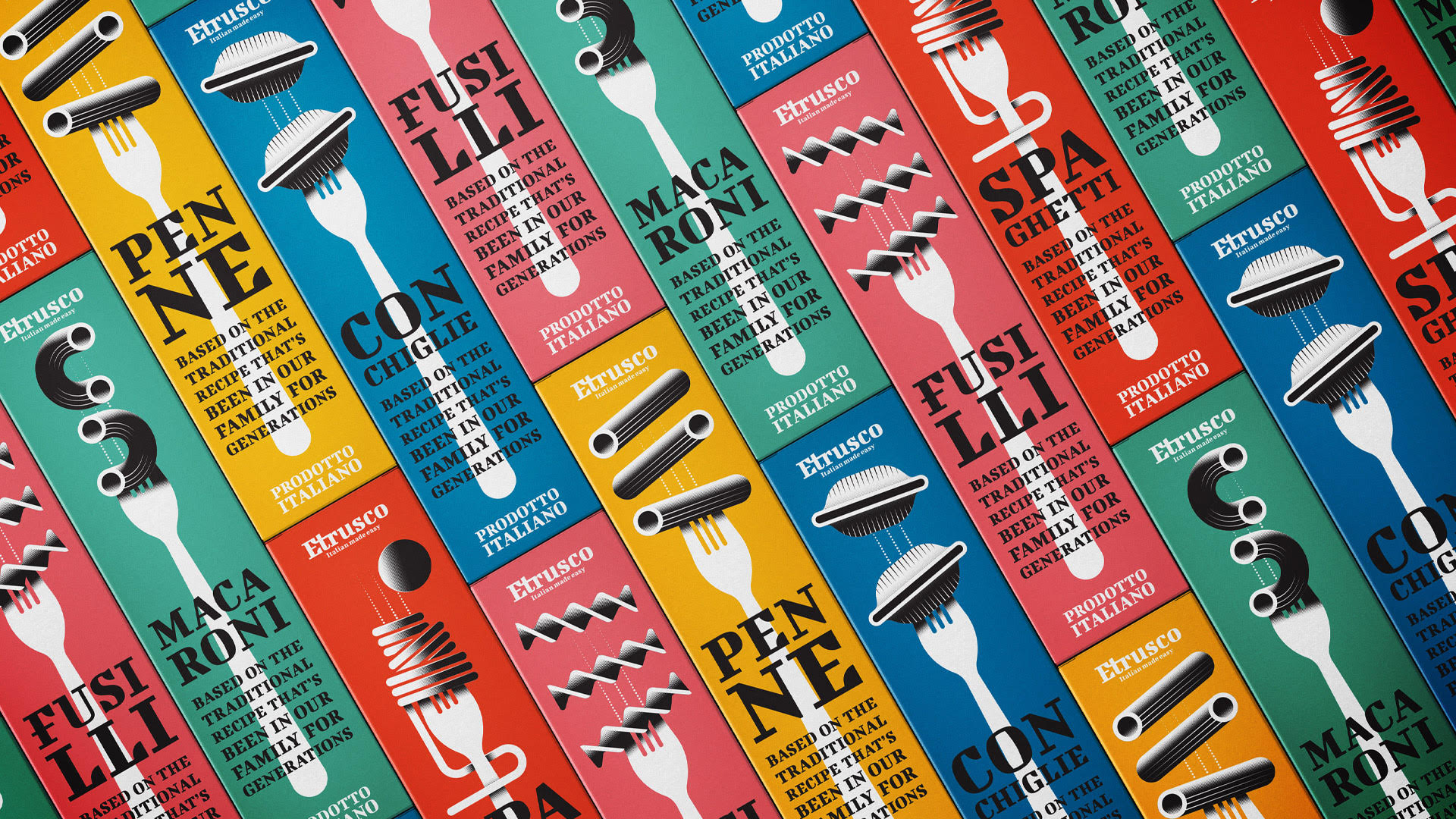
While there may be differing opinions, one could argue that all pasta essentially shares the same core composition, differing primarily in their shapes. Nevertheless, it’s worth noting that these varied shapes and sizes have a significant purpose, especially when paired with specific sauces. The pasta’s configuration plays a crucial role in absorbing and complementing the flavors of the ingredients.
This rationale drove Bart to create a collection of illustrations employing a distinctive visual style characterized by geometric shapes and a limited color palette to emphasize the diverse pasta shapes. The incorporation of vibrant background colors serves to distinguish the various packaging designs while ensuring they maintain a cohesive series. Unlike competing brands that often adhere to a uniform color palette across their packaging, the Etrusco brand achieves a dynamic visual appeal with a touch of nostalgia through the clever use of illustration and typography. This strategic approach sets it apart from competitors, particularly when showcased on supermarket shelves.


