Designed by: PepsiCo Design & Innovation
Country: United States

London Essence Co. Unveils Refreshed Brand and New Packaging Design with BrandOpus

21

The London Essence Co. is known for crafting luxurious mixers and premium adult soft drinks, renowned for their pure flavors derived from quality ingredients. This year, they have embarked on a partnership with BrandOpus, a global branding agency, to refresh their brand. This venture commences with a new pack design and a 250ml can format for their range of Crafted Sodas.

The rejuvenated look and feel of the London Essence Co. integrates the brand as a ‘Tastemaker’, encapsulating the boldness and diversity of the city which bears its name. This also serves as a nod to the brand’s history in supplying essences to luxury fragrance houses.

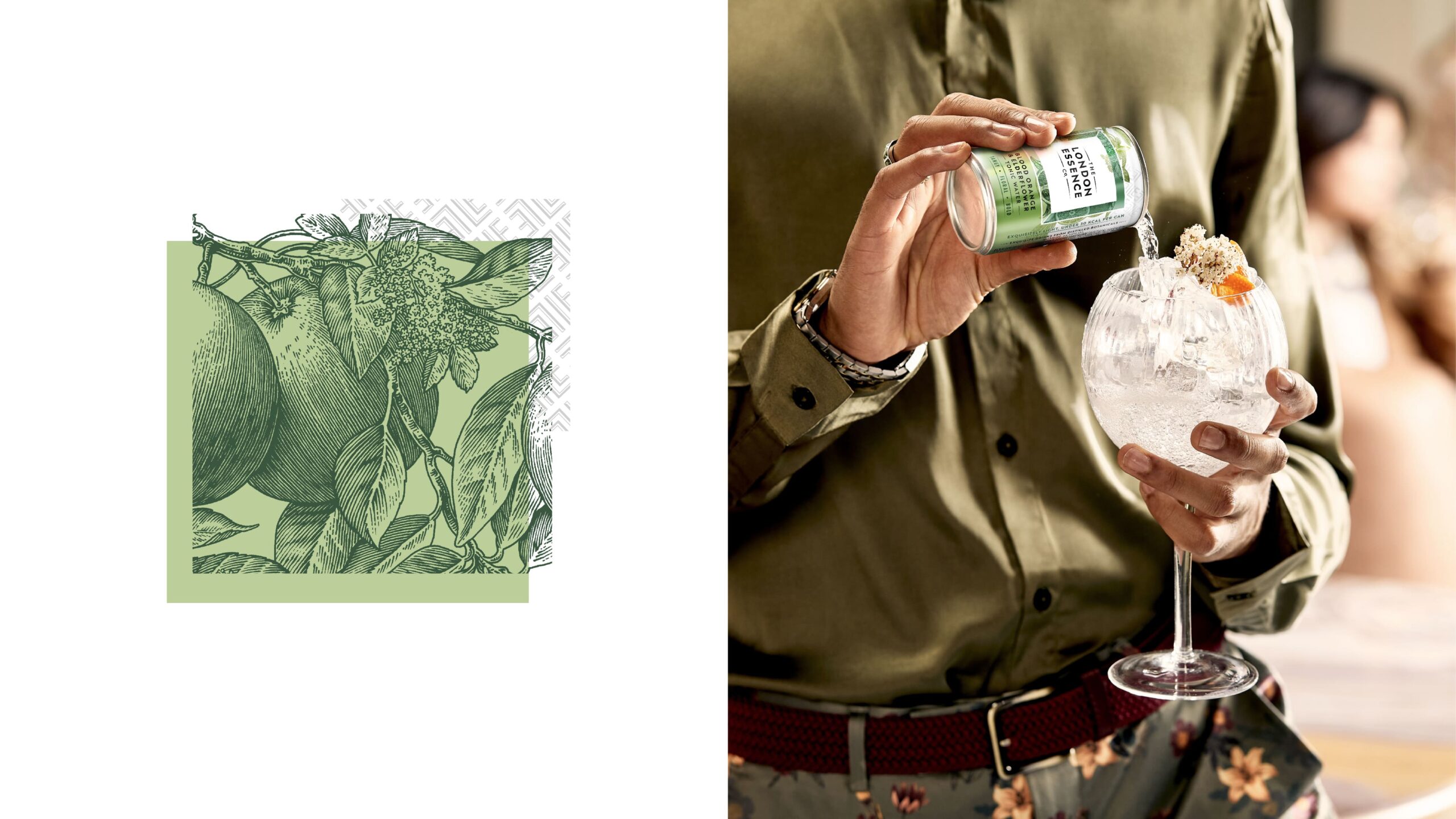
The brand narrative of ‘Tastemaker’ is centered around the exquisitely distilled and blended flavors that are evident across London Essence’s portfolio of mixers and drinks. This narrative materializes in the craft and detail present in every element – from artist commissioned botanical illustrations to the multiple layers that reflect the depth and complexity experienced in each sip.
London Essence Co. Unveils Refreshed Brand and New Packaging Design with BrandOpus


London Essence Co. Unveils Refreshed Brand and New Packaging Design with BrandOpus


London Essence Co. Unveils Refreshed Brand and New Packaging Design with BrandOpus


London Essence Co. Unveils Refreshed Brand and New Packaging Design with BrandOpus


London Essence Co. Unveils Refreshed Brand and New Packaging Design with BrandOpus


London Essence Co. Unveils Refreshed Brand and New Packaging Design with BrandOpus


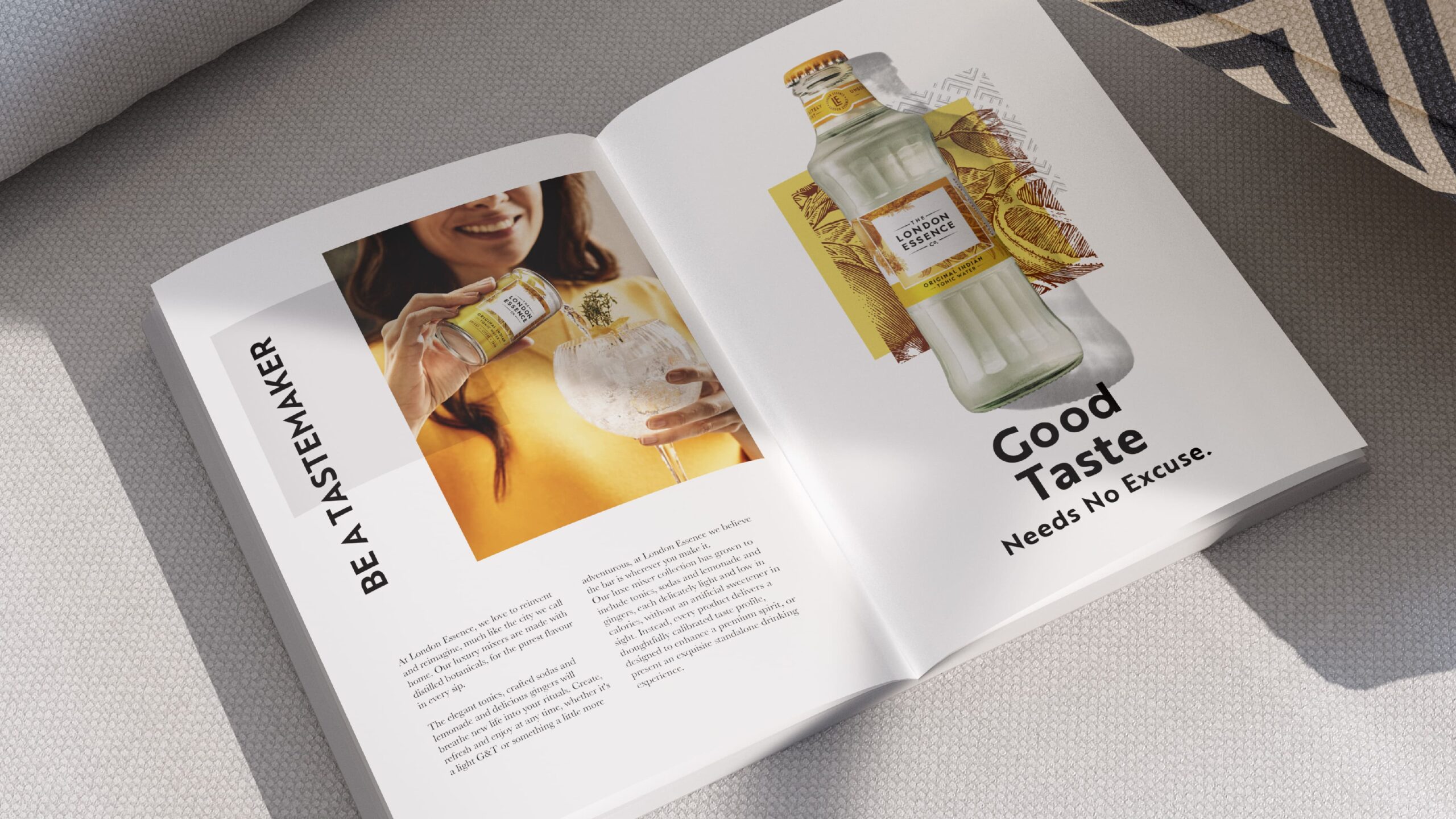
London Essence Co. also embraces the ‘Tastemaker’ role by setting standards and empowering discerning drinkers to discover new ways to elevate their experiences. The new brand identity delivers this by acting in a way you might expect from a fashion or scent brand.

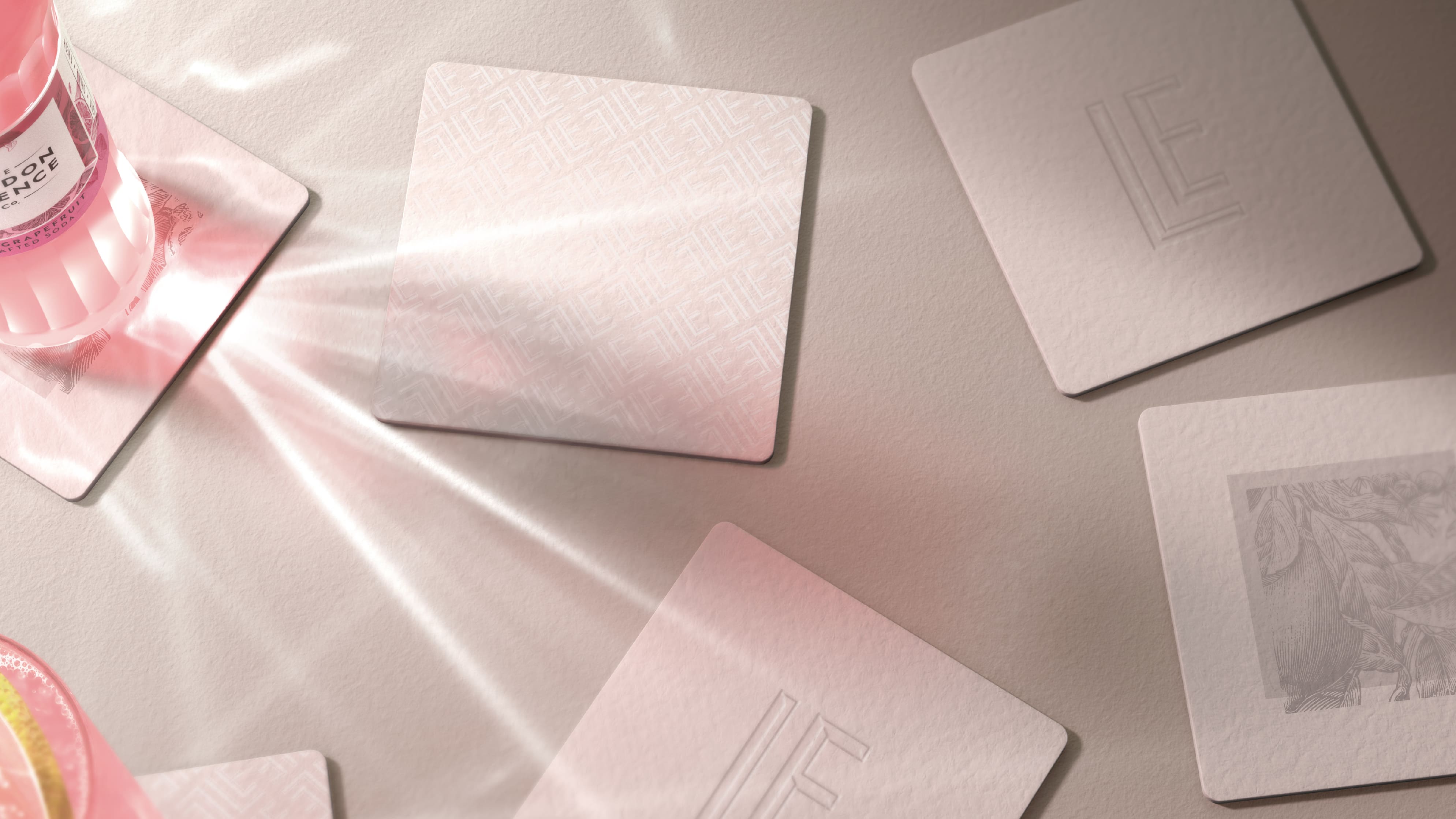
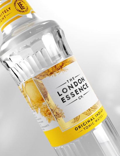
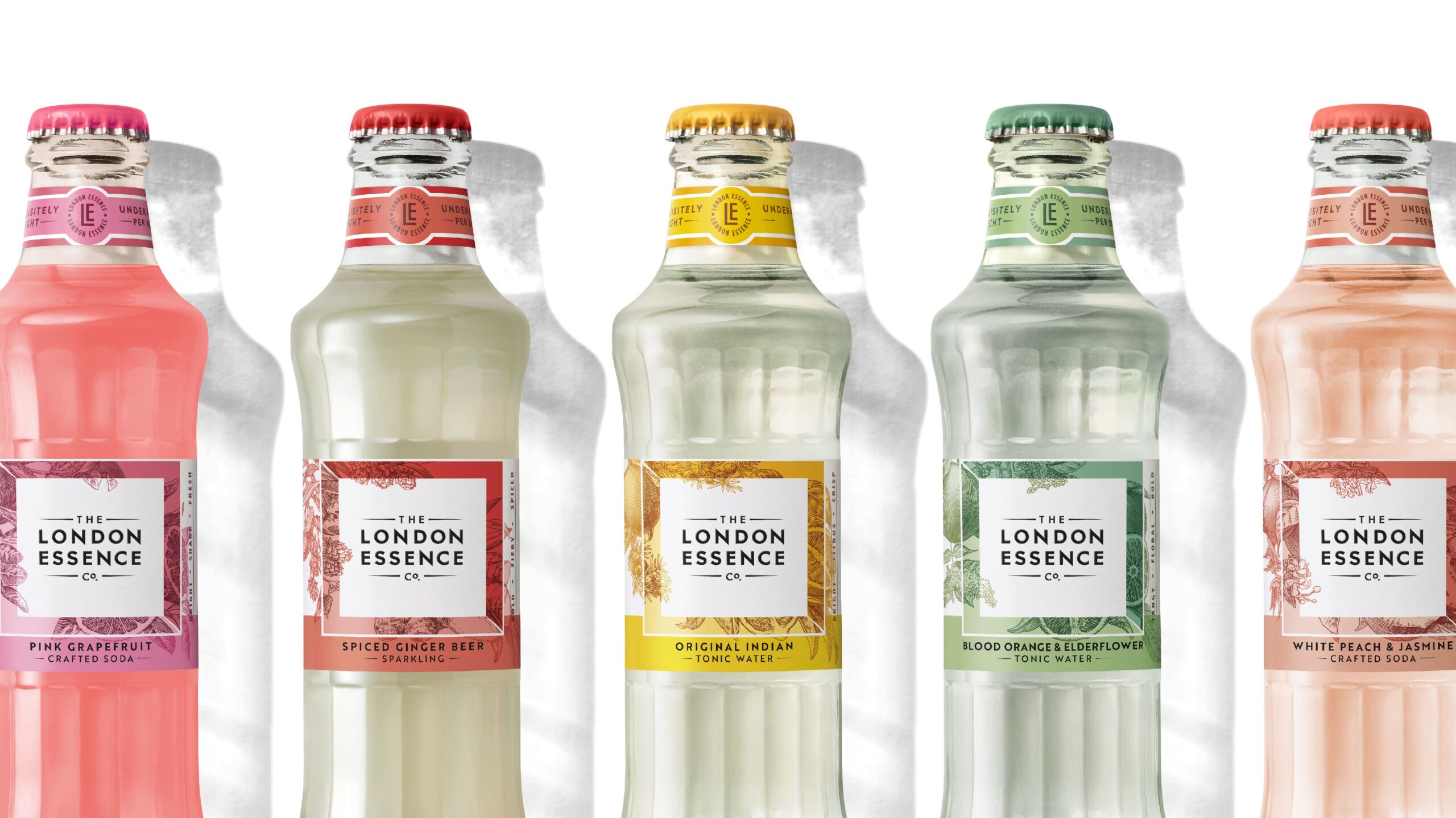
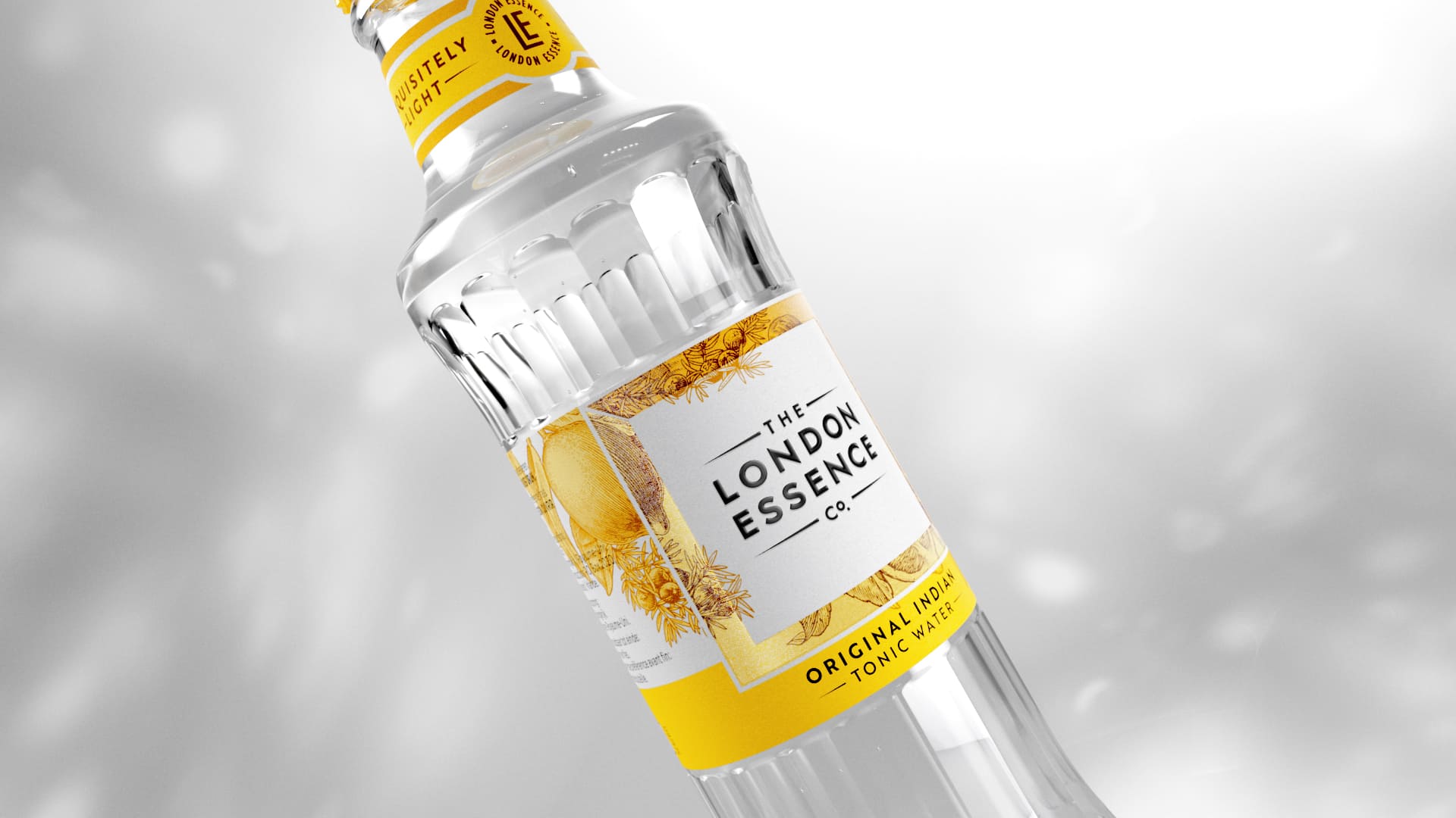
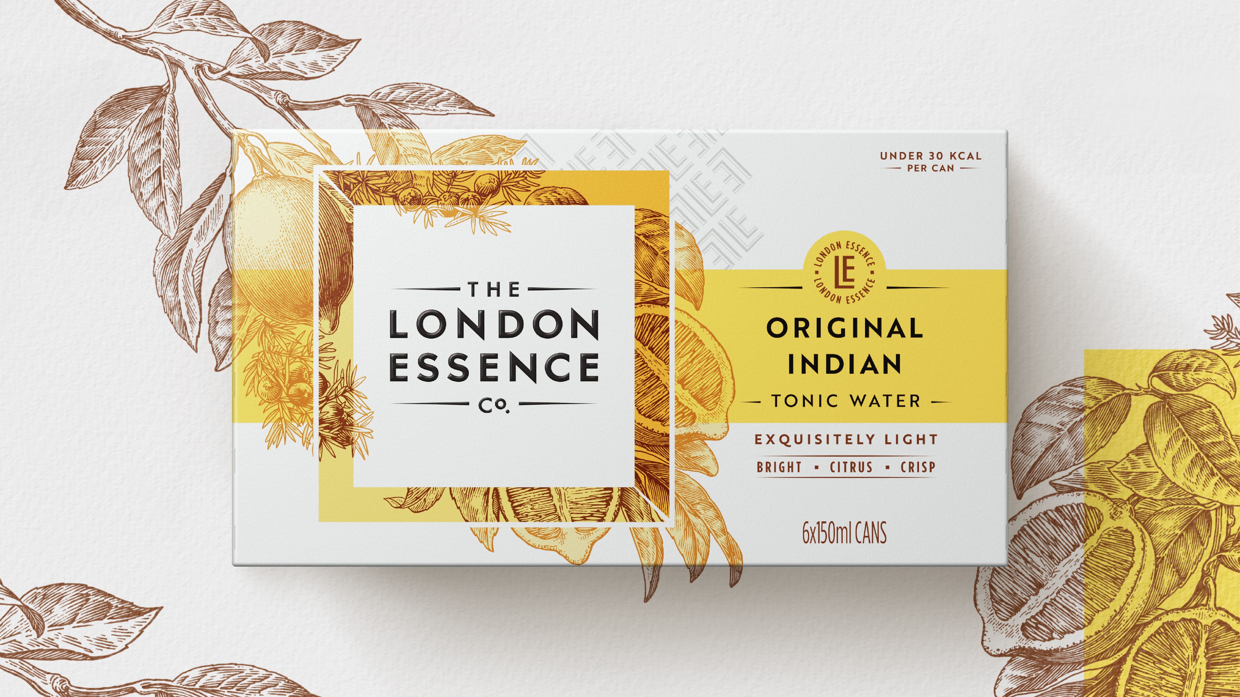
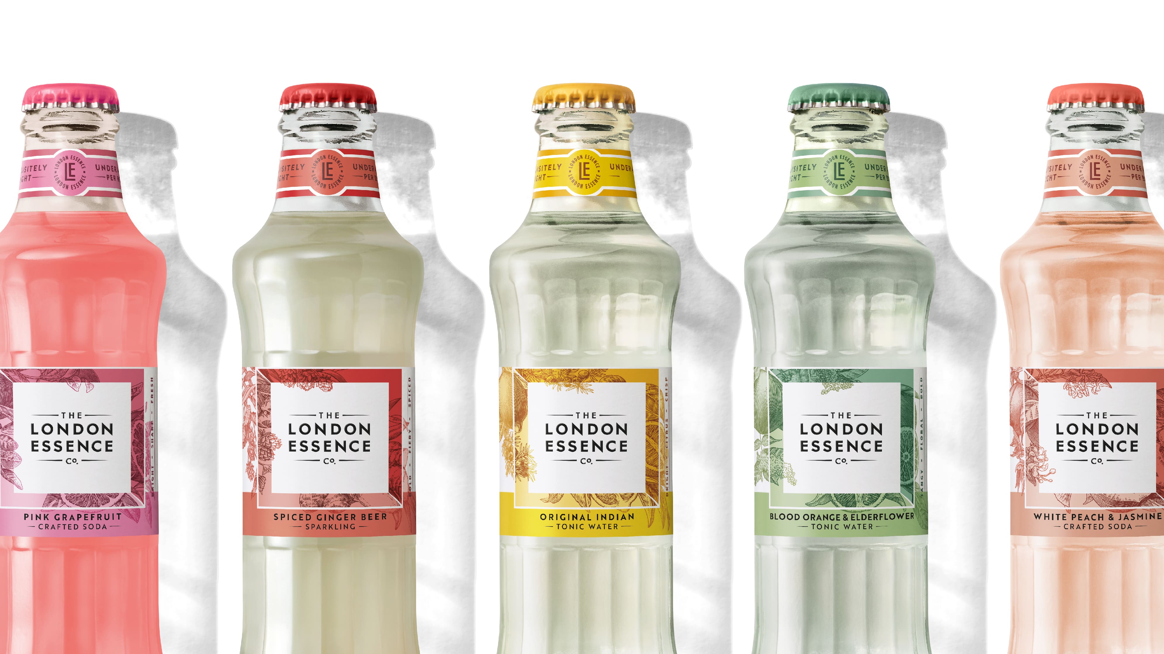
The classic brandmark, framed in a confidently white square, creates a label that serves as a mark of exquisite taste and authority. The distinctive square visual, interwoven with bespoke botanical illustrations around its frame, is the heart of the redesign. This design mirrors the core of London Essence’s brand, with every drink crafted from delicate layering and artfully blended flavors.

Daniel Wegrzyn, Business Director at BrandOpus, explains the intent behind the re-brand, stating that they wanted London Essence to act and behave as a Tastemaker would, with more ways to tell its story and drive desire. They relished the challenge of standing out in the category and appealing to a new generation of discerning drinkers with a more connected, intentional, and confident expression of the brand.

Ounal Bailey, co-founder of The London Essence Co., expresses delight at revealing the new design as part of their brand refresh. This celebrates their growth in the UK and globally, following their recent London Distilled campaign. They aim to integrate the creative, stylish, and diverse influences which shape the brand, into the design of their product range. They are confident that this increases the brand’s impact and awareness with a more connected identity across multiple touchpoints in retail and hospitality.

The new 250ml format will be the first in the range to feature London Essence’s re-designed monogram, a simplified pattern and mark of quality to feature on every product. The range will be rolled out across major UK retailers from February 2024, followed by a full brand portfolio rollout throughout the year.

21

Get the latest packaging design inspiration in your inbox:

Popular designs

Over the wave

This Kombucha originates in Lombok, Indonesia, where its paradise beaches attract hundreds of surfers eager to ride the waves. When you surf,

Burma Love Rebrand

Love at First BiteAs an extension of the Burma Superstar restaurant in San Francisco, Burma Love Foods gives diners an opportunity to

Far Out Bar

Description: Far Out Bar is a cutting-edge packaging design project created for High Life Farms’ macrodose THC chocolate bars. This project involved

Designed by: PepsiCo Design & Innovation
Country: United States

London Essence Co. Unveils Refreshed Brand and New Packaging Design with BrandOpus

21
London Essence Co. Unveils Refreshed Brand and New Packaging Design

The London Essence Co. is known for crafting luxurious mixers and premium adult soft drinks, renowned for their pure flavors derived from quality ingredients. This year, they have embarked on a partnership with BrandOpus, a global branding agency, to refresh their brand. This venture commences with a new pack design and a 250ml can format for their range of Crafted Sodas.

The rejuvenated look and feel of the London Essence Co. integrates the brand as a ‘Tastemaker’, encapsulating the boldness and diversity of the city which bears its name. This also serves as a nod to the brand’s history in supplying essences to luxury fragrance houses.

The brand narrative of ‘Tastemaker’ is centered around the exquisitely distilled and blended flavors that are evident across London Essence’s portfolio of mixers and drinks. This narrative materializes in the craft and detail present in every element – from artist commissioned botanical illustrations to the multiple layers that reflect the depth and complexity experienced in each sip.
London Essence Co. Unveils Refreshed Brand and New Packaging Design with BrandOpus


London Essence Co. Unveils Refreshed Brand and New Packaging Design with BrandOpus


London Essence Co. Unveils Refreshed Brand and New Packaging Design with BrandOpus


London Essence Co. Unveils Refreshed Brand and New Packaging Design with BrandOpus


London Essence Co. Unveils Refreshed Brand and New Packaging Design with BrandOpus


London Essence Co. Unveils Refreshed Brand and New Packaging Design with BrandOpus


London Essence Co. also embraces the ‘Tastemaker’ role by setting standards and empowering discerning drinkers to discover new ways to elevate their experiences. The new brand identity delivers this by acting in a way you might expect from a fashion or scent brand.

The classic brandmark, framed in a confidently white square, creates a label that serves as a mark of exquisite taste and authority. The distinctive square visual, interwoven with bespoke botanical illustrations around its frame, is the heart of the redesign. This design mirrors the core of London Essence’s brand, with every drink crafted from delicate layering and artfully blended flavors.

Daniel Wegrzyn, Business Director at BrandOpus, explains the intent behind the re-brand, stating that they wanted London Essence to act and behave as a Tastemaker would, with more ways to tell its story and drive desire. They relished the challenge of standing out in the category and appealing to a new generation of discerning drinkers with a more connected, intentional, and confident expression of the brand.

Ounal Bailey, co-founder of The London Essence Co., expresses delight at revealing the new design as part of their brand refresh. This celebrates their growth in the UK and globally, following their recent London Distilled campaign. They aim to integrate the creative, stylish, and diverse influences which shape the brand, into the design of their product range. They are confident that this increases the brand’s impact and awareness with a more connected identity across multiple touchpoints in retail and hospitality.

The new 250ml format will be the first in the range to feature London Essence’s re-designed monogram, a simplified pattern and mark of quality to feature on every product. The range will be rolled out across major UK retailers from February 2024, followed by a full brand portfolio rollout throughout the year.

21
Previous slide
Next slide

Explore more great package design

Get the latest on packaging design in your inbox: