
The hard seltzer industry has seen an unprecedented boom, leading to the advent of many exciting flavors and innovations. Among these, Thorntail’s “hard agave” stands out—it’s akin to a hard seltzer with a dash of tequila, presenting an ultra-light margarita in a can.
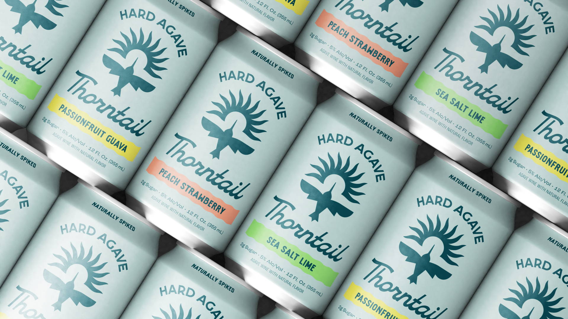
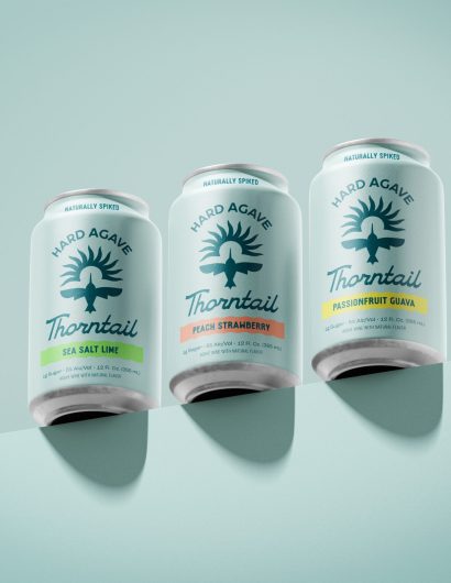
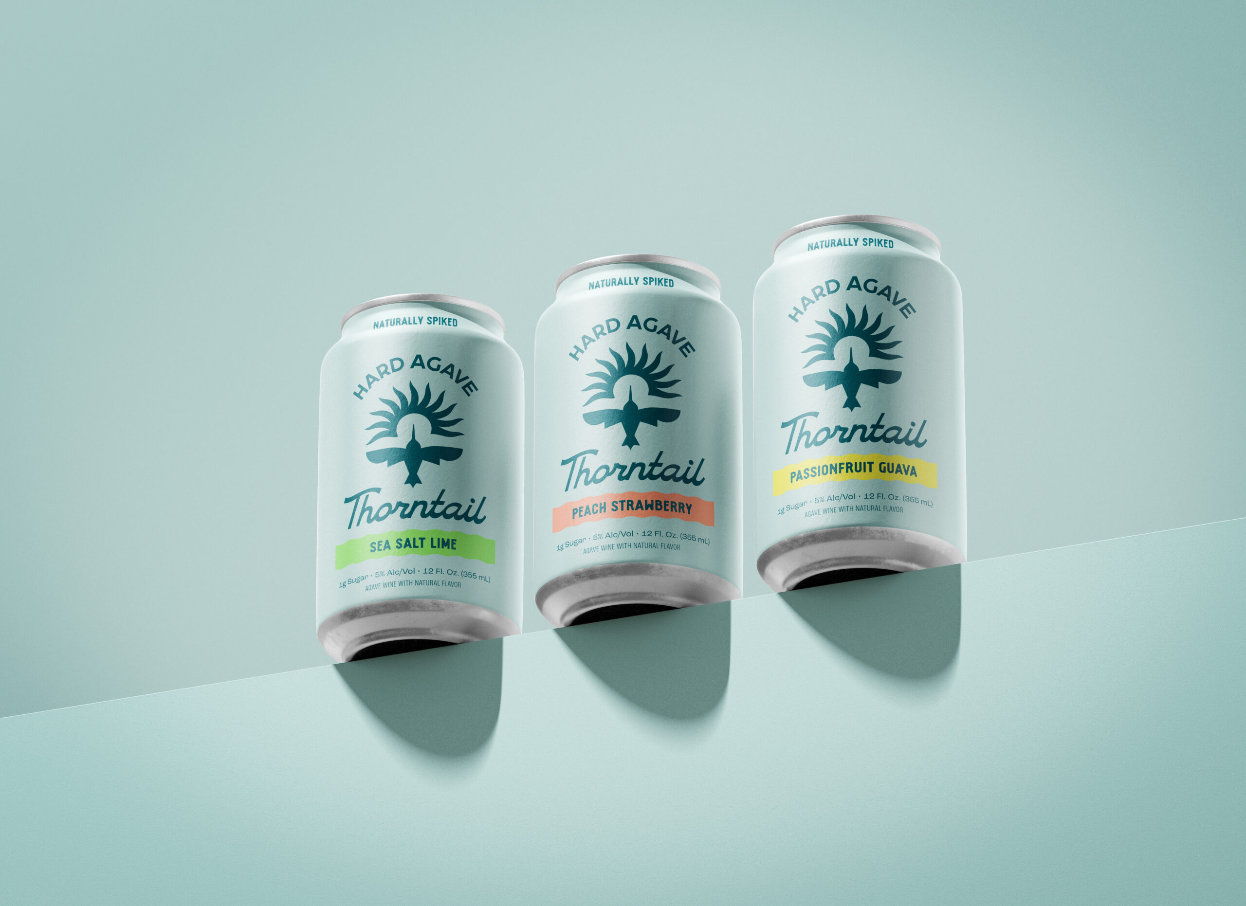
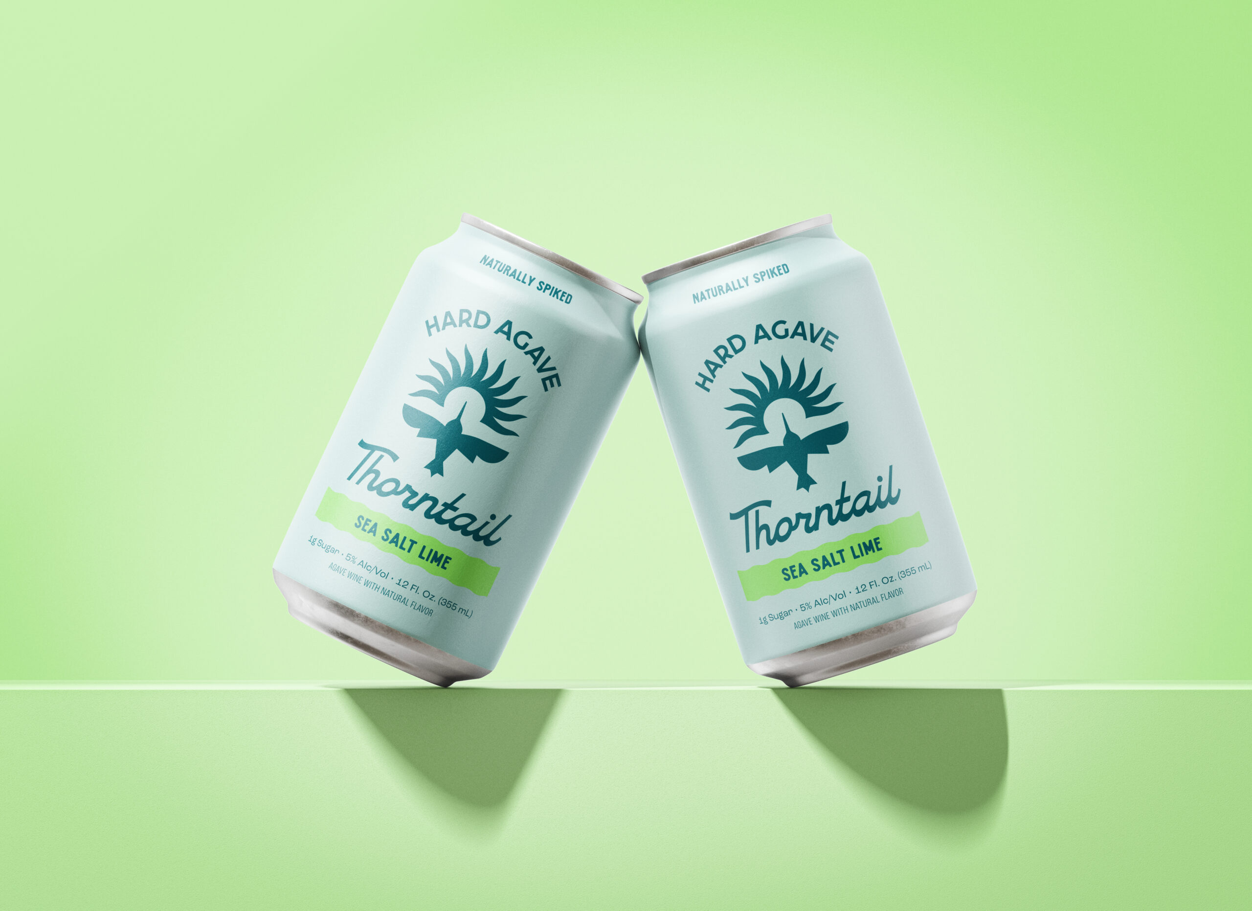
Thorntail’s branding exudes a classic southwestern vibe with its sunny hummingbird logo and crisp wordmark resembling a Route 66 neon sign. The colorful flavor names contrast beautifully against the pale blue backdrop of a desert sky, giving the cans a sophisticated look that can be effortlessly translated into stylish merchandise. The end result? An invigorating beverage perfect for a relaxed Indian summer picnic.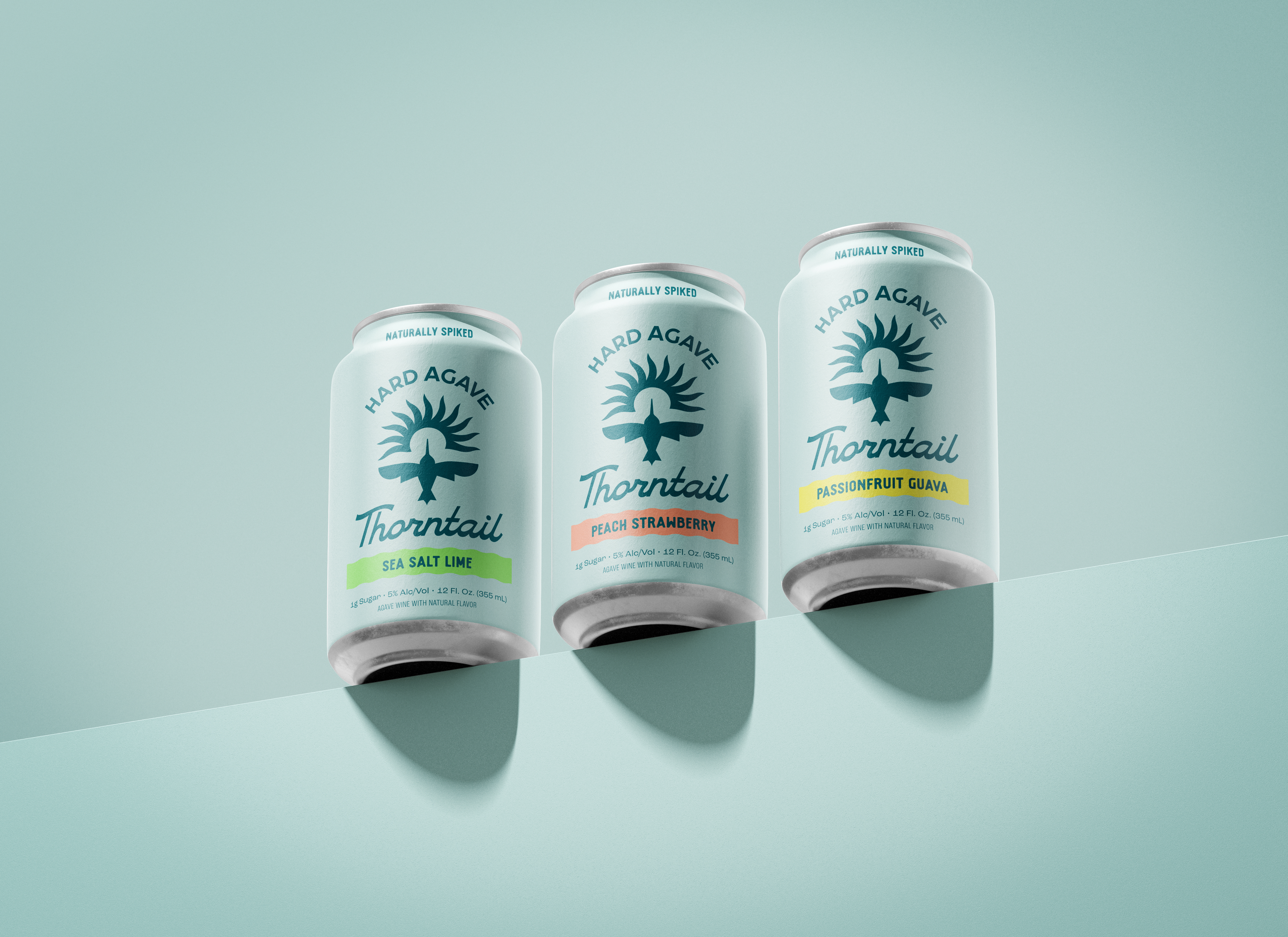
In a market teeming with choices, standing out requires a unique visual identity. Thorntail Hard Agave, currently available at QFC and Fred Meyer, achieved this by collaborating with the Seattle branding studio People People. The design studio was tasked with creating a distinctive and captivating brand that resonates with consumers. The final design is as light, spirited, and uplifting as the beverage itself, featuring an abstract illustration of a thorntail hummingbird, coupled with a script typeface and tones of teal influenced by the Blue Weber agave plant.
Thorntail defies categorization—it’s neither a typical seltzer nor a tequila, but something entirely new. This presented a challenge and an opportunity for People People. The prevailing trends in the market were identified: logos of hard seltzers set against white or highly saturated colors, and products with agave as an ingredient typically showcased an icon of the plant. To break away from the norm and communicate the product’s uniqueness, People People adopted a different approach.
The packaging was designed to feel fresh, vibrant, and invigorating—attributes that align with the product. With only 2g of sugar and an alcohol by volume of 5%, the product’s lightness is mirrored not only in its taste but also in its visual representation. The brand, cans, and 6-pack boxes all display a distinctive pairing of light and dark teal blues. Inspired by the Blue Weber agave plant, the colors evoke a sense of brightness that mirrors the beverage’s refreshing taste. To bolster brand recognition, designers maintained color consistency across all packaging, deviating from the common practice of changing backgrounds per flavor.
Instead of the common agave plant graphics, People People drew inspiration from Thorntail’s namesake: the thorntail hummingbird. Known for pollinating agave plants, these hummingbirds embody the same light and zippy characteristics as the beverage. The visual identity features an abstract illustration of the hummingbird, symbolizing upward flight for an uplifting feel, accompanied by a script typeface inspired by the hummingbird’s graceful movements.
‘Hard Agave’ or ‘Fermented Hard Agave’ is prominently displayed alongside the logo and product name to pique consumer curiosity. Recognizing the limitations of can space for detailed information, People People created Thorntail’s website as a hub for in-depth education. The website features a playful infographic that takes consumers on a journey, detailing the production of hard agave from farm to can. People People’s creative approach ensures that Thorntail Hard Agave not only stands out on the shelves but also strikes a chord with consumers seeking a unique and refreshing experience.